Hi Everyone!
I’m so excited for today’s post because I’m talking one of my favorite topics…paint! We all know how transformative paint can be for a space and while we are all spending more time in our homes, many of us are also looking for ways to make our spaces even more of a sanctuary. Although the quarantine and social distancing has DEFINITELY been difficult and has downright sucked for a lot of folks, it’s also had a very positive impact on many people in regard to their relationship with their homes. Being confined to them has encouraged us to reevaluate just what our homes mean to us and how we want to feel while we are in them. It’s triggered lots of home projects and makeovers both big and small, with a fresh new paint job being at the tip top of the list. As a designer, it’s been so awesome to see so many people encouraged to work on creating homes that bring them joy and being inspired to make impactful changes to their spaces.
Today, I’m here to continue the inspiration through color and to all my moody space lovers out there – this post is for you:) I’m so so excited to announce my partnership with Sherwin-Williams®! Over the next year, I’ll be sharing inspiring color-focused projects and ideas, and I’m kicking things off with a round-up of some of my favorite Sherwin-Williams paint colors…the “Moody Edition.”
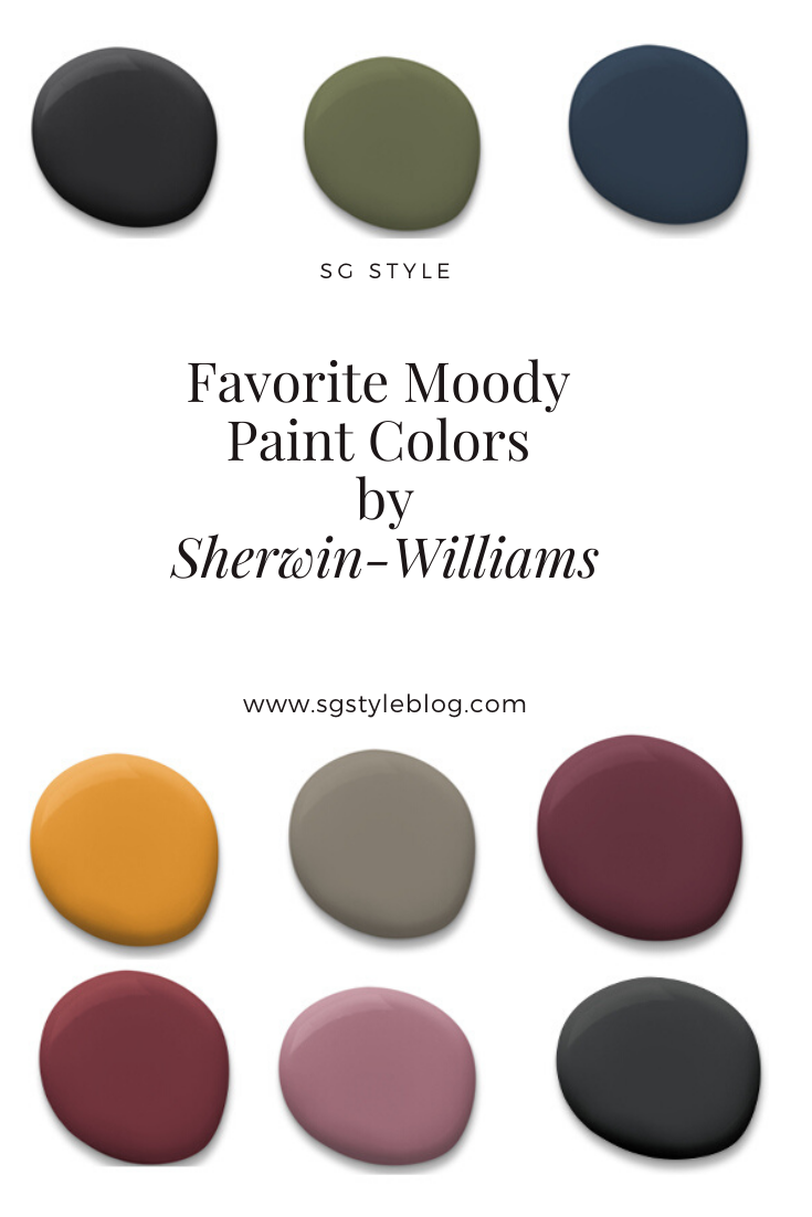
Whether you’re looking to go super bold or are just ready to make a little change, I hope you’re inspired to bring some moody cozy color into your spaces. I know when you hear the words “moody interiors” the immediate thought is “dark” spaces. This isn’t necessarily the case. You can create a sultry moody space with more than just black paint (although y’all know I love a good black room!) and here are my picks for paint colors to give your space major moody vibes.
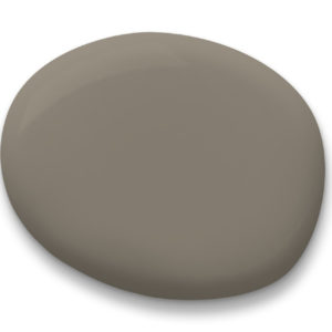
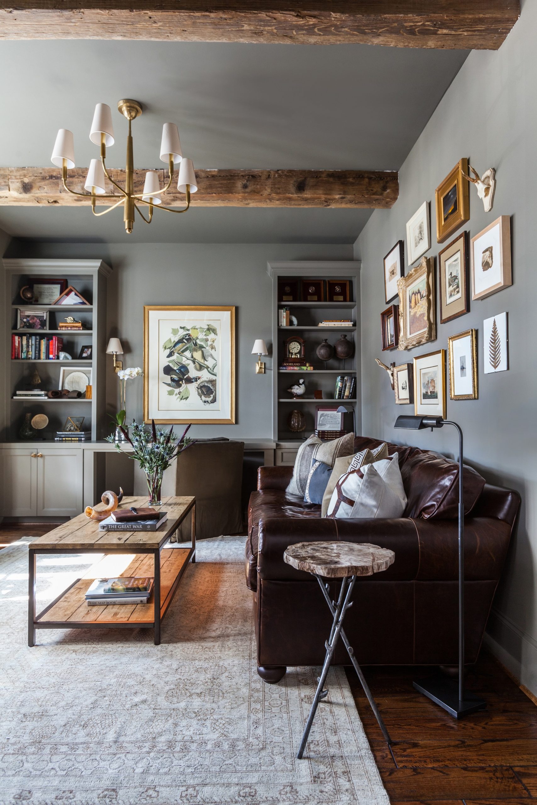
Let’s kick things off with the neutral of the bunch: Anonymous SW 7046. As someone who is generally not a fan of neutral colors or spaces, this is one that I actually really love. It’s a beautiful color with depth, and it has the perfect undertones that make it work in just about every single space you can think of. This is a neutral that’s anything but boring and is a great base to layer in natural materials, bright textiles, patterns, etc. I love the way it looks in this space:
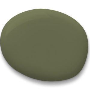
Now, y’all know I love me some green and this earthy olive is so so good, friends! Not too muddy, not too emerald…just perfect. I love this color on kitchen cabinets, built-ins, upholstery, literally everywhere. Sarah Sherman Samuel used it in her son’s room recently and it literally stopped me in my tracks! I’m obsessed with how it pairs with marigold.
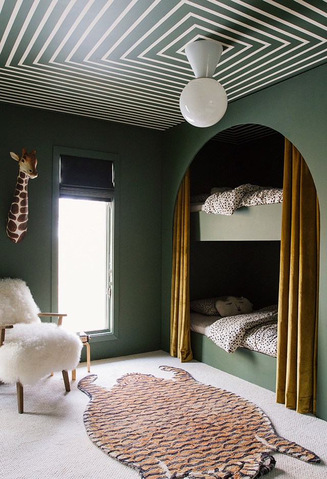
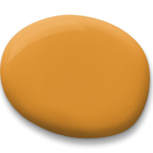
Speaking of marigold! It’s everywhere lately and it is one of MY colors of the year, friends. I’m absolutely obsessed with it. It’s definitely a color not for the faint of heart in terms of using it in a major way in a space, but it also works so well as an accent to other colors. Whenever I imagine a layered, eclectic room, I always picture marigold or mustard yellow included in some way. Curry SW 6671 is a deep, rich golden yellow that gives me all the good feels. I looks particularly amazing with green, purple, and burgundy.
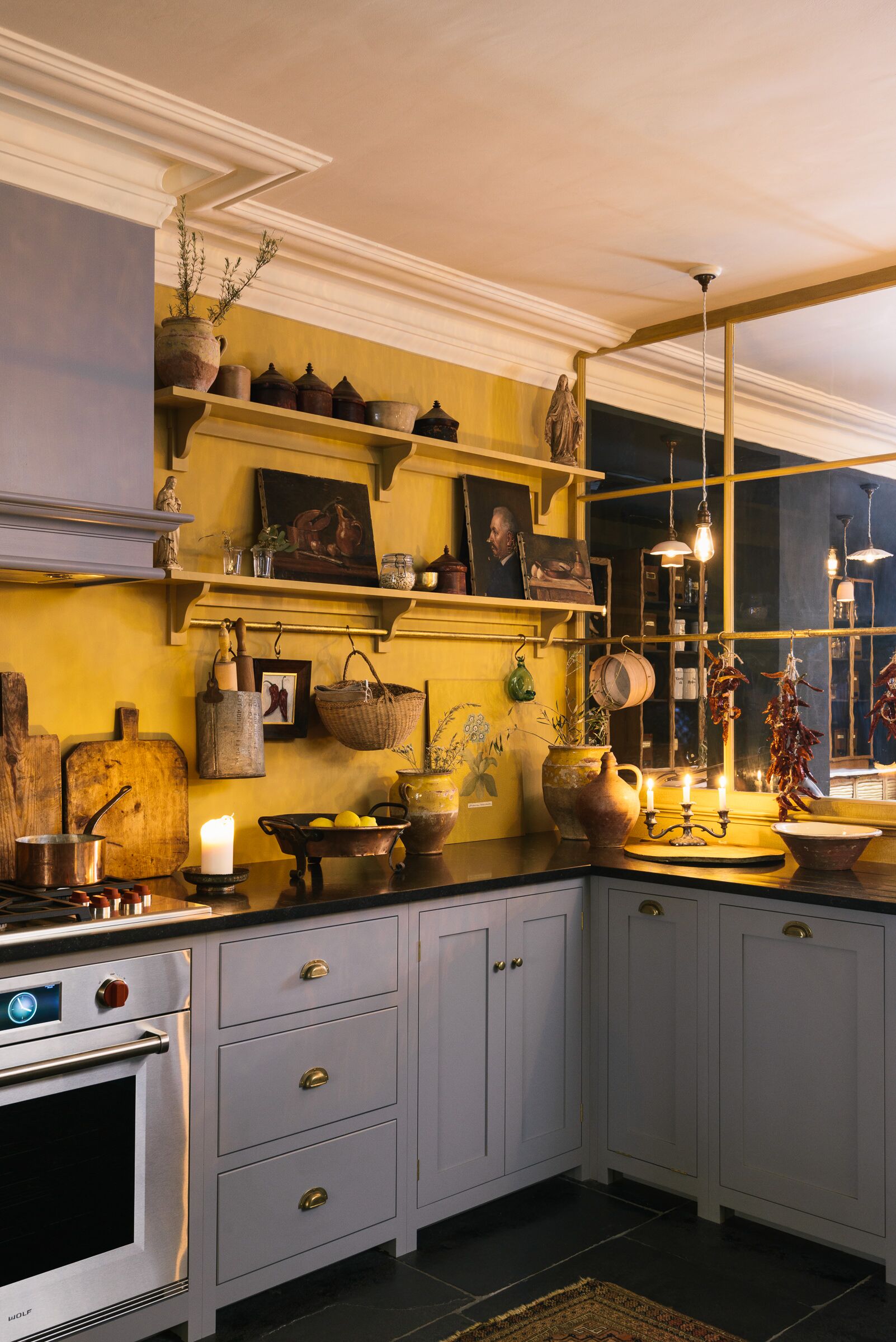
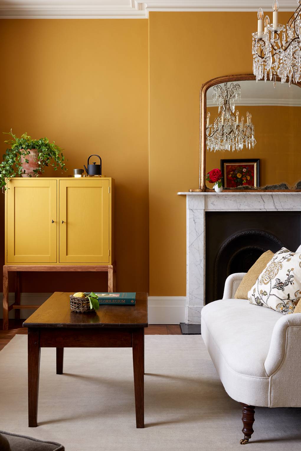
I love love love it and already have plans underway to bring it into our home in a major way.
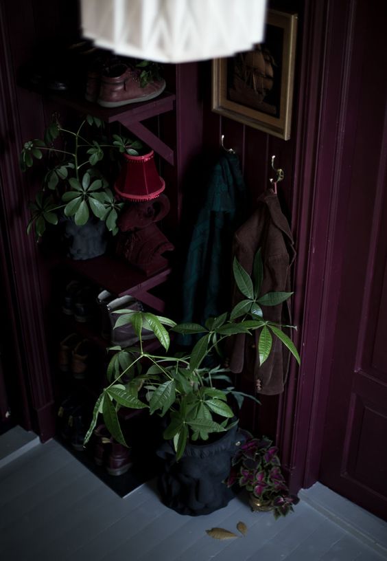
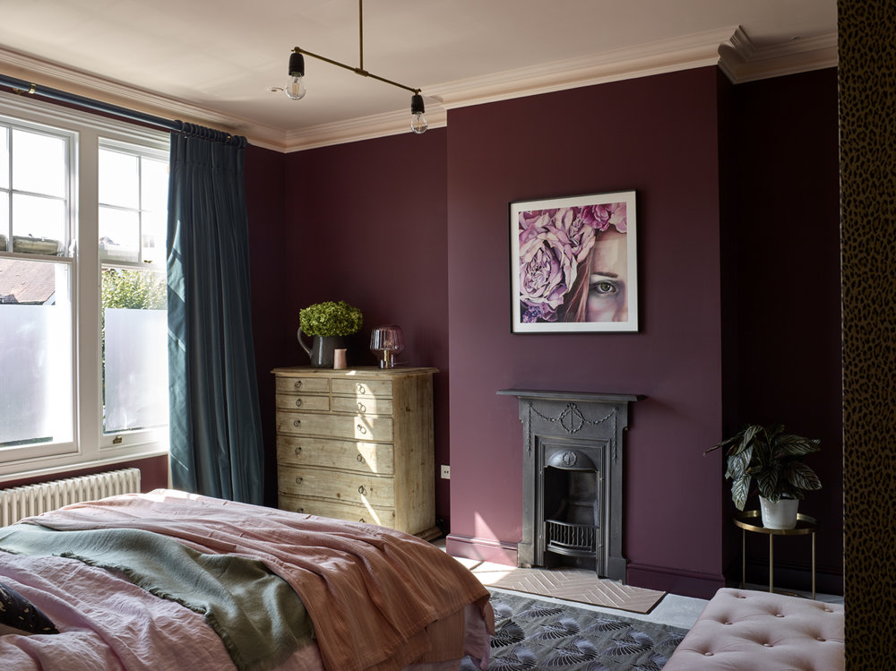
BORSCHT SW 7578 & BURGUNDY SW 6300
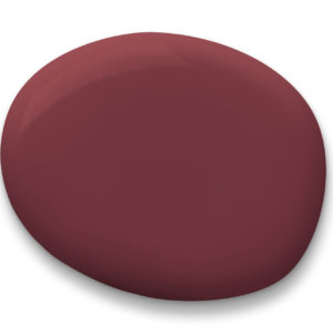
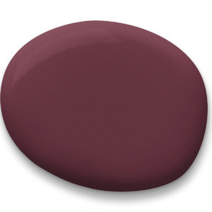
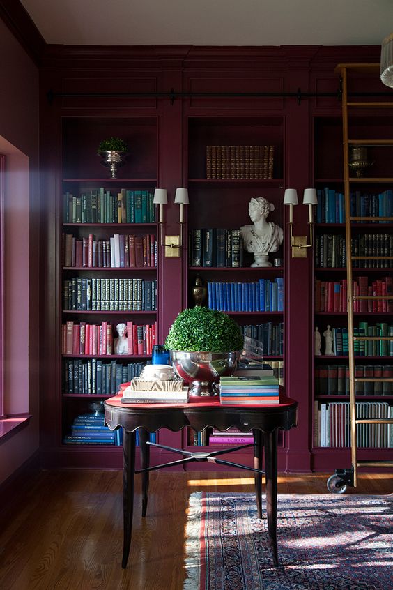
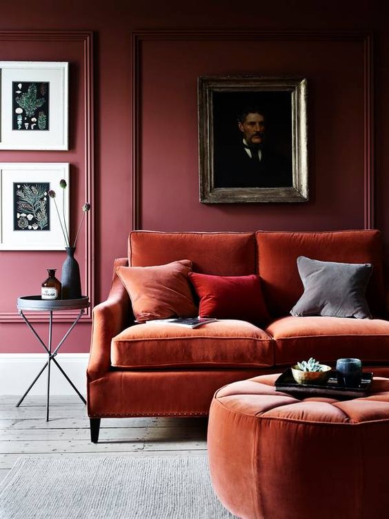
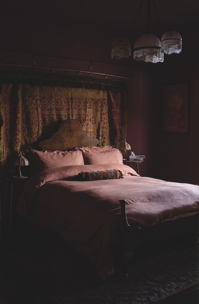
There’s no denying my affinity of deep red/plum jewel toned painted space so of course I had to include it in the round up. Borscht falls more red on the spectrum, while Burgundy has more purple undertones, and they both are just gorgeous. This is the other color family I’m loving this year and I can’t wait to show you what I have up my sleeve for it. How lovely and inspiring are these plum colored spaces:
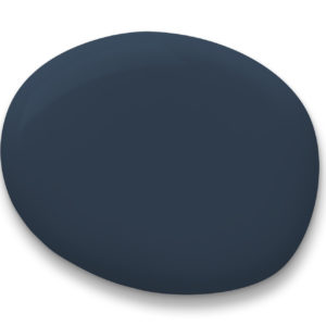
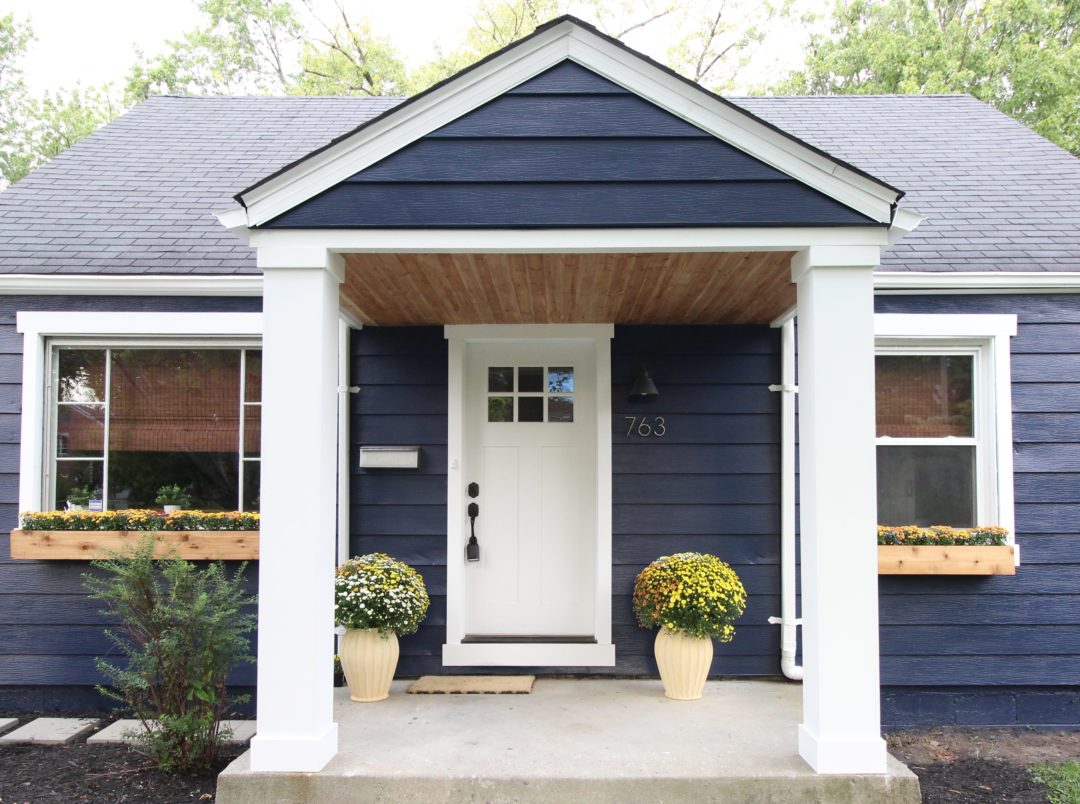
Sherwin-Williams 2020 color of the year is one of my favorite colors in their entire collection. It’s a blue that, despite its name, doesn’t feel overly nautical to me. I love a navy space as an alternative to black.
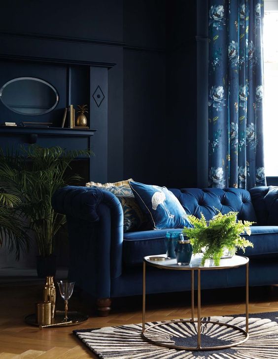
I particularly love Naval SW 6244 used on exteriors.
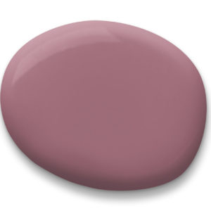
Ok, so hear me out. I realize pink isn’t exactly a color anyone would remotely consider to be moody, but it can be. Moss Rose SW 6291 is a beautiful deep mauve-y rose pink that is so sophisticated and pretty. Picture if millennial pink grew up and got its life together…this is what it would look like. I’m a big, big fan. In my opinion, the key to nailing this color in a room is to really go for it from floor to ceiling and even the trim, or use it in a fresh and unexpected way.
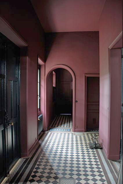
Source Unknown
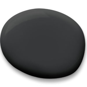
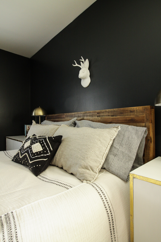
Ok so I really really, really love this color y’all. So much so that if we didn’t already have black walls, I would be painting our house THIS color. The inky black with deep green undertones gets me every time. It’s a beautiful and fresh alternative to black. I’m currently trying to convince three of my friends to let me paint something in their house this color!
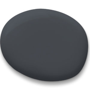
So I can’t have a list of Sherwin-Williams moody colors and NOT include Cyberspace SW 7076. It’s popular for good reason and it’s a great option for those who are looking for something a bit more than just a neutral gray, but aren’t quite bold enough to really go there with black. This is another one of those colors that looks great on everything from walls to cabinetry.
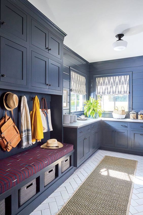
And last, but absolutely not least, we have THE black. I’ve shared about my love for Tricorn Black SW 6258 in my favorite black paints post and it’s hands down my favorite black. It’s the best, most perfect black. Yes, those are big words… I said what I said! I hadn’t yet discovered the greatness that is this black when we painted our walls but you can bet your paycheck that if I had this is what color they’d be right now. Be better than me friends. If you’re looking to dive into some black moody walls choose Tricorn Black. Trust me.
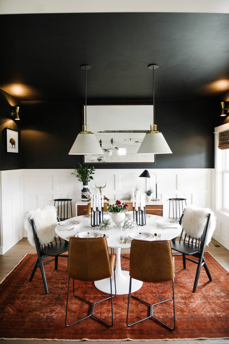
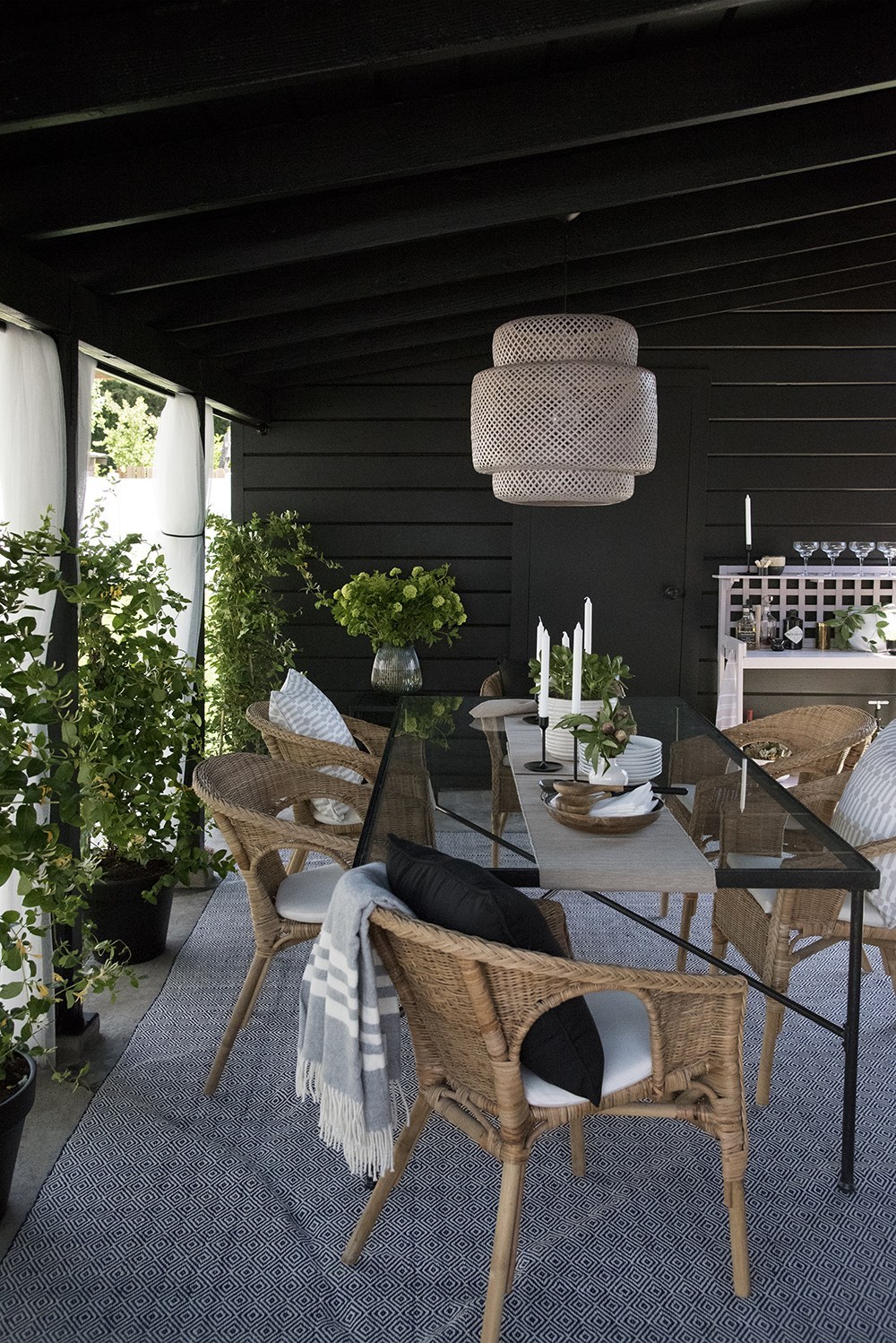
Alrighty friends so there you have it! My favorite moody paint colors from Sherwin-Williams. Whether you’re looking to go super bold or are just ready to make a little change, I hope you’re inspired to bring some moody cozy color into your spaces. If you want to check out any of these (or any other) colors in person, you can now order up to 10 color chips online and Sherwin-Williams will deliver them to your door for free! You can get more information about that here. And if one of those colors ends up being your jam, just call your local Sherwin-Williams store, place your order over the phone and then drive over for seamless and safe curbside pickup. It’s so easy and convenient!
I’m also super excited to share with you my exclusive Sherwin-Williams coupon code! You won’t find this anywhere else but here as this code is unique to me AND you can even use it on top of any current sales! Yassss! Just share the barcode number with the store employee over the phone when you place your order.

So tell me, do you have a favorite Sherwin-Williams color you swear by? Until next time…
*This post is sponsored by Sherwin-Williams. As always all thoughts and opinions are my own. Thank you for supporting the brands I love!
Laura A. says
Thank you so much for this post! I’ve been searching for a “marigold” color and you’ve identified the perfect hue. I have big plans to use Tricorn Black in our new home too! Trying to decided the color of our exterior mudroom door (leaning towards curry or naval)… House is white/black but rear of property has a beautiful red and white metal building nearby mudroom door… Afraid to use the uncomplimentary color combos… Any suggestions appreciated!
Lisette says
I’m experiencing paralysis by analysis there are so many great choices presented here. I have a cathedral-ceiling wall in the living room with large, colorful abstract wall art. Am thinking Greenblack; the adjoining wall is SW Pale Moss and a cross wall is SW Gossamer Veil. Not sure the Greenblack would work with the Gossamer Veil but I can always repaint that wall to something else. Thoughts?
J.G says
Omg , you r a person rich in creativity & so not afraid to express it & greatest of all u r sharing with us . For me & those whome need a little convincing to go with our gut feeling to express
Ourselves by what we like & choose thank u very much. . U r kind of giving us a little push to try something different than the steady norm . I’m always a person to do the opposite than the safe boring norm , but I spend way too much lime trying to pick & choose that perfect statement shade of a bold color with undertones I that will work . I’m for dark moody colors . Yes I too like ur choices.x if fact I had seen the photo of the pinkish hall with the tiled flooring a month ago & have been desperately trying to ding its color. I fell immediately in❤️ With it. I have a very small house where all the rooms r visible standing in few different places . I’m going moody& bold & taking chNces , I’m only one it needs to please & I to ❤️. One reader said her house was snail would never work . I’m saying will work & make a WOW factor. Just take ur time on choosing ur options & don’t make it choppy looking by choosing your choices wisely so they flow into one another nicely thank u .
Makeyourspaceblog says
Absolutely love these color choices! It’s so fun to experiment with color! We painted our powder room a beautiful moody SW Greenish Blue color (can’t remember the exact name). You’re so incredibly talented!
Linda M says
We chose Anonymous for the Exterior paint for the trim on our house in a neighborhood with mostly beige and tan trim decor. It really makes our home stand out and look really nice. Received many compliments. Love your designer colors.
Michelle says
Thank you for the code!!! With the current 35% off sale I just saved about $46 in order to finish three or four projects around the house! Tricorn black is a long time favorite of mine and I’ve used in our pantry most recently. Our guest room is a dark and moody SW blue similar to the COTY Naval and in our mudroom we’ve used a deep green grey called Thunderous Gray which seems in the same family as Anonymous. We have light and bright rooms too, but a few of these dark and moody spaces make the home feel like us. Love your spaces, Shavonda!
Michele says
I love greenblack, too!!! So much so, we are getting ready to go big and paint our exterior greenblack! IF I was one of your three friends you are trying to convince to try this color, what front door color would you suggest? I am not afraid of color! Thanks for playing with me…well, maybe anyway!
Nancy D. says
Tricorn Black went on our garage and front doors! Revel Blue went on the house making our EG neighborhood a bit more lively! 😉 We figured our neighbors would either hate us or be inspired. So far…it’s the latter!
Rebecca Sherman says
I’ve completely fallen in love with that unusual Anonymous color, which I think is exactly what my small studio space needs. I also am head-over-heels for that gorgeous green-black color. Thank you for this fantastic post!
Karlene Chan says
Wow. I am truly inspired..especially about these colours. At the beginning of this post I saw these colours and lacked the imagination of what to do with them. As an aspiring newbie artist (paint on canvas) you have changed my approach to using and seeing colours. You are a talented lady. Thanks for allowing us to glimpse your designer vision. Keep on trekking past those boundaries of the safe and mundane..loved this article..thanks for showing us the beauty of these colours on these walls..wow
Frank D says
Thank You for sharing your wonderful color choices . It’s so helpful to see how you’ve used them in your home. So much better then looking at a color chip or chart. I’ve considered some of your colors to use in my own home and after your inspirational presentation i may do so. Keep up the good work !!!
Tara Brooks says
I just love all of these “Moody Paint” colors Shavonda shared with us. I ordered samples so I can keep them in mind for future projects. I want to paint a chest in the colors Moss Rose or Tricorn Black. They are so beautiful and will match my wallpaper in my bedroom.
Thank you Shavonda for your vision!!! I will look forward to your future blogs.
Thank you SW for the endless colors we all love!
Martha says
Shavonda
I absolutely love these color choices. I’ve used moss green in my bedroom, did my son’s room a very dark blue, had gold suede paint in my den and the dark cranberry.
I love dramatic colors next on my list is BLACK for a bathroom great designs
Tamala Newbold says
I love your bold color choices. The exterior of our house is Naval, and we LOVE it!
ADNIKA MATTHEWS says
I loved Navel as well, but decided on the color, Salty Dog for the accent wall in the living room with Oyster Bay as the main color.
AudioOneStudios says
Love, Love, Love these moody paints…these are really stunning, high-end designs/rooms. Like most, I almost never read these blogs, but today I did, and what a pleasant surprise. What I would like to know is what finishes were used.
Sue Alderman says
Soothing. I love all these rooms. I’m afraid to use bold colors. I thought these rooms would look too dark but I find the colors soothing. I need a SW color consultant to help me.
Janet Brown says
Oh my! What a horrible, racist comment that person left! Hate the colors, NOT the designer! I LOVE Shavonda’s bold color choices! The color of one’s skin should have no reflection on their design style……..how very narrow-minded! I cold go on in my anger regarding that person’s comments but I would rather choose to tell Shavonda how awesome her color choices are and embrace her creativity. I love color and these are definitely bold, but look right at home in the photos of the rooms shown!!!!
Kate Sjoberg says
I’m just going to leave a comment so that horribly rude and inconsiderate comment below isn’t at the top.
Shavonda, I’ve been a follower for years and as always, I love your bold color choices. You’re inspiring me to paint some spaces with these colors! ?❤️?
Julia says
I’m with you Kate! You go Shavonda! As a very meek, afraid to use bold color girl I always appreciate someone with the creativity to pull off using these bold colors. Thanks for the ideas!
Lynn H. says
I painted my study with something very much like the curry and love it. Energizing. But I don’t like any of the other colors for any room. Very depressing and sleepy. We need light in our rooms especially during these dark times. Awful choices. The red are very dated used a lot during the early 2000’s. Come up with something new. You might check out Pottery Barn??? They’re always right on.
Ann Millhone says
I would not use the colors in a thousand years. Stop being on trend by shoving black designers down our throats.
Better yet why don’t sort your email list by zip codes, so a majority of your customers will get color info appropriate for them.
Janet Curry says
How offensive can you be? The use of dark colors in design is a style choice that many find attractive. The fact that you read a completely benign article on design and felt compelled to respond with such an incredibly racist comment is alarming. Shame on you.
Susan says
There are always race hoaxers out there to rile up others for the simple enjoyment of injecting hate and derision into pretty much everything. They live in a very sad place and want everyone to join them. This one, in my opinion, is promoting race (white) hate against what is perceived as a burb woman hating on those who reside in certain zip codes. The internet can turn anyone into anonymous hate commentators with agendas.
Anyway…
These moody rooms are beautiful. Brings a sophistication to what could otherwise be another white or gray neutral room.
Anonymous says
Is your assertion that we can’t live in ANY zip code???
Paula Wright says
What a coward you are Ann Millhone to hide behind a comment that does not reveal your email address. Your racist comment is not warranted however, it demonstrates who you are. We all are entitle to own opinion and it’s okay to differ respectfully. Shame on you for not seeing the work of an Interior Designer and not her race. The world has no place for you. I hope Sherwin Williams is monitoring the comments that reflect their company and remove your RACIST comment!
jen lindsley says
Wow Ann – you are outrageous -who do YOU think YOU are? Someone extra special? Shame on you
Allison Deveraux Murphy says
I can not believe how racist this comment is. Shameful! What in the world does her race have to do with paint choices? Different styles? Different approaches to design? You should be absolutely ashamed for your snide comments and behaviour.
Catherine Cote says
I can’t believe this kind of thought still exists in our society today. I hope your comment will be removed. It is truly offensive. I knew nothing about Shavonda until I saw this email, and viewing her photos was evidence enough she is a crazy talented gal. I suggest you simply hit the delete button next time you read something you don’t like.
Black ASID says
Actually all of us reading this talented designer’s blog got your racist remarks shoved down our throats. Try focusing on a person’s talents and not their skin color and you might wake up feeling good about yourself. As for zip codes Black designers and their clients live in all zip codes.
If you are uncomfortable with this blog, perhaps you should not read it. Kudos to Sherwin WIlliams for showcasing this lady who loves bold colors.
Stacey Simmons says
Ann,
Nothing is being shoved down your throat. You have a choice to pick the colors that reflect your own mood. Why all the animosity towards this interior designer making the choices of color for her mood?
Anonymous says
Ann,
What’s the zip code to Ignorantville? You must be the mayor.
JaneD says
What a horrible thing to say! Everyone has their own taste and color preferences. She is amazing designer. If you don’t have something nice to say to keep scrolling.
Stacy May says
How sad for you to be trapped inside the very small, dark confines of your intolerant, racist, uneducated mind.
Mia U says
LMAO, Because white designers have not been pushed down our throats for thousands of years? Racist POS. GTFO of here.
Michele Bennett says
OMG, how I love your home and the colors you chose are spot on! I never would have even considered those colors, and yet now I want them all in my home. Absolutely stunning!
Thanks for sharing,
Michele
Tlov says
Omg. How on trend are you!! Love it!! So glad I opened this email from Sherwin Williams!.. I almost archived it ..so glad I didn’t because now I’m TROLLING you and taking so many notes for my next paint project:) you have SUCH GREAT style and taste!
Deb says
Yay for color! All gorgeous choices. I love all the examples so very much… where to begin!
Joanne Medsker says
Shavonda, you are so creative! All rooms are just gorgeous. Looking forward to your next post.
Sue James says
We painted our kitchen in a beautiful Teal Color. My hubby thought I was NUTS! But I still LOVE it 5 years later!
Cabinets are White and all the woodwork a crisp white also!
I hand out in my kitchen all the time and it inspires me to be very creative in the kitchen also!!!
Sherri Zylberminc says
I painted the accent wall behind my bed a rich teal . What color will complement to paint other walls . Furniture is dark brown .Bedspread is champagne , cream and taupe beige .i dont want boring . Will maison blanche SW 7526 work or open for other suggestion
Steven Trohalaki says
I have a small house with small rooms. These colors are all way too dark.
Sharmane says
I was looking for a nice color something light to paint my bathroom, and seeing this add in my email. I love love the moss rose color the perfect color for my project. Thank you for the inspiration.
Martha says
Looking for a bathroom color. Have tiles on walls halfway up. They are a cream color with a little darker in some. I’m thinking a kaki color?
Martha says
I literally came to your blog for the first time looking for paint color recommendations, and what is it the very top?! gorgeous, thank you so much. I’m about to go paint my house all of these colors.
Sandra says
Ugly colors, some rooms mite be ok.. very disappointed.
GoldenDesigner says
How about learning how to spell girl before leaving your comment! “mite” try “might”. Also, my mother always said if you have nothing nice to say, don’t say anything! These colors work great in those specific locations. If you do not have a trained eye, you need to hire a color consultant/decorator/designer to assist you. One of the reasons why those colors worked so well in those spaces is because most were vintage with lots of interesting details.
Rachael L says
Hello, I’m so happy I found your blog. Besides being in love with your style, you’ve helped me solve a dilemma I’ve had for so long! Lower cabinets, paint them green or black. Could not decide. Now thanks to you I know about greenblack by SW. I’m so excited that they will look black until the light shines on them and you’ll see the green undertones. So excited!
Kristen says
Thanks to this post we just painted our house in Anonymous, with Tricorn shutters. After trying a lot of other colors that just weren’t quite right, I finally realized I needed to check your blog for inspiration! Thank goodness I did! We have already gotten so many compliments and more importantly, I LOVE how it looks! So thank you for this round-up and unintentionally helping me find the perfect house color!!
karen says
Hi, I love this so many new ideas in my head now. I have a small spare room that is my office, Ironing room, Gym space and dressing space and I am stuck on what colour to do, any advice? I already have my bedroom a deep navy blue and walnut and living areas are cream, beige & green with oak so looking for something a bit different. Really stuck as its a multipurpose room.
Thank you in advance.
Paula Burns says
Hey Shavonda, These colours are pretty different to the ones I usually gravitate to. After seeing your examples though, I’m awestruck! Loving the curry. Such possibilities..
Nikki B. says
Hi! I have a dresser that needs painting… You just inspired me to try Tricorn Black or GreenBlack!!! I am so excited!!!! Thank you Shavonda for narrowing down the choices! That is always so daunting.
Holly says
Hi, Shavonda. Thank you for this! I have been going back and forth on painting my bedroom black or a dark green, so you did the work for me and picked Oakmoss! I think it will look perfect.
Kathryn Galloway English says
Tricorn Black is the best black paint color. EVER. The only problem is once you start painting things with it, it becomes very hard to stop…it’s sooooo pretty on everything… I have been debating to painting my kitchen Oakmoss (or Eclipse) and haven’t pulled the trigger yet. Maybe this will persuade me to just get on it.
Jenn says
This makes me wish I had more walls! Gah I’m drooling over the Moss Rose and it is not. Color I ever would have thought to paint with! I have some friends looking for a green too so going to send this along. Terrific round up, thank you for this!
at home with ashley says
All of these colors are soo good, and I think you just made me fall in love with moody paint. The Oakmoss really is just right.
Stephanie says
I’m dying to paint an accent wall in my master black, but I’m afraid there’s not enough natural light and it’ll be too much. Cyberspace is going to be the perfect solution!
Carla says
Thank you for this post. I want to redo my bedroom in a moody paint color. I’m considering either blue or green. Naval and Oakmoss have officially been added to my list!
Allison Lee says
Yesssss my friend! Painted my bedroom and all exterior doors Tricorn and I’m hooked! I love that greenblack though! We’re probably gonna repaint/update our kitchen cabinets and that is a top contender now! Love it!❤️❤️
Terea says
Hey Shavonda! I love all those colors. I usually stay neutral with my wall colors because I change my mind so often, but lately I’ve been feeling like my dining room needs something more. I think one of these colors may in its future…thanks so much!
Marci says
Hey Shavonda! These color choices are sooo soooo gorgeous. And yes the ONE good thing about the quarantine is the tackling of home projects. I have a ton of painting projects on my list and have only managed to complete one, but one is better than nothing.
ETA: sorry if this comment comes up a million times. My email was wrong ?
Marci says
Hey Shavonda! These color choices are sooo soooo gorgeous. And yes the ONE good thing about the quarantine is the tackling of home projects. I have a ton of painting projects on my list and have only managed to complete one, but one is better than nothing.
Angie says
One of these days I’m going to get over my fear of messing up and paint a glorious moody color.
Beth G says
Hi Shavonda! In our old house, we painted 4 differ rooms in Ellie Gray. Ellie is my nickname and we loved the color. It was different in each room – and just plain awesome. I also made chalk paint with it and painted an old cabinet in it. We love SW paint!
Jessica says
Whooohoooo! The paint guide the world was waiting for! Seriously, just had to swatch TWELVE dark blues last week to decide when now I can come visit this page and land on the same color: Naval!!! Great guide. Great colors. Best blogger behind the content. Thank you, Shavonda!