Hello Everyone!!
Happy Monday!! I hope you all had a fabulous project filled weekend. I’m extremely excited because not only did I have a project filled weekend, I actually had a project filled week.
That’s right, here at casa de Gardner there’s been a whole lotta paintin’, and a whole lotta changin’ goin on and Ive got the pics to prove it!!
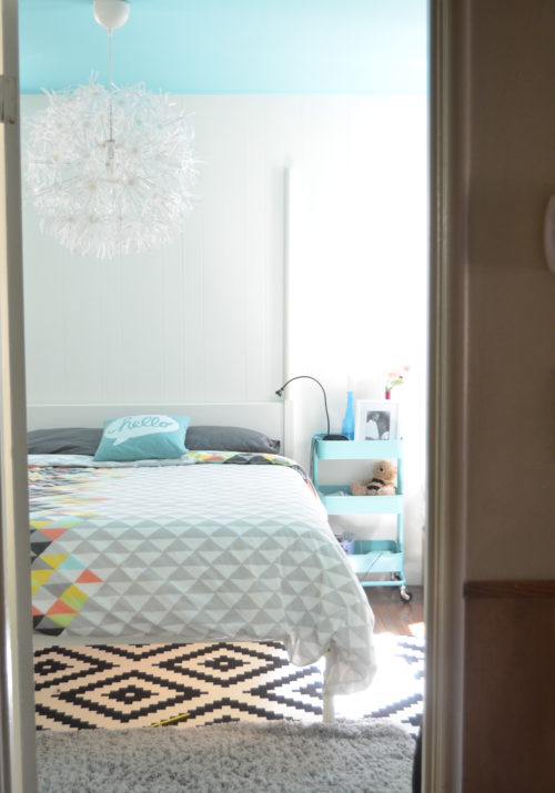
It all started last Tuesday. I woke up with paint on my mind. Little Mr. Colorful’s room was in dire need of makeover. Naomi despised his room and quite frankly, so did I. Painting his room was one of the projects on my home goals of 2012 list so I had even more motivation to get er done. I’m happy to report that mission has been accomplished!! I’ll be posting the results and full-on detail goodness of that redo tomorrow, but today’s post is dedicated to another project that graced the home goals list: painting the kids/guest bathroom.
When we moved in, much like every other room in the house, the walls of the bathroom were earth toned in nature. While earth tones aren’t our cup of tea, they were definitely the previous owners. Unlike the entire front area of the house which was bathed in a brownish-tan color, the bathroom was burgundy and burnt orange. This bathroom doesn’t have any windows so the dark colors really made the room feel small and closed in. The shower and toilet are tucked into a room within the bathroom so the burnt orangey-yellow color was doing NOTHING to help it feel less “cave-like”. In fact, the soft light, coupled with the yellowish walls made the room feel dirty even when it was clean. That all changed with a few coats of paint.
I went in to this makeover with a few things on my priority list.
Priority #1: Get rid of the dark walls. This involved making a color-choice mistake the first time around, but then we got it right the second time. (More details below)
Priority #2: Get rid of the theme. The kids picked out ocean themed decor for the bathroom before and I really wanted to shy away from anything themed. Im not big on themes so this gave me the opportunity to start anew with a fresh concept. This is the bathroom that our guests use as well and it always rubbed me the wrong way to think of them staring at starfish and whales as they used the restroom.
Priority #3: Inject some “happy” into the space!
Here’s the bathroom when we toured the house for the first time prior to us purchasing it:
Here’s the bathroom right before we painted it:
But what we got was this:
Waaaaaay too subtle, washed out and white!! Absolutely NOT the best color choice for the space. Thankfully I’m not deterred by failure so I just thought of a different option. We were going for a palette of soft grey, aqua, teal, and yellow so I decided to pull the aqua onto the walls and use the other colors to accent. With this in mind I headed back to Big Orange (after about the 5th time) and opted for Behr’s Aqua Spray:
(Source)
And this is what we ended up with:
We absolutely LOVE IT!! This camera is NOT reading the true awesomeness of this aqua. Its true to the color of the swatch in that its bright, punchy and happy…exactly what I wanted! The accents of lemon and teal add a punch of fun.
The added mirror above the toilet helps makes the space feel bigger and brighter by bouncing a bit of light around. I picked up the mirror from Ross for $10. It was originally silver, but teal spray paint in Rustoleum’s Lagoon gave it the color I was looking for. An Ikea floating glass shelf, faux grass, crisp white shower curtain, and some art make the room feel dressed. I downloaded both prints from Sprik Space. Her prints are awesome AND free! ( I also used one in my son’s room redo!) I just took them to Staples to have them printed on quality card stock at a cost of 2 bucks. I framed them with white Ikea frames and wha-la…instant art!
The other art by the mirror is DIY with some acrylic paint and the paint top! I just dipped the top in the paint and stamped them on the page to create a circle stencil. Super easy and I love how they turned out. Keeping all the frames a crisp white helps the space fell tailored and unified.
Overall I love how the bathroom turned out. Its appropriate for guests without making it feel too “grown up” for the kiddos. The best part about it is that the colors are so vibrant and they really play well together. I would say it was a success. We’ve still gotta add a couple of towel rings, frame out the mirror, and update the builder lighting, but its a far cry from where we started. I also really want to paint out the cabinets in white, but Naomi is against it so that’s still up for debate. This is now my absolute favorite room in our house! Everytime I walk in I feel instantly happy! Here’s another before and after:


Anonymous says
non alcoholic fatty liver disease emedicine non alcoholic fatty liver disease emedicine non alcoholic
fatty liver disease emedicine
Also visit my web-site; what cure fatty liver
Brandi says
Hey Shavonda, I love your bathroom makeover. The artwork you chose is adorable. Love the pop of color it adds to the space. I recently gave my bathroom a makeover too. I had to paint it 3 times before I got it right!
Shavonda says
Hi there!! Thank you so much for stopping by! Yeah sometimes when your dealin with color it can take a couple a tries before getting it right!