Hi Everyone!
Happy Wednesday friends. So remember how I just laid out our home goals for this year? Well it looks like the whole addition situation wont be happening. At least not this year. Womp Womp! It’s not necessarily the news we wanted to hear, but it’s also not the end of the world for us either.
We knew it was going to be a massive undertaking both literally and financially, but after getting a few quotes and speaking to an architect and some contractors it looks like its gonna be a bit more expensive than we are ready to take on right now. I’ve said before that we plan to be in this house for quite a while so making it into the perfect home for us is more of a marathon than a sprint. That being said we’ve crossed the addition plans off the list for a while. I cried it out then I put on my big girl pants and switched focus to tackling a few other projects that will make the house more functional, comfortable, and prettier as it is until the addition can become a reality. Some will be the not-so-fun “behind the walls” stuff that we can’t see but that really needs to be done, and some will be investments that are much more tactile.
Since we wont be adding another bathroom into our lives anytime soon, I’ve decided one of the projects should be making the one bathroom we have work (and look) much better for the 4 of us on a daily basis. Don’t get me wrong, the bathroom isn’t TERRIBLE, but there are definitely some areas that need improvement. Plus its a big white box, which as you can imagine drives me batty.
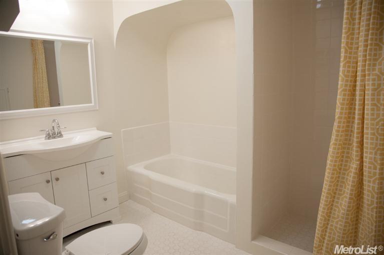
This is the listing picture of our house when it was on the market and it looks exactly the same today…except the shower curtain is white and grey. Also we added rugs which are, you guessed it….WHITE! Shoot me now!
As I said, the bathroom itself isn’t terrible. We have a great space to work with and considering both the age of our home and that it’s the only one in the house, it’s quite spacious. Over the past year and a half of living in it we’ve come to realize there are some things that need improvement. We plan to do a bit of reworking the space to make it a much more livable situation for us….including taking out the shower and in its place adding linen/bathroom storage, raising the arch and adding a shower to the tub, retiling the floor, adding a skylight or solar tube for natural light, and bringing in a larger vanity. At the same time, I really really want to bring in visual interest by incorporating wallpaper. I LOVE wallpaper and I’ve been dying to use some in our home, so when the folks at Milton and King contacted me about working with some of their bespoke papers I thought this was the perfect opportunity to bring some into the bungalow.
Guys their wallpapers are SO SO good. When I came across their Shibori line of papers while browsing through the selection I almost died! Ya’ll already know how obsessed I am with Shibori, so it was a no brainer that it would be the direction I, going with. I mean how perfect, right? Anyway I fell in love with pretty much all of them, but managed to narrow it down to three. 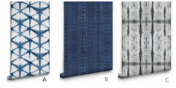 A: Shibori Star: Love the graphic feel of this print. It comes in 5 color ways. The olive green is gorgeous, but we all know how Naomi feels about green. #ainthappening. Id go with the indigo with this one.
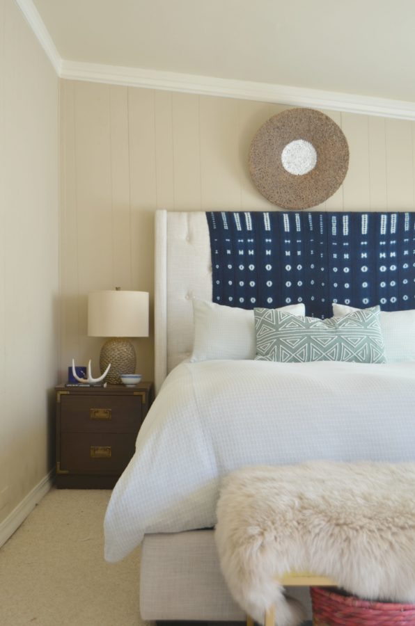
B: City Scape: Um hello indigo!! This is probably my fav of the bunch. The deep hue reminds me of my African mudcloth textile.
Naomi likes the light blue color way of this option, while I’m partial to the deep blue.
3. Stalactite– I really love this one, too. Its only offered in the black but it would look amazing in indigo as well.
So friends, Id love your input. What would you do? I really feel like either option will look great. I love that these papers look like fabric, which I think will be beautiful on the wall. Also you should know I’m thinking of this on the vanity wall only. Alright friends I’m all ears…
Until next time …
Xo-Shavonda
*featured image via Vanessa Francis for Décor Happy Blog
Hollie @ Stuck on Hue says
Yay! Your blog is finally showing up in my Bloglovin’ feed. Those shibori wallpapers are amazing. I like A because it adds color and pattern but would not make the bathroom too dark.
I’ve got new shibori pillow covers going into my shop in the next few days. I’m not usually a boho girl, but I’m a sucker for blues!
Julia@Cuckoo4Design says
Oh my gosh I am in love with A! A! A! A! for sure!
cassie @ primitive & proper says
so your blog finally showed up in my feed… this post just now. 😉 i haven’t been ignoring you!
i looooove b the most, but they are all fab!
Lilly says
A all the way especially since I remember you saying the re aren’t any Windows in the bathroom, I think A would help mimic the effect of light with the white background and the bold blue playing off of it.
Alex says
I can imagine that all that white must have been pretty hard on the eye and certainly not somewhere to relax in. Good to see you have the drive to change all that though!
Jen says
B!!! Love it.
Katrina says
You already know, I love love option B…is just so pretty and yes totally reminds me of the fabric you already have! The linen closet with a be a great addition into your space…one of my friends did the same in her bathroom and it looks amazing!
Jamie says
I LOVE C!
Megan says
Oh I like them all! But I’m favoring the first two. Sorry to hear about your addition plans being pushed back but that bathroom has so much potential! We redid our bath this past summer and it’s so much better. Two sinks is a must!! We have other baths, but not with a nice shower (unless you count the cave in our basement but umm… No thanks!), but our “master” bath is a tub only. So our family of four all use our main bath and we added the extra sink and love it. Good luck!!