Hi Everyone!
Happy Monday friends! Im so excited for today’s post guys. After months of planning & collaborating, and a whirlwind weekend, my design bestie, Carmeon, and I are sharing the reveal of our surprise room makeover giveaway space. If you follow us on Instagram you will have already seen the daily documentation of the transformation. We received lots of questions so today both she and I each are sharing the details on how we made this space come to life.
Ok so I guess I should back up to the beginning and explain how this whole thing came about. Last summer Carmeon came out to Sacramento to visit me for a few days and while she was here we brainstormed ways for us to collaborate and work together on some kind of design project. At the heart of it we wanted the project to be fun and to give back to our wonderful readers and followers for all the support we get on a daily basis. We get tons of messages and comments from so many people saying “I wish you could come and help me with my room/space/home/life”. So we thought to ourselves..”why dont we just do that!?”. And so we did. We decided to host a givewaway in which someone would win a complete room mekover by the both of us.
The rules were simple: 1. The winner would need to live in or within a 1 hour drive of Memphis, TN. 2. To enter send us an email with photos telling us which space they wanted us to tackle and why. 3. The winner would need to provide a monetay budget to be used towards the space. 4. Both homeowners and renters were welcome.
We received several entries and in the end chose Meghan and Ronnie who needed help with their master bedroom. They were newlyweds (only married for a month) in thier recently purchased house who had addressed every other room in their home, but lost steam when it came to tackling their bedroom.
So I booked a flight to TN, Carmeon and I came up with a deisgn plan, we showed up, kicked them out for the weekend, and now they have a whole new bedroom retreat to enjoy!
Lets’s start with the before, shall we? Here are the photos they submitted of their space for the contest entry:
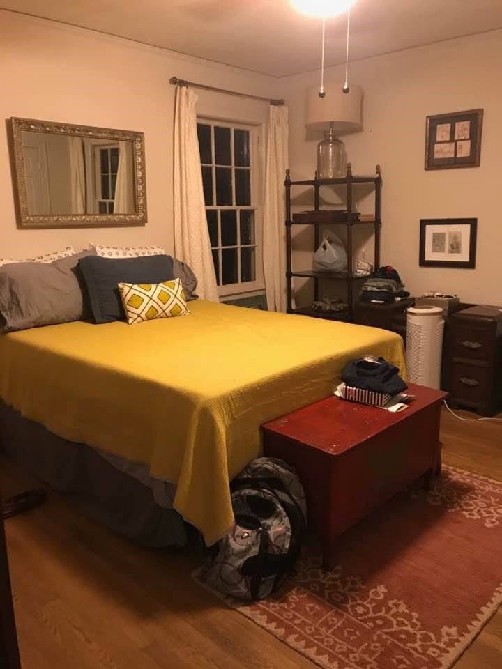
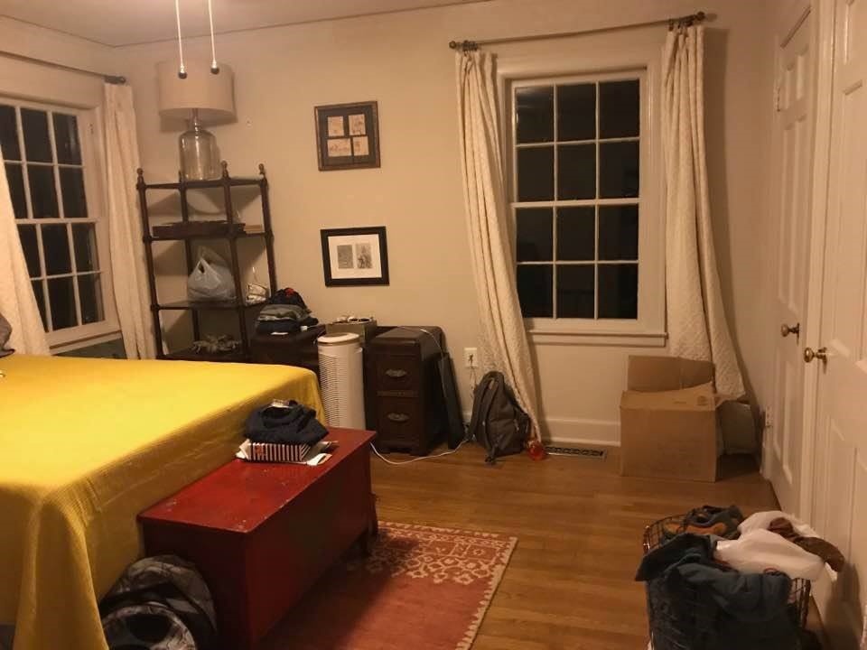
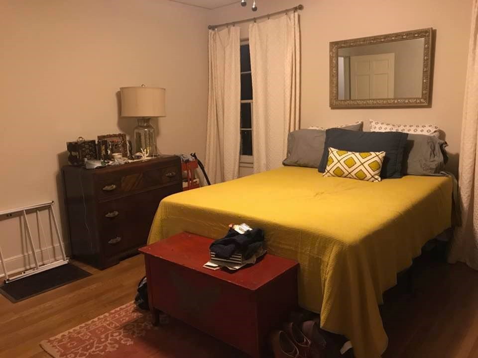
As Carmeon and I came up with a design plan for the space we kept a few of Meghan and Ronnie’s requests in mind. 1. Even though the space has two closets, Meghan needed additional storage for her shoes and clothes. 2. They envisioned a light and bright space, and didnt want darker or super saturated colors. 3. The ceiling fan needed to stay. 4. They didnt want plants in the space because of their cats and they arent specifically plant people. With these requirements (and thier budget) in mind, we set out to create a space that was both functional and beautiful.
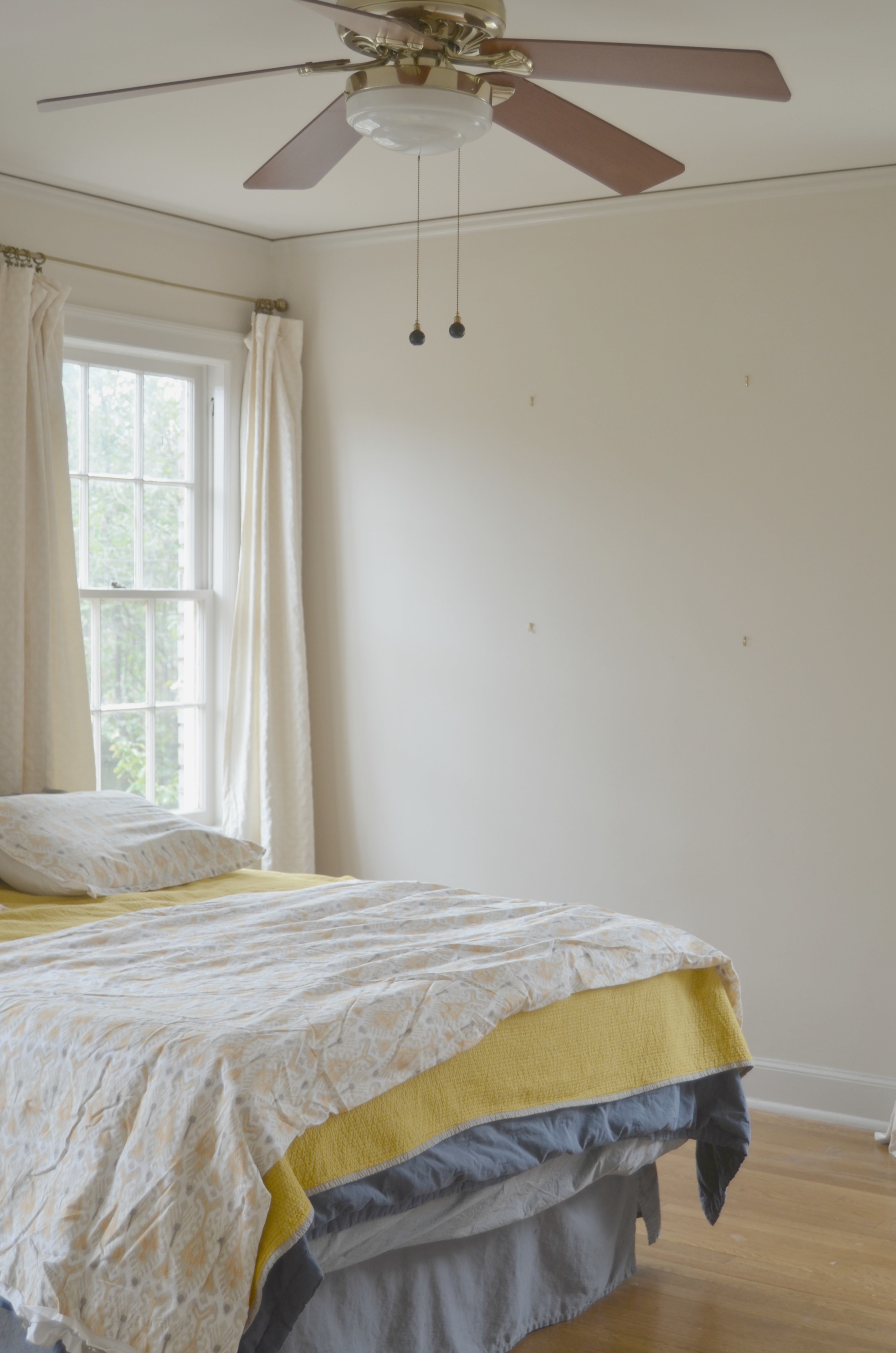
Here are a few pics from right before we started. The room was literally a blank slate.
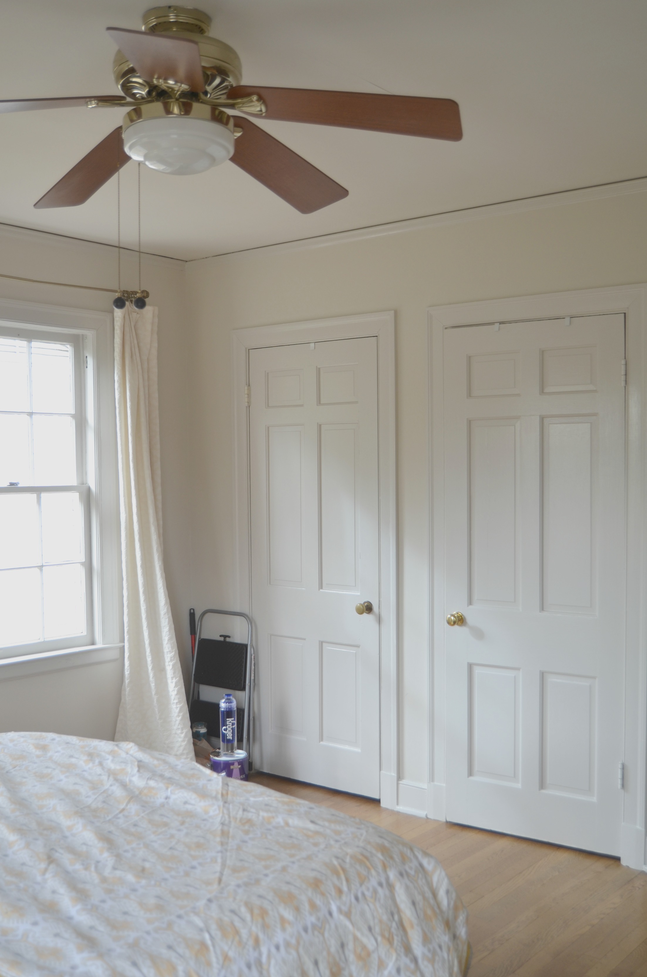
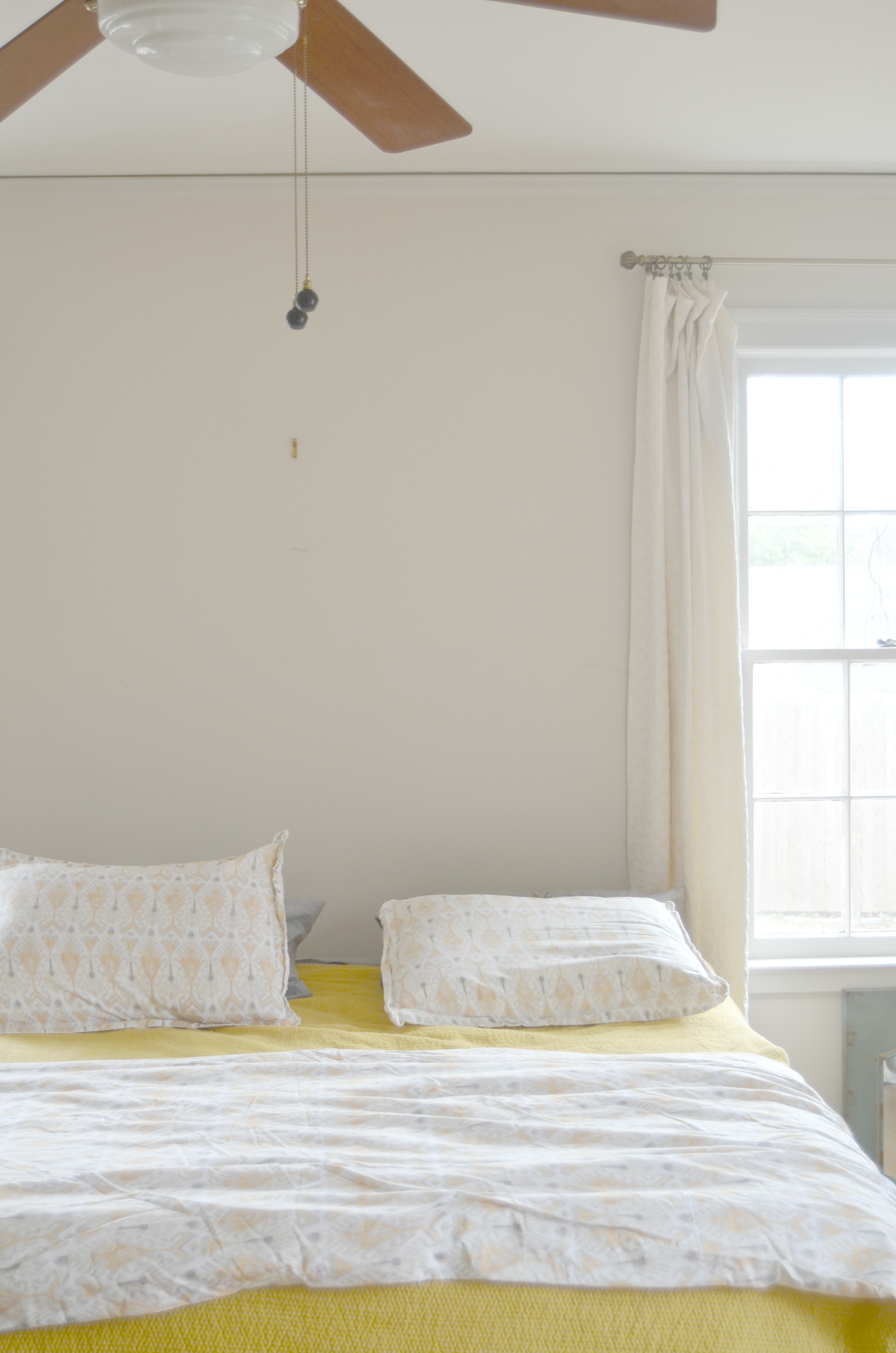
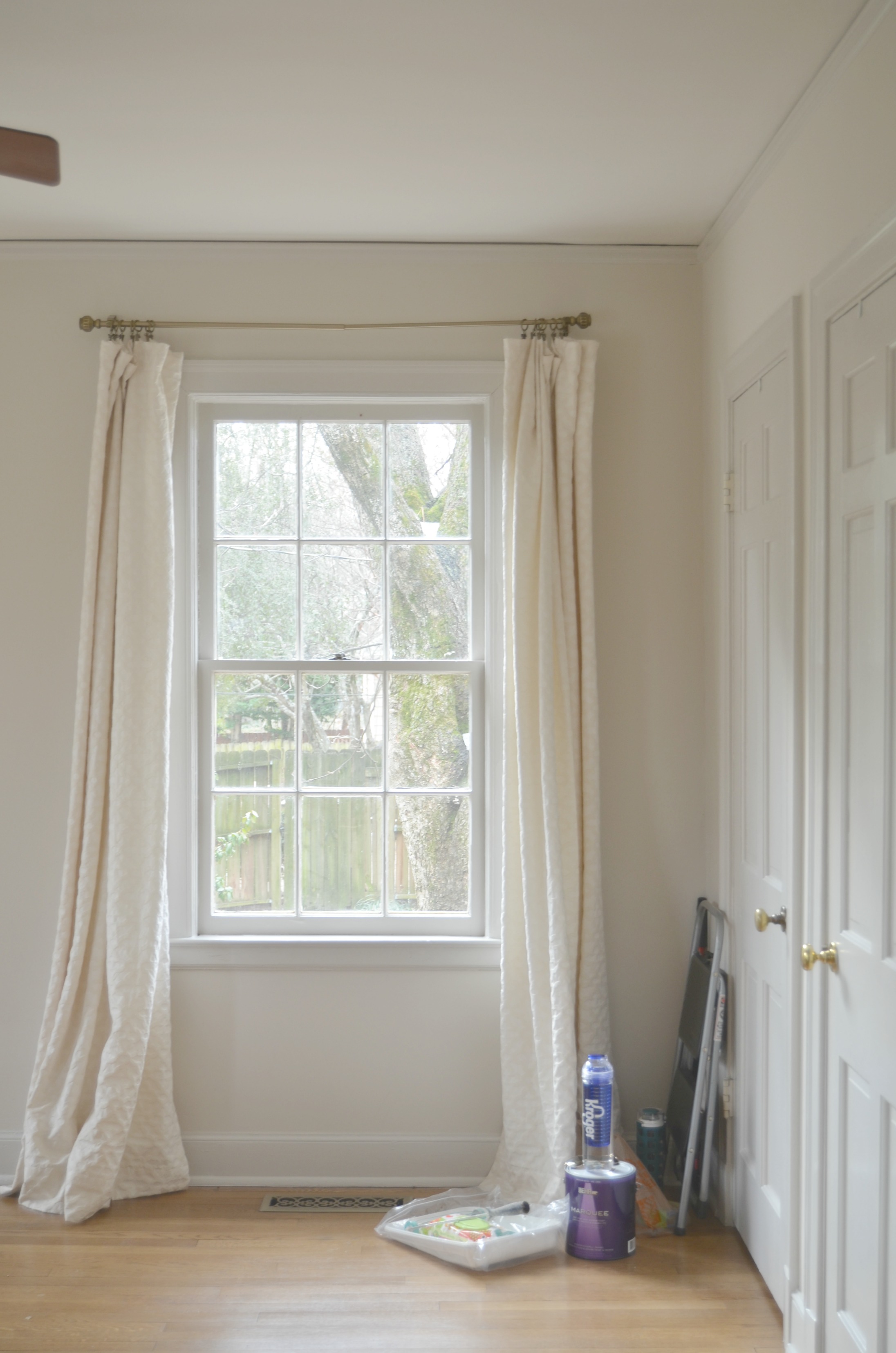
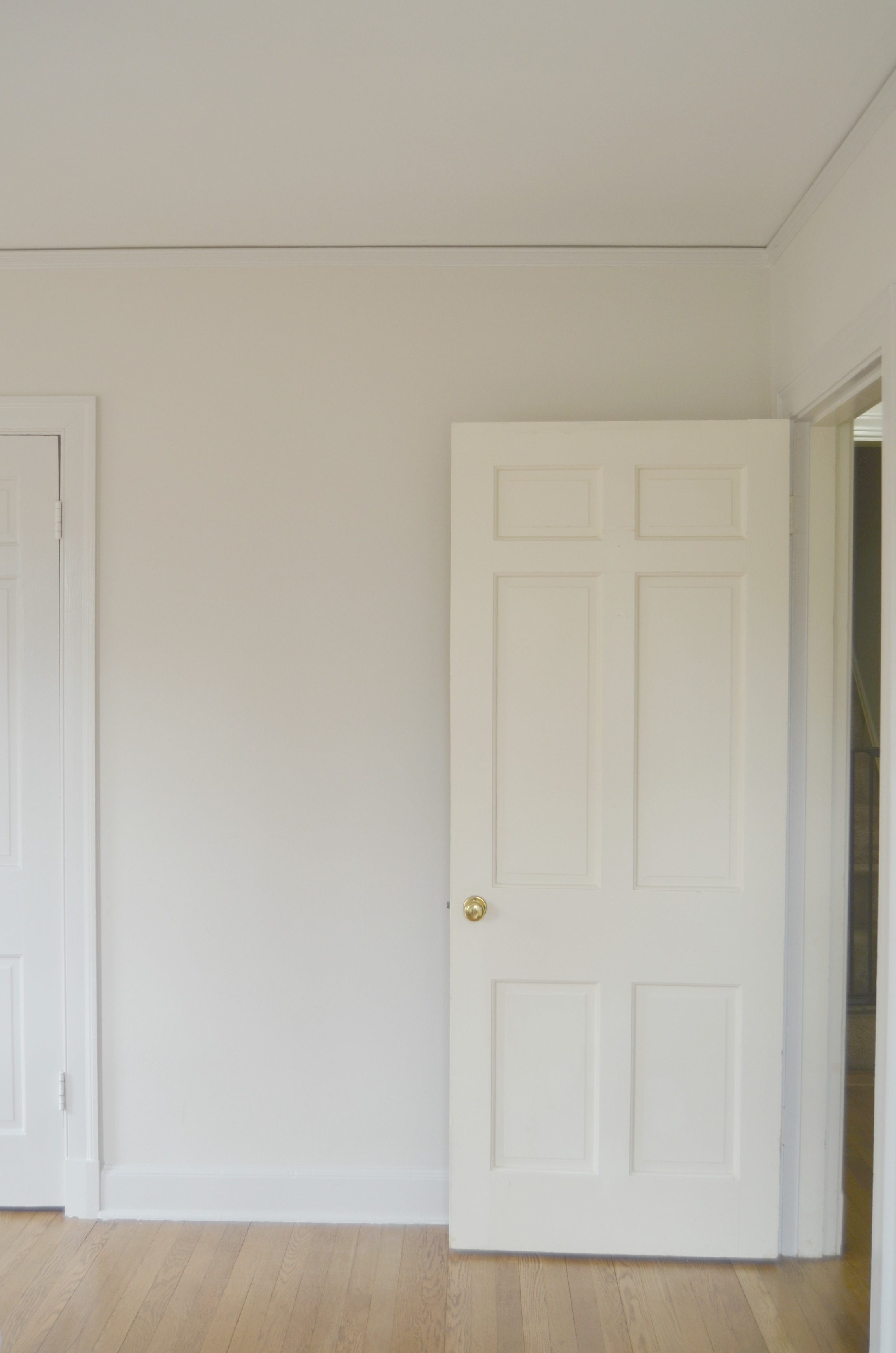
And here’s how things looked after we got done:
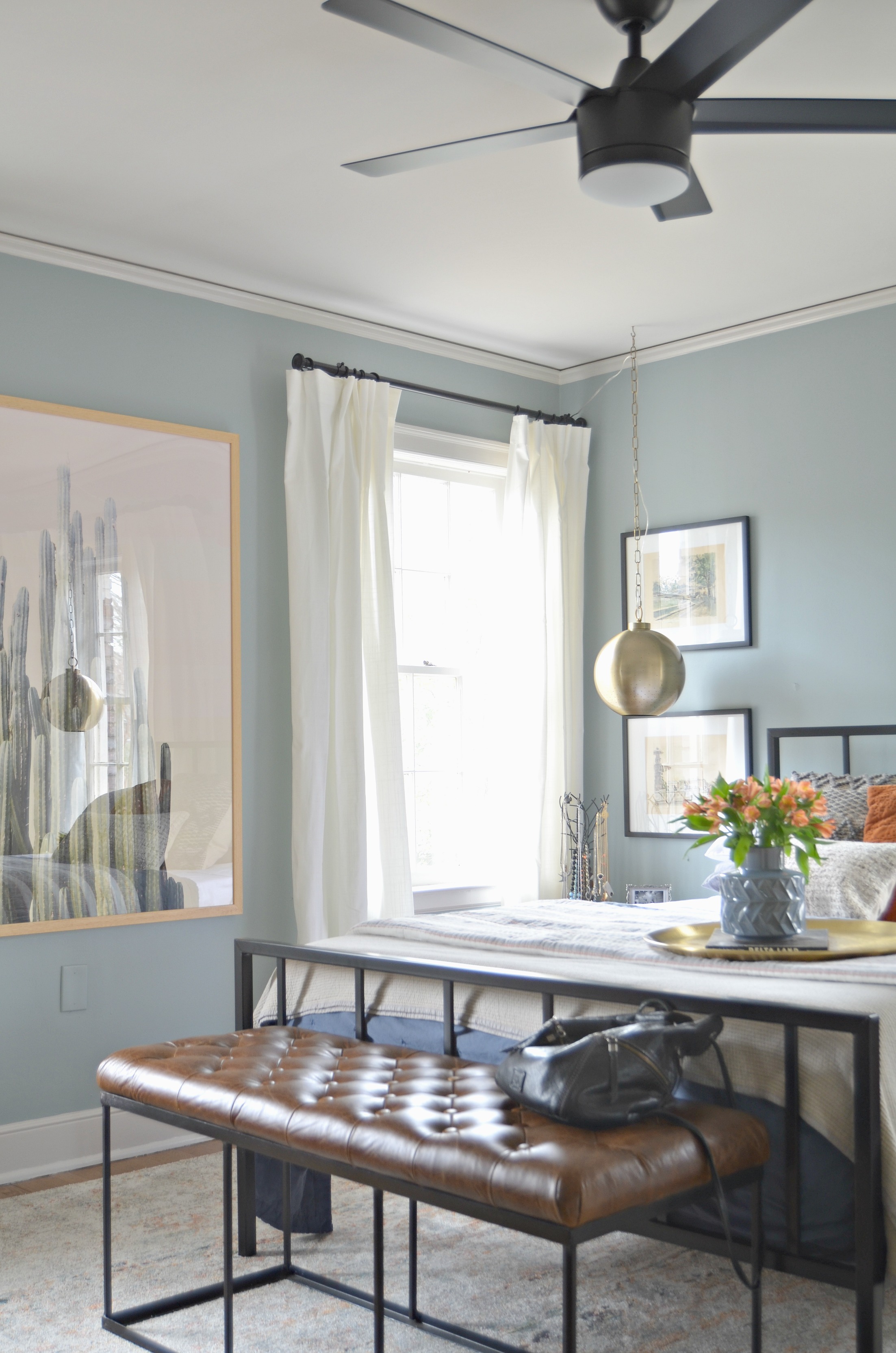
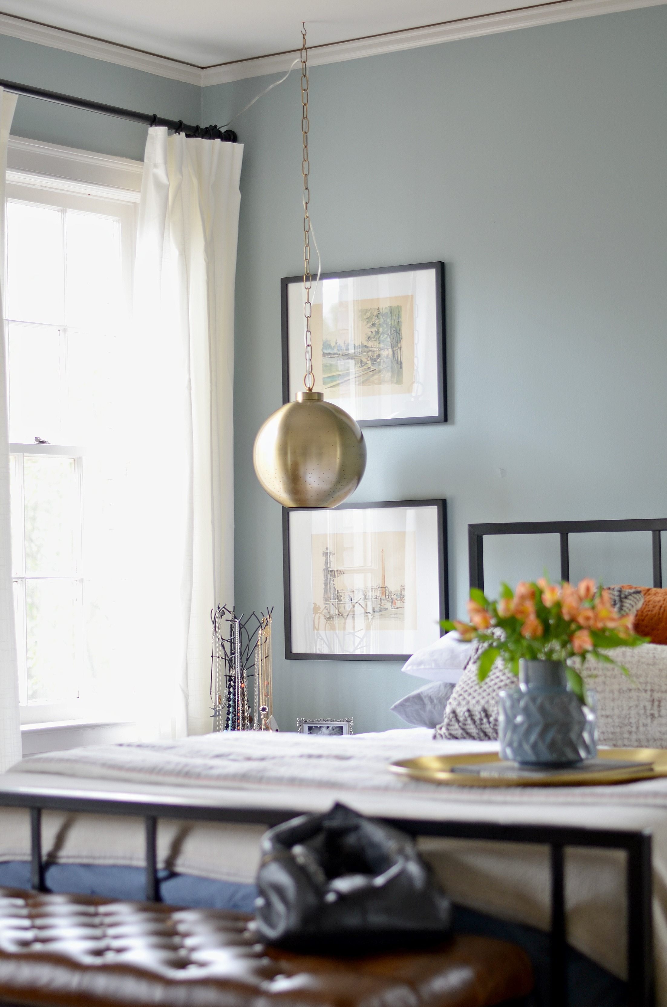
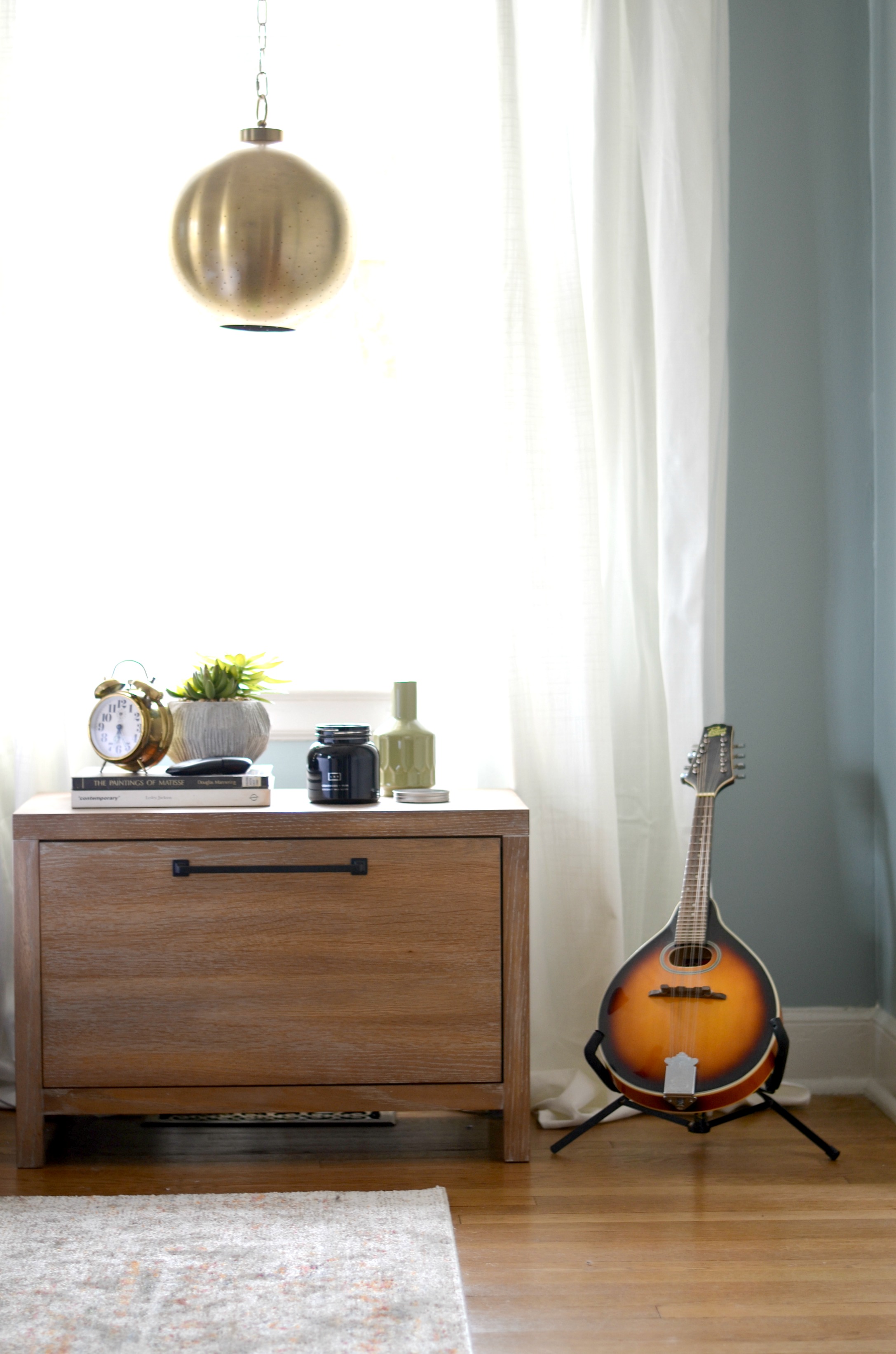
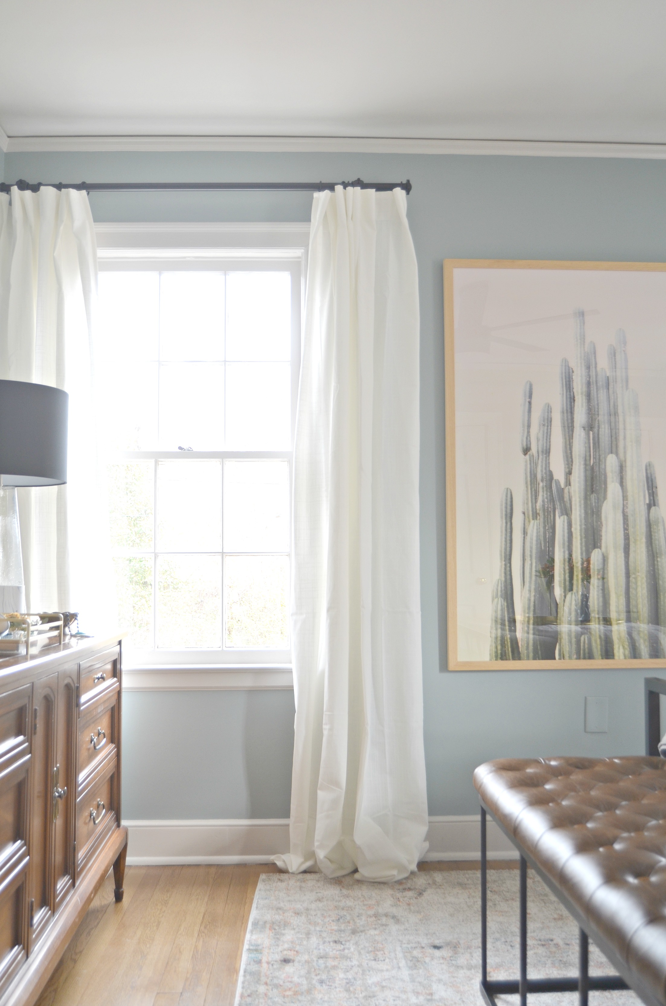
The most challenging decision we made in the space was definitley the wall color. Carmeon and I both are really quite bold in our design choices and tend to gravitate toward statement making color. Meanwhile, Meghan and Ronnie’s entire house had white walls throughout. They were open to allowing us to paint the walls in here and we knew we had to get it right. Drawing inspiration from the other rooms in their home, we decided on a blue with a warm undertone that wasnt too overpowering, but could also read as a great neutral while allowing their art and other pieces in the room to make more of a statement. The color we chose is Benjamin Moore Kentucky Haze. We love how it looks in here and the color is picked up in the rug, bedding, and art. Ronnie likes the color so much it has inpired them to consider color in other parts of the house as well!
Speaking of art, we had no idea how much of an amazing, extensive, and eclectic collection Meghan and Ronnie had! Throughout their home they have pieces found while vintage shopping, some brought home from thier travels, even some created by thier own hand. Once we discovered this we wanted to make sure we used some pieces from their own collection in the space.
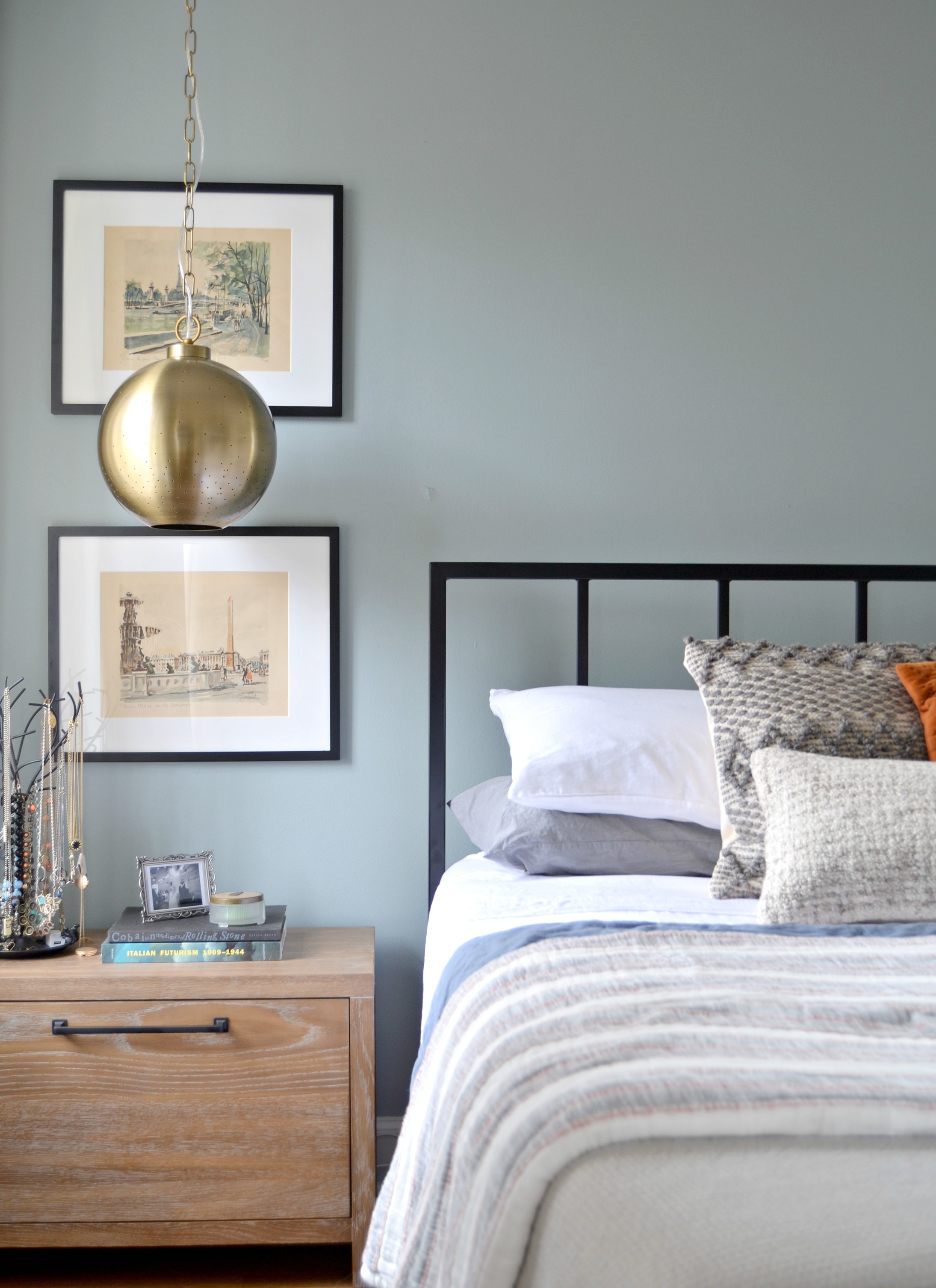
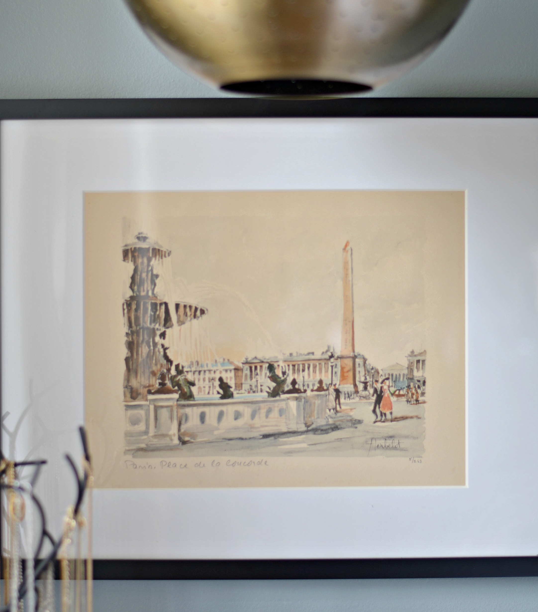
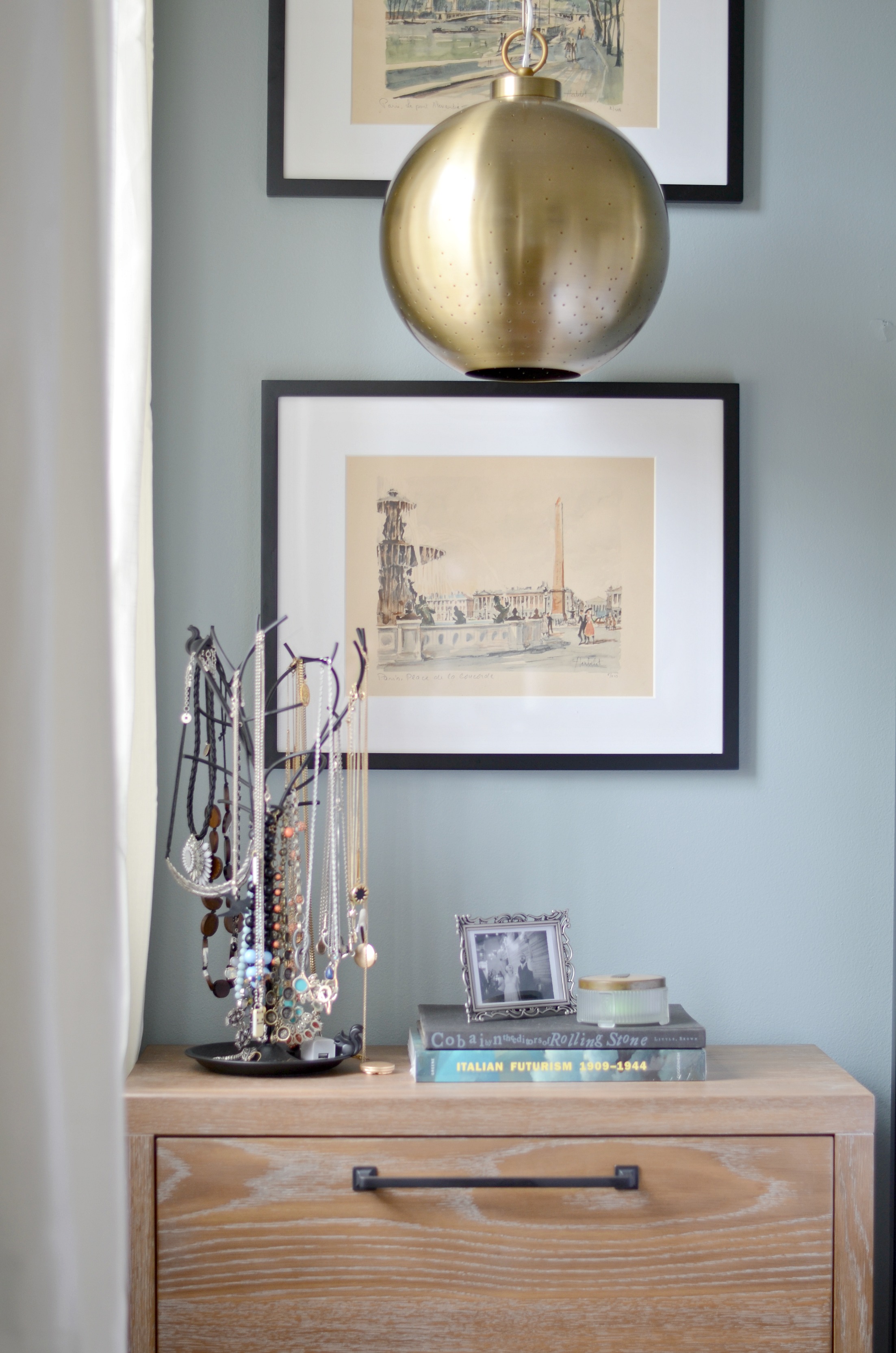
These watercolor paintings were brought back with them from their honeymoon in Europe and we just had to use them in here. These simple frames from Target were the perfect way to dispay them and they happen to include every color we used in the space!
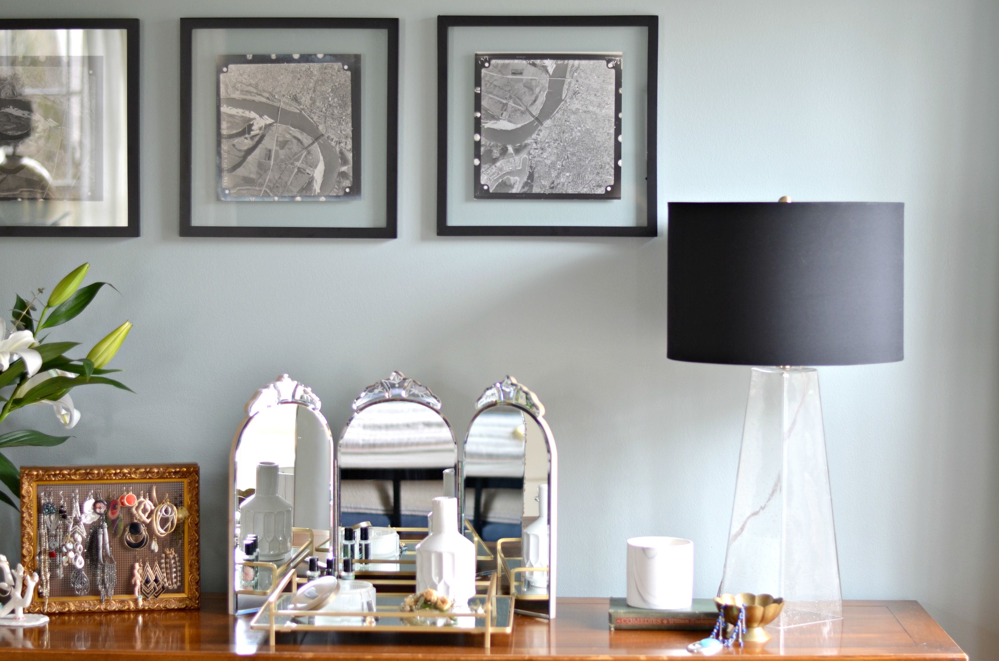
We also brought in these great vintage black and white prints they had that are arial captures of Memphis from the 1950s.
The only piece of art we brought in that wasnt already theirs was the cactus print from Minted.
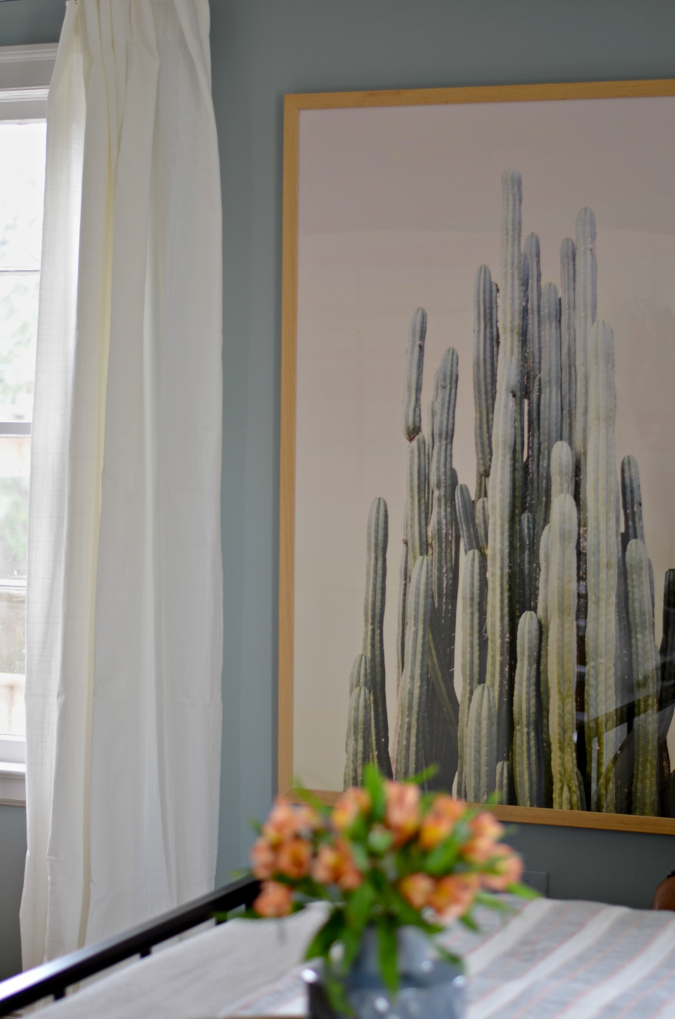
We chose this print as a way to bring in a bit of greenery and life in non-traditional way. Since they requested no plants, and Carmeon and I are both basically crazy plant ladies, we had to think of a way to bring in the feel of nature without the maintenance. We went a bit bold and unexpected by going really oversized and framing it in a natural wood to contrast against the black frames of the other art pieces.
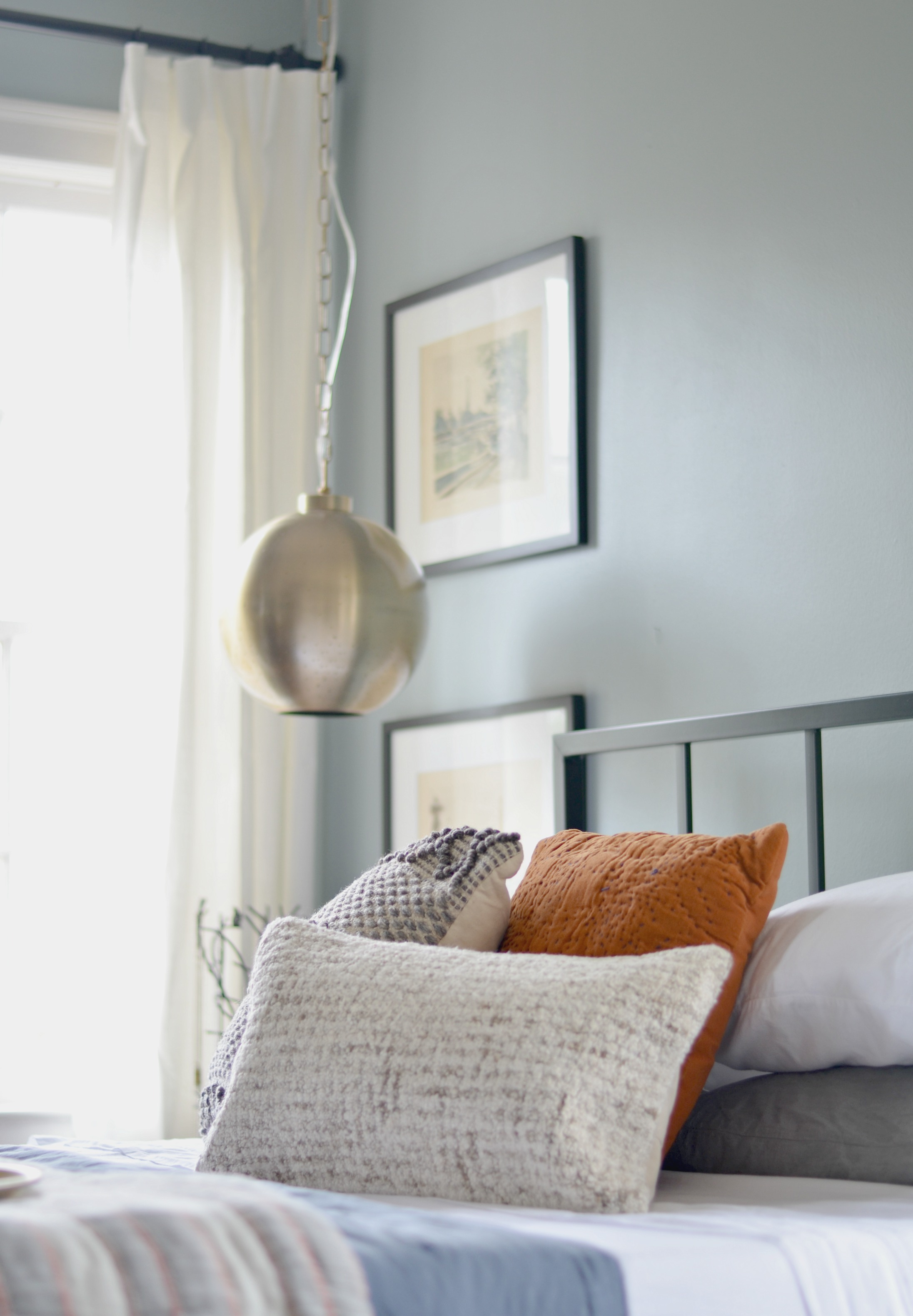
Throughout their house, they have a very distinct love of Midcentury and vintage design. Lots of thier furniture and accessories are either a nod to or are midcentury so we wanted to find a way to bring a little of that into the bedroom as well. We decided to mix it up a bit when it came to the lighting and when we came across these fantastic pendant lights at Target and knew they would be perfect for the space!
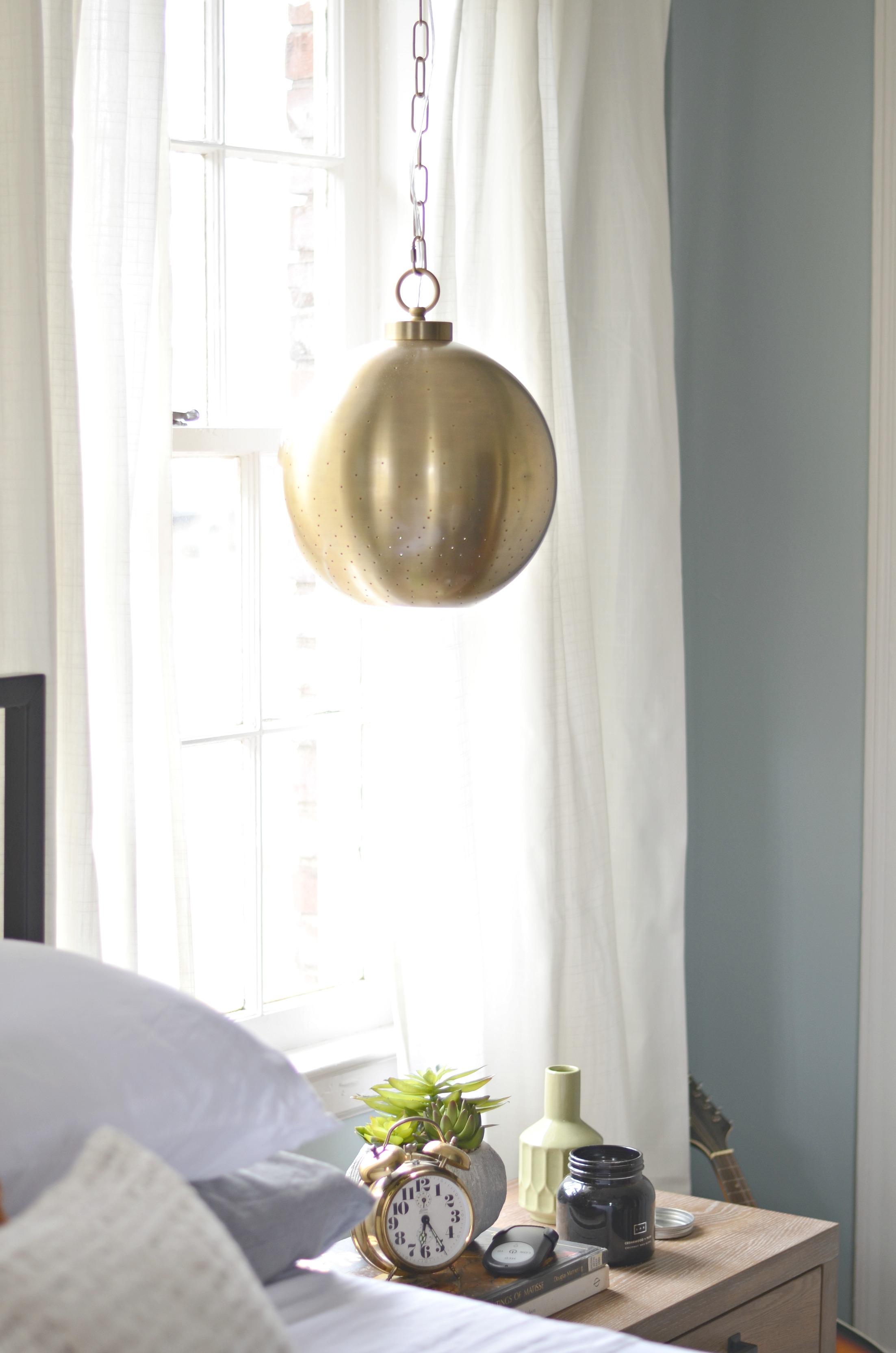
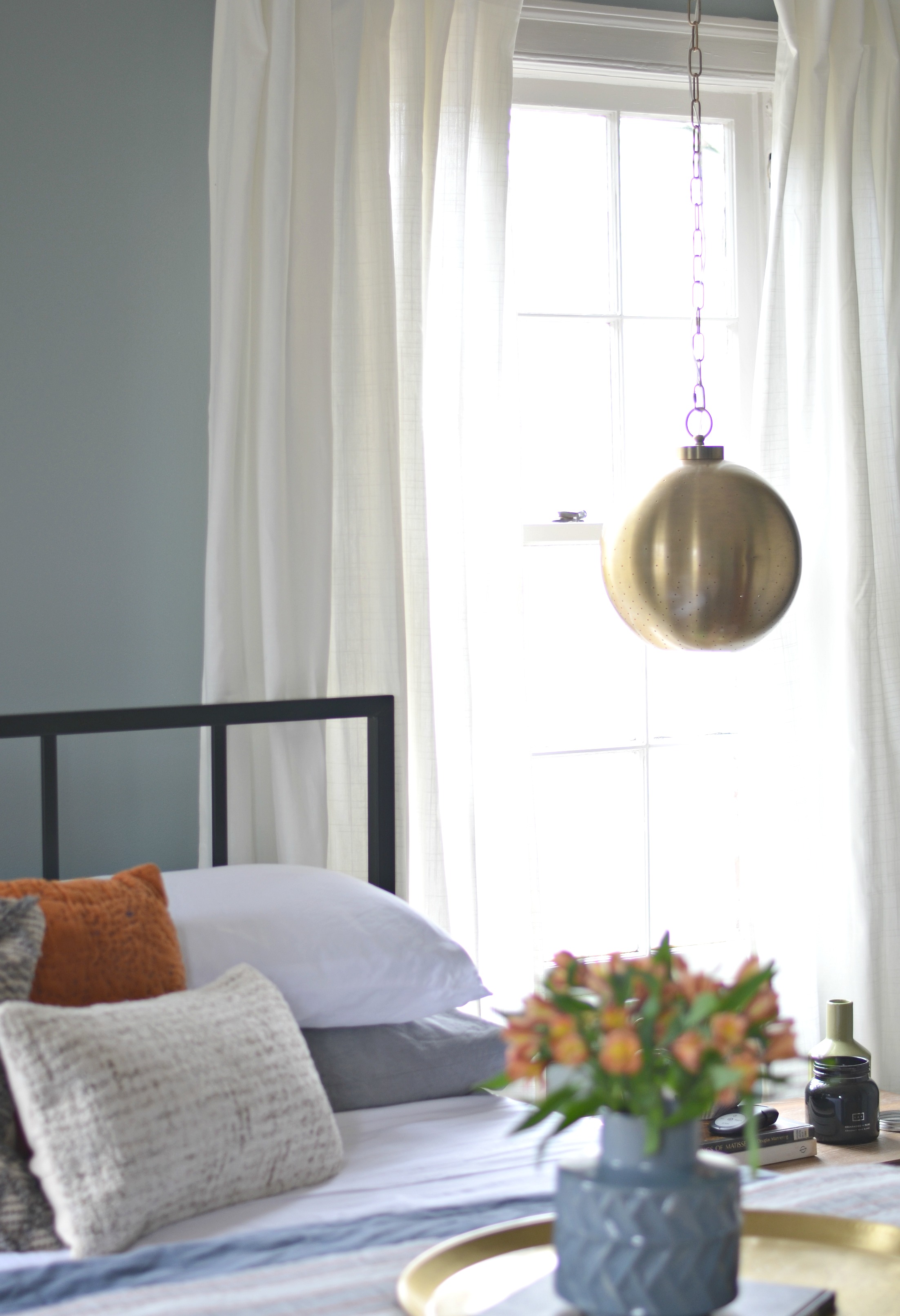
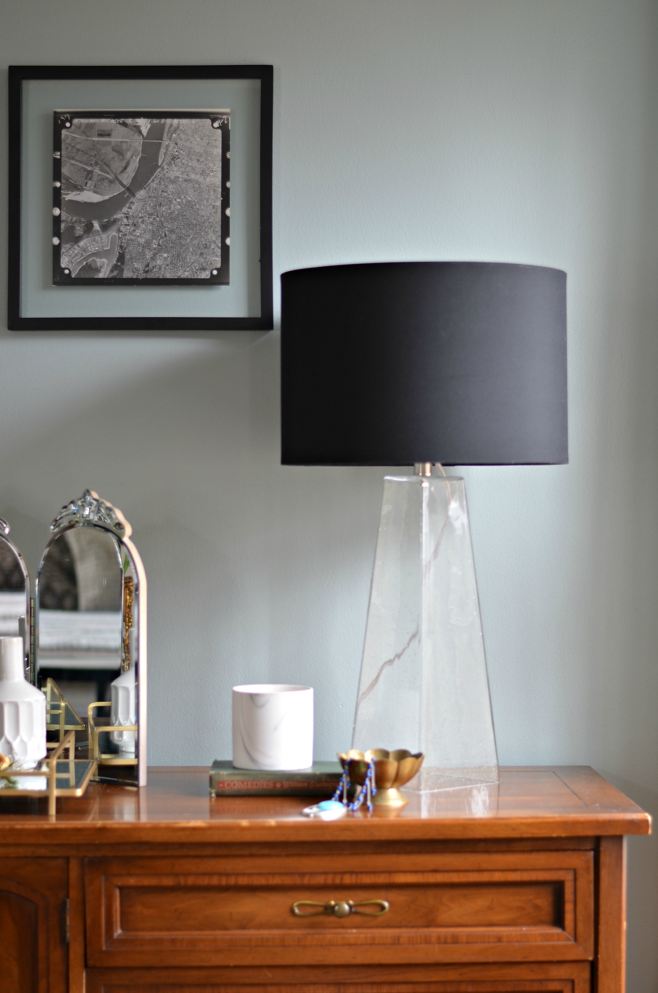
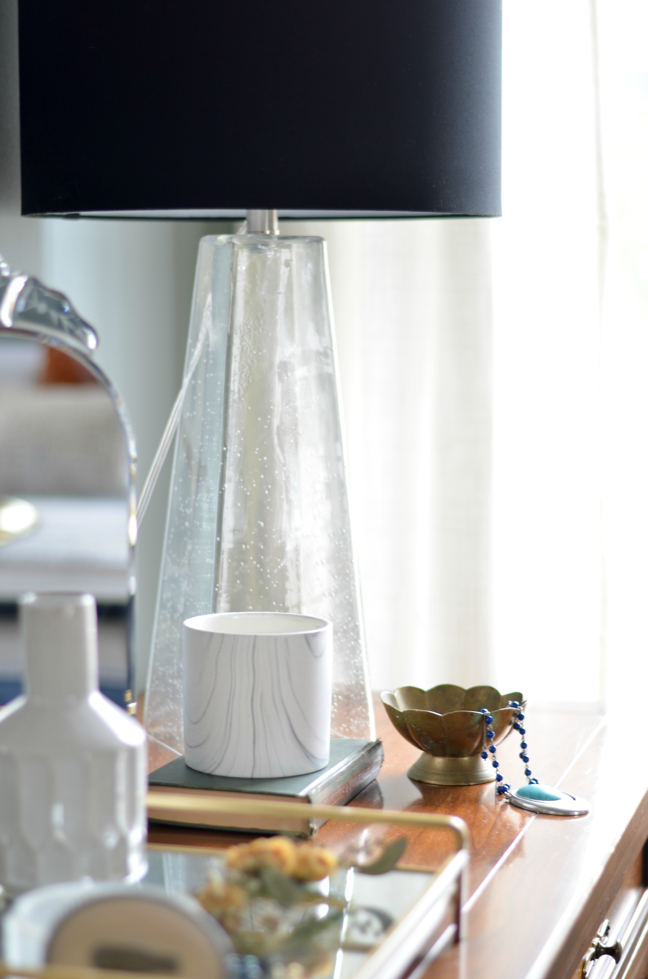
The brass finish and shape give them midcentury charm, and I love how cool and contemporary they look as bedside lighting in lieu of traditional table lamps. On the other side of the room we opted for a lamp with a clear glass base with a feminine silohuette.
For the window coverings we chose simple RITVA curtain panels from Ikea paired with STORSLAGEN hardware. I shared a trick to installing these super affordable panels in a way that makes them look way more expensive than they actually are over on IG too.
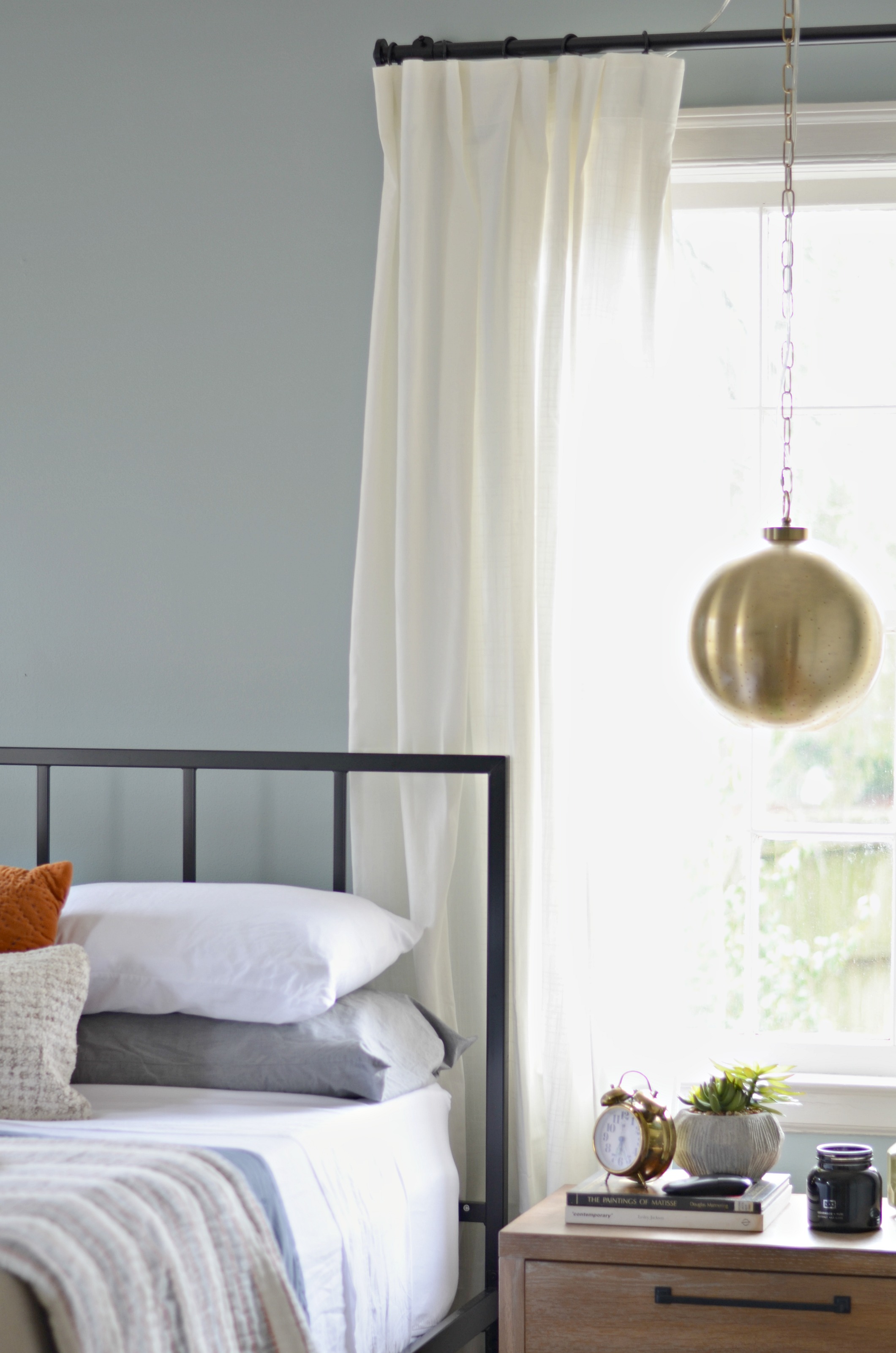
For the overall style of the room Carmeon and I wanted it to feel very fresh, calming, and personal. We wanted it to feel like a space they would themselves have created and not like a space we just plopped in the middle of their house that didnt feel anything like them and wasnt connected to the other roomes in thier home. They love a mix of old and new and we wanted to make sure we layered in a bit of both as we were pulling the room together. All the details came together really beautifully and Meghan and Ronnie love it!
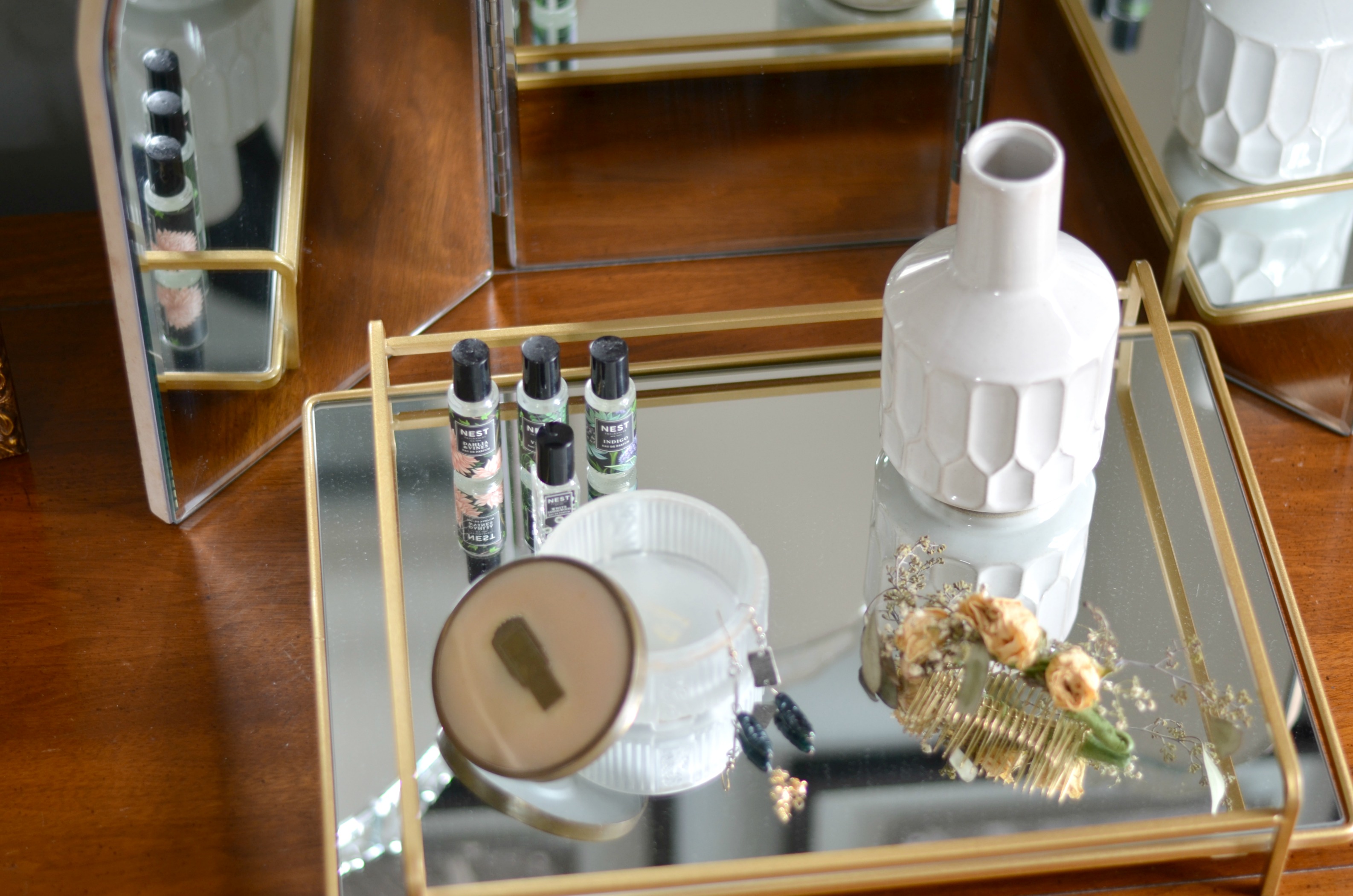
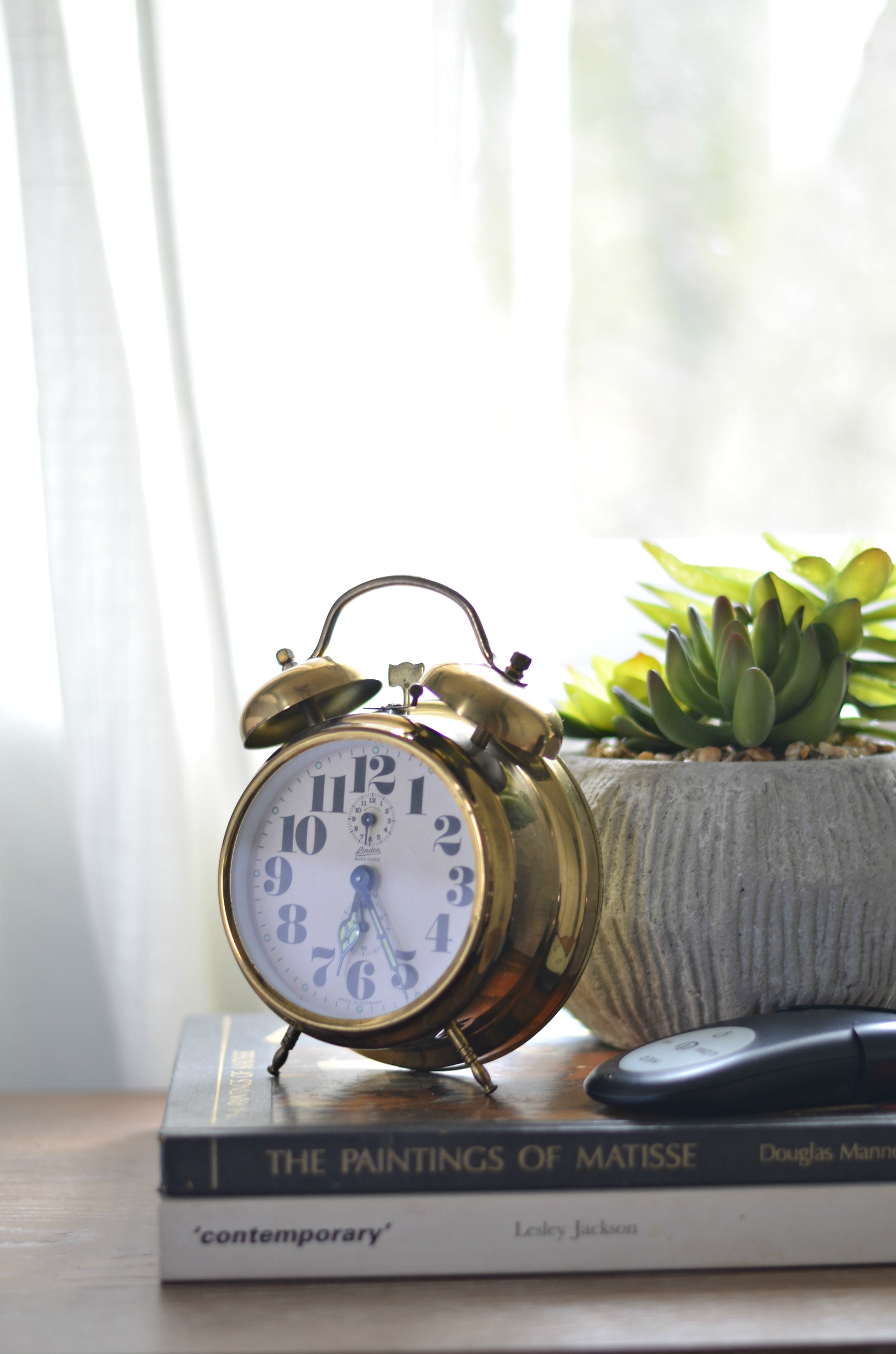
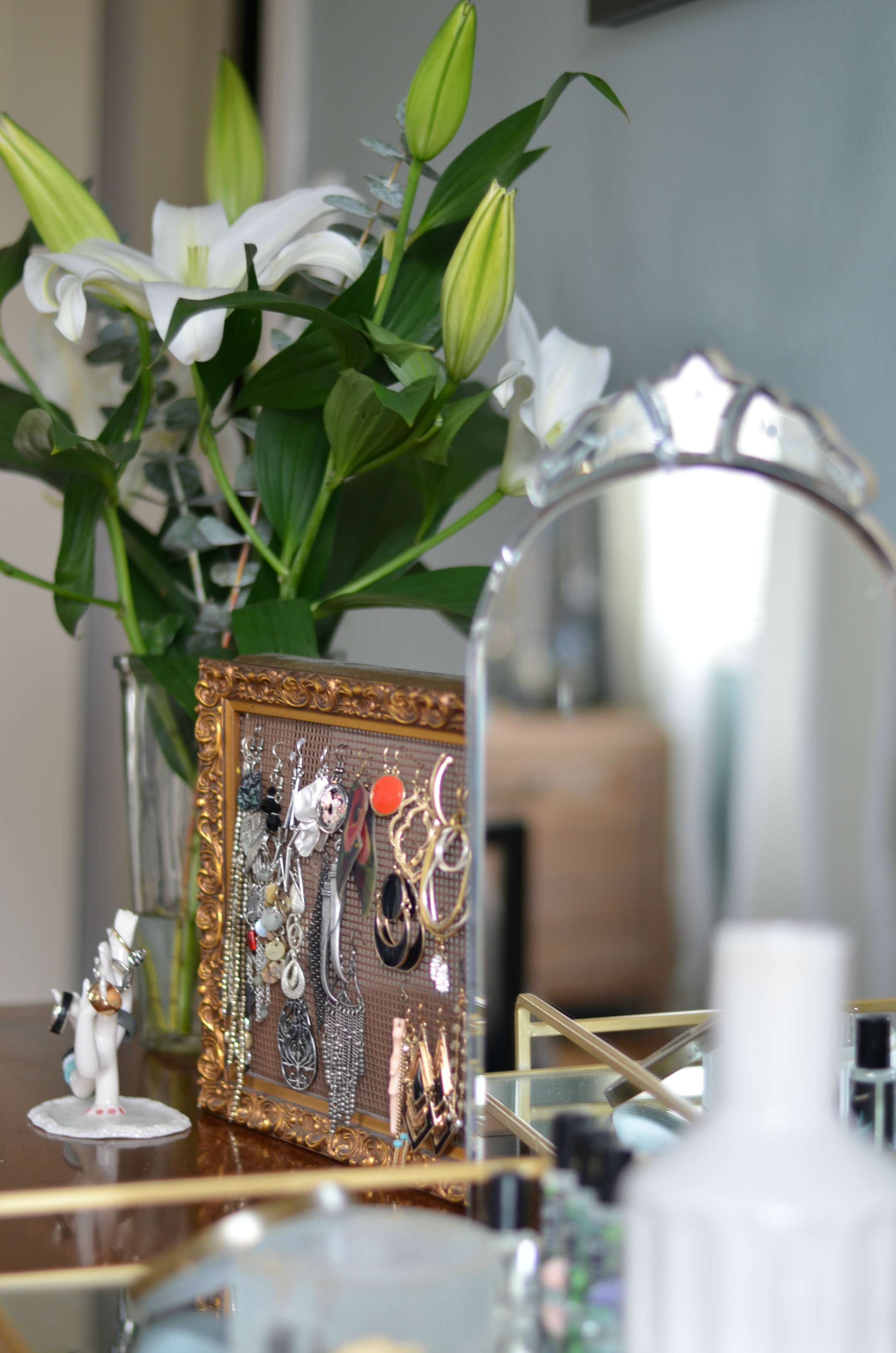
Its one thing to have a client you’ve worked alongside to create a space with for months. One that has absolute input on the design. One who approves and disapproves of details, and that you work together with to come up with a plan for a space. But its a total different ball game to relinquish that control, hand over your money, and completely trust a designer to make it what you hope without ANY say in the design at all. And that’s what Meghan and Ronnie did. They trusted Carmeon and I to make the most personal space in their home into something special for them and Im so glad we were able to do that for them.
It was a busy 2 1/2 days, but we had such a great time. We shared a and saved the whole process as well as a video reveal of the finsihed space in our IG highlights so make sure you stop by and take a look! Now make sure you head over to Carmeon’s blog because she’s dishin on the changes we made to the layout of the space, the flooring details, where we scored all the furniture pieces, and how we addressed their storage needs.
Until next time friends….
*Thank you so much to Minted for providing the amazing art piece for this project.


i buy house fast says
Nice post. Thanks for sharing this fabulous room makeover with us. I loved it. You nailed it. Good job.
Amanda says
Great work! I like the makeover of this room. I am so inspired and got some great ideas. Thanks a lot for sharing the great article.
Steven L. Martinez says
Hi miss Shavonda, I really appreciate your blog and it gives the reader’s brilliant ideas and motivation to makeover the home. Thank you for the great ideas you shared, I hope to read more updates.
Angela M. says
You ladies did an outstanding job!! Love everything about this space.
Shavonda Gardner says
Hi Angela!! Thank you so much sweet lady! We had a great time working on it and we are so happy with how things came together.
Kara says
You two really did a fabulous job with this room!! So inspiring. It’s also amazing that you did this with Target accents! I never knew they had such fashionable stuff.
Shavonda Gardner says
Hi Kara!! Thank you so much! And YESSS!! I love Target for accessories. They usually have a great accent lighthing selection and also their decor line is pretty top notch too! Thank you for your kind words and for chiming in!
Joan says
I just found your blog from a link at Design Indulgence. What a beautiful makeover! I’m looking forward to diving in to your blog to see more!
Shavonda Gardner says
Hi Joan! Thank you so much and welcome over!! We are so excited about the way this space came together.