Hi Everyone!
Yeah, so lets discuss the dining room friends. I’ve mentioned before that our dining room is the room in our bungalow that gives me the biggest headache. It’s the one space that has been the most difficult for me to adjust to in the downsize, and its my least favorite room in the house. Or at least it WAS. Nowadays Im starting to like it a little more.
Lets take a little walk down memory lane and have a peek at what the space looked like when we first saw the house and put in an offer to buy it:
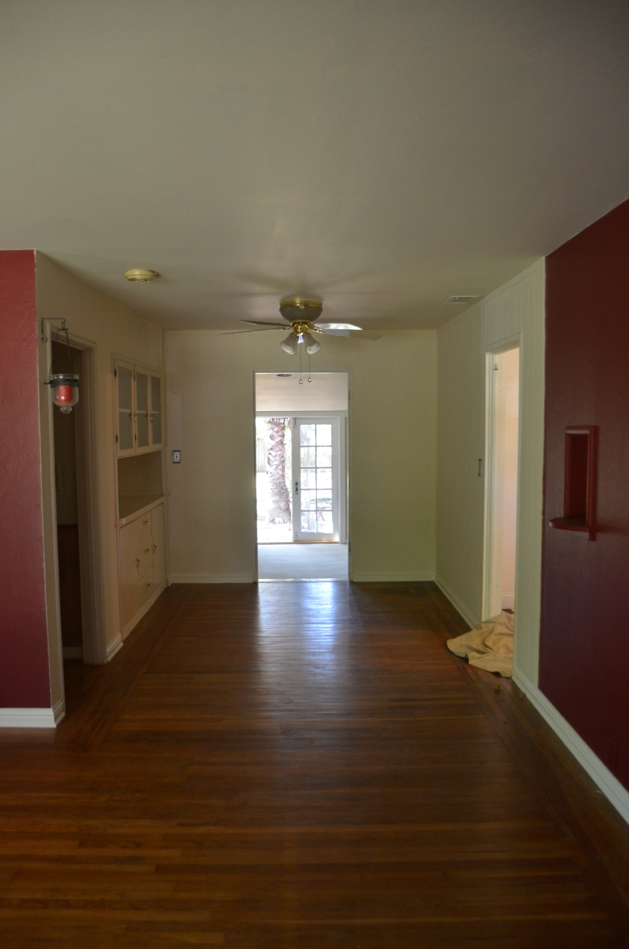
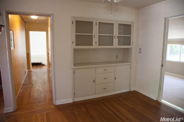
Not gonna lie, I freaked out when I first saw it. We were coming from a house that had 2 dining areas, both large enough for a table big enough to seat 10 people comfortably. So yeah, this was a shock. BUT on a positive note, I immediately loved the original hardwood floors and built in hutch.
Right after moving in I painted the walls and changed out the ceiling fan to a light fixture I found at the flea market.
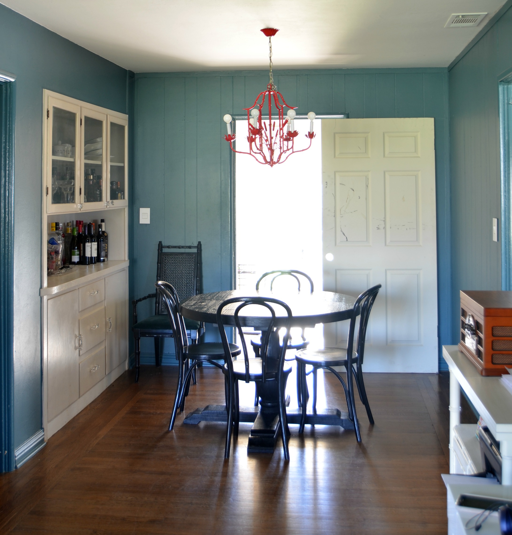
This was a good “lipstick on a pig” situation until I was ready to really dive in and figure out how to go about designing this space on a more permament level. We brought in a door from the garage to use for privacy for our bedroom. Im telling you it was super classy friends!
One of the things that bothered me most about the space was the paneling that ran only along the back wall and just past the kitchn door along the wall that connects the dining room with the living room. I hated it. And I always wondered why on Earth they would only put paneling on this small section? I very soon discovered why.
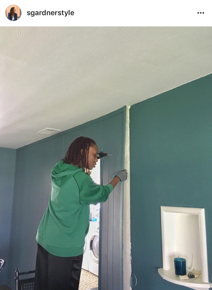
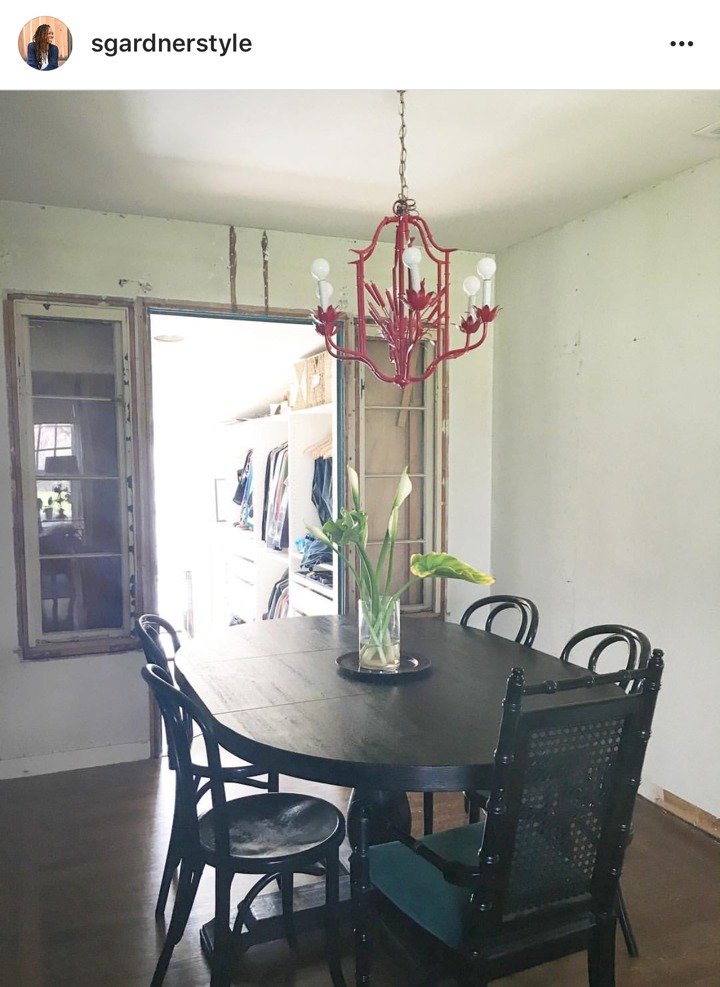
Behind the panelling I discovered windows. Well sidelights rather. It was at that moment that we realized that our dining room at one point led to the backyard and the “addition” that is now our bedroom was part of the exterior space. *slaps palm to forehead*
So yeah. Theres that. It presented a unique design challenge that I wasnt anticipating. But being the glass half full person that I am, I looked at them as a bit of a unique design feature and started thinking of ways make them seem intention and to incorporate them into the space in a meaningful way. Fast forward 2 years and I’m finally starting to give this space some dedicated attention.
Last year I repainted the main living area black so this space got a jumpstart in a new direction. I also replaced the lighting with this SINNERLIG pendant from IKEA, and we installed some proper privacy into our bedroom with a barn door. We opted for a simple pre-primed shaker style door from a local window and door shop, and had it installed using affordable barn door hardware from Home Depot. At the same time we had everything trimmed out in a pretty basic trim. We had to change out the door trim as well once we removed the panelling.
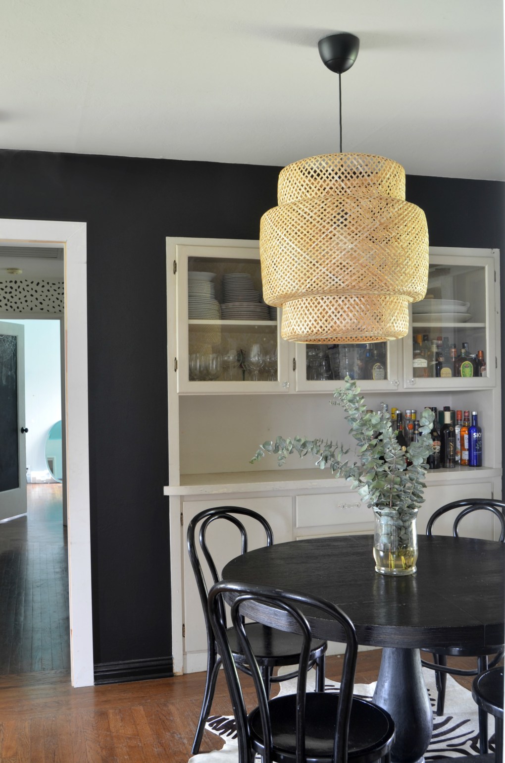
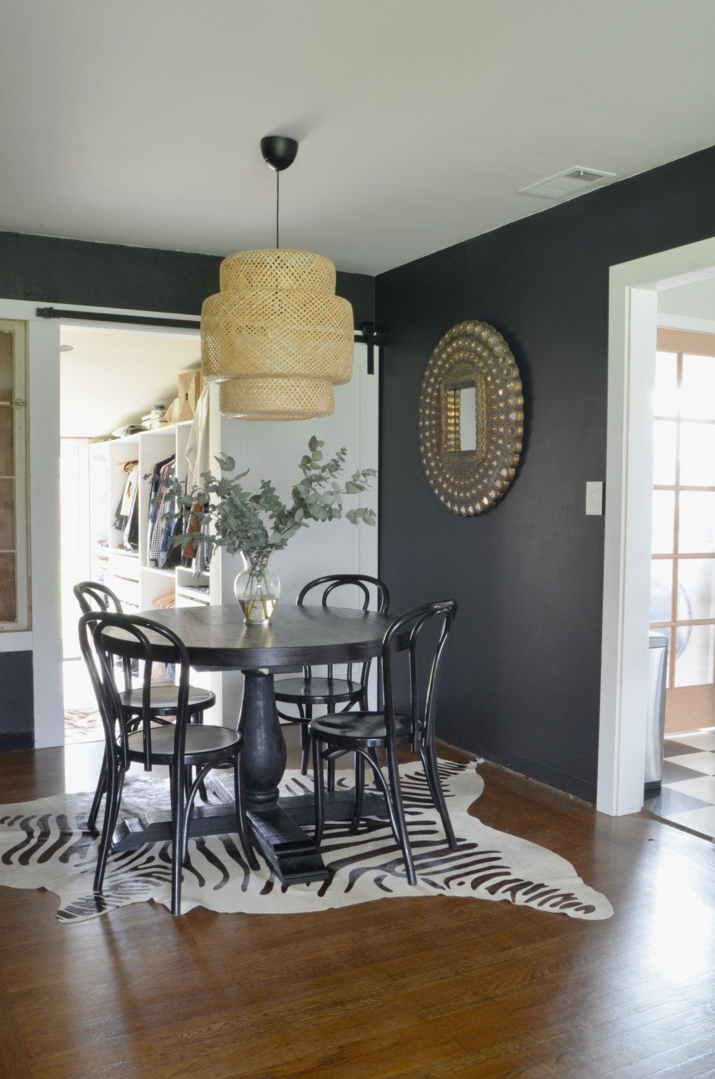
Shortly after this we got some new Panton chairs from Poly and Bark, which I LOVE!
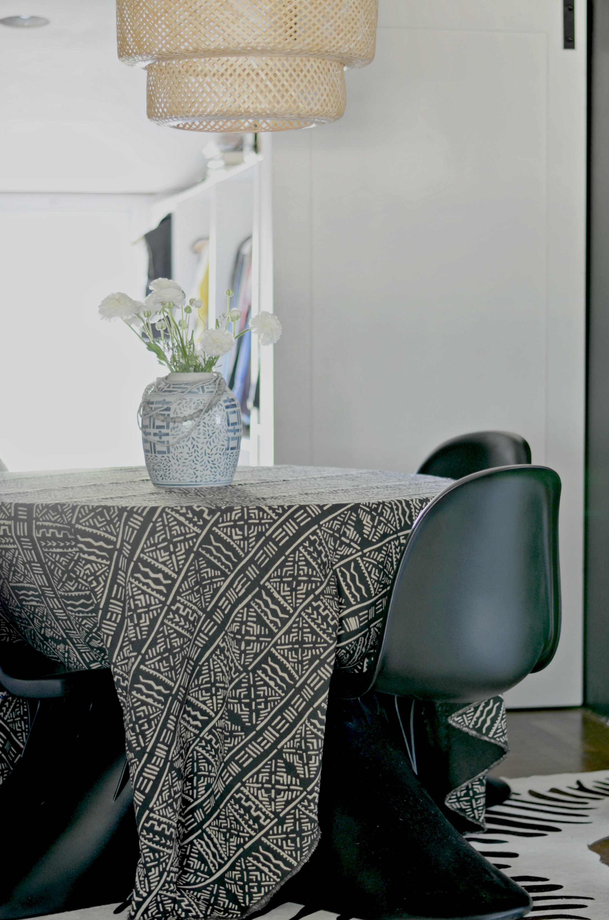
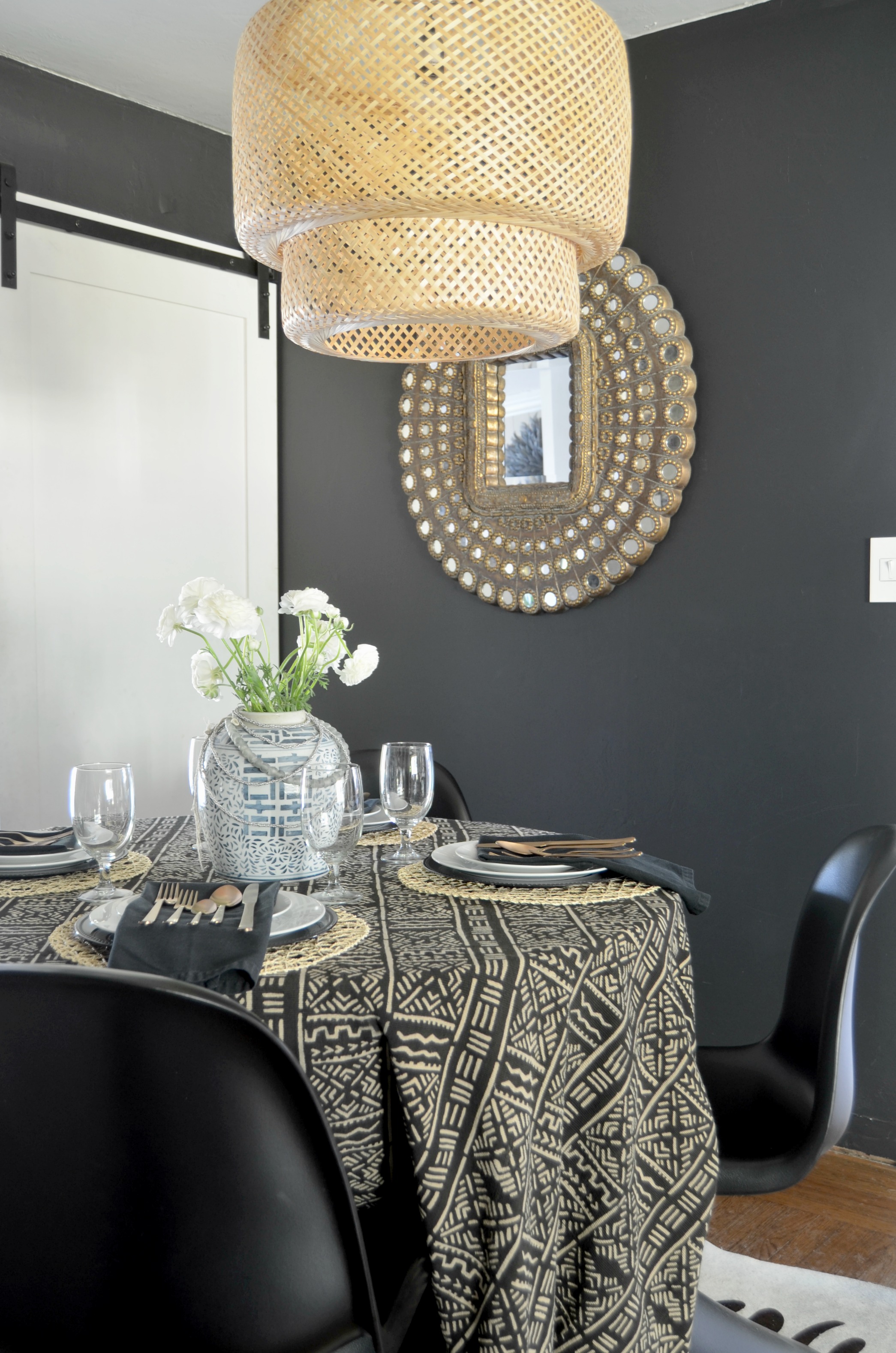
The space was starting to come together and feel more like something that didnt make me cringe everytime I walked by it. But I was still putting off the inevitable so last week I got it together and started focusing on getting some more things done in here. Starting with all the painting.
I gave the built in a coat of fresh white paint, which along with the glass hardware from DLawless gave it some new life. Ive got a couple more DIY projects in store for the built in to give it a makeover that Ill be sharing in the coming weeks.
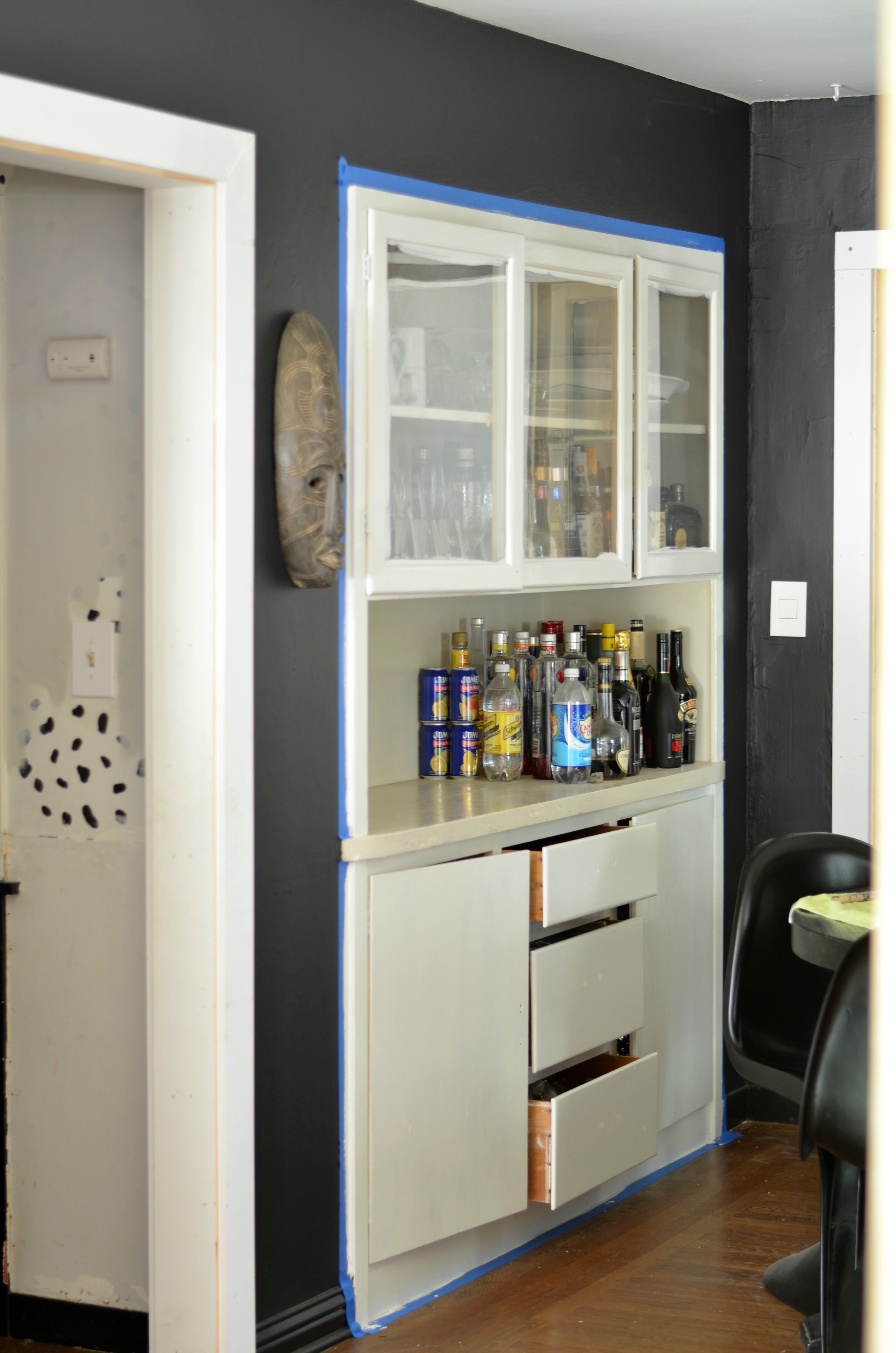
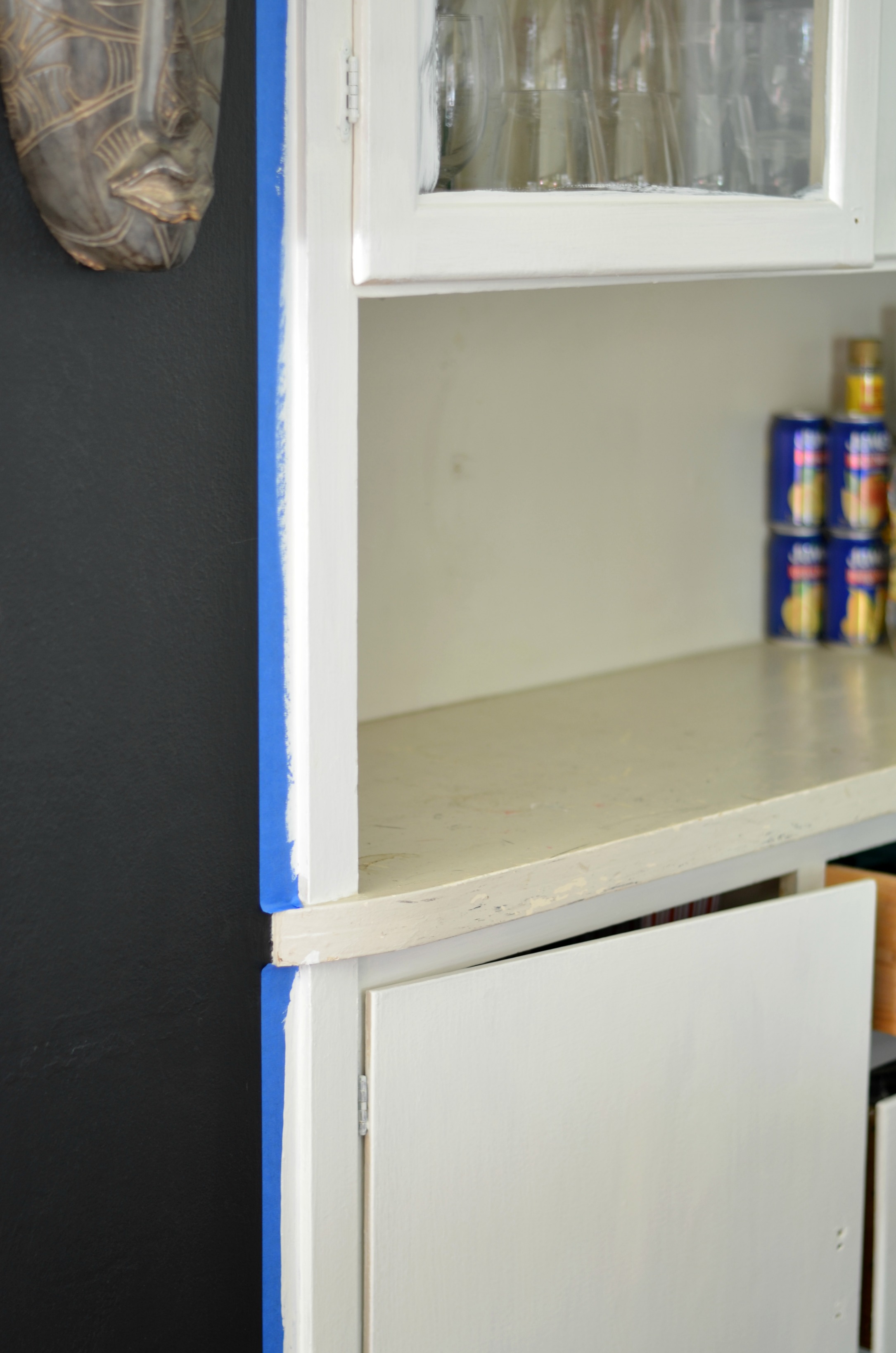
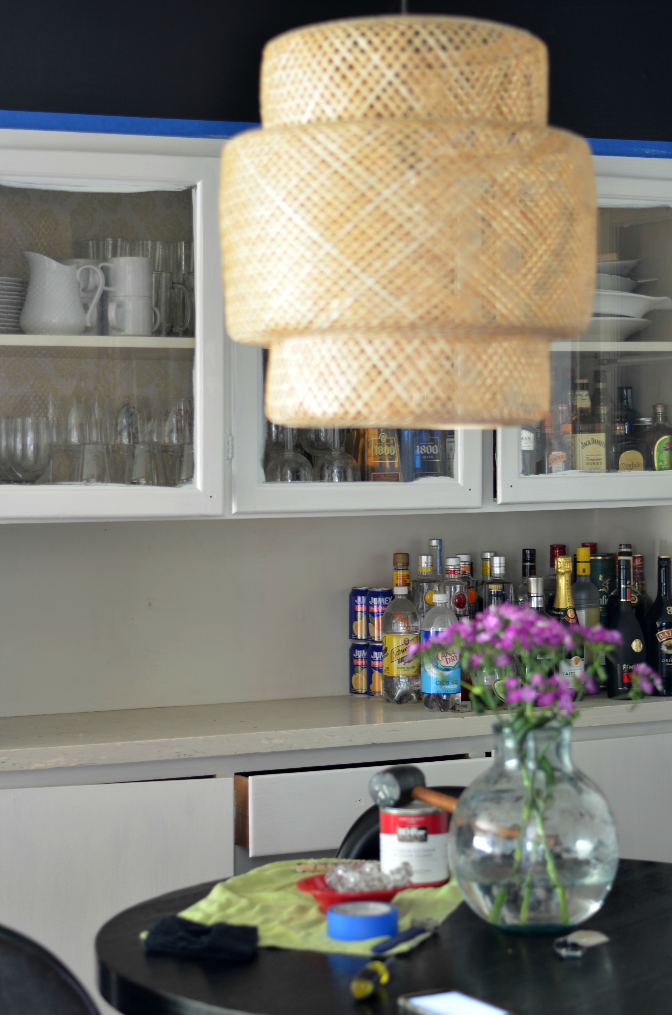
After that I moved on to the trim and barn door. Ive had plenty of time to think about how I wanted to approach those details. I waivered back and forth between painting them a contrasting color or painting them black to blend into the walls. In the end when the real estate Gods give you a tiny space with random paneling, hidden windows, and a variety of trim…you paint all the things black!
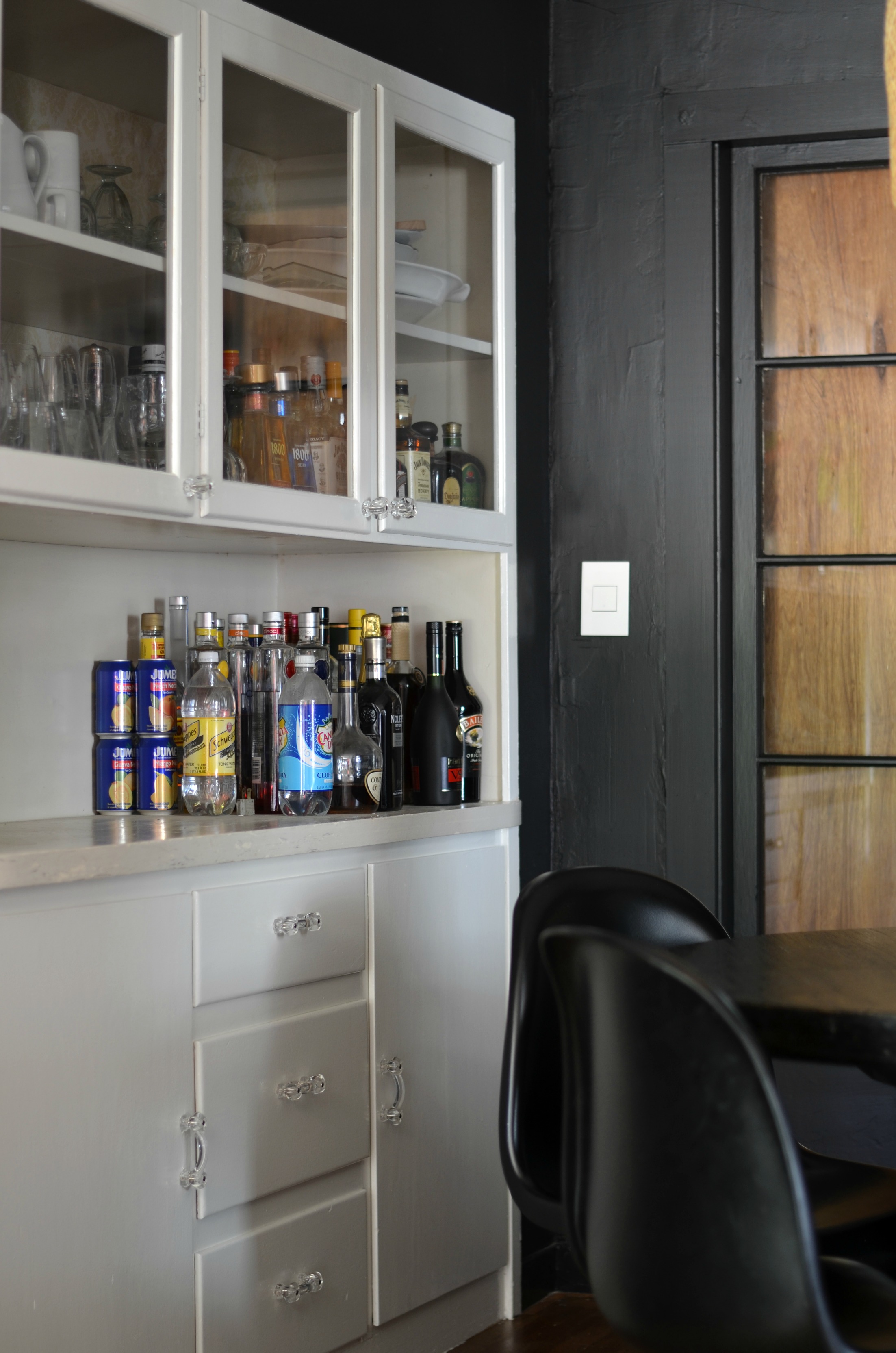
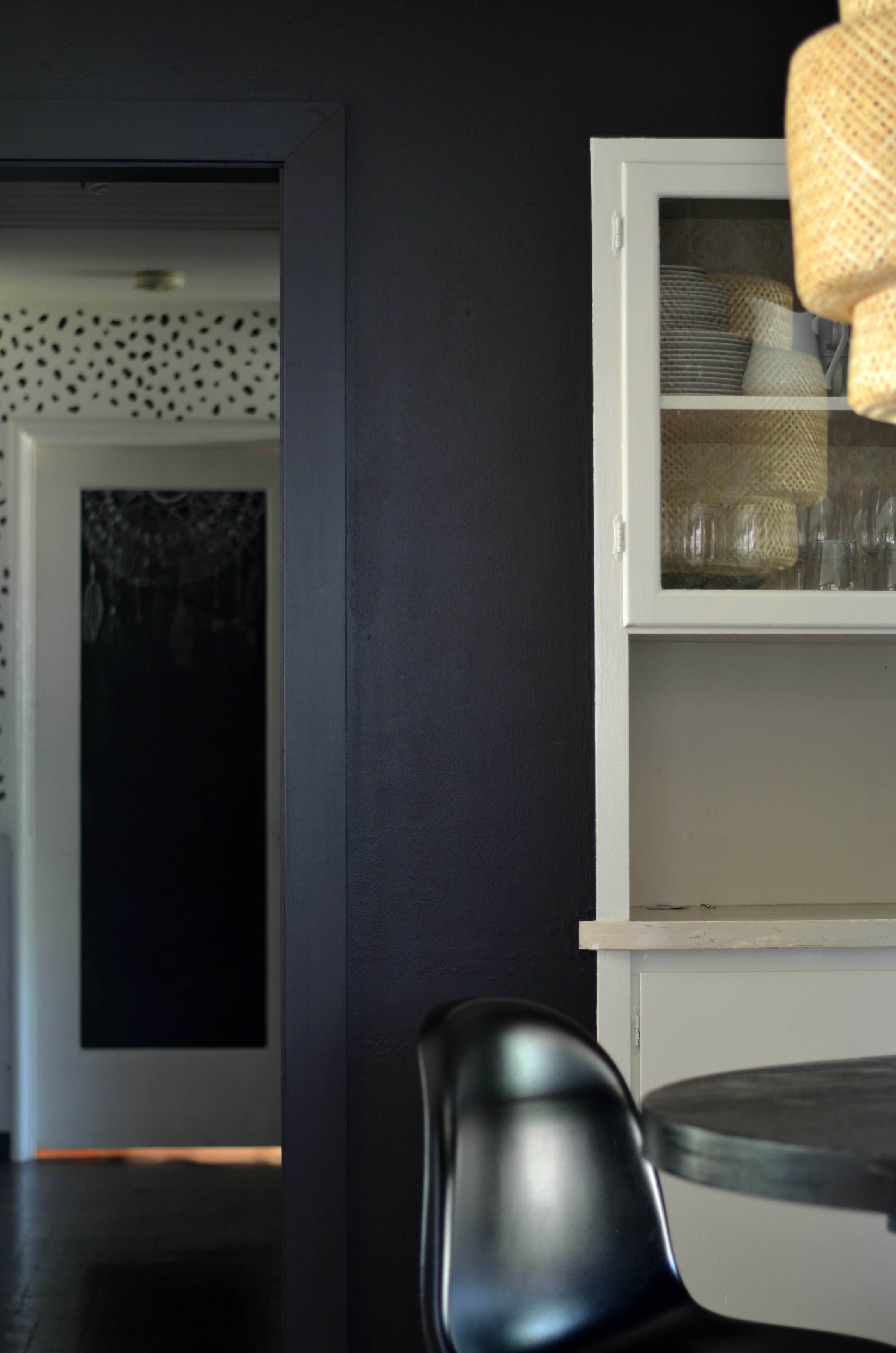
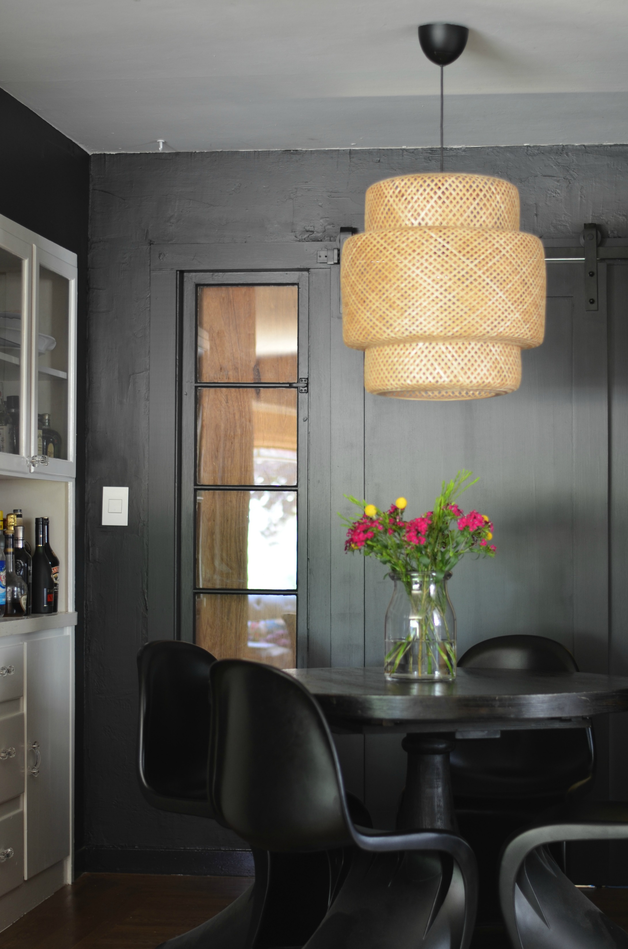 It was a fairly easy choice to make, actually. The idea was to make all those undesirable details disappear as much as possible. Painting everything black makes the eye go straight to the built-ins and makes the space feel larger because there appears to be an absence of boundaries.
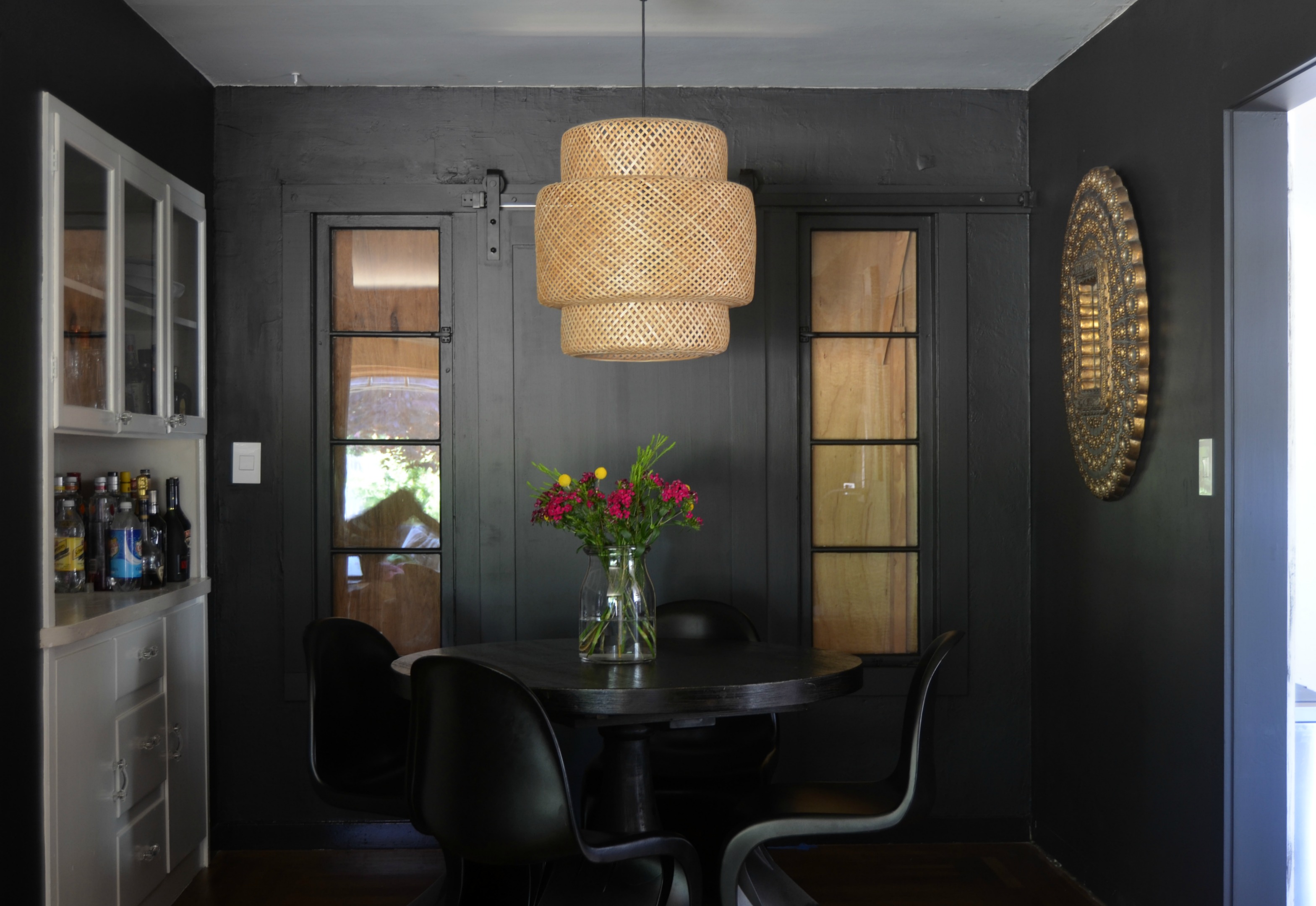
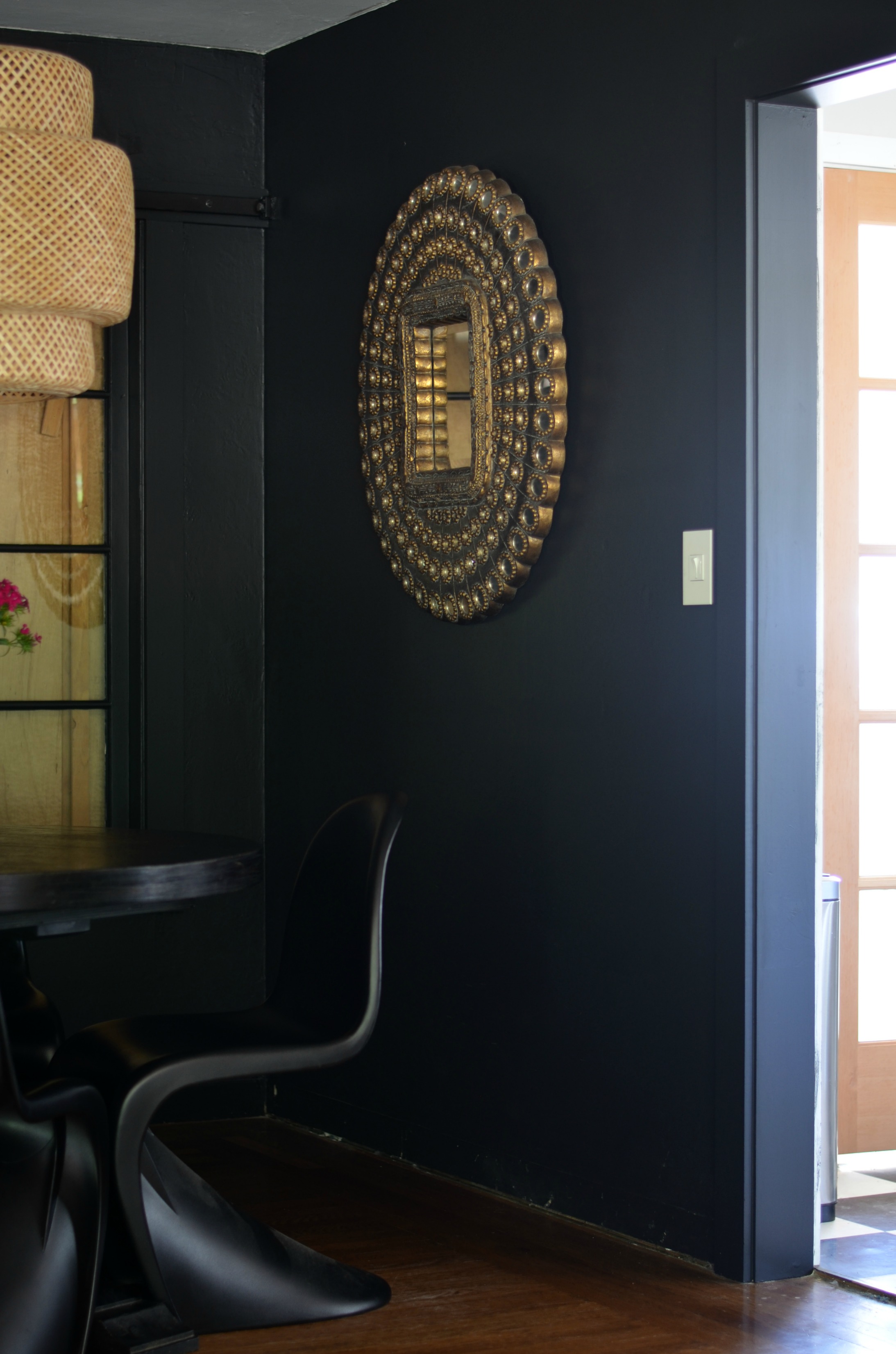
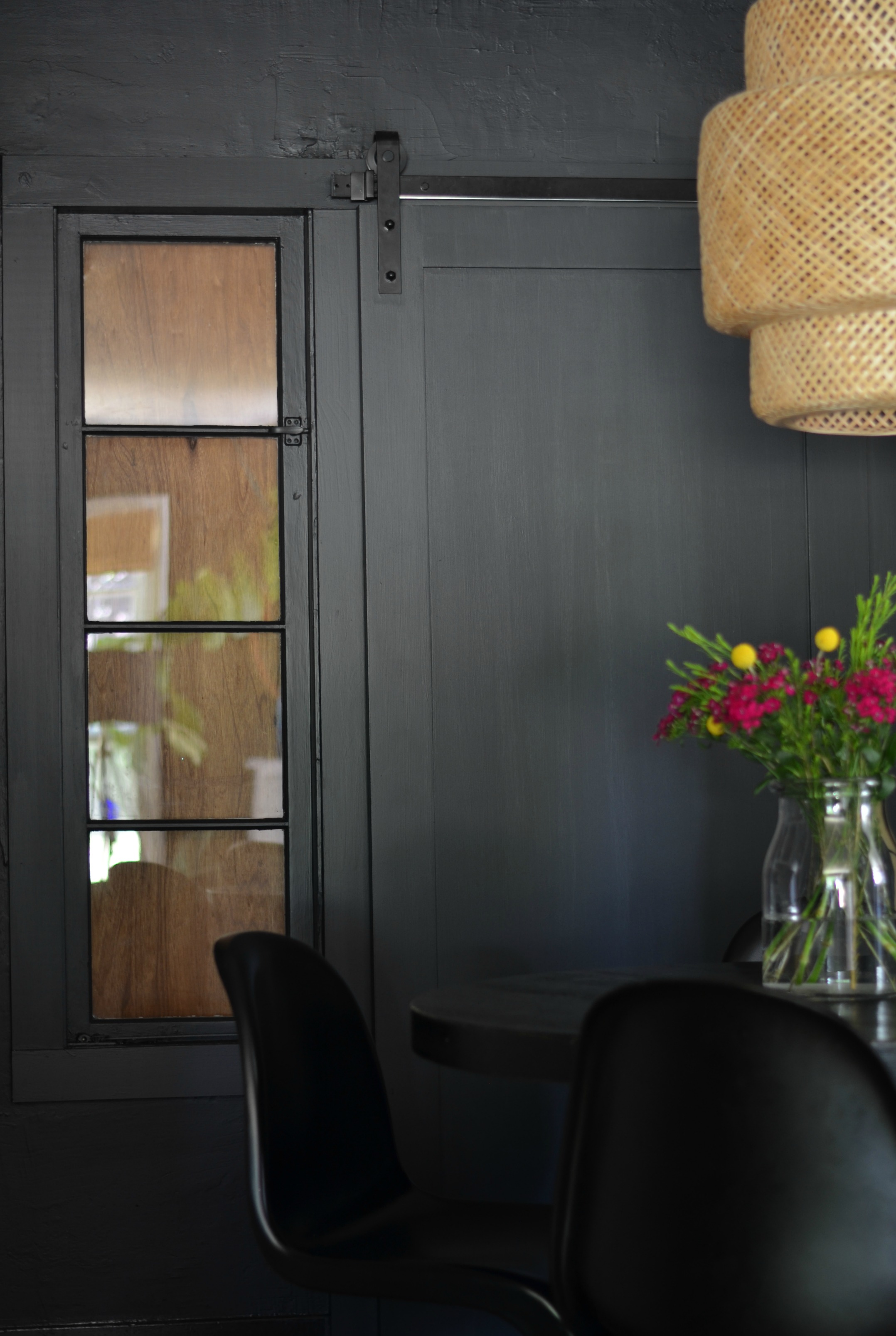
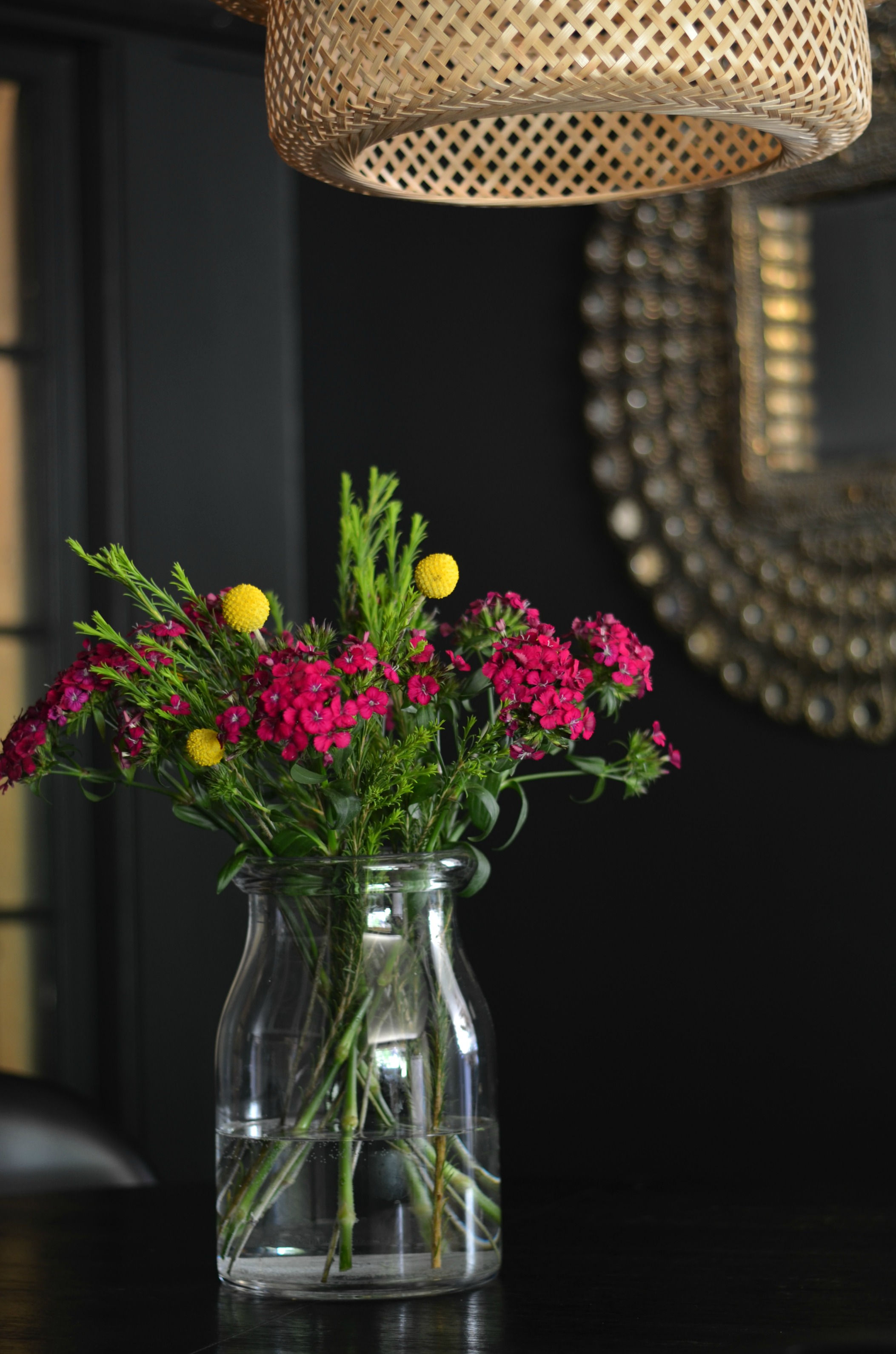
Im IN LOVE with it! The moody vibe is EVERYTHING. It feels so luxe and regal and I couldn’t be happier. Its well on its way to being the space I hoped it could one day be. There are just a few more things to tackle and I can call it good.
Up next in here:
-DIY a handle for the barn door
-Finish the Built-In makeover
-Replace section of baseboard
-New dining table
-DIY stained glass for the sidelights
Until next time friends….
Sources
Black Paint: Martha Stewart Francesa (color matched to Behr Marquee formula)
White Paint: Benjamin Moore White Dove
Table: World Market (discontinued)
Bentwood Chairs: Vintage found on Craigslist
Panton Chairs: Poly and Bark
Glass Hardware: D Lawless
Pendant: IKEA
Peacock Mirror: Pier 1 (discontinued)
Barn Door Hardware: Home Depot
Rosana says
Hello Shavonda. I have been a long time fan of your blog and work. I enjoyed watching your IG stories and posts. I was super excited to see that you are doing the one room challenge. I can’t wait to follow your progress and see the outcome!
Jamala Wallace says
Gorgeous room.. very hypnotic appeal to it.. I love how sultry it looks
Amy KS says
Hi Shavonda,
just revisting your blog after a long while, not sure why, especially since I love all your instagram posts and stories. Anyway, I’m not sure if you already did the stainglass windows, but I was thinking that putting mirror into those sills (if at all possible) would be a great way to make the space seem bigger. You may have already thought of this and decided against it, anyway, I love the way the room is looking, it looks stunning dressed in black.
Shavonda Gardner says
Hi Amy!! Thank you so much for popping back by love. I did consider mirror actually:)
Nenette says
Hi there, long time fan but first time commenting on your blog. I must say you have inspired me so much when it comes to interior decorating. Truly, I love your aesthetic and you have great eyes for color. Just a quick question I have for you and I hope that you’ll be able to give me a few pointers. My husband and I purchased our home almost 2 years ago but I don’t know how to go about decorating. It’s one of those open floor kitchen leading to dining room, leafing to the living room kind of house and I want to do one room at a time. What would you suggest please? I would appreciate any advice you can spare. Thanks so much in advance!
Karen says
Nice job!
I really like the idea of DIY stained glass. It will look great.
Shavonda Gardner says
Im so excited to try it. Im a little nervous, but excited!
Blake Von D says
Sooooo good, Shavonda! So many Pinterest worthy views.
Shavonda Gardner says
Thank you sweet friend!!!
Aimèe says
Love this.
Shavonda Gardner says
Thank you!
Mary says
Nice job, it looks great!
Shavonda Gardner says
Thank you so much!