Hi everyone!
I’m so excited for today’s post friends! After months of being tight lipped I’m finally able to share photos and details about the 2019 Real Simple Home.
To say I was shocked to receive an invitation to be a designer for the home this year is the understatement of the century. I mean, Nate Berkus, Sabrina Soto and Jenny Komenda (among others) designed the home last year ya’ll. This was major. After I picked my jaw up off the floor the first thing I did was ask if my bestie Carmeon could co-design the space with me. Given the thumbs up we got to work coming up with a design plan.
This years home is located in gorgeous Park Slope, Brooklyn. It’s a three story townhouse that was gutted and renovated, and we, alongside several other designers, were given a space in the home to design. I was asked to design the office and I couldn’t be more excited. Real Simple really wanted to emphasize multi use spaces this year so the office also needed to function as a work out/yoga space as well. \Also I don’t have a dedicated office in my home so I REALLLY wanted to create what would be my idea of a dream workspace here. The fact that it happened to be in NYC sweetened the deal.
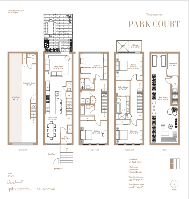
The room is located on the third floor shared with the master bedroom suite (which Mandi from Vintage Revivals KILLED by the way! It’s so good!). It’s also one of the smallest rooms in the house and yall know small spaces are my jam so it was on! The room was a clean blank space with white walls, gorgeous wood floors, big beautiful windows and tall ceilings. We couldn’t have asked for a better situation to start with.
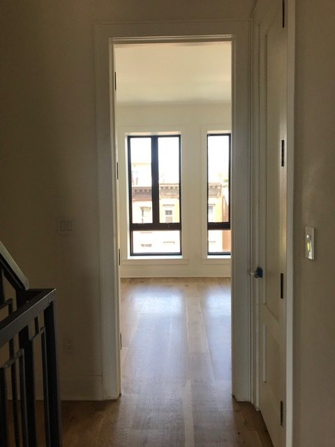
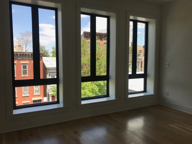
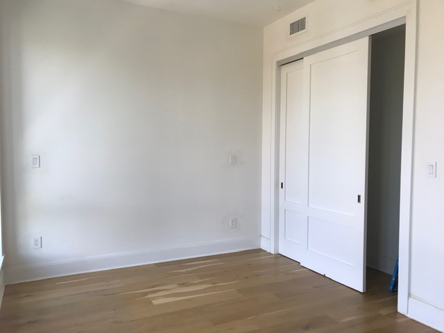
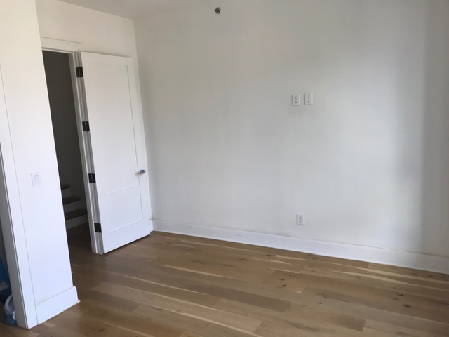
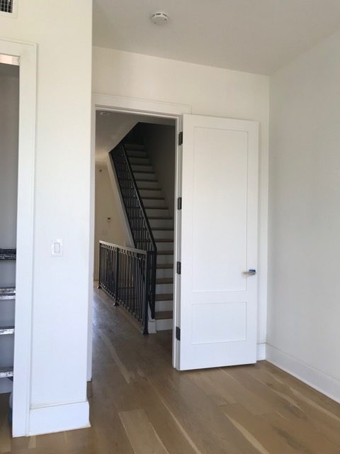
After we received the images of the space we got to work coming up with a floor plan. Carmeon and I both created our own individual floor plan layouts and then shared them with one another AND WE BOTH ENDED UP WITH THE EXACT SAME ONES!! This is why we work so well together. We just get each other. In the end we decided on this one:
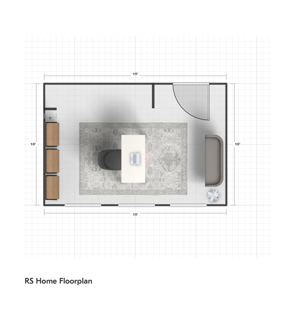
We loved the idea of placing the desk so it floats in the middle of the room. This creates good flow around the entire space and allows for a bank of bookshelves behind it and a small loveseat on the wall in front of it. The windows are unobstructed so you can really take in the city views and light outside.
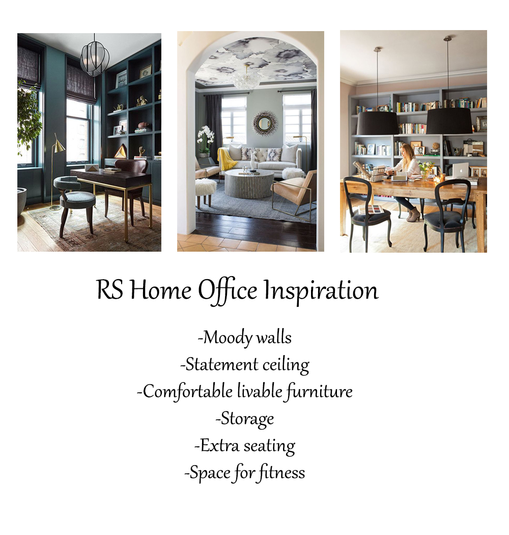
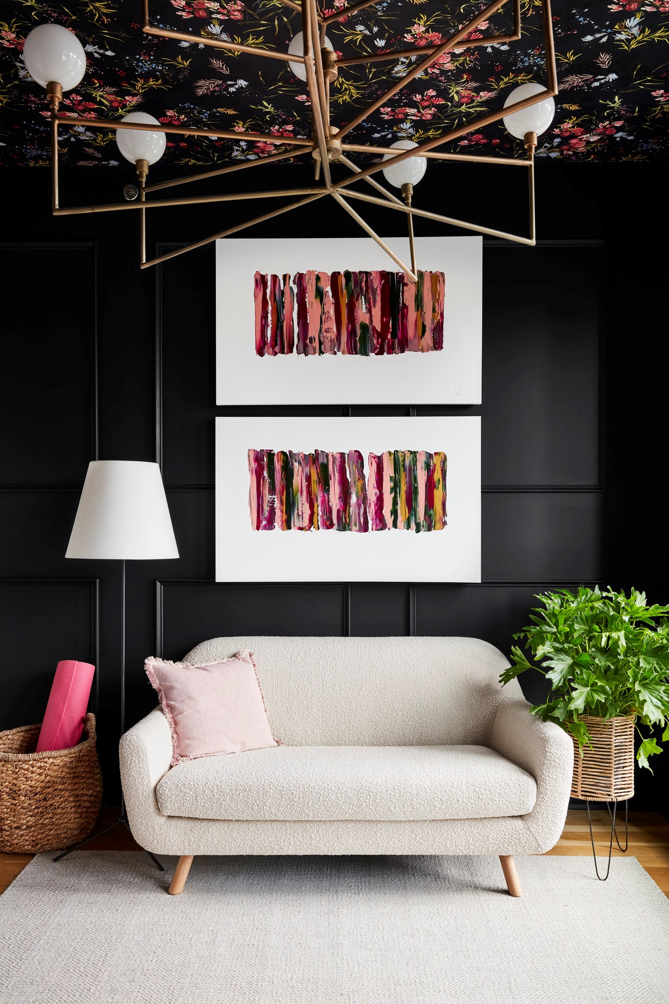
Once settled on the floorplan we got to work coming up with a design concept. I really really wanted to go moody and bold in this space and Carmeon was fully into it as well. We wanted the space to feel comfortable, interesting, functional and luxurious all at once. I wanted to use wallpaper in an unexpected way and we both LIVE for burlwood so that was absolutely happening! We sent over our inspiration and design boards to the editors and crossed our fingers they didn’t think we were out of our minds.
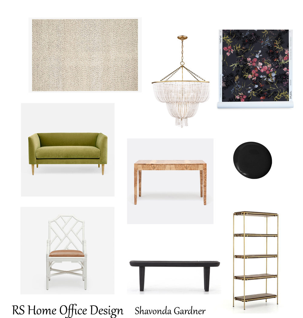
The Real Simple team loved it and they got busy with paint, electrical, and construction prior to our arrival to pull everything else together. Seeing the wallpaper go up on the ceiling made it all feel very real!
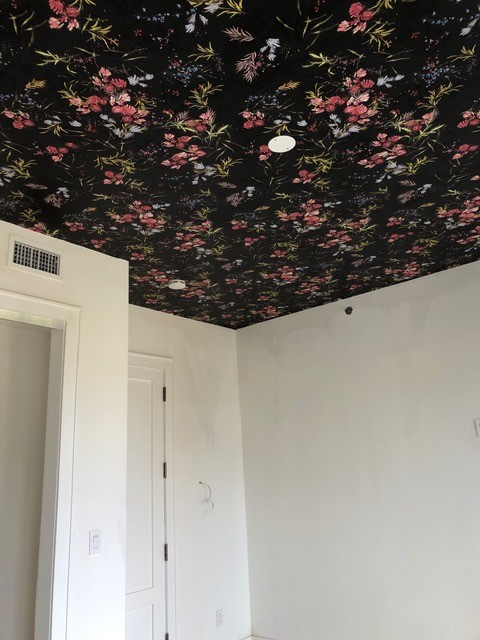
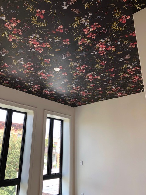
I’ve been a long time fan of Kelly Ventura wallpapers and I knew this would be the perfect time to use some in a design. Her moody florals are amazing and the Meadow print was just perfect for our space.
We couldn’t wait to see the other elements of the room come together and after three days of work in NY this summer we are thrilled with how this space turned out.
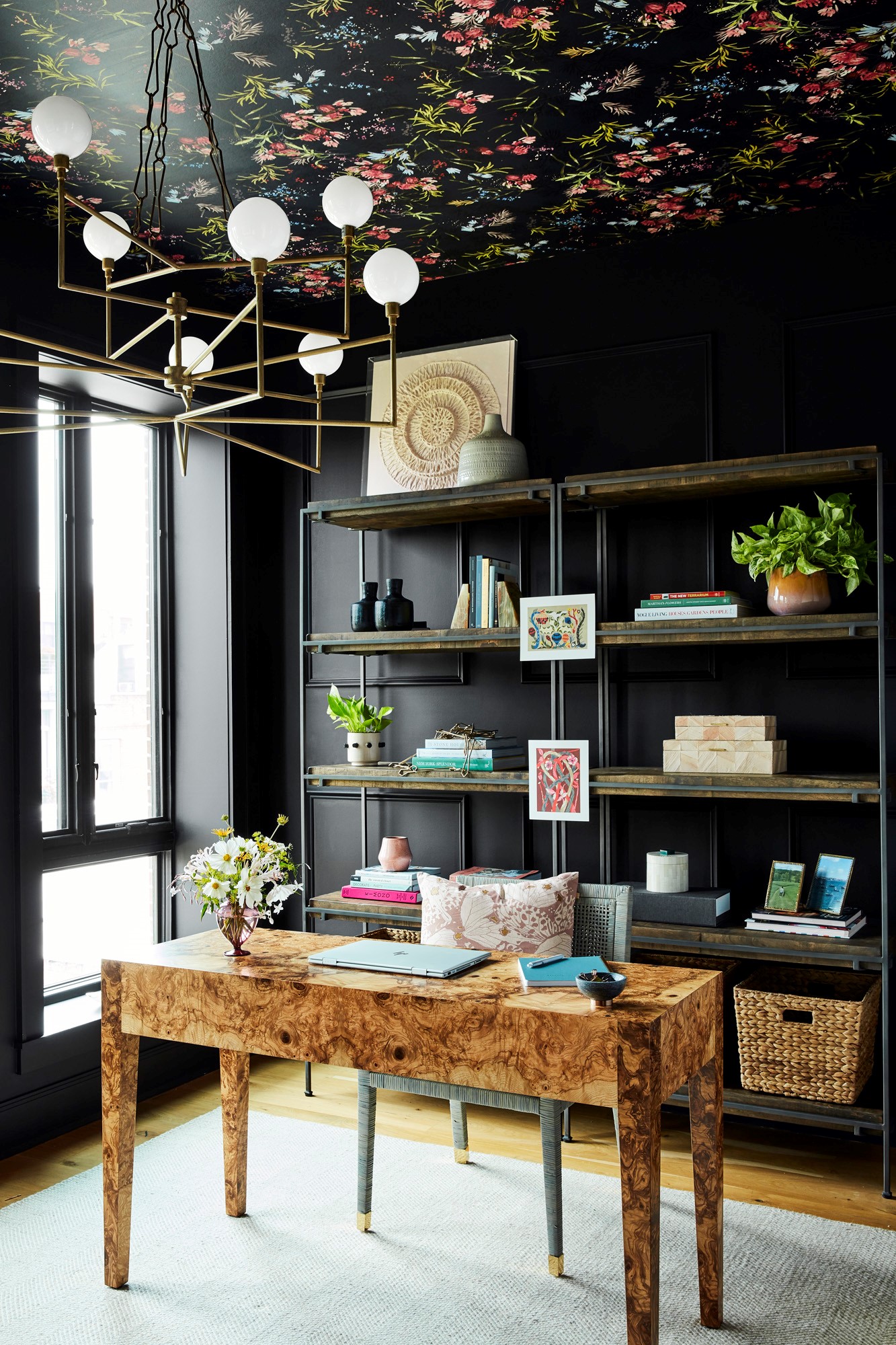
Photos by Christopher Testani
We added a simple molding detail to the walls to add an architectural element to the room. The burlwood desk is so so gorgeous and looks incredible against the dark walls. A rattan chair and boucle loveseat bring in layers of texture to the space. The amazing statement chandelier compliments the wallpapered ceiling beautifully . A neutral rug grounds the space and helps balance out the busy ceiling. Custom wall art, and accessories finish off the space.
Speaking of accessories, Carmeon is a master stylist. She was a merchandiser and buyer for YEARS professionally so she is the magic behind why our projects come together so beautifully. I don’t particularly like the styling part of design so I literally just put everything in a room and walk away. When I come back it looks like a million bucks thanks to her and her incredible eye.
We are so grateful for this opportunity and are just so happy to be in the company of the other amazing designers in this year’s home. We will be back in NY next month to see the entire home complete. If you’d like to see all the behind the scenes of our Real Simple experience check out my IG Real Simple Idea Home Highlight.
Make sure you head over to Real Simple and check out the entire home and virtual tour of the spaces. Also be on the lookout for the October issue of the magazine!
Until next time friends…
ROOM SOURCES
Wall color: Valspar Dark Kettle Black
Wallpaper: Kelly Ventura
Chandelier: Varaluz
Rug: Loloi Rugs
Bookshelves: Pottery Barn
Desk: Made Goods
Desk Chair: Serena and Lily
Loveseat: Article
Art: Custom by Monica Lewis Art
Pillows: Holistic Habitat
Seagrass Planters: Holistic Habitat
Floor Lamp: West Elm
Plants: The Sill
Flowers: Livia Cetti
JaneD says
I am literally obsessed with this room! like you, I am also crazy about wallpaper and anything black! So glad I opened a random Sherwin Williams email and discovered you:-)
DD says
Same here – clicked through on a SW marketing email. Nice surprise!!
Doris Lynch says
Love all the styled rooms featuring new colors. Gives me ideas …
Lindsay says
this is STUNNING. as in, i am literally STUNNED. i’ve read interiors blogs for years and am just now getting what it means to be inspired. i’ve copied ideas and followed tutorials, but there’s a difference between that and saying “i love the way this room feels and I want my space to feel like this. what would that take here?”
basically you ROCK and i am so pumped to get going on my own house!
Pam says
Beautiful!! That ceiling is inspiring.
Vanessa says
Well done Shavonda, how exciting!
Darcel says
I. LOVE.IT!!!!!! You had me at the black walls and floral ceiling. Congratulations on being selected as a designer for the project. You deserve it. Really proud of you.