Hi Everyone!
Happy Thursday friends and Happy ORC Reveal Daaaaaaay! Well, reveal day for our project that is. After weeks of A LOT of trials and tribulations Carmeon and I are so excited to FINALLY share the completed spaces with you!
Before we get to the afters let’s take another quick look at what the rooms looked like before…starting with the bedroom:
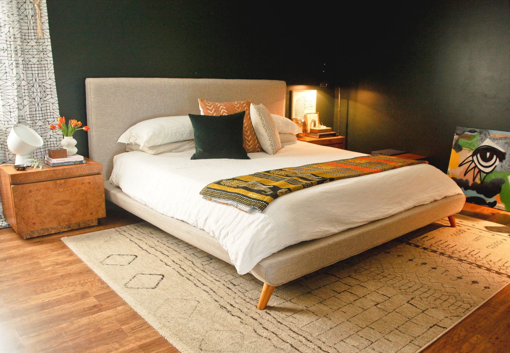
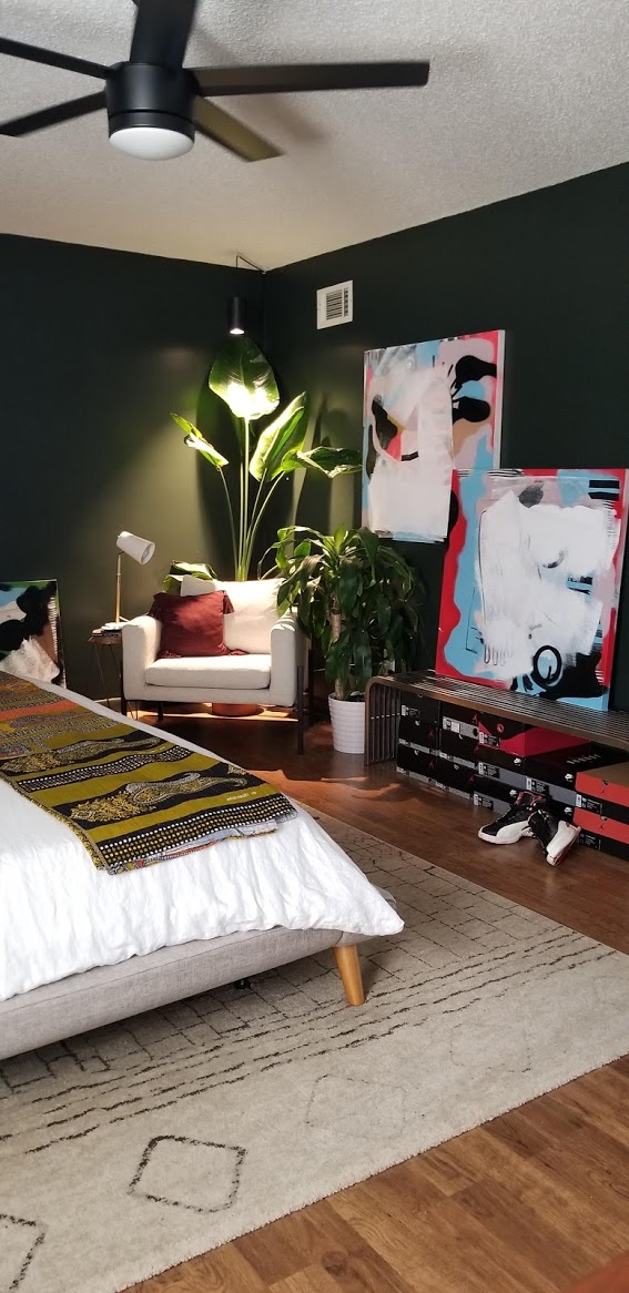
Carmeon had been planning and saving up for her bathroom renovation for years, so when we were given the opportunity to participate in ORC she already had a very clear vision of what she wanted for that space in mind. I pushed her to go a little further and also consider a makeover of the bedroom to go along with it. I knew there were a few things in the room that bothered her so I was like “girl! lets do this!”
Carm’s style is quite modern and even leans a bit minimal and masculine. She’s very much all about a space that’s well curated and often pared down. Her favorite designer is Kelly Wearstler so our goal was to create a Kelly Wearstler -meets -modern -Africana plant filled inspired master bedroom suite.
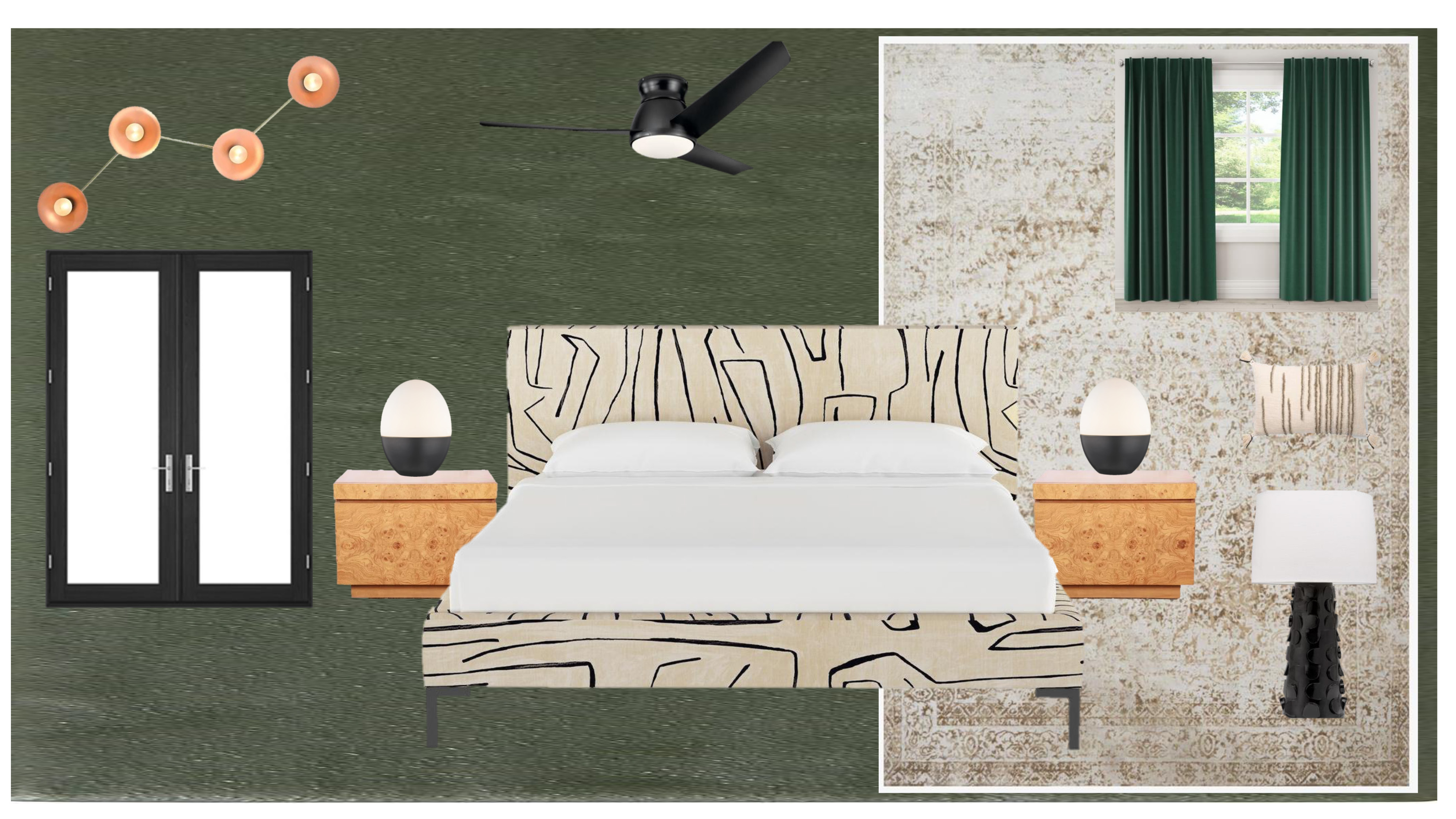
We started conceptualizing the design and knew the main features would include bringing back olive green, adding french doors to the master, a statement graffito print bed, adding a few new pieces to her already amazing art collection, and bringing in beautiful modern statement lighting. We also wanted to keep a few fabulous pieces that Carm already owned in the space…ahem…vintage burlwood nightstands. I still die everytime I see them. They are sooooo good.
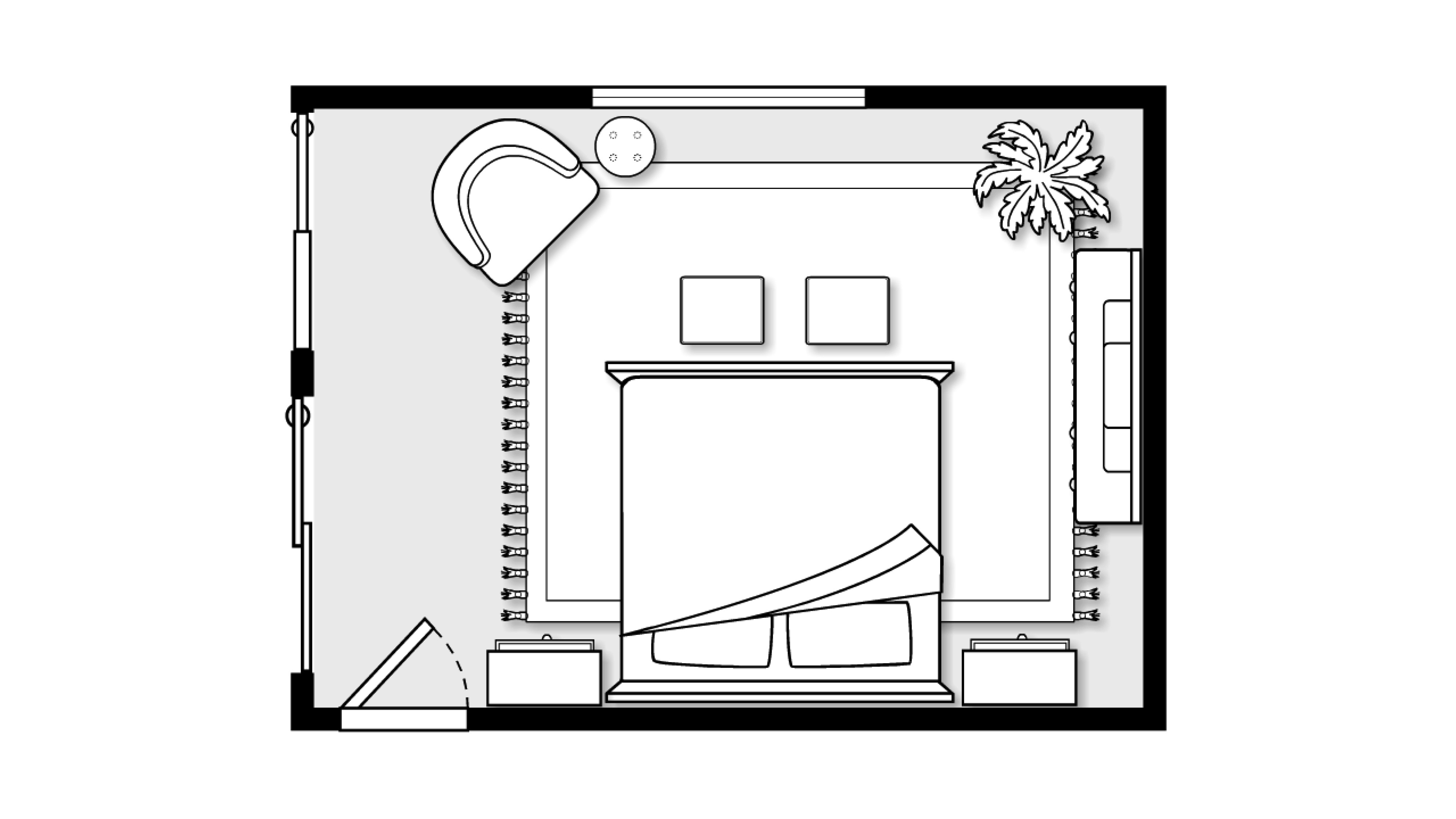
As for the layout, we decided to swap the position of the bed to accommodate the placement of the new french doors and work in a little seating area as well.
And here’s what the space looks like after…
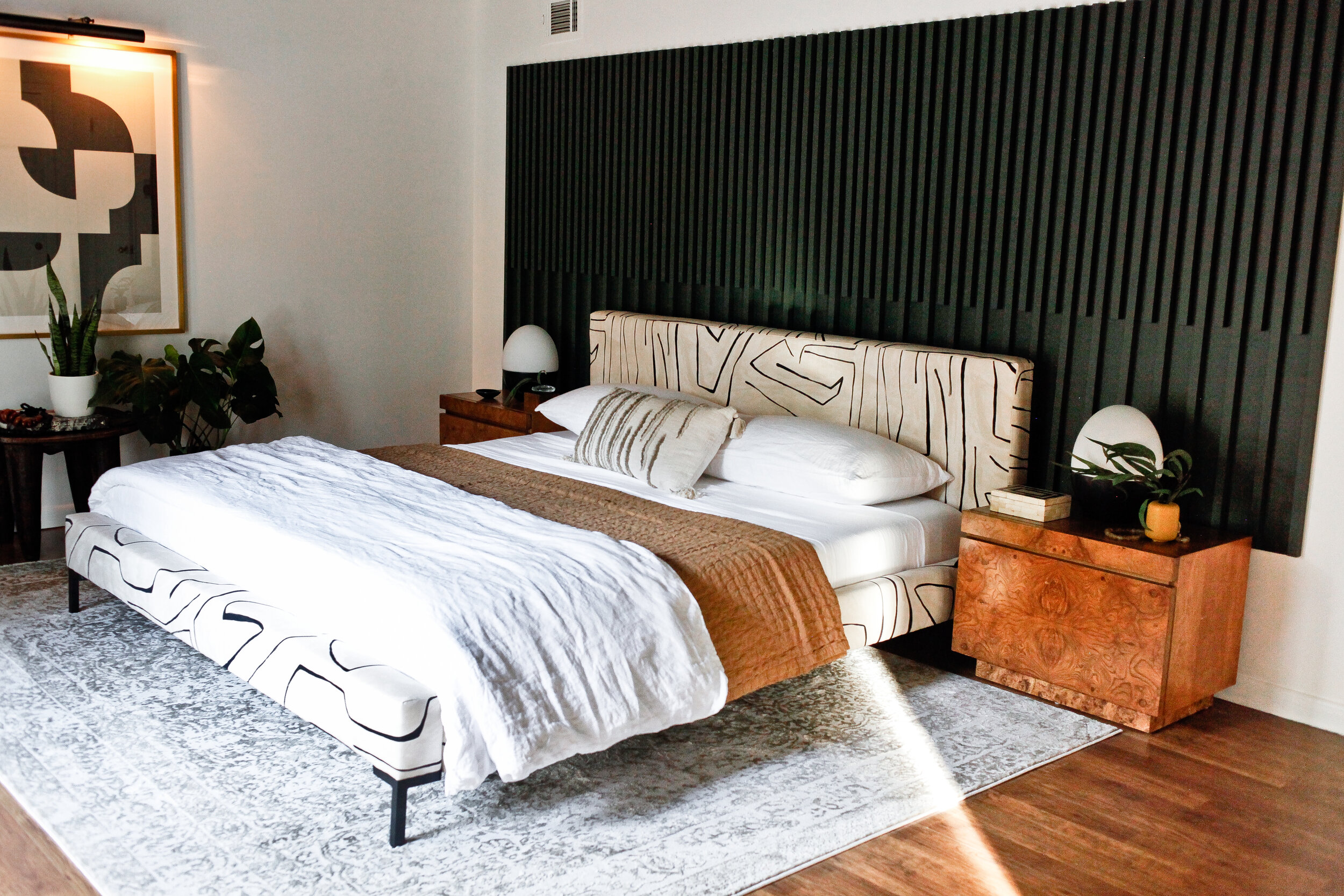
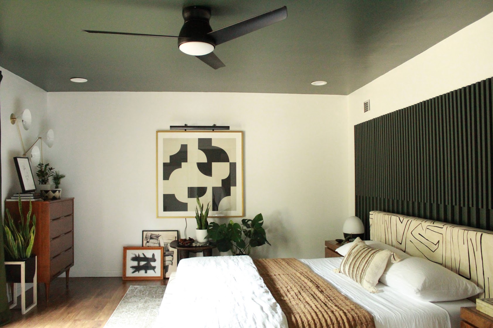
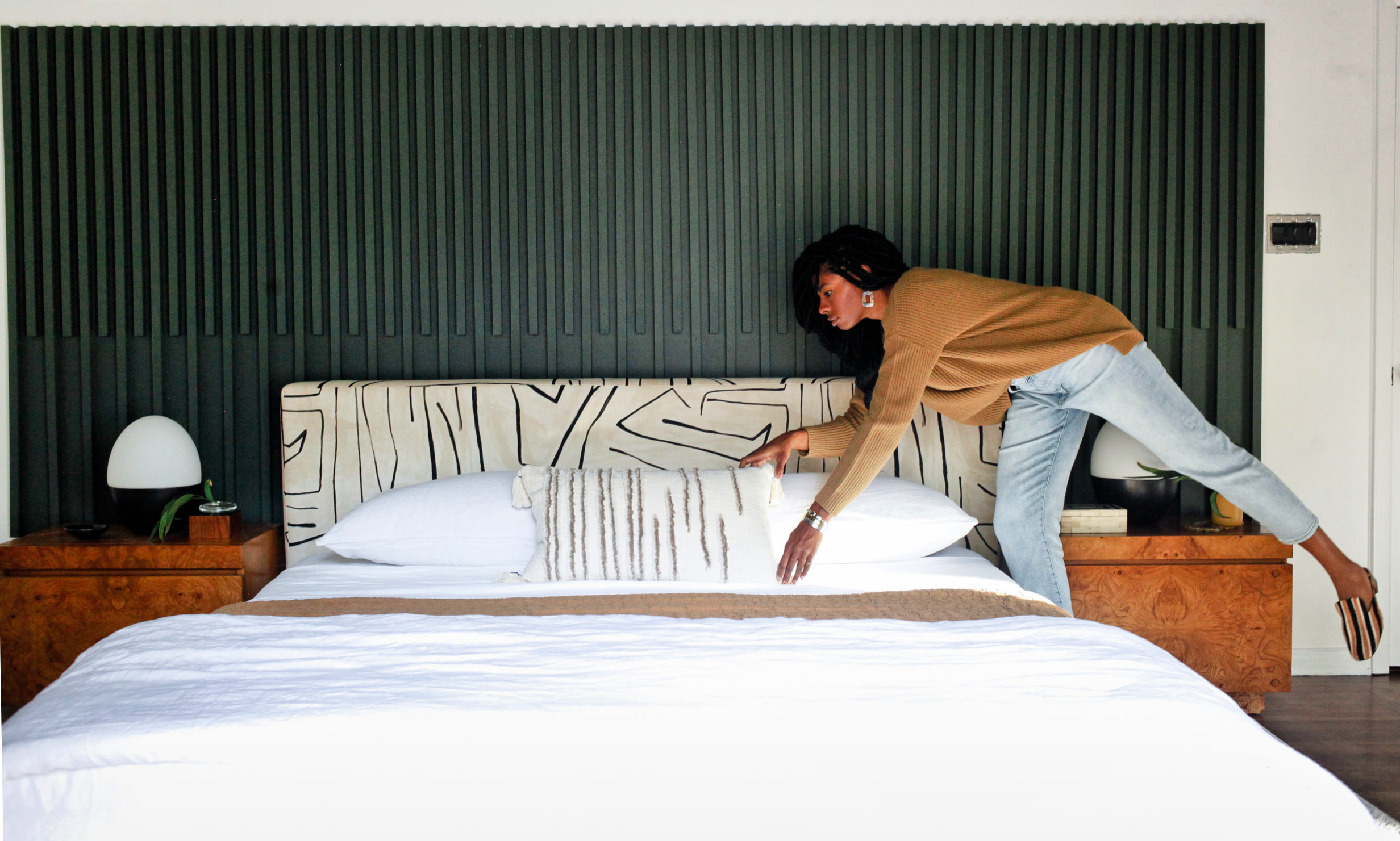
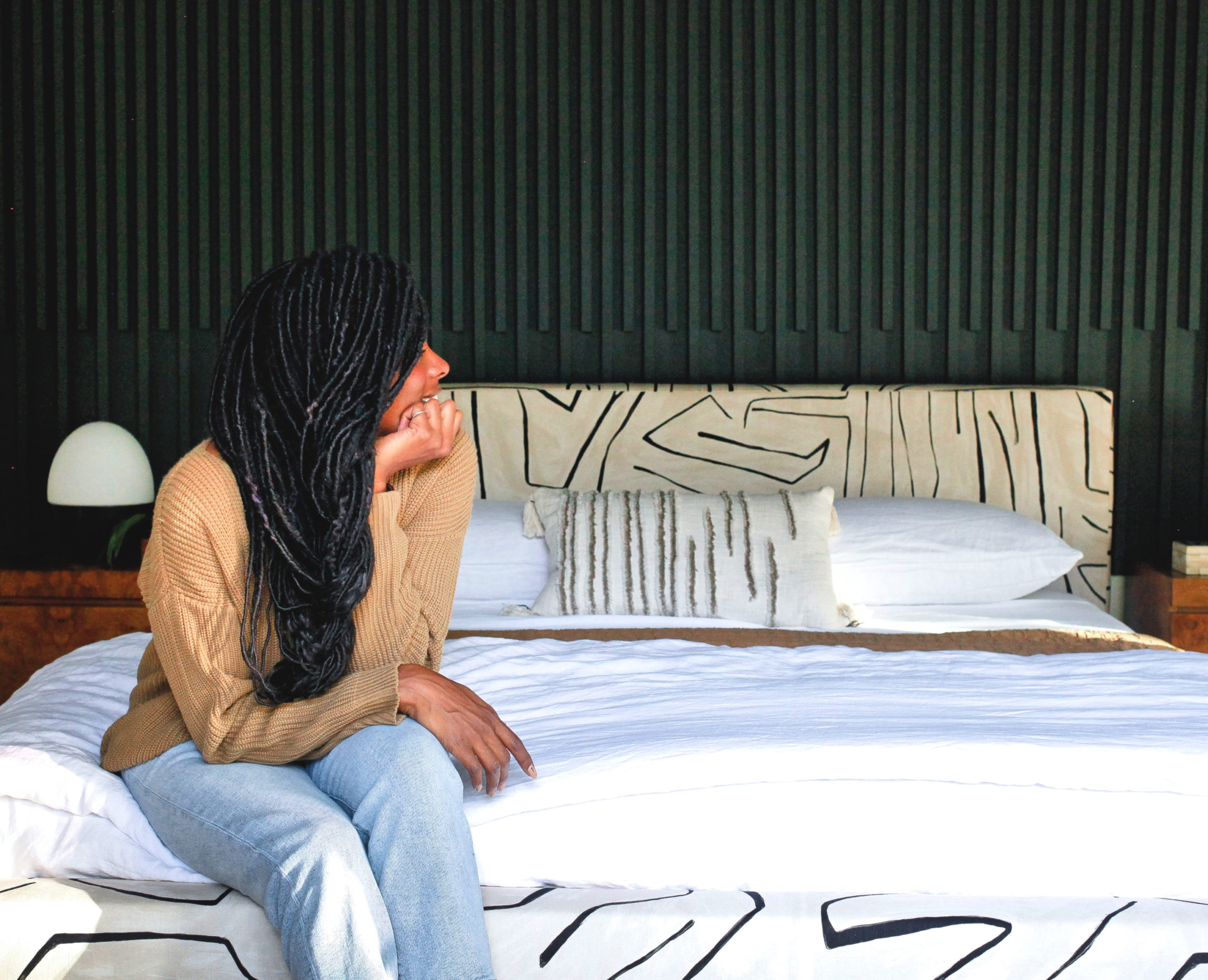
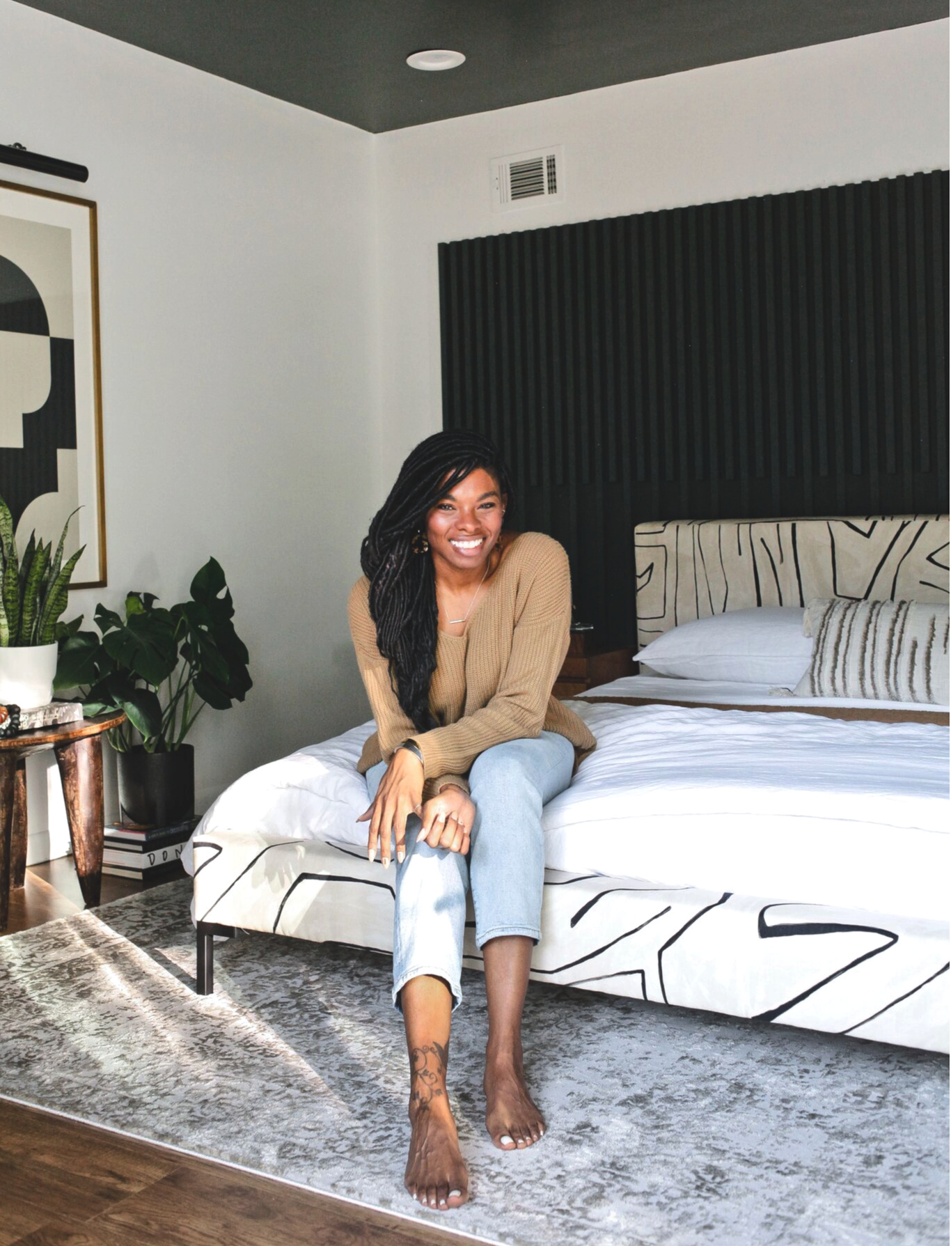
This space is all about the luxe details and the headliner is this gorgeous Deva Linen bed from Lulu & Georgia. This bed is Carm’s literal dream! Grafitto is her favorite print ever (she even hand painted a version of it on her entry walls) and we are so excited to have it be part of the design of this space.
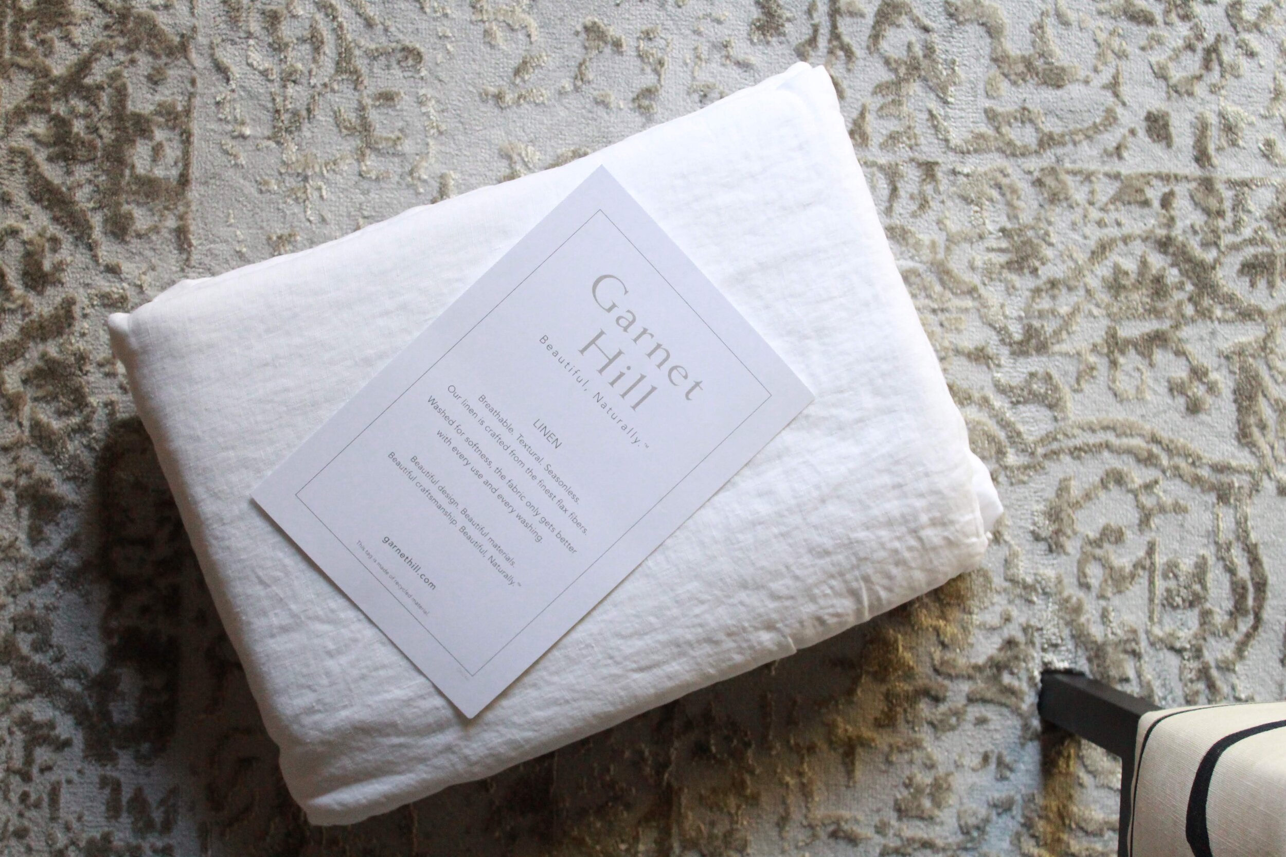
Because the bed is such a statement the bedding is kept understated and simple. My absolute favorite type of bedding is linen. I’ve slept on linen bedding for years and every time I try to venture out and switch it up I come right back to it. The crisp white relaxed linen sheets and cotton coverlet are both from Garnet Hill.
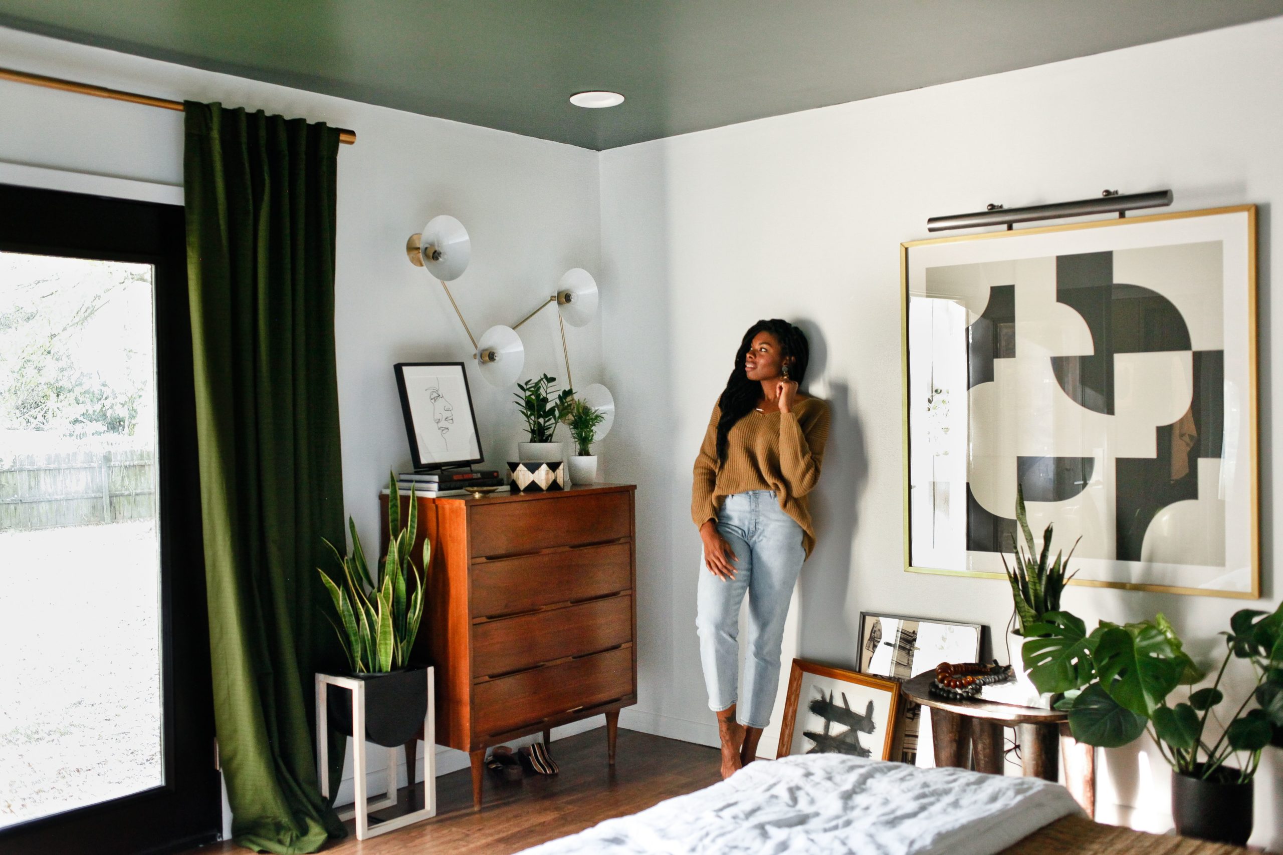
Probably the most shocking part of this makeover are the white walls! Everyone thought I would NEVER allow white walls to see the light day in this space and….. TADA!! #pivotabitch. So here’s the deal friends: 1. This isn’t my house! 2. Carmeon is an amazing designer with amazing taste. She had a vision for what she wanted her space to feel like and I was there to help her execute that. 3. We brought in a moody ceiling to accompany the white walls.
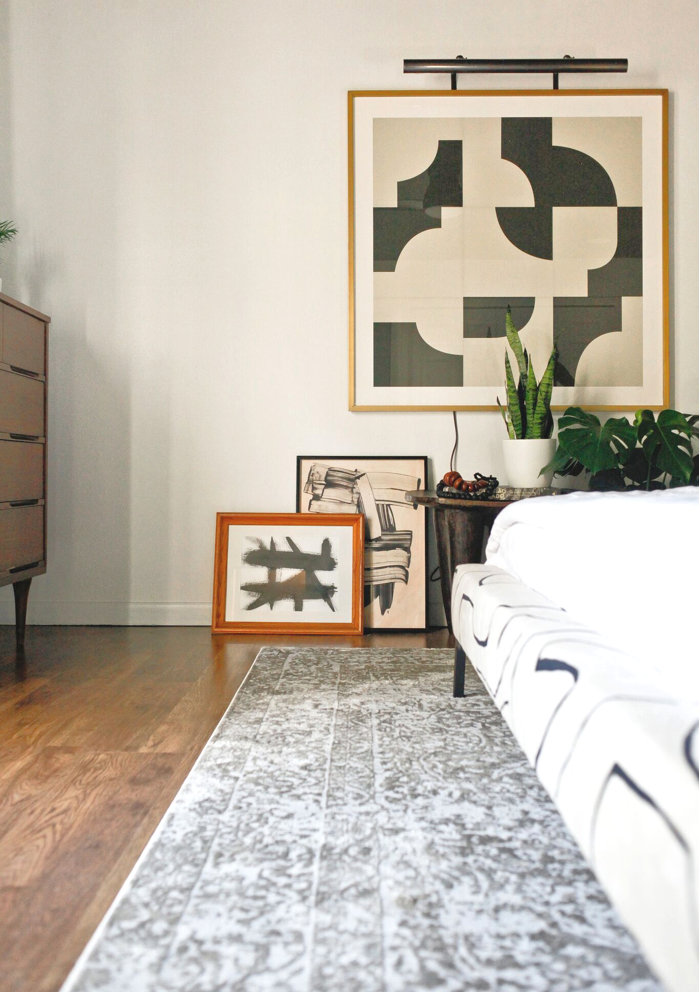
One of my favorite things about Carm is her love of art and her really impressive collection throughout her home. We brought back a lot of the pieces she already owned and also incorporated new pieces from Minted, including this large scale piece.
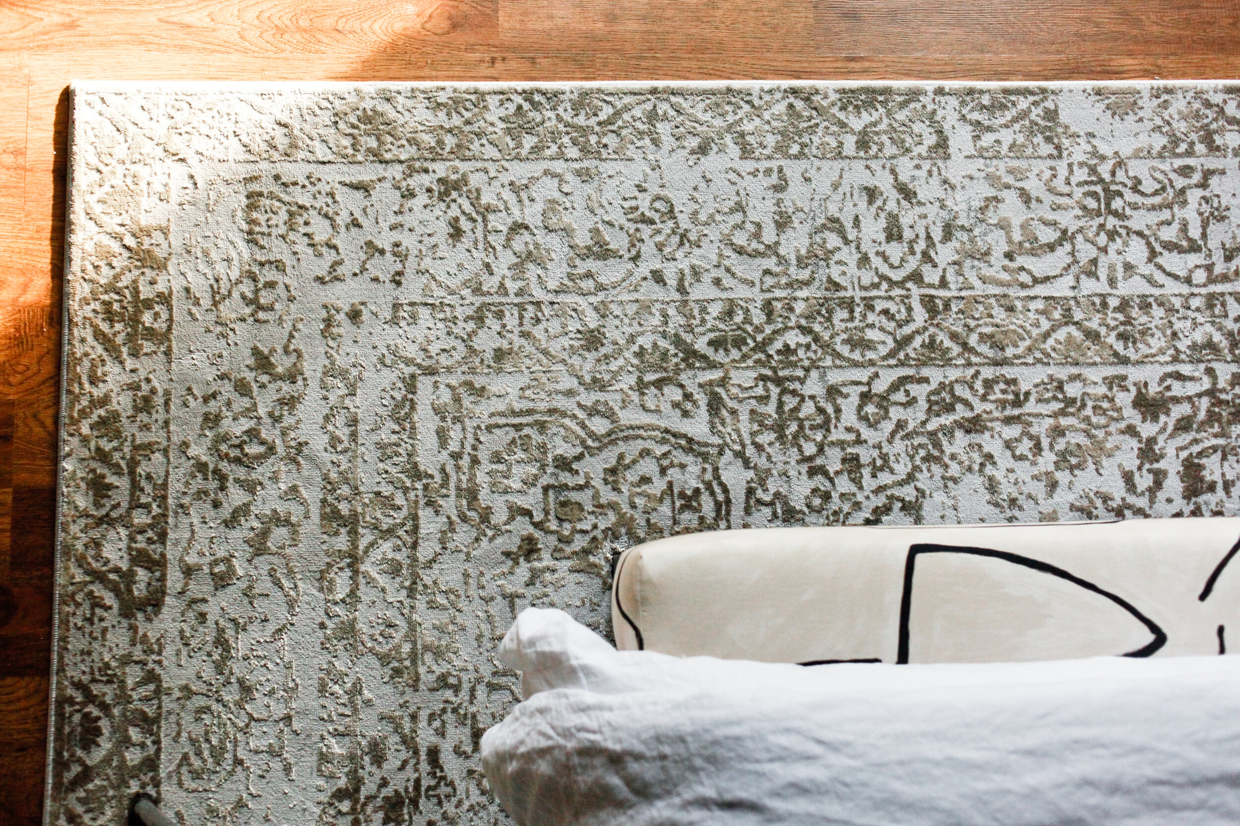
One of our favorite brands to work with is Loloi. We’ve worked with them several times before and are happy to be able to partner with them again on this project. We selected the Patina rug for the space and while it’s in the champagne and grey colorway it happens to pick up an olive tone in the room. I love the mix of pattern and texture in this space and the rug contributes to that in a major way.
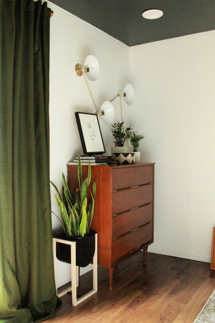
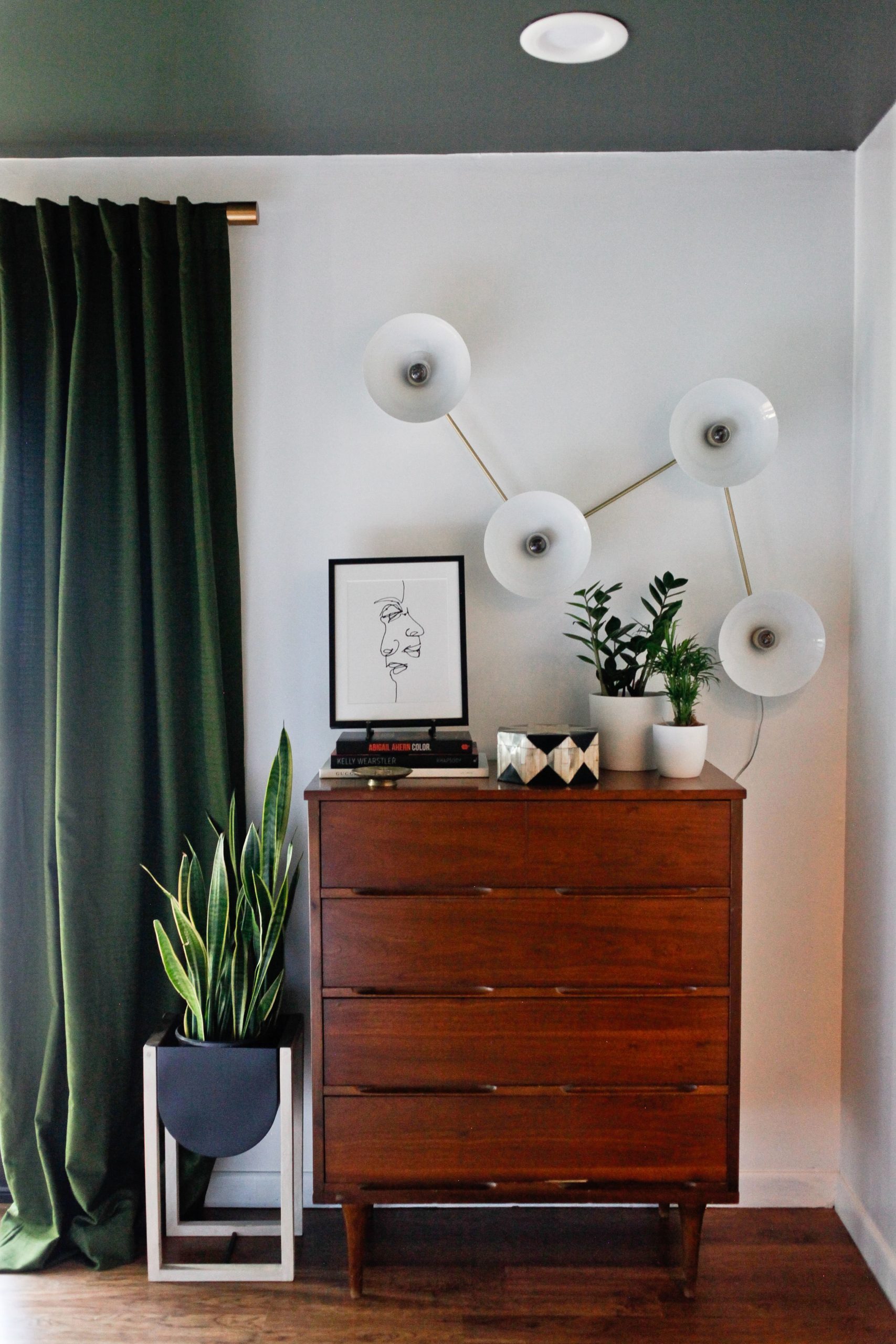
Both the bedroom and bathroom features beautiful high quality lighting and this Multi-Focal Wall Sconce from Blueprint Lighting is one of my faves in the space. I also really love the addition of the nightstand lamps from Mitzi. Mitzi is part of the Hudson Valley Lighting Group, which happens to be my favorite brand for lighting.
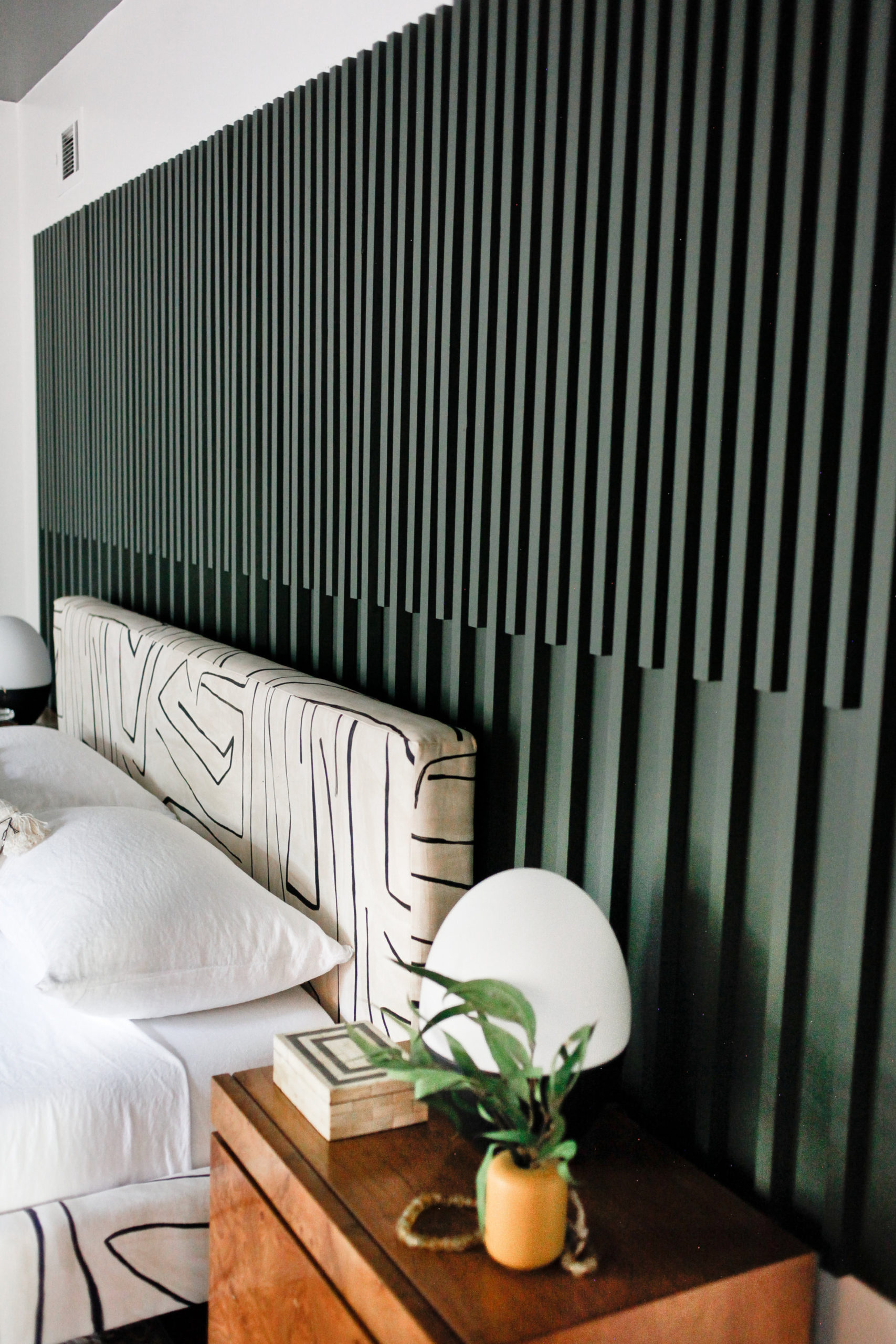
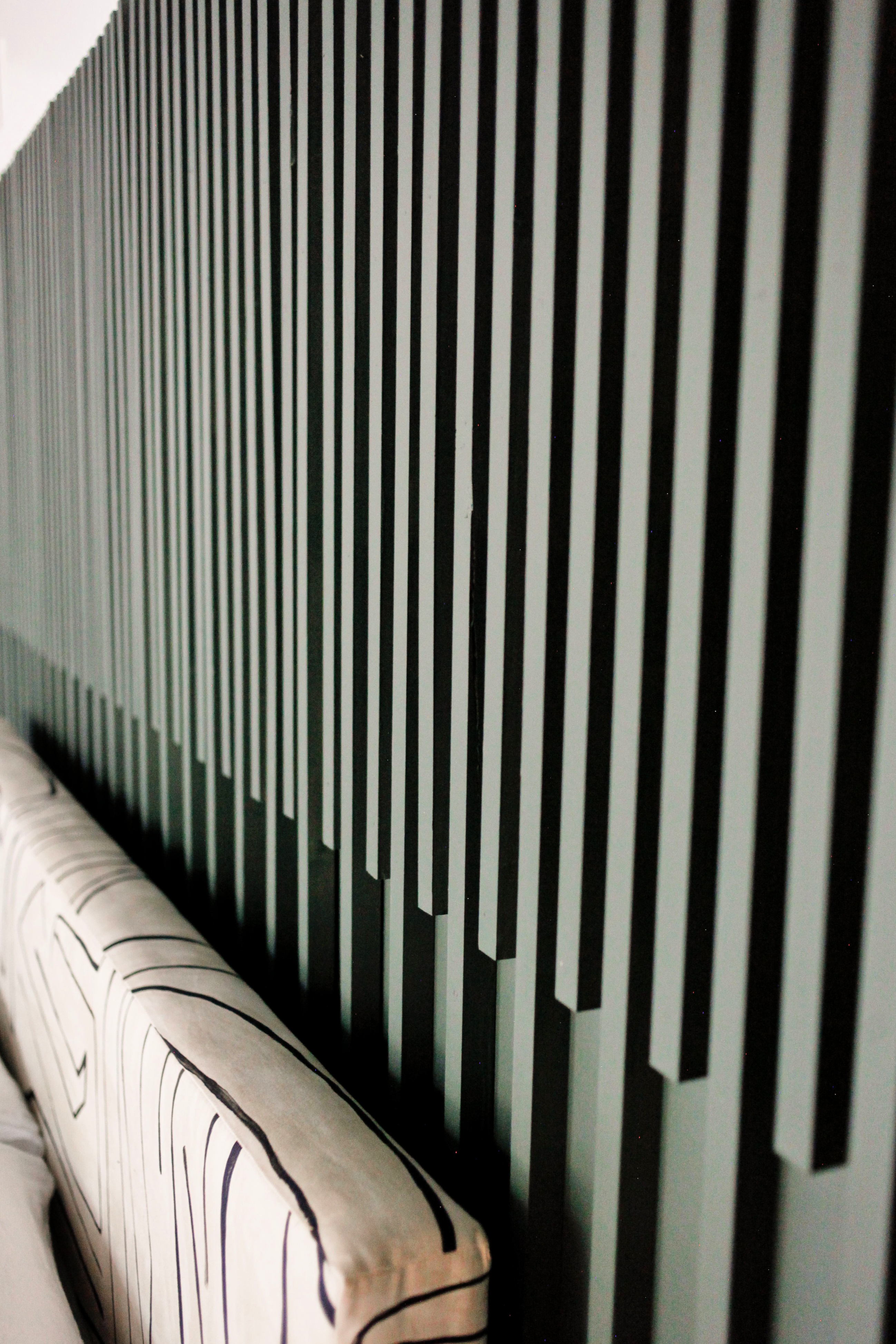
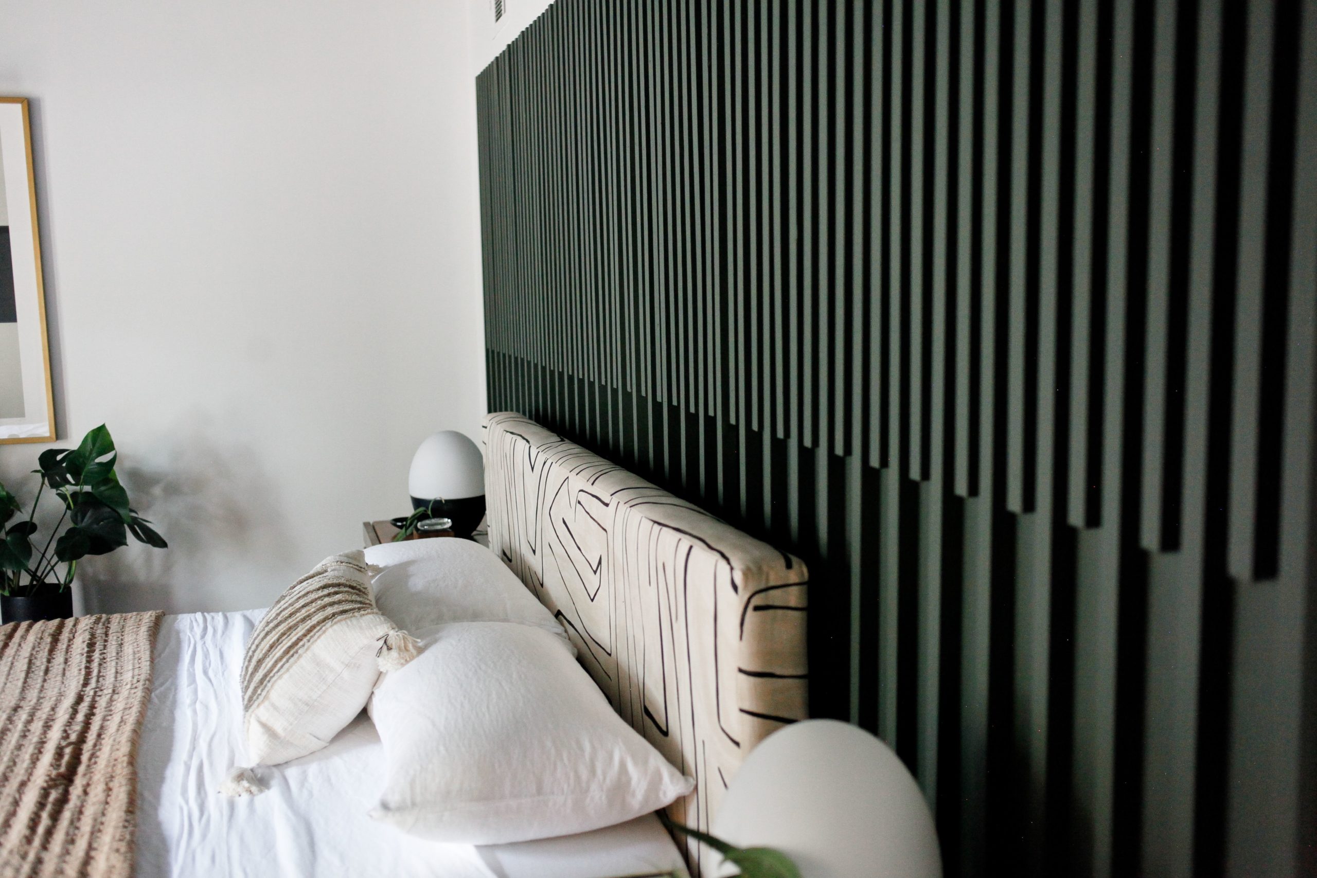
A huge visual feature in the room is this DIY slat board. Her house is a 70s ranch with mid century leanings, so she doesn’t have things like crown molding or wainscotting or other moldings in her house. We really wanted to add some architectural interest to the space so Carm put her handy skills to work and created this amazing slat wall which she wanted to feel more like art. She nailed it! see what I did there! Carmeon is breaking down how she did it all over in her blog post so make sure you go over and check it out.
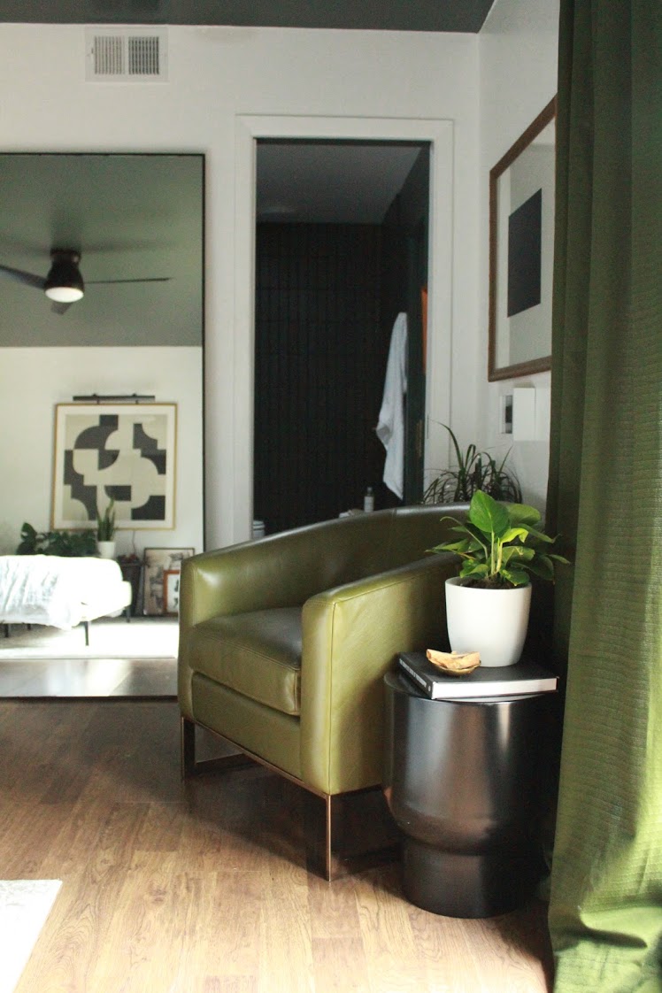
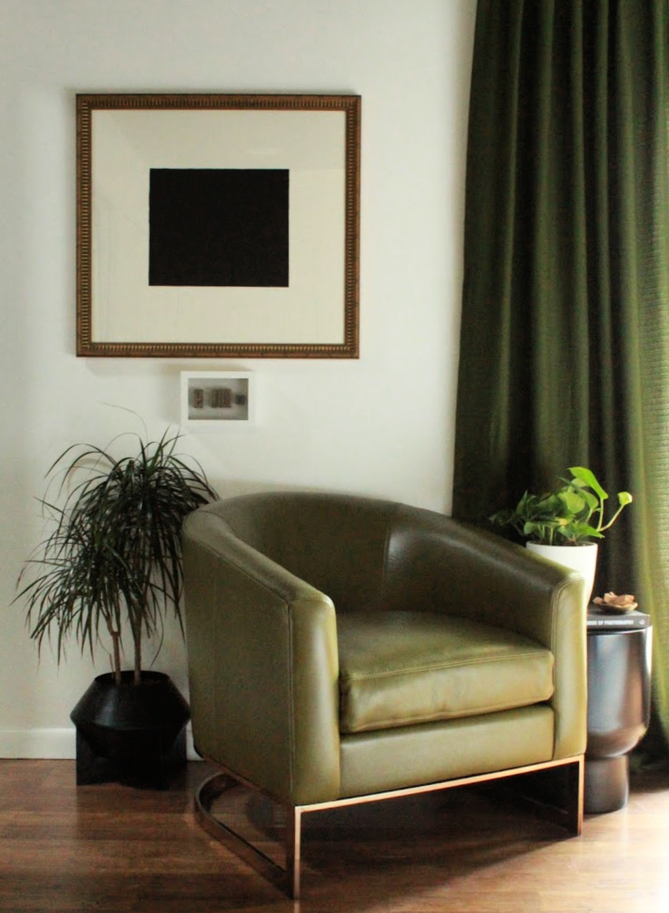
For the seating area we continued the theme of shades of olive with a leather Tina Metal Chair from Jonathan Louis. The leather is so soft and comfortable and the meal chair detail is really beautiful. Its the perfect spot to sink into a good book or enjoy a cup of coffee or tea…or wine! Jonathan Louis makes great quality furniture at an affordable price. I LOVE a lot of their upholstery. You can click here to find a retailer near you.
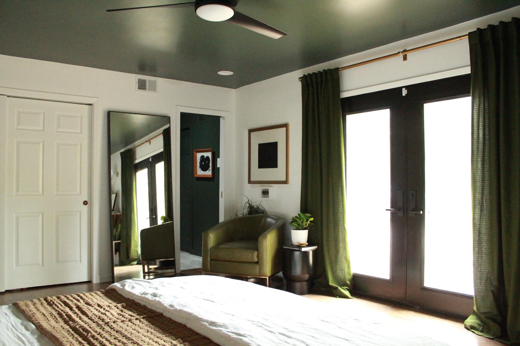
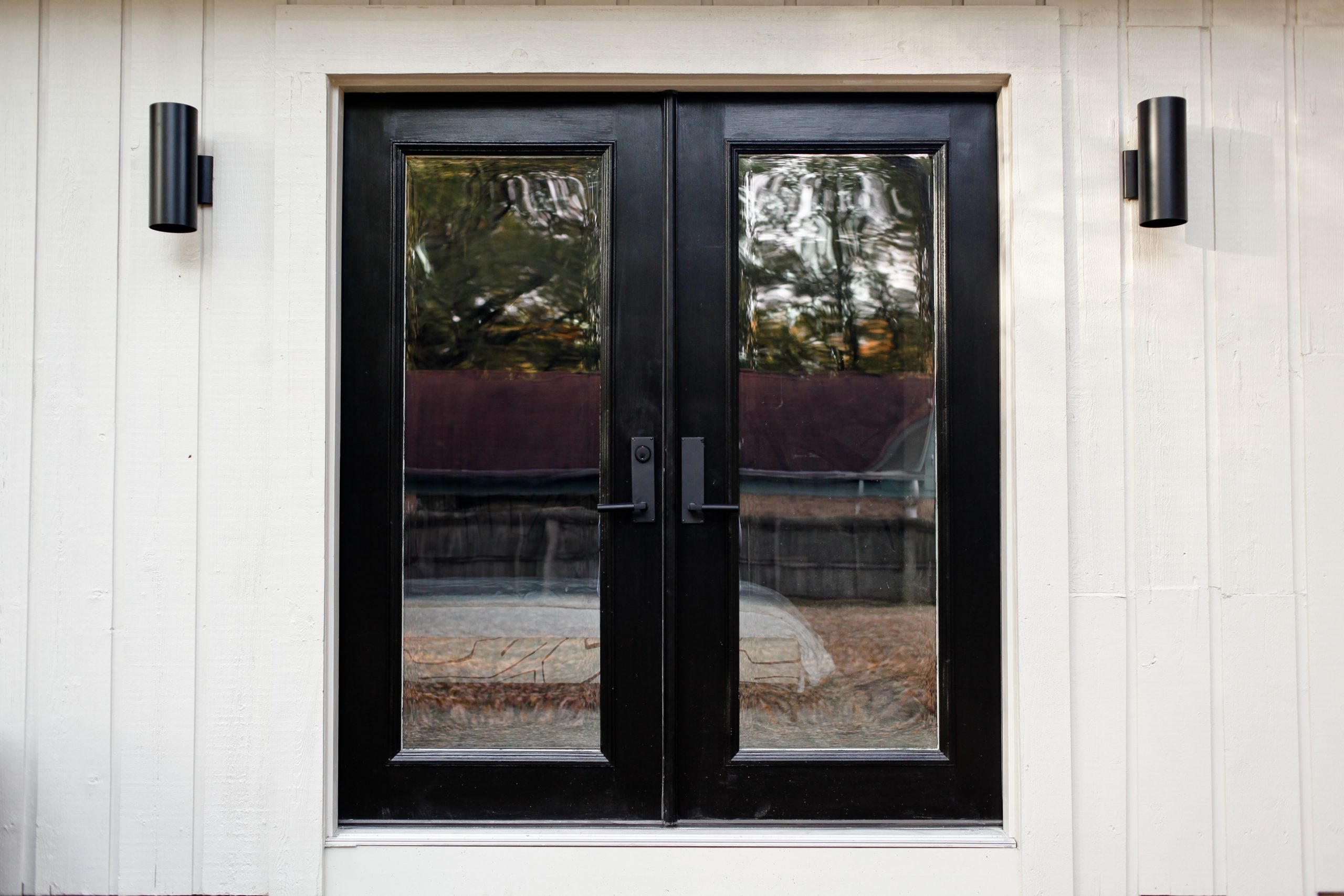
My favorite part of the entire makeover is definitely the addition of the french doors. Previously there was an oddly placed window which didn’t bring in much usable light anyway. The french doors just flood the room with the best light. Plus I just think there’s something special about having indoor outdoor access from a master bedroom. We are already plotting on the design of a patio space right off the french doors, so be on the lookout for future projects with that!
THE BATHROOM
As I mentioned before, Carm and Marcus had been planning their bathroom renovation for quite some time before ORC came along. They had been talking about what they would love their bathroom to look and feel like so we had a great head start in the design department. In fact, the design of the bedroom was very much pulled from what was to happen in the bathroom. Here’s what the space looked like before:
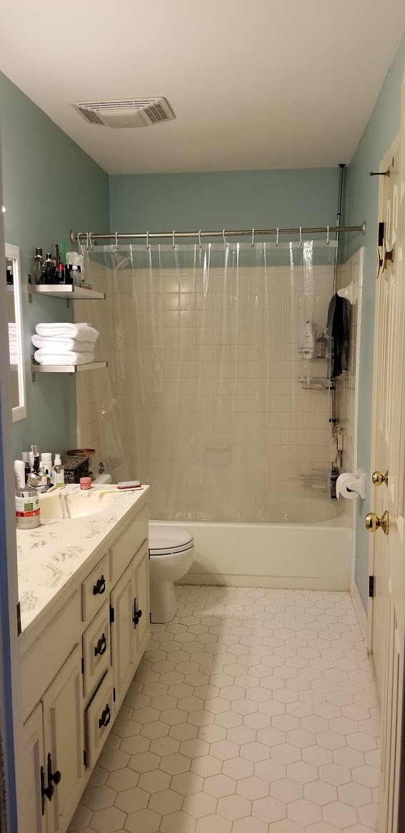
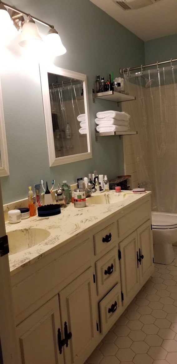
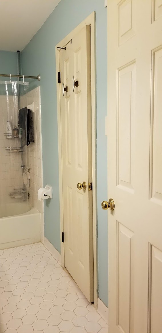
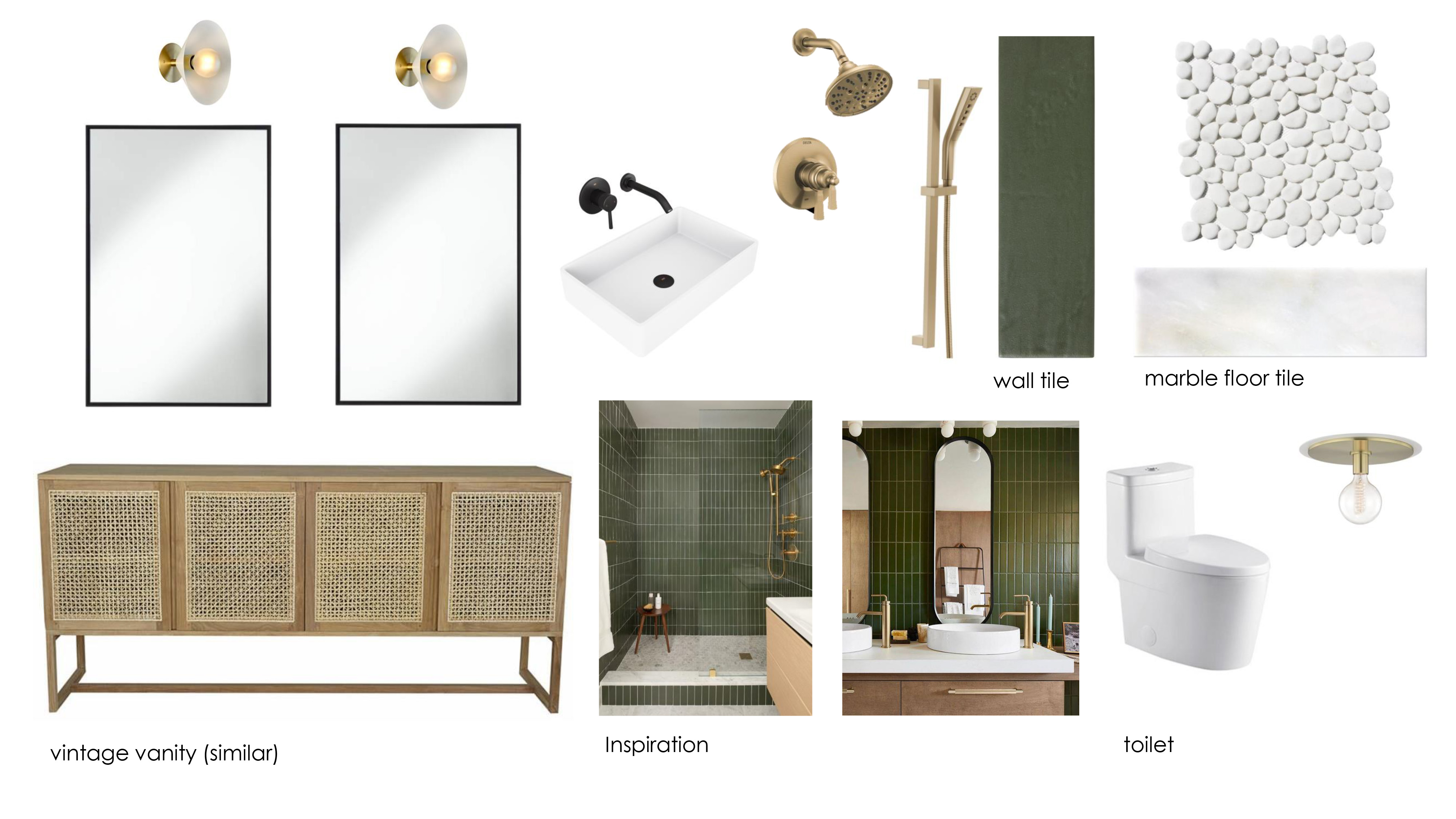
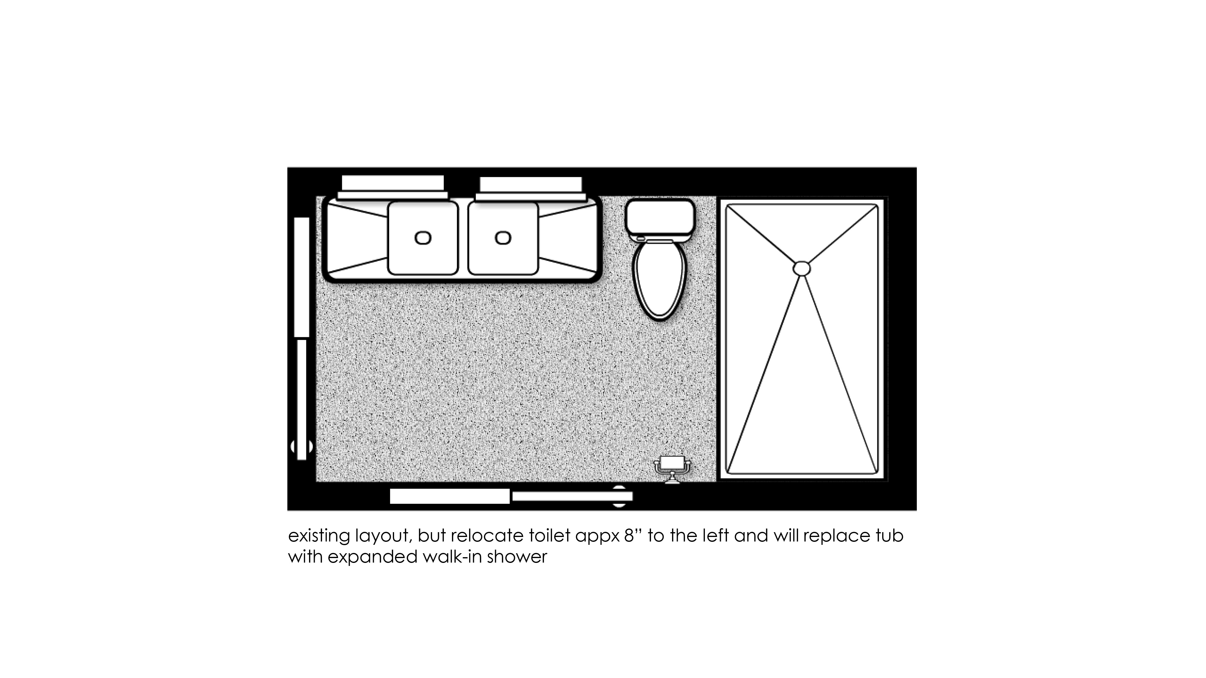
Let’s just say the space was quite dated. We believe it was in its original state from when the house was built so it was definitely time for an update. Here’s the mood board and layout we hoped to achieve:
Here’s what the space looks like now:
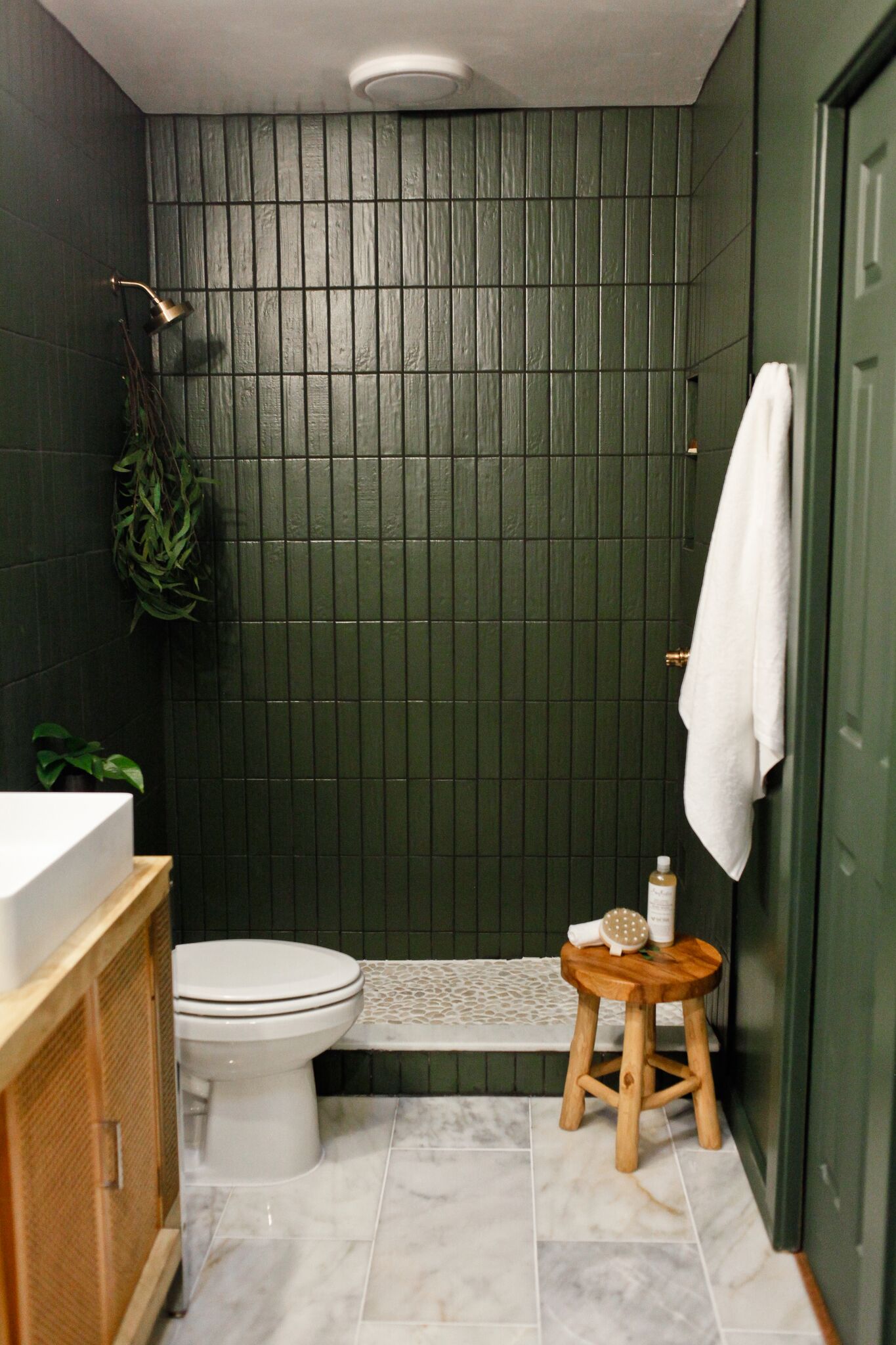
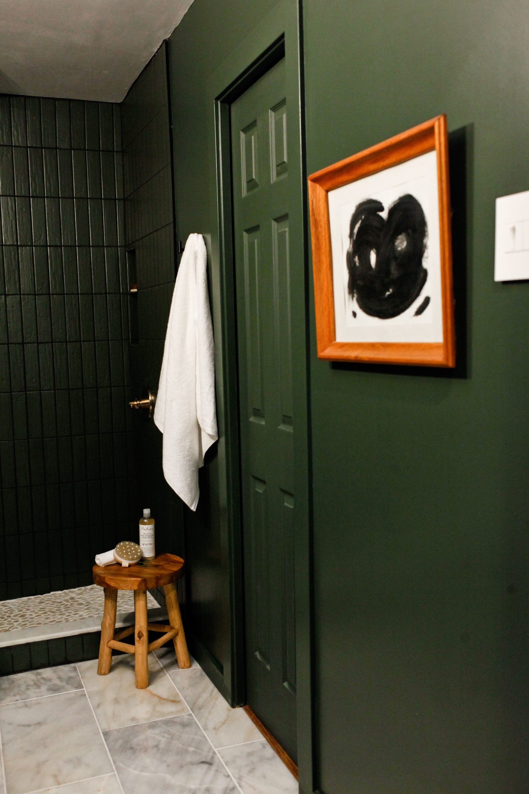
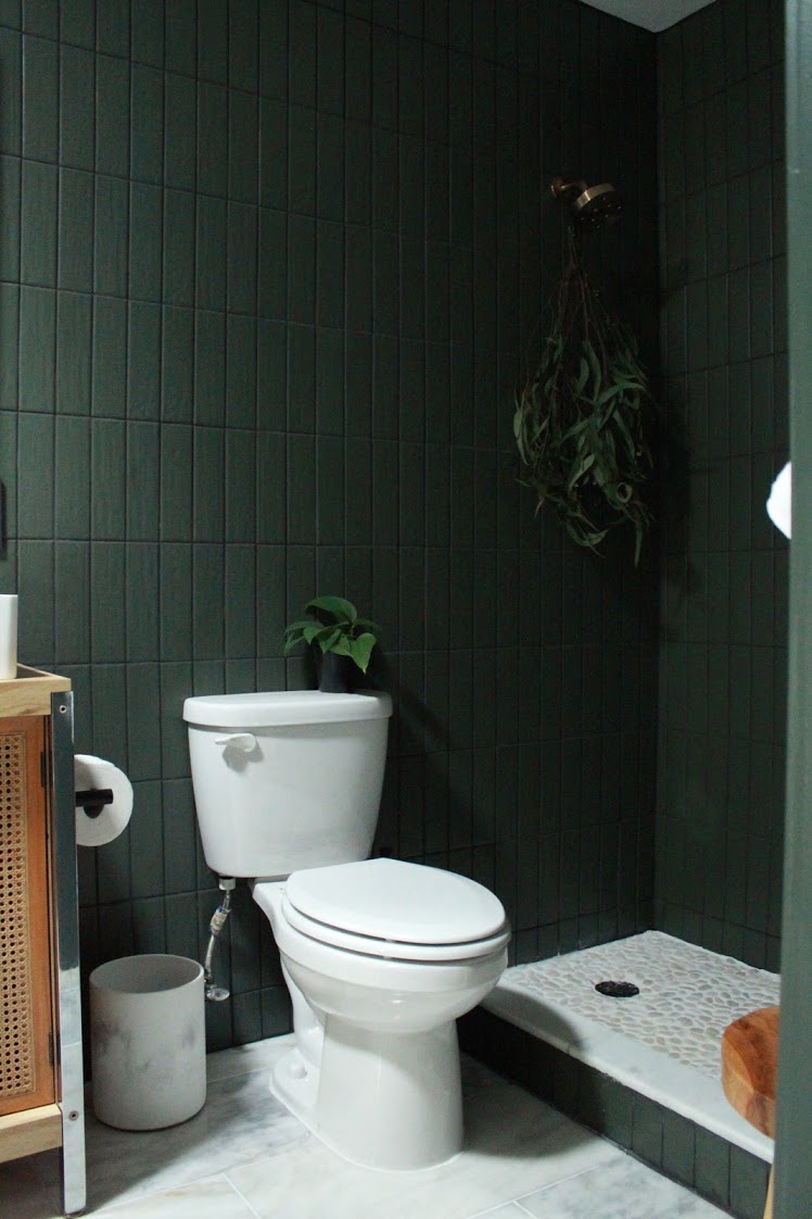
It’s now a super moody spa-like space with the most amazing materials. One of the biggest changes is that we took out the tub and replaced it with just a large shower. Carm never used the tub ever so it made much more sense to provide the function of a nice big shower for them to use instead. They are just waiting on the glass shower doors to be installed:)
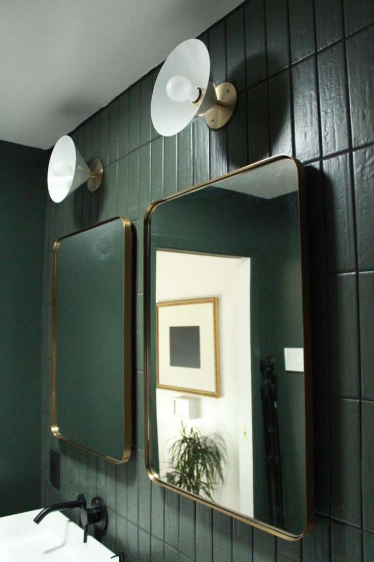
The starting point for the design of this space came in the selection of the tile. All of the fabulous tile in the space is from The Tile Shop. Carmeon and her husband took a trip to their local store in Memphis and made all the selections in person. For the walls and shower surround they chose an army green subway tile. There’s a slight texture which gives a handcrafted, imperfect look to them. For the floor they selected an oversized marble, which is just so gorgeous in person. And for the shower floor they chose a natural pebble mosaic.
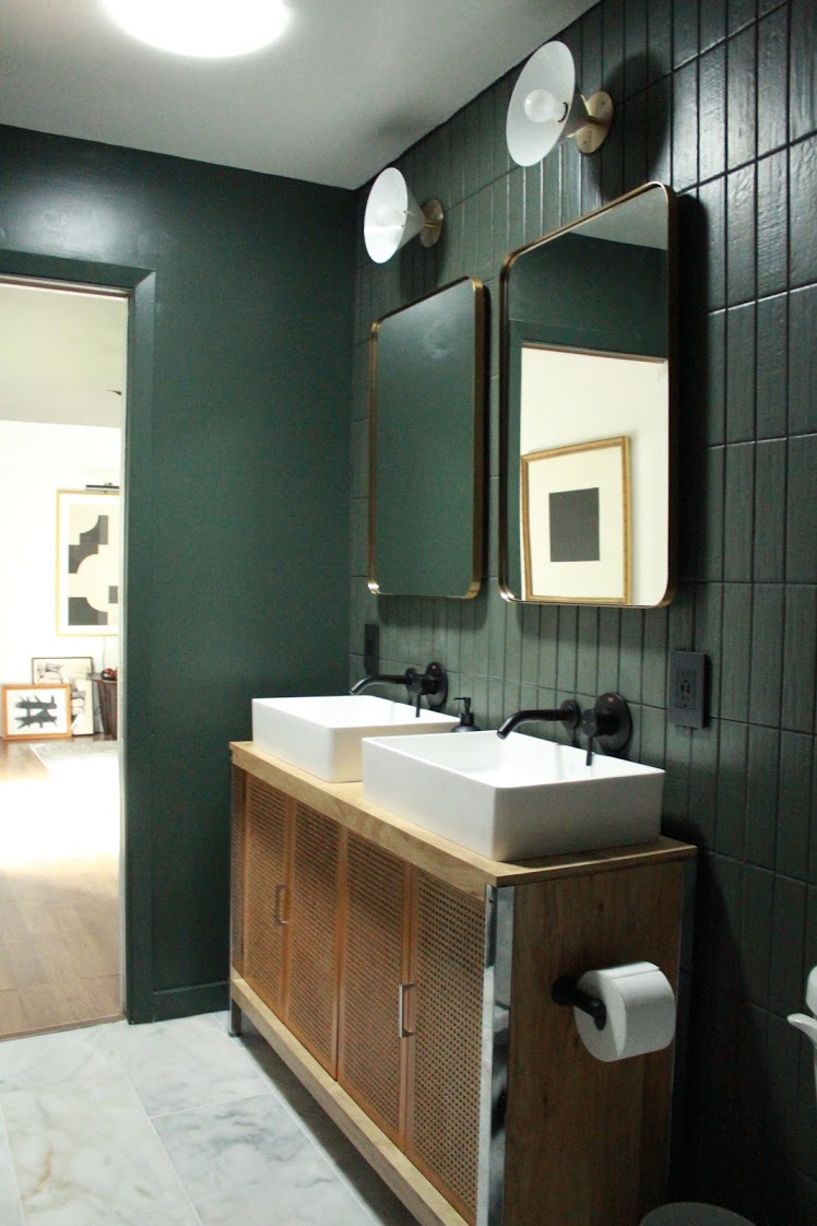
One of things we originally planned for the space was to bring in a skylight. I’m a HUUUUGE advocate for a bathroom skylight after having ours installed last year and we REALLY wanted to make that happen in this space as well. Especially since, like mine, it’s an interior bathroom with no window and no ability to add one. After having several contractors and the local Velux team in Memphis come out and take a look at their space we were so bummed to find out that their roof wouldn’t allow for one. But all was not lost. We decided on the next best thing to a skylight: a VELUX Sun Tunnel® Skylight. The VELUX Sun Tunnel® Skylight is a fast and affordable way to transform your space with natural light. They are non invasive, don’t require major construction, can be installed in only a matter of a couple of hours, and they’re perfect in lots of different spaces! It was such a great way to bring in much needed light in here.
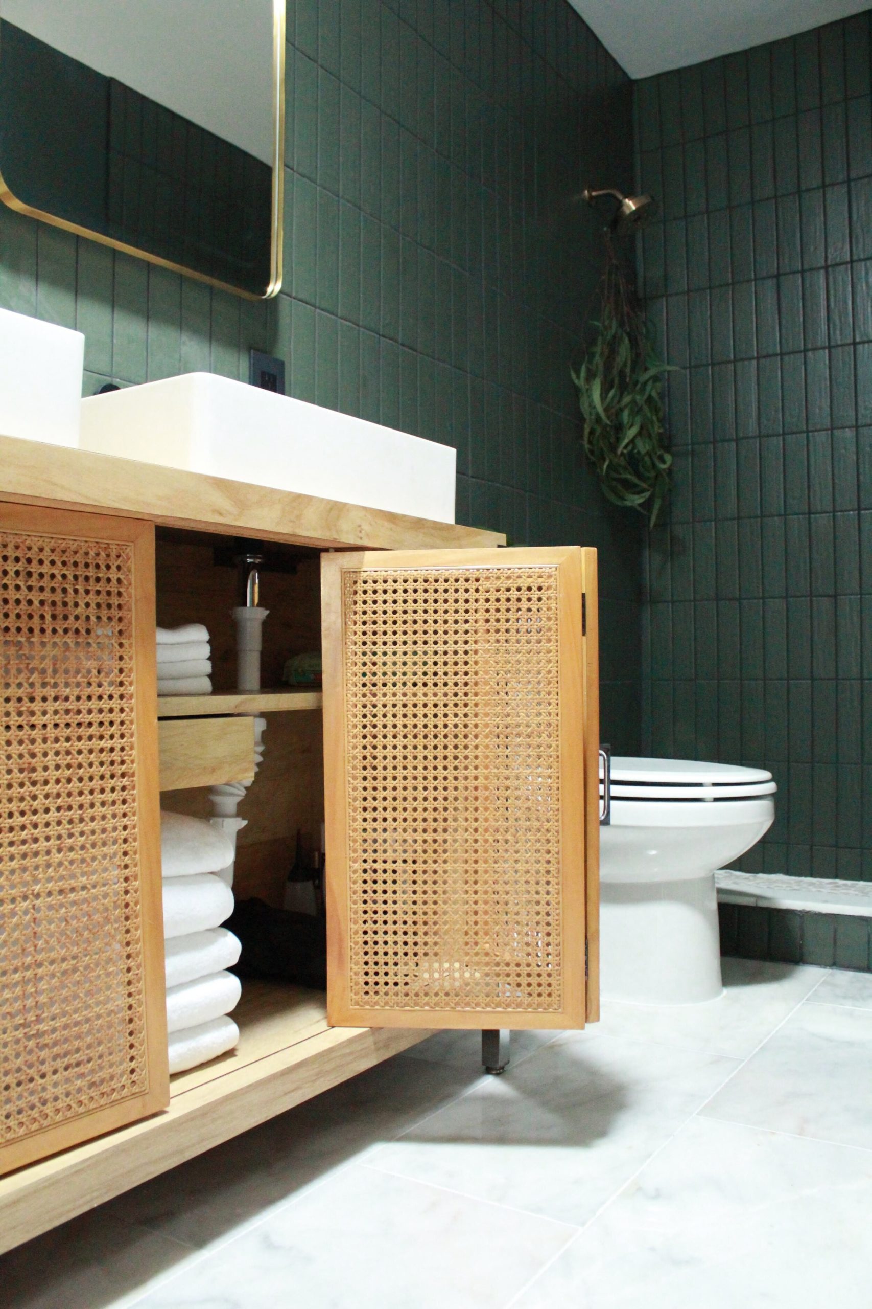
Carmeon has a knack for finding the most amazing vintage furniture and this vanity is no exception. She found a console cabinet months ago at a local vintage store and decided to turn it into their bathroom vanity. I LOVE the cane detail and I think it looks so fabulous against the moody tile. It adds the perfect natural wood element to the space.
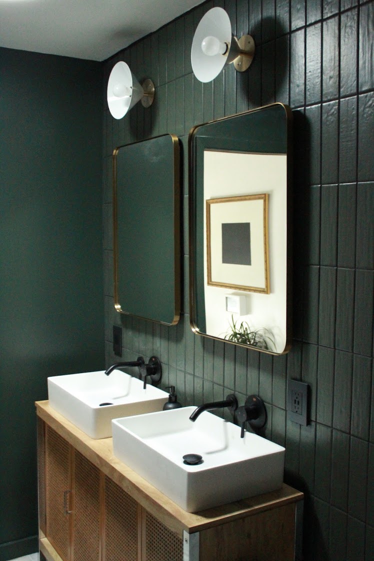
We continued the same lighting style as the bedroom in this space with these Focal Point Wall Sconces from Blueprint Lighting. The mirrors are from Amazon, and Carmeon has a DIY tutorial coming up on how she created the vanity medicine cabinets which the mirrors cover up!
This makeover process came with a lot of ups and downs and through it all Carmeon stayed positive and persevered. In the end she has two beautiful spaces and I’m so so thrilled for her. Design is always really fun for me and I love what I do, but I love it even more when I get to do it with my best friend.
Now make sure you all head over to Carmeon’s blog for even more details about the space, and to get all the links to all the things. Also be sure to head over to and check out the video tour of both spaces over on her IGTV!
Thank you so much Linda for inviting us to work together for this One Room Challenge. Thank you so much to all of you for sticking with us through this process and cheering us on every step of the way. And finally, a HUGE thank you to our amazingly generous sponsors for helping us bring our vision to life. We are so appreciative and we couldn’t have done it without you.
Until next time friends…
Sponsors & Sources
The Tile Shop | Lulu & Georgia | Behr Paint | HANDy Paint Pail | Lowe’s | Blueprint Lighting | Emtek Products | Loloi Rugs | Jonathan Louis | Minted | Hudson Valley Lighting | Kichler Lighting | Empire Molding & Millwork | Legrand | Garnett Hill | Tierra Del Lagarto | Bathroom Butler
Paint colors: Behr Ultra Pure White and North Woods. Both in Behr Marquee formula
Window Curtains: Amazon (not sponsored)
Sinks & Faucet: Vigo (not sponsored)
Shower Hardware: Delta (not sponsored)
Wood Stool: Home Goods (not sponsored)

Liz says
LOVE this! So moody and textural, but timeless. Bravo!
Vanessa says
The green ceiling in the bedroom is lovely, it gives the room a sophisticated look.
Cassie Bustamante says
worth the wait- it is EPIC!!! that wall and that headboard!!!
Jewel says
I can’t even begin to pick a favorite part!!!! I love the headboard, green, tile, art, lighting…basically all of it! Worth the wait!
Darcel says
You had me with all of the green. I absolutely love both spaces! I particularly like the wood slat design behind the headboard and the bathroom vanity.