**This post is in partnership with Sherwin-Williams®. I am a Sherwin-Williams brand ambassador. All thoughts and opinions are my own.**
Hi friends!
Ok so even just typing out the title of this post gave me heart palpitations. How on Earth is our little guy ALREADY a teenager? My momma heart can’t handle it. No matter how much I want to keep him little for as long as possible he is indeed growing up, and this meant it was time to give him an updated space fit for him to head into high school. Yup, High. School.
One of the projects on our Home Goals list for this year was to give Michael’s an updated look now that he’s a teenager and will be going into high school next year. There were several goals for this space and even though it’s the smallest room in the house, it has to be super functional for him as he’s requiring more out of it now. It started with him wanting to change to a different rug and it quickly spiraled into a full-on complete overhaul….including removing all the old paneling and putting in all new sheetrock to create smooth new walls. An updated color palette and fresh paint set the stage for his new space. Here’s a look at what his room looked like before:
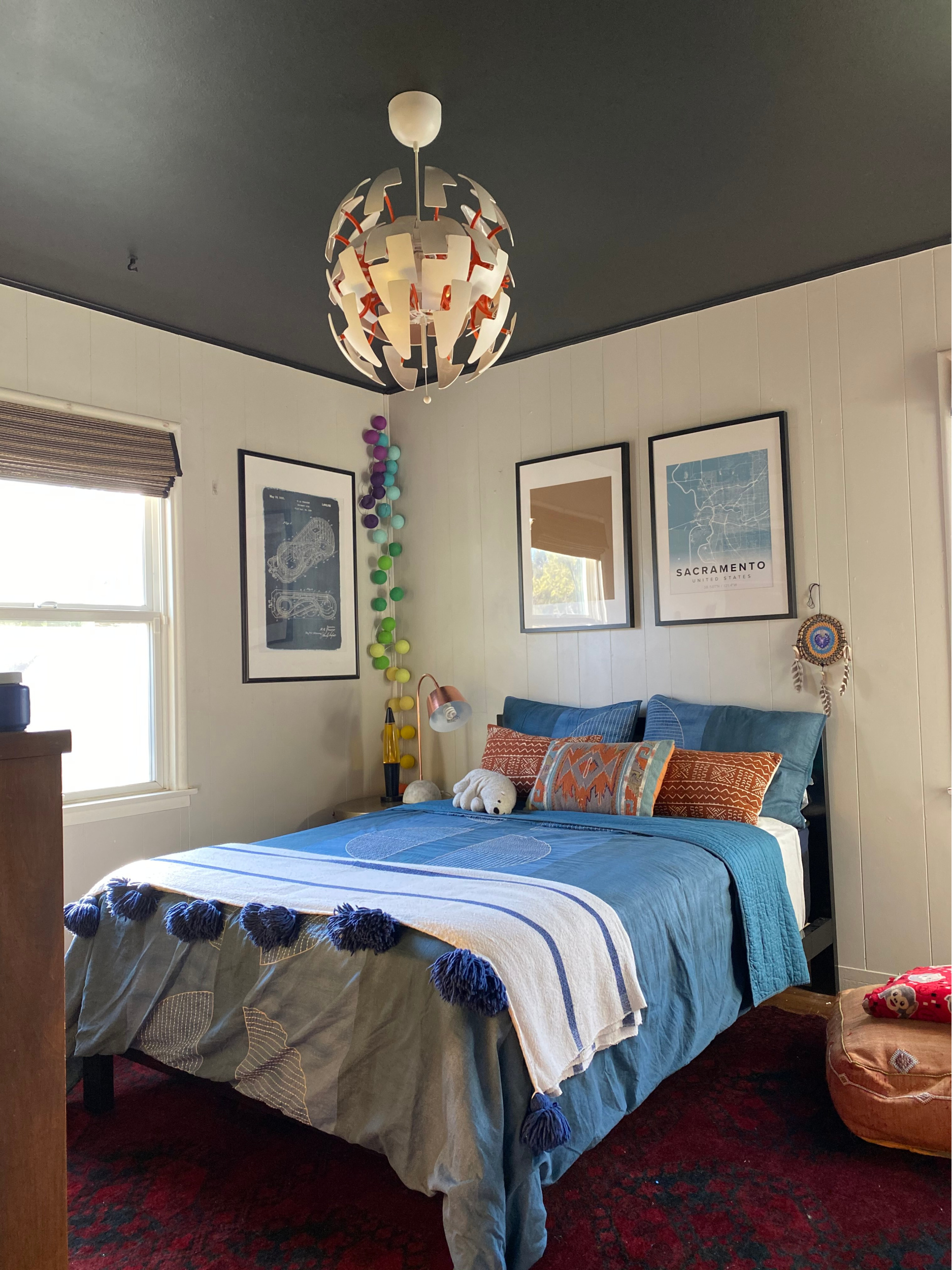
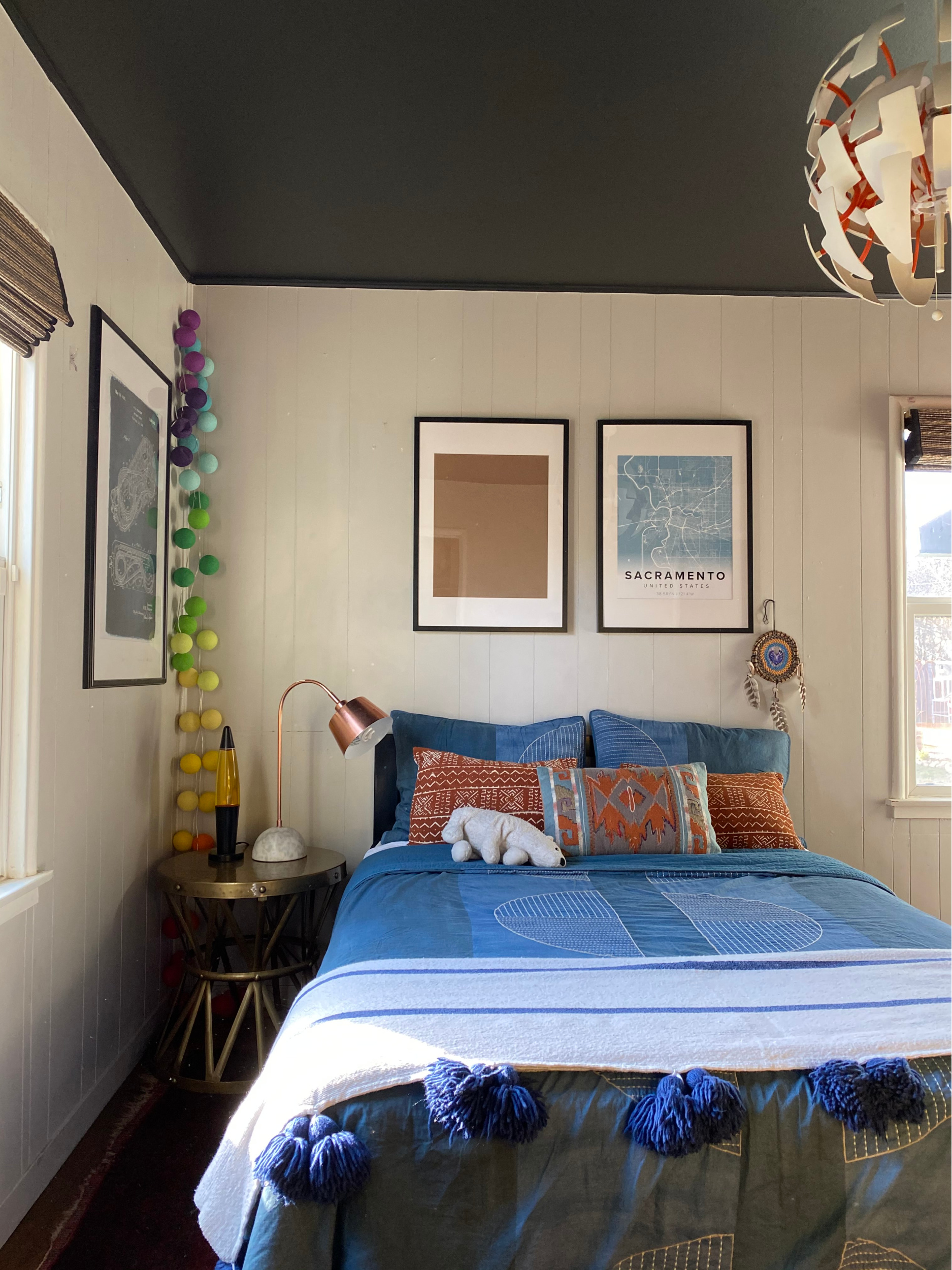
It wasn’t terrible, but it definitely had room for improvement. His previous room was indicative of life pre-COVID and since so much has changed with our day-to-day, we prioritized making changes that would contribute to what he needs it to be now. We had to get a desk area in here so he has a quiet and comfortable place to attend class every day. We also needed to get in some good storage.
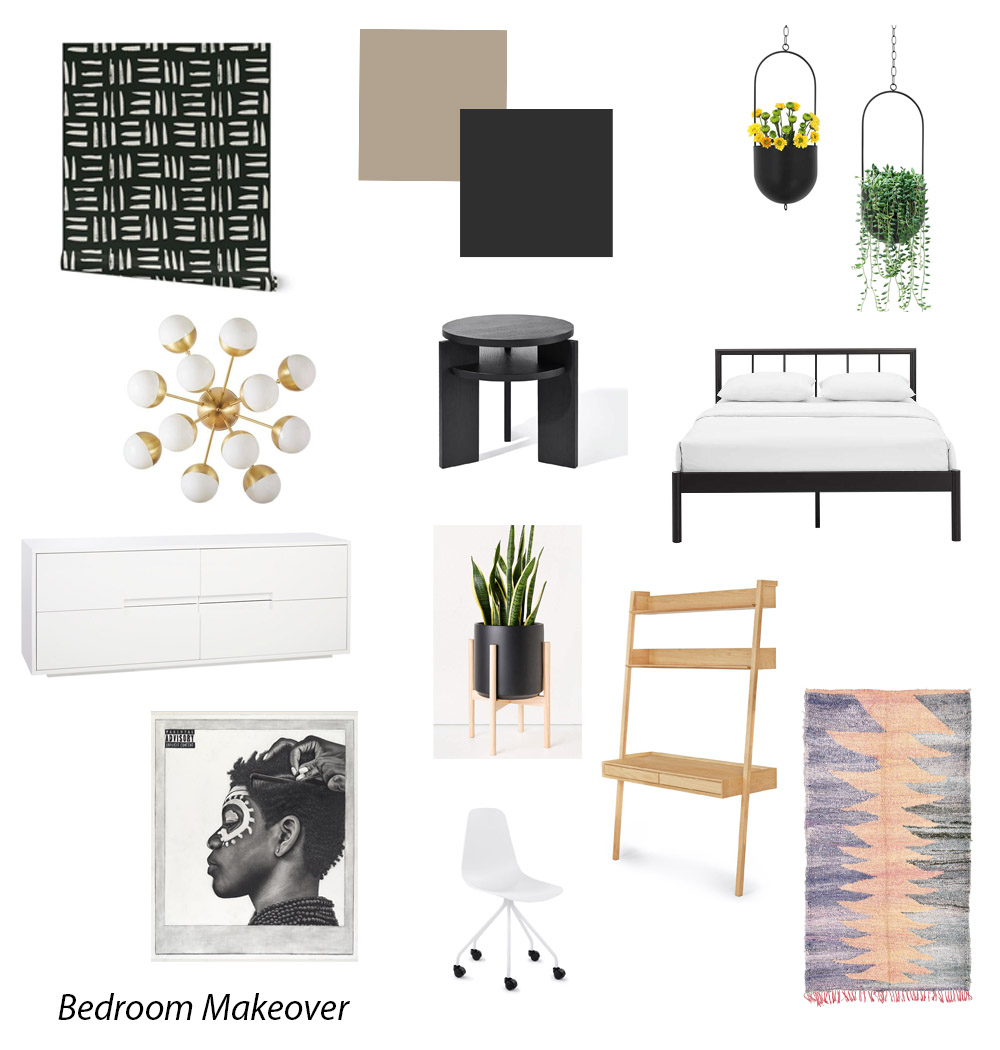
Michael helped with the entire process of designing his new space. He selected the paint color, furniture pieces, accessories, etc. He wanted a room that was modern and fresh and much more grown up. I wanted to make sure his space truly reflected all the things he loves: art, photography, anime, Schitt’s Creek and plants. He also specifically asked for a muddy neutral wall color and wanted lots of black weaved in since that’s his favorite color. Here is the design mood board I created based on his choices and selections:
For the walls and ceiling we chose Sherwin-Williams Tony Taupe SW 7038, and for the doors, baseboards and window trim we went with my tried and true Tricorn Black SW6258. I was very pleasantly surprised by how much I actually really really love the color of the walls. Tony Taupe is a gorgeous warm neutral and it provides the perfect tie in for all the elements of the room. It’s such a strong neutral color, but it also holds its own in the space as well. Here’s what his space looks like now:
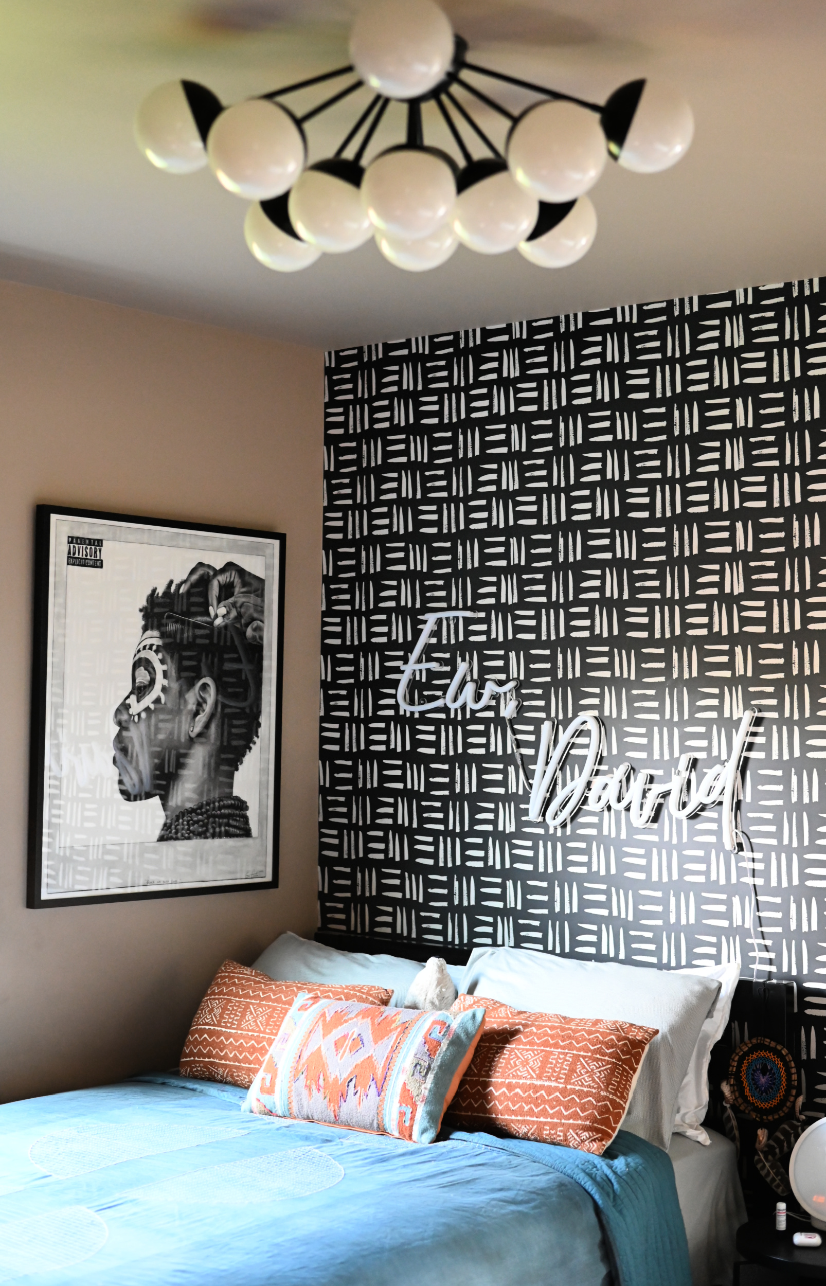
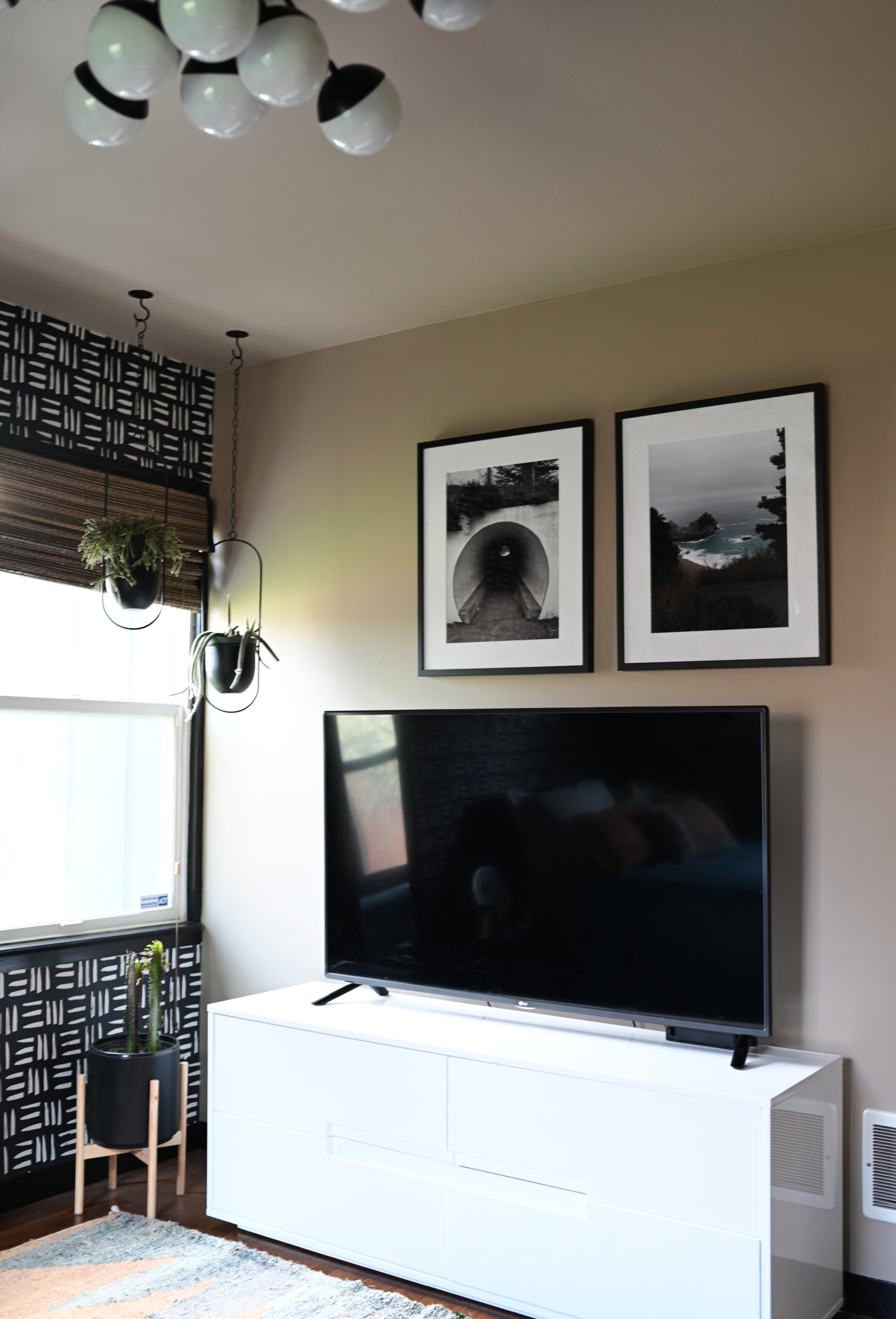
He’s so happy with how the space turned out and I’m happy that he has a space that feels special and personal to him since he basically designed it himself. The taupe, black and white color palette feels very modern and refined and yet the details don’t make it feel too adult.
Since we had to replace the drywall, we used Sherwin-Williams Drywall Primer to prime the walls. I then used Emerald Interior in the matte finish for the walls, and Emerald Urethane Trim Enamel in a satin finish for the trim and doors. I love using a satin finish on places like the trim and doors against a matte finish on the walls because you can really see a contrast. I just LOVE the contrast between the matte, neutral walls and the glossy black trim and doors.
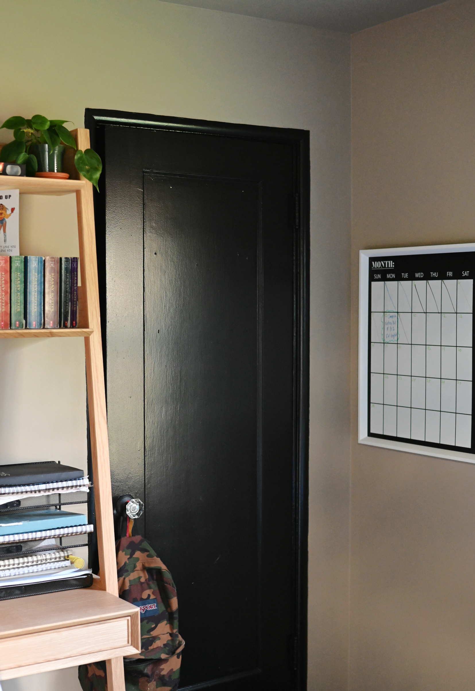
I always encourage people to design spaces that evoke a feeling and that is reflective of who they are, and that definitely includes our littles as well. I believe in giving our kids autonomy in their spaces to design it as they wish. There’s so much they DON’T get to control and allowing them the freedom to express themselves creatively in their safe spaces is one thing they can and SHOULD have control over. My motto is as long as there’s no food in your room, you keep it clean-ish and nothing is growing under the bed, then your room is your business. For me there’s the added layer that both of my kids are artistic and incredibly creative so that connection resonates with me in ways that may not resonate with other parents. When I walk into this space it looks and feels like Michael and so many bits of him are weaved all throughout.
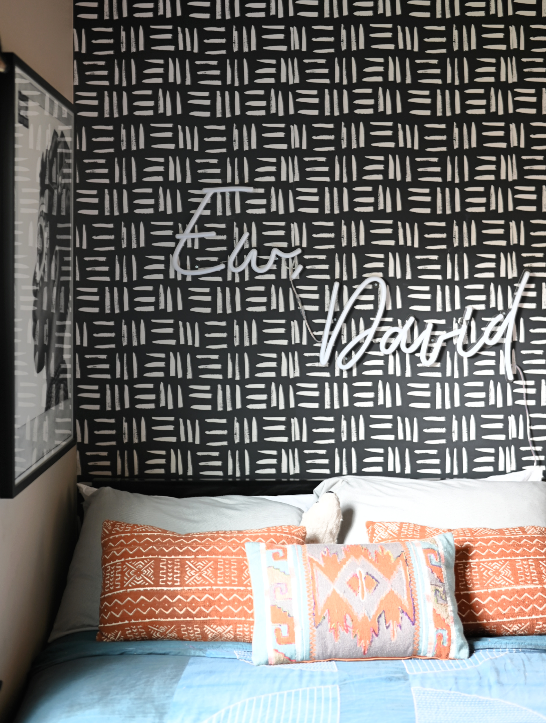
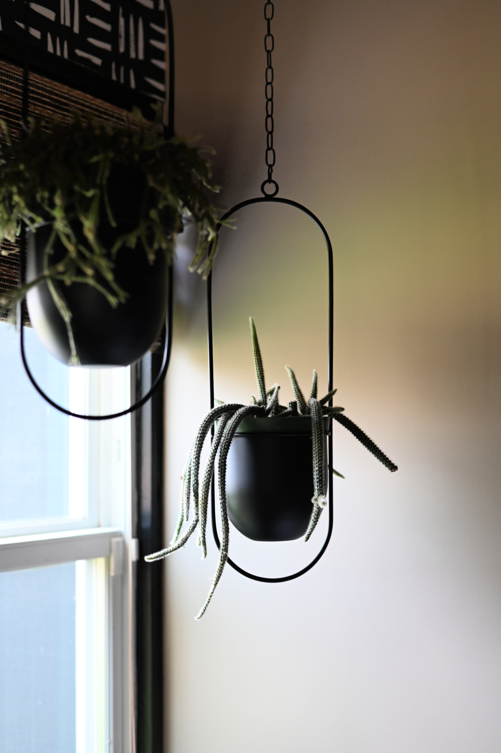
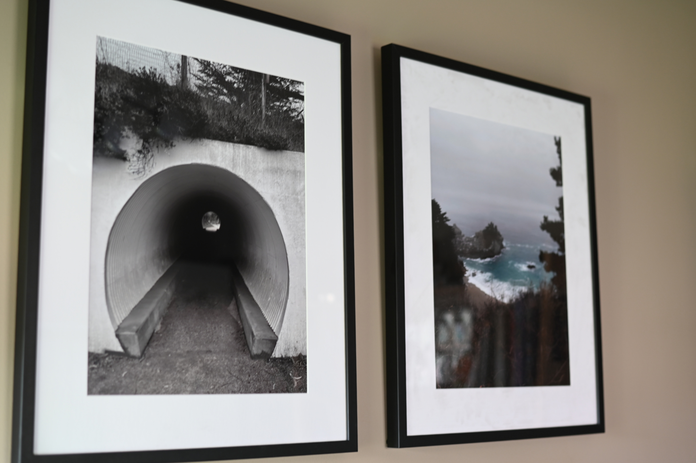
We even had some of his photography framed to display in his room. He’s really good and I’m having more of them framed to display throughout the house. The wallpaper is designed by my best friend, Carmeon, and he was adamant that some of auntie Carm’s paper make it into his room as well!
The one detail I was really particular about was his desk area. Because his room is so small and floor space is quite limited I wanted a desk with some sort of hutch or bookcase so he could also have storage up the wall as well. We love the one we settled on. It’s the perfect size and the open shelves are an added bonus.
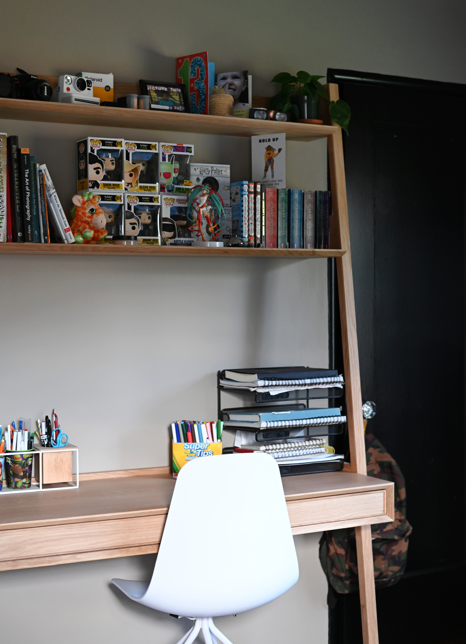
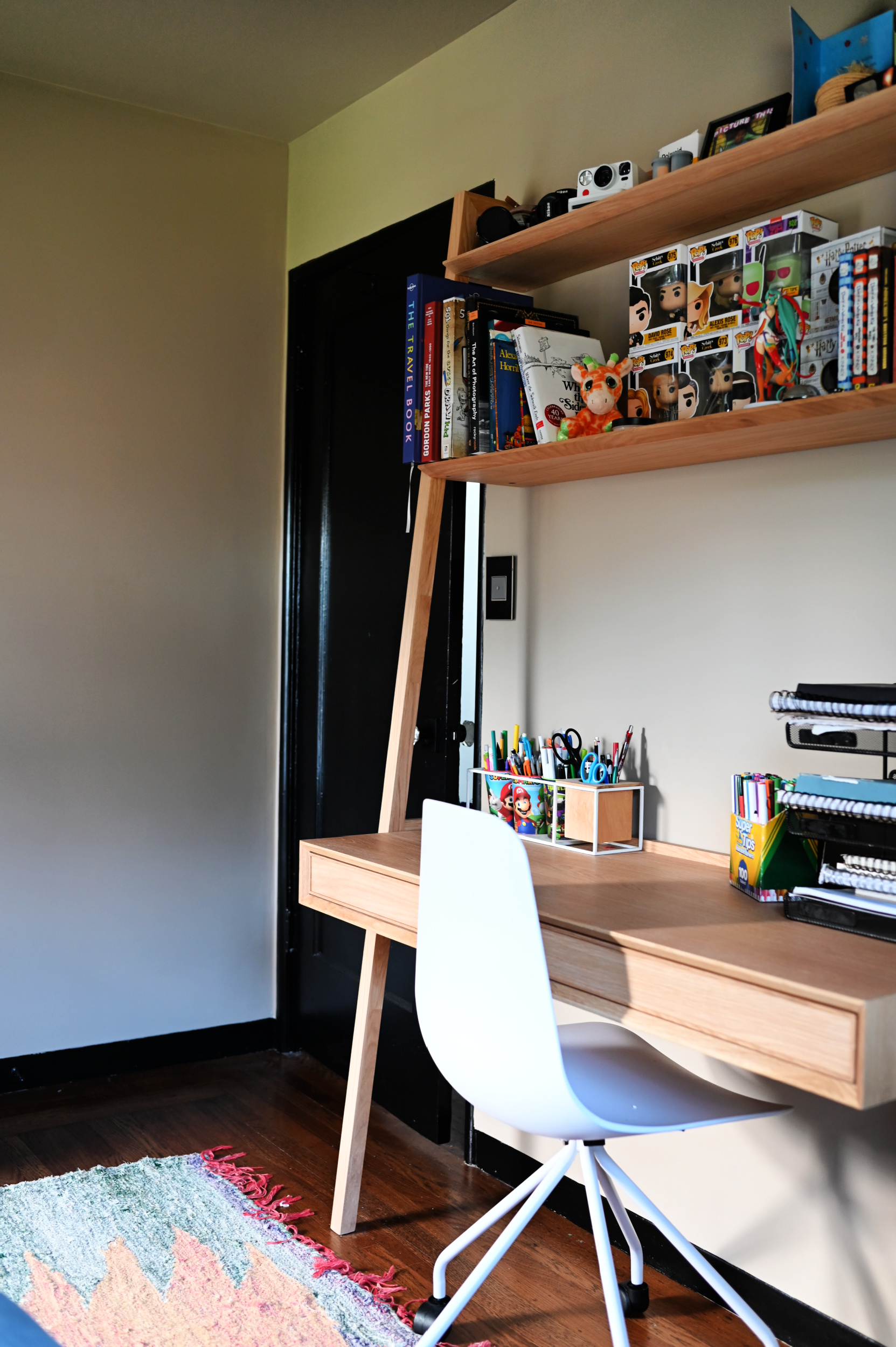
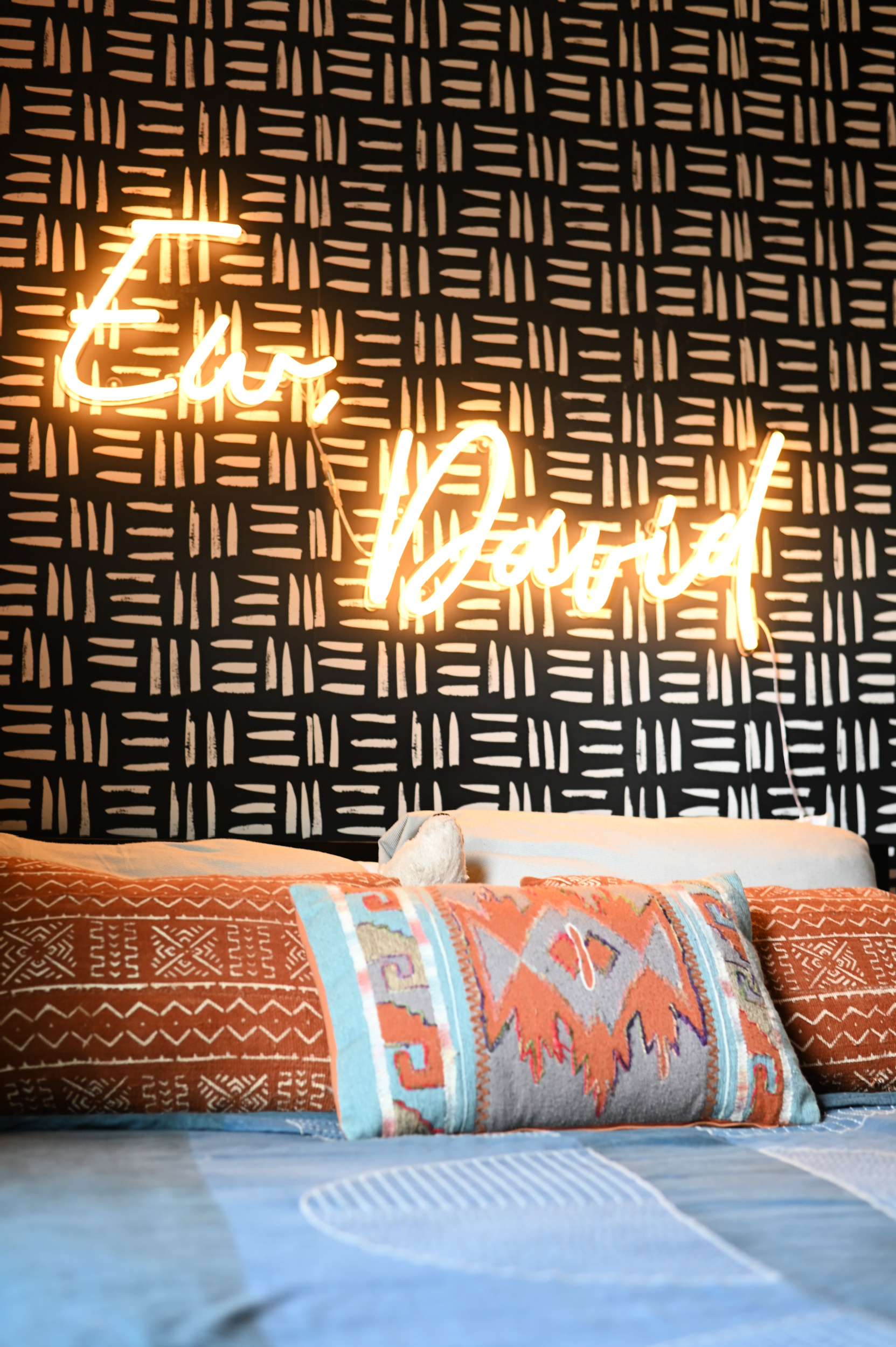
We are still waiting to find the perfect deep hunter green duvet cover (another thing he requested) but we are so happy with this space. I love that he chose a neutral color like Tony Taupe to really allow his personal style to shine through and I look forward to seeing how this space evolves as he matures and changes. One project off the to do list for the year!
Until next time friends….
Bethany says
I love the room! Would you mind sharing where you got the desk? We are looking for something similar for my son’s room.
Shavonda Gardner says
Hi Bethany! The desk is from Article
Anne says
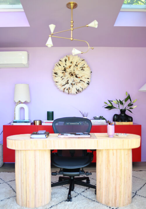
Hi! I just found your instagram page and I love so many details in your rooms! Can you tell me the name of the chandelier in your son’s room? And where did you purchase the beautiful juju hat on your fireplace? Thanks!
Shavonda Gardner says
Hi Anne! Thank you so much and welcome! His light is from Lucent Light Shop and its called the 12 cluster light. I get my juju hats from Isabelle at Accent Touch. https://www.myaccenttouch.com/collections/juju-hats
Amida says
Love this room, Its really bright and bold. the black and white wall pattern is so stylish. You should definitely check out at https://cadcabin.com/ for 3d home design plans and articles.
Heidi Trombetti says
This room is bold and cozy and gorgeous! I used Tony Taupe 9 years ago and just moved into a new home with a mountain view, and after purchasing several neutrals from Samplize, I decided to go with Tony Taupe again. I love it as much as you do!
Heidi Trombetti says
This room is bold and cozy at the same time! I love Tony Taupe and first used it 9 years ago. Just moved into a new home with mountain views, and decided to go with it again. I love it as much as you do!
This room is bold and cozy and gorgeous! I used Tony Taupe 9 years ago and just moved into a new home with a mountain view, and after purchasing several neutrals from Samplize, I decided to go with Tony Taupe again. I love it as much as you do!
Michelle says
This is such a cool room for a teen- thank you for sharing!
Catherine says
He’s got a GREAT eye! Both for design and for photography.
Love that desk, too.
S says
This is gorgeous— would love a source list b/c the details are all so great!
Yael @ Nosherium says
Oh my goodness this is STUNNING! Michael has gorgeous refined taste!
Cassie says
oooooh it looks amazing! Love the neon Ew, David! ha!