This post is sponsored by Sherwin-Williams®. All opinions are my own.
Hi Everyone!
I’ve been having so many discussions on social media about what people are excited about, and have been seeing in interiors this year. Every time I pose the question I always get the same answer: COLOR COLOR COLOR!
As someone who is an absolute color lover it makes my heart sing to hear so much chatter and excitement over folks looking to move away from super neutral spaces and toward embracing color in their homes. We aren’t talking just a hint of color, either! No, no. I’m hearing an overwhelming response of people being drawn to not only bold splashes of color, but also rich color used as a base to layering on even more color. I’m finding we are loving jewel tones specifically. After sharing my favorite moody paint colors last year (I still get messages weekly from folks who were inspired to go for a moody color from the list!) I thought it would be fun to do another round-up this year dedicated to my fave jewel tones in the the Sherwin-Williams fan deck and share some inspiring spaces that channel them.
First up….Shamrock SW6454
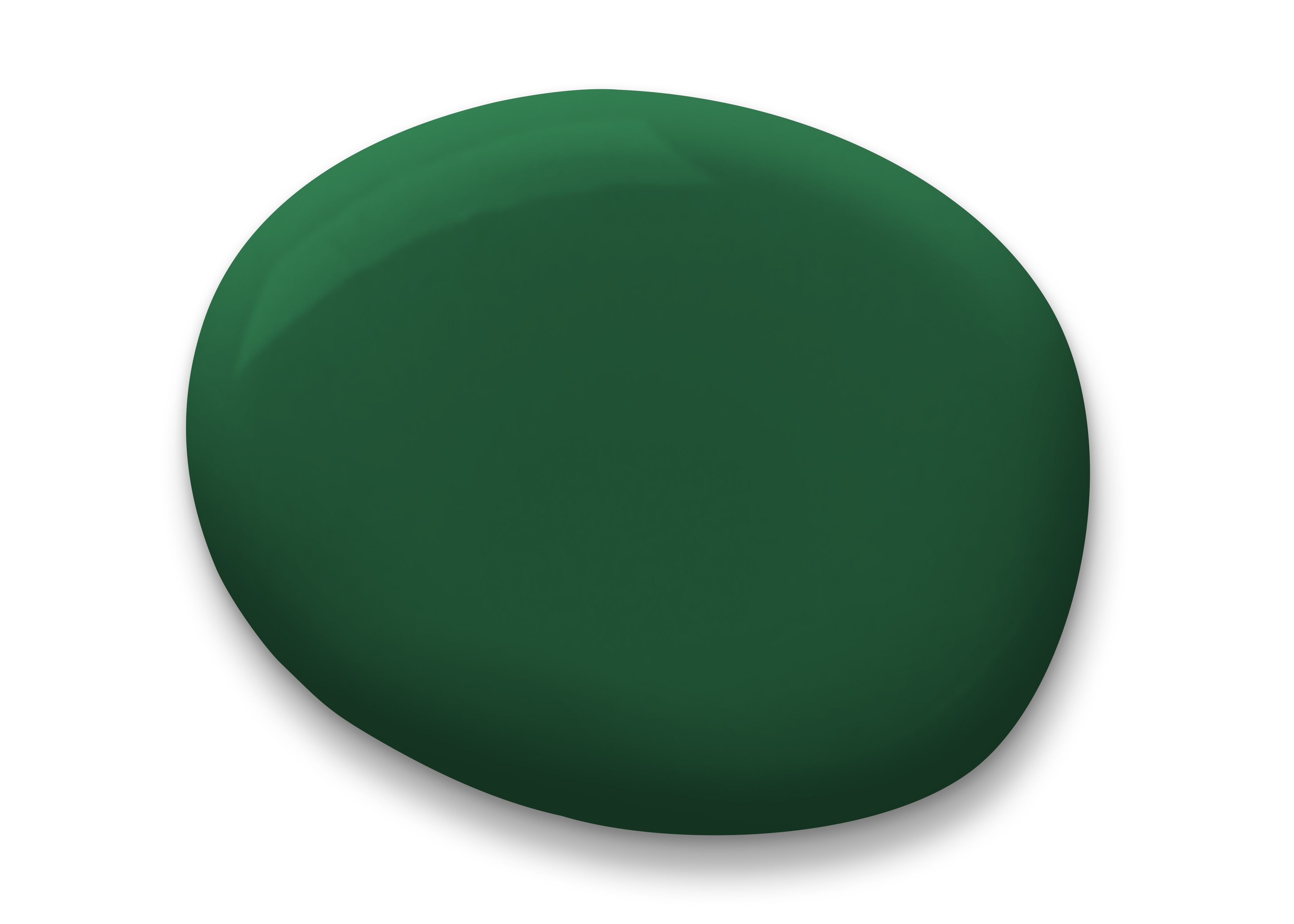
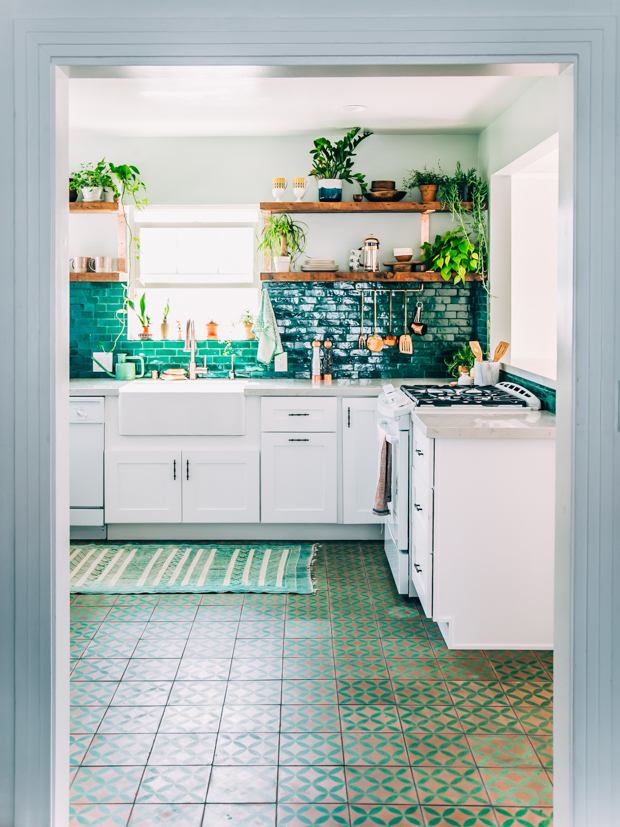
It’s no secret to anyone here that emerald green is MY color!!! I’m a May baby so I was quite literally born with emerald as a part of my life. The color of nature, growth and life, there’s nothing better than this beautiful rich earth tone in a space. Whether used on a wall, cabinets or in upholstery it always makes a space feel luxurious and considered. Also…PLANTS. If all else fails just load your space up with lush greens to incorporate this color. One of my fave jewel-y green spaces is Justina’s kitchen.
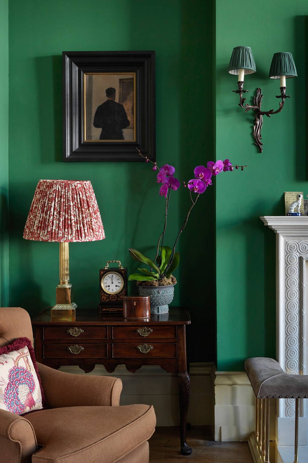
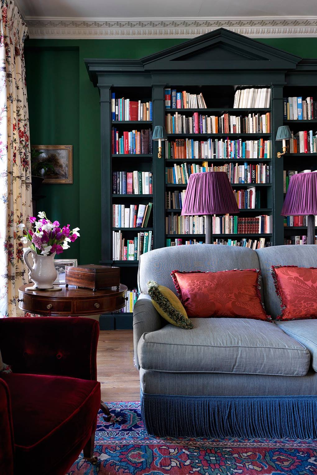
I also really really love the way this home is styled and decorated by Gavin Houghton. It really highlights not only the striking nature of the green but also how it plays well with SO MANY colors.
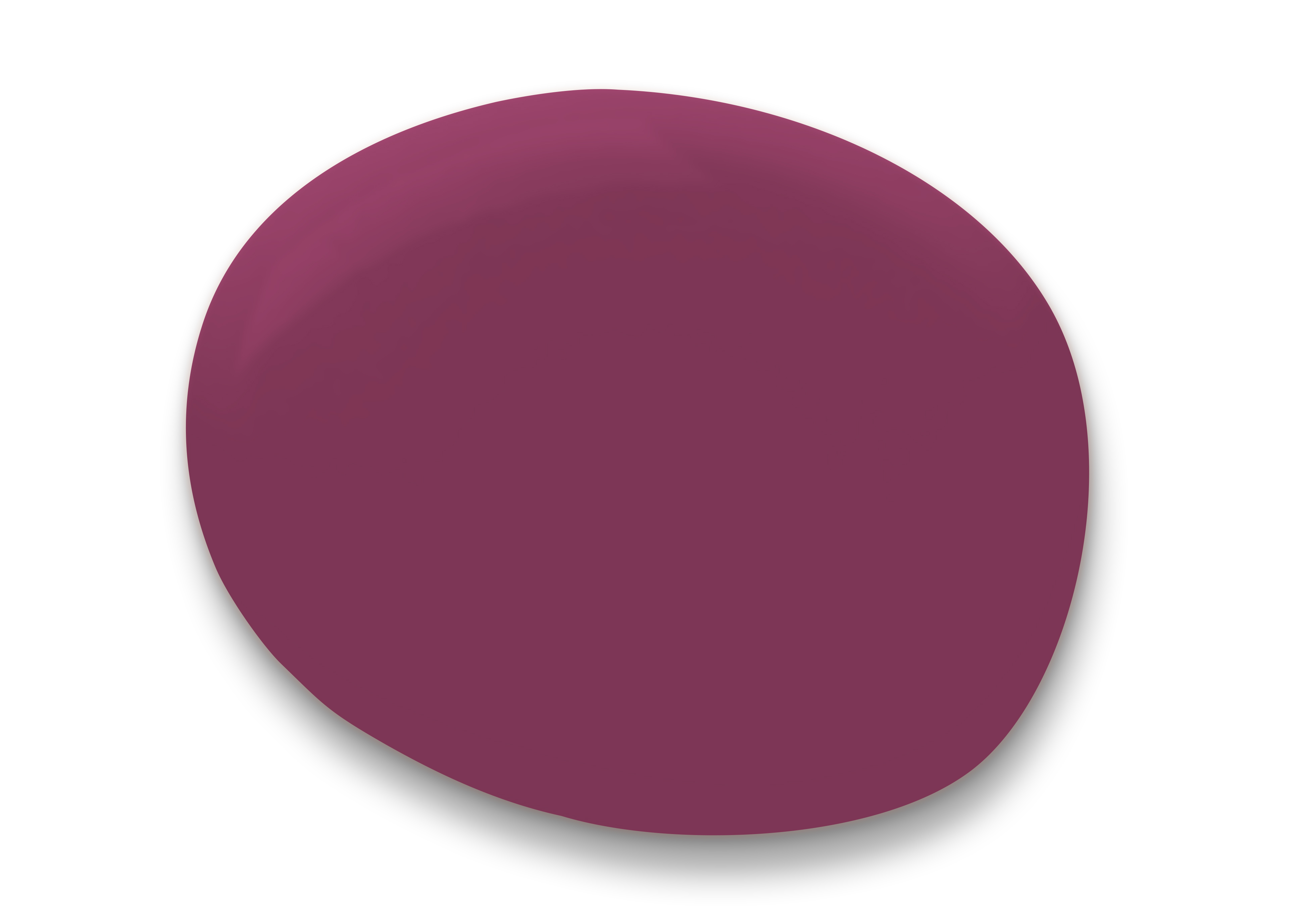
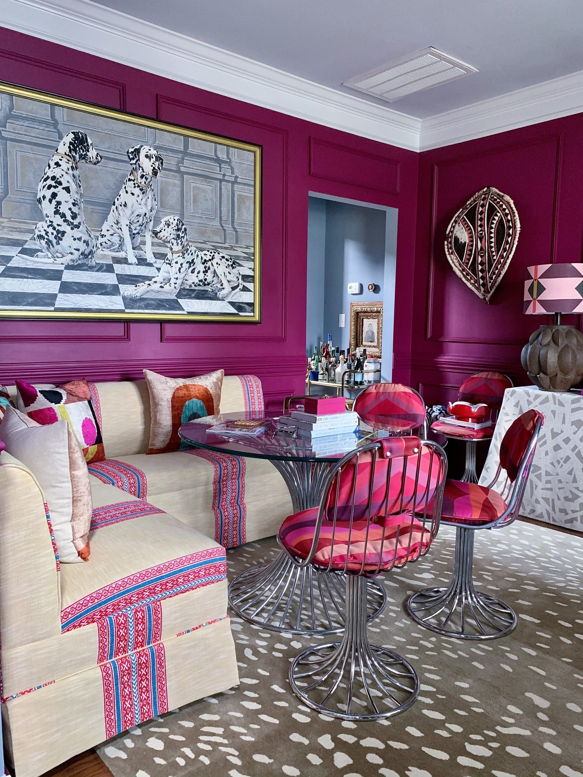
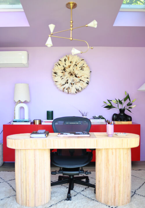
Anytime I think of jewel tones, a magenta is always at the top of the list. When I tell you this is a good one…THIS. IS. A. GOOD. ONE. If you’re looking for a color that really packs a punch Frambroise is the one! The first time I ever saw it, it stopped me in my tracks and it’s been a fave ever since. I recently saw it used by my good friend, Ariene, in her office and oh my gracious! It’s soooo dreamy and inspiring…the perfect backdrop for a creative workspace.
 s
s 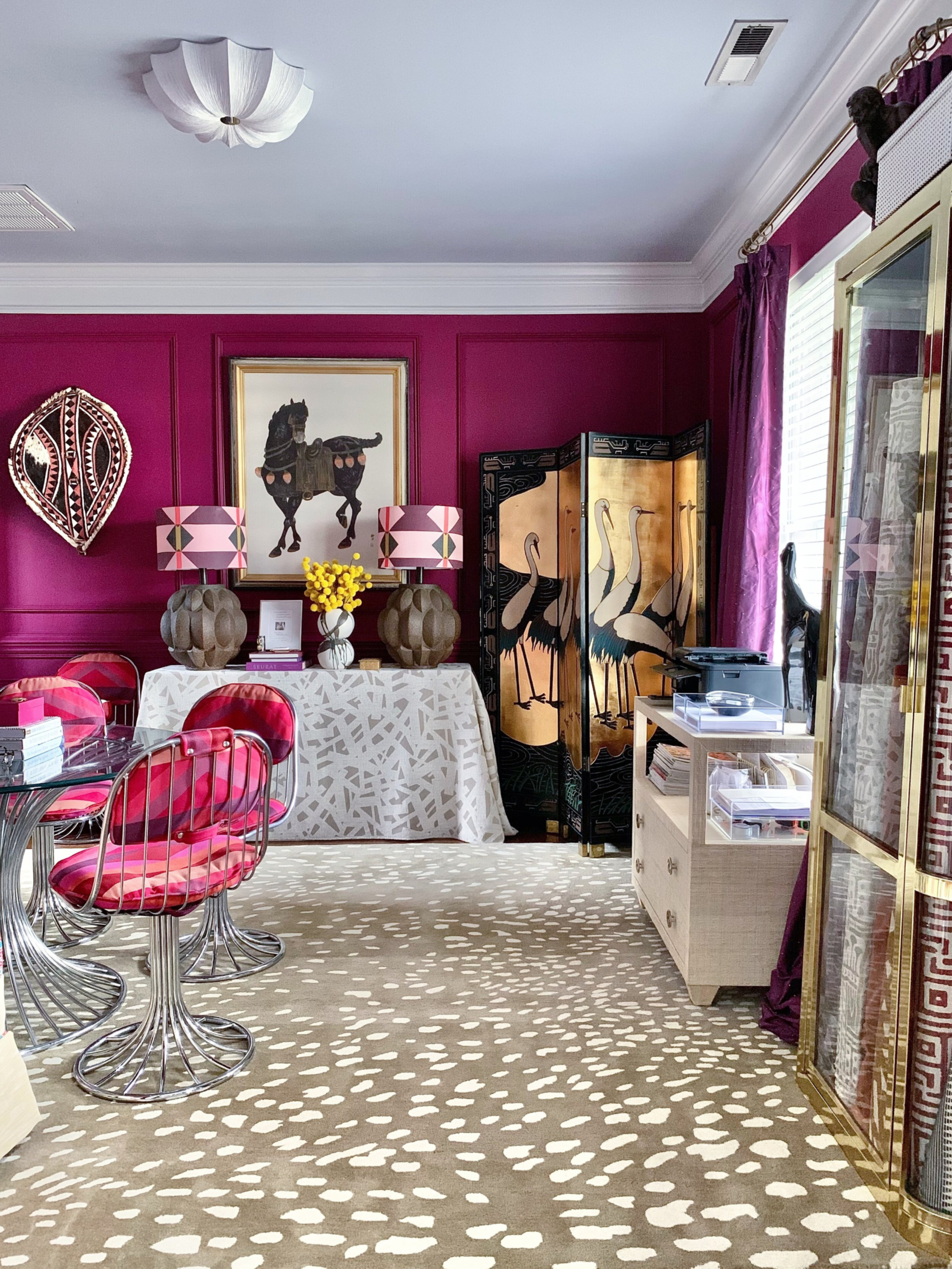
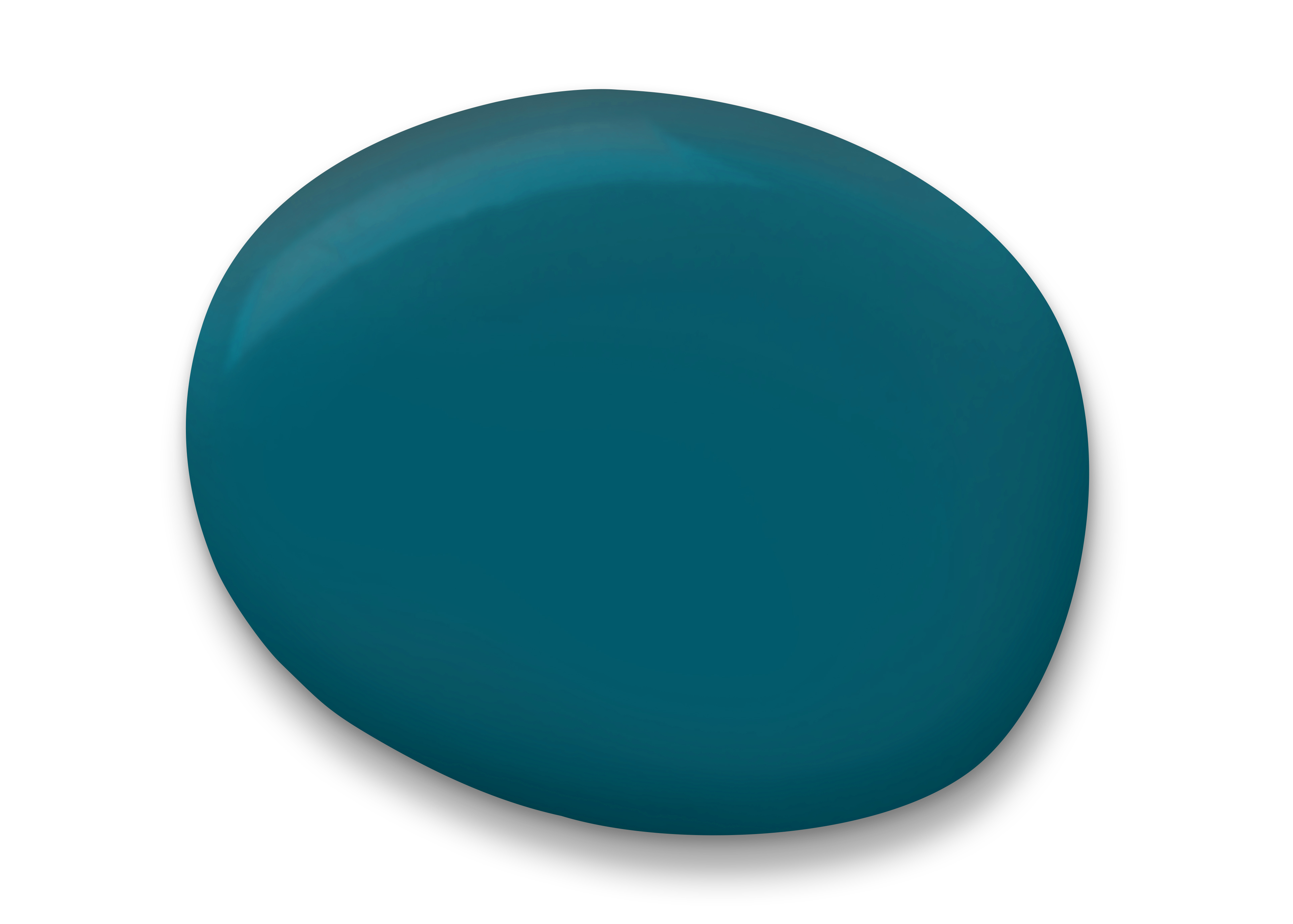
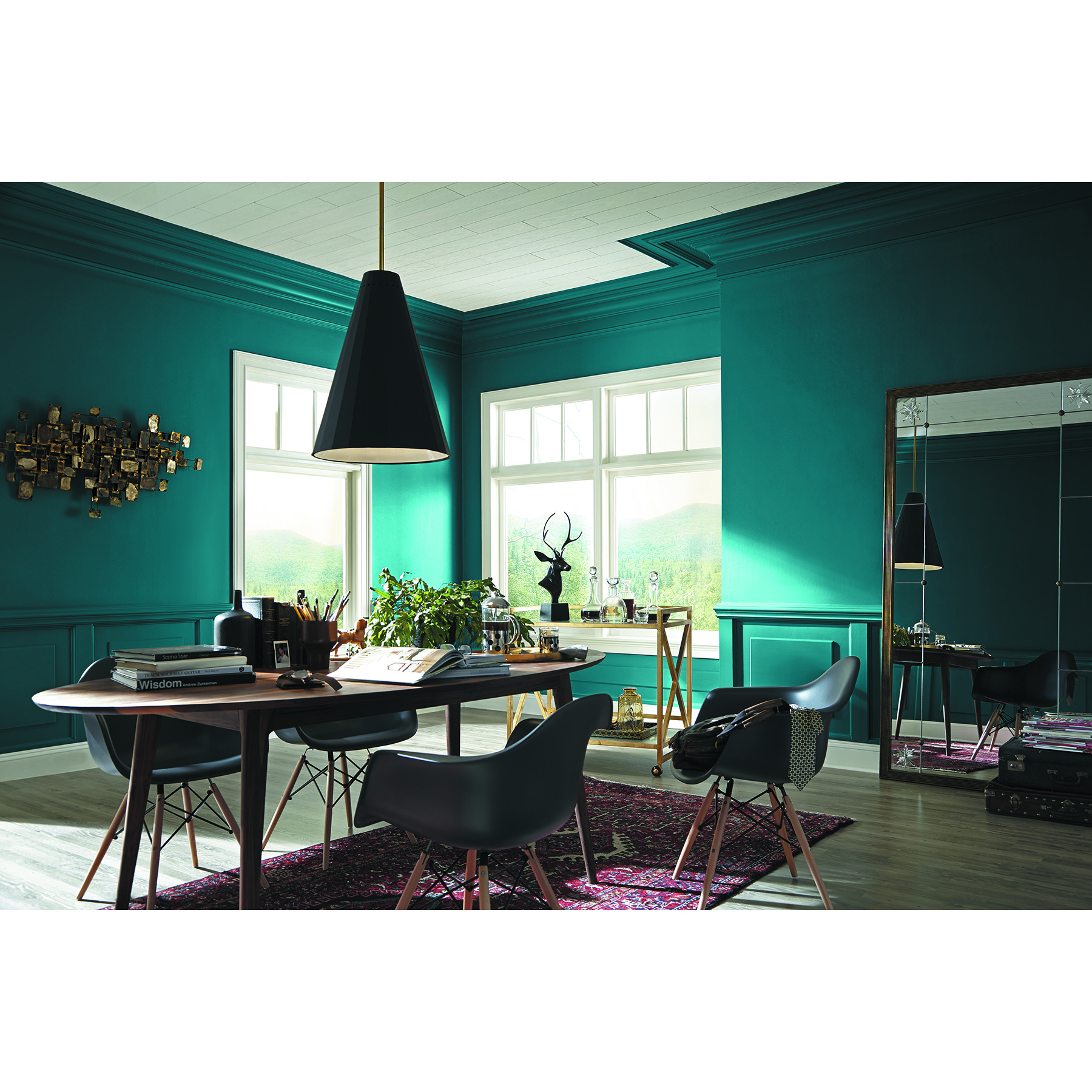
Oceanside was actually the Sherwin-Williams Color of the Year in 2018 and for good reason. Years later I still find myself completely drawn to it. This peacock/teal jewel of a color reminds me of, well, the ocean! Caribbean waters, salty breezes, sunshine, sand and relaxation: all things we are desperately craving after being confined to our homes for the past year. It also transports me to Morocco or India! Oceanside invites the energy and vibrancy of a vacation, so even if you aren’t planning a beach getaway or boho excursion anytime soon you can still bring the essence of those vibes into your space with this gorgeous color.
via: Sherwin-Williams
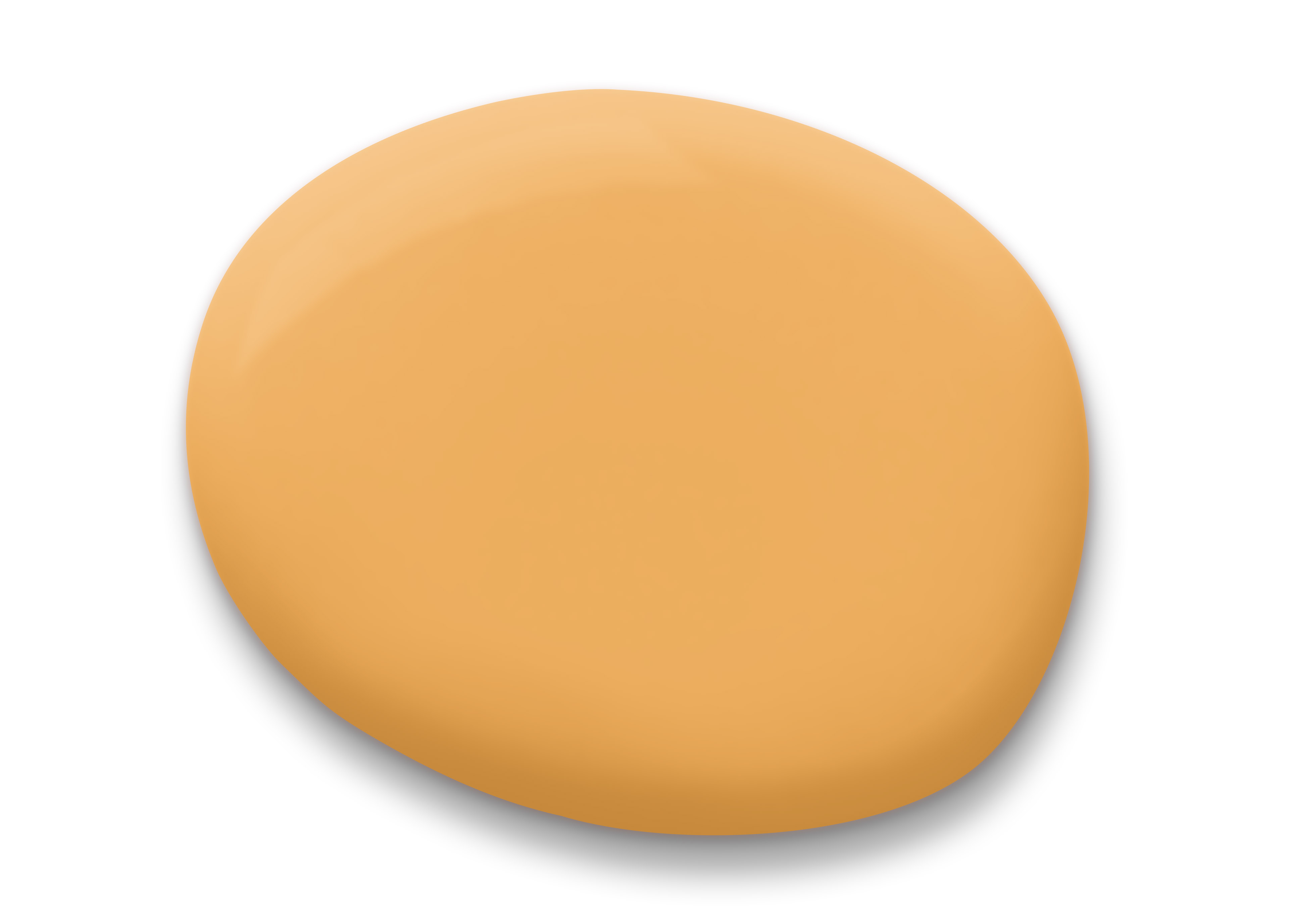
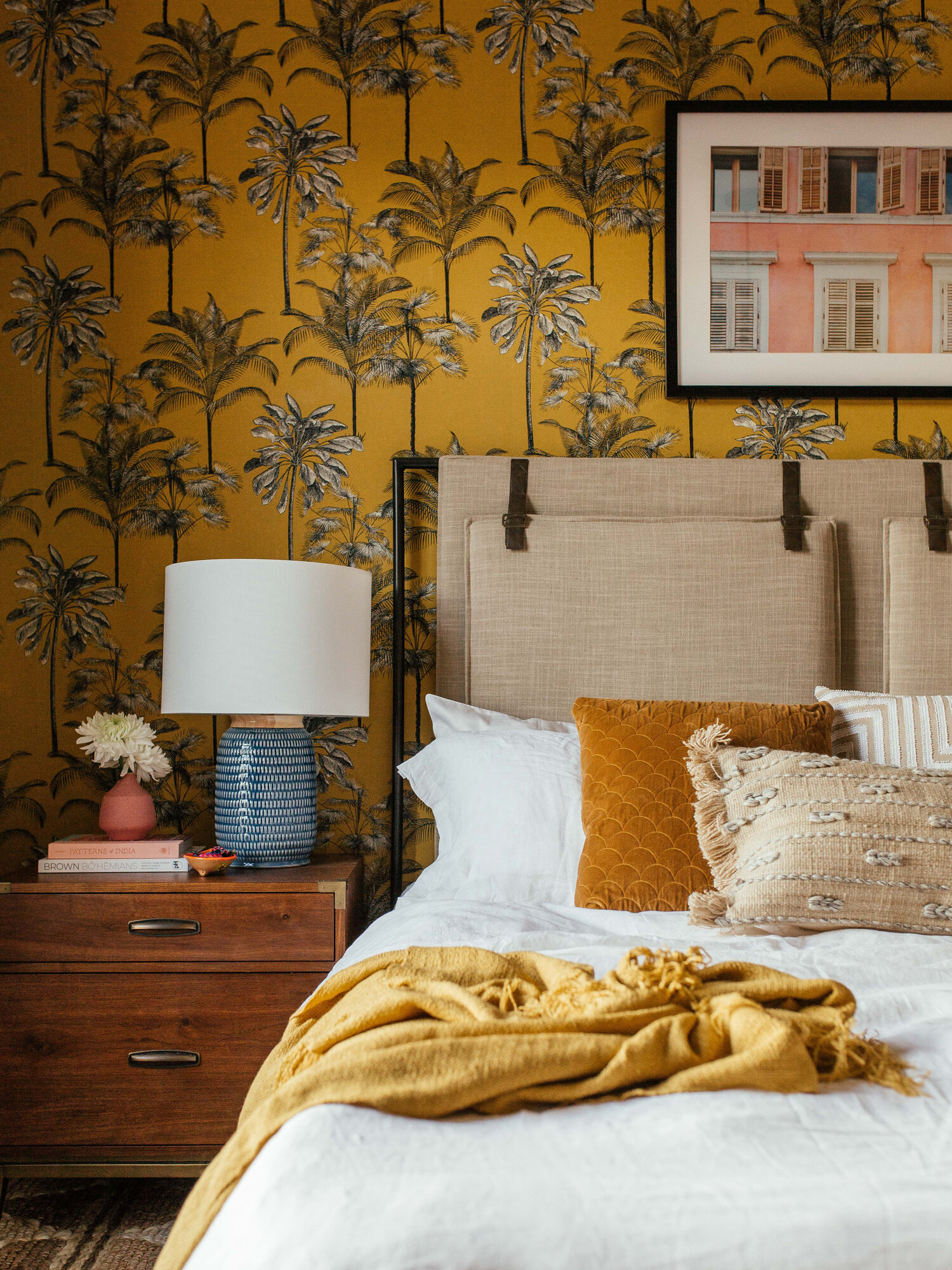
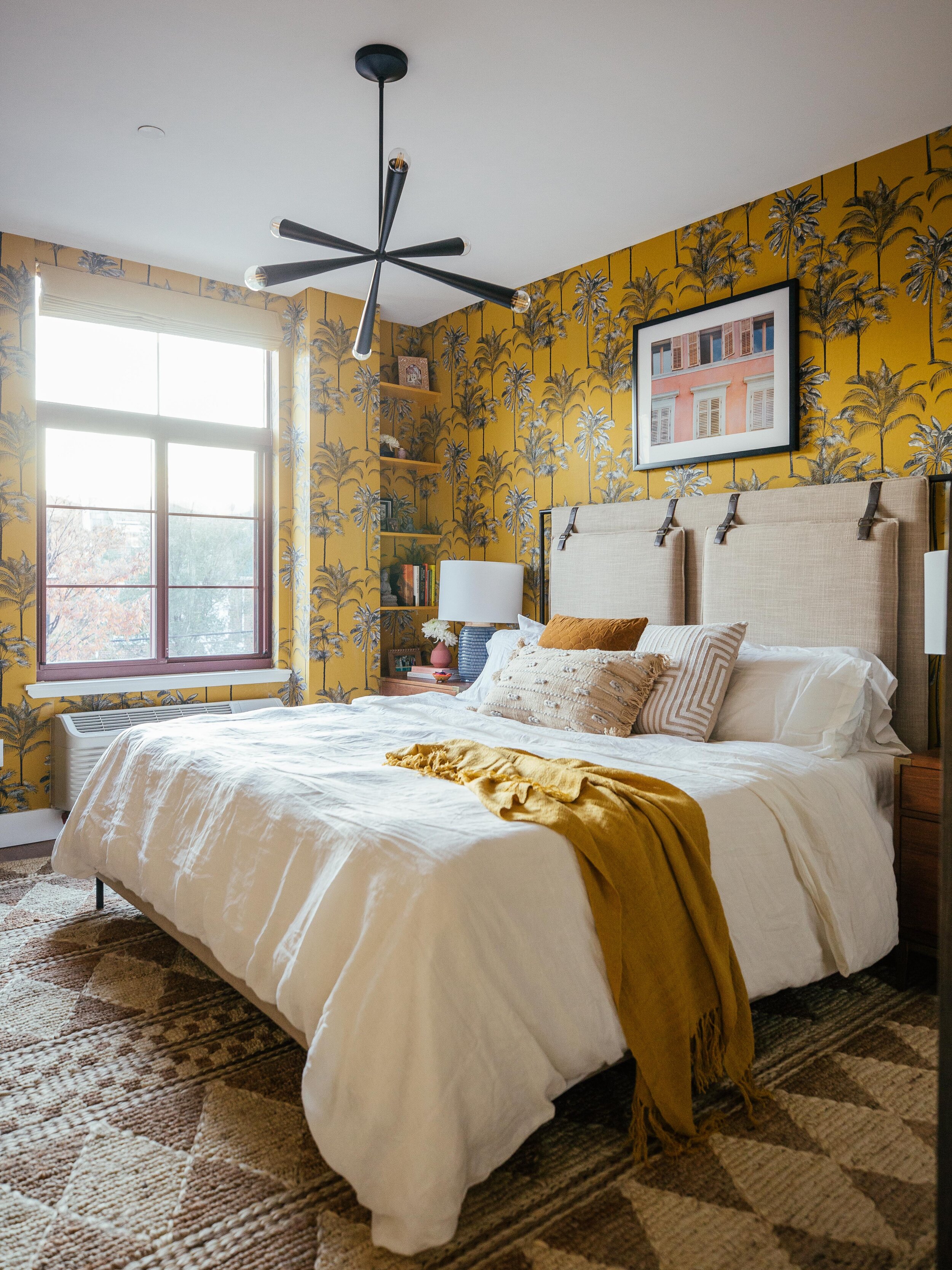
Raise your hand if you’re having a serious moment with marigold! You’re in good company because your girl is in deep. I just can’t get enough of all the rich, jewel-inspired shades of yellow. You can’t help but smile when you see it and I surround myself with it at every opportunity, from my wardrobe to my decor. I think of golden hour sunsets, the warmth of the sun on my face, sunflower fields and rich flavorful spices when I see it. Even as just an accent in a space through art or furniture, this color is so easy to incorporate into a space to make a statement and it looks so good with so many colors. I’m actually using this color in our home in a major way this year and I cant waaaait! My amazingly talented design genius of a friend, Dabito, used a golden yellow wallpaper in a recent bedroom makeover and it’s SO INCREDIBLE. I’ll be referring back to it again and again.
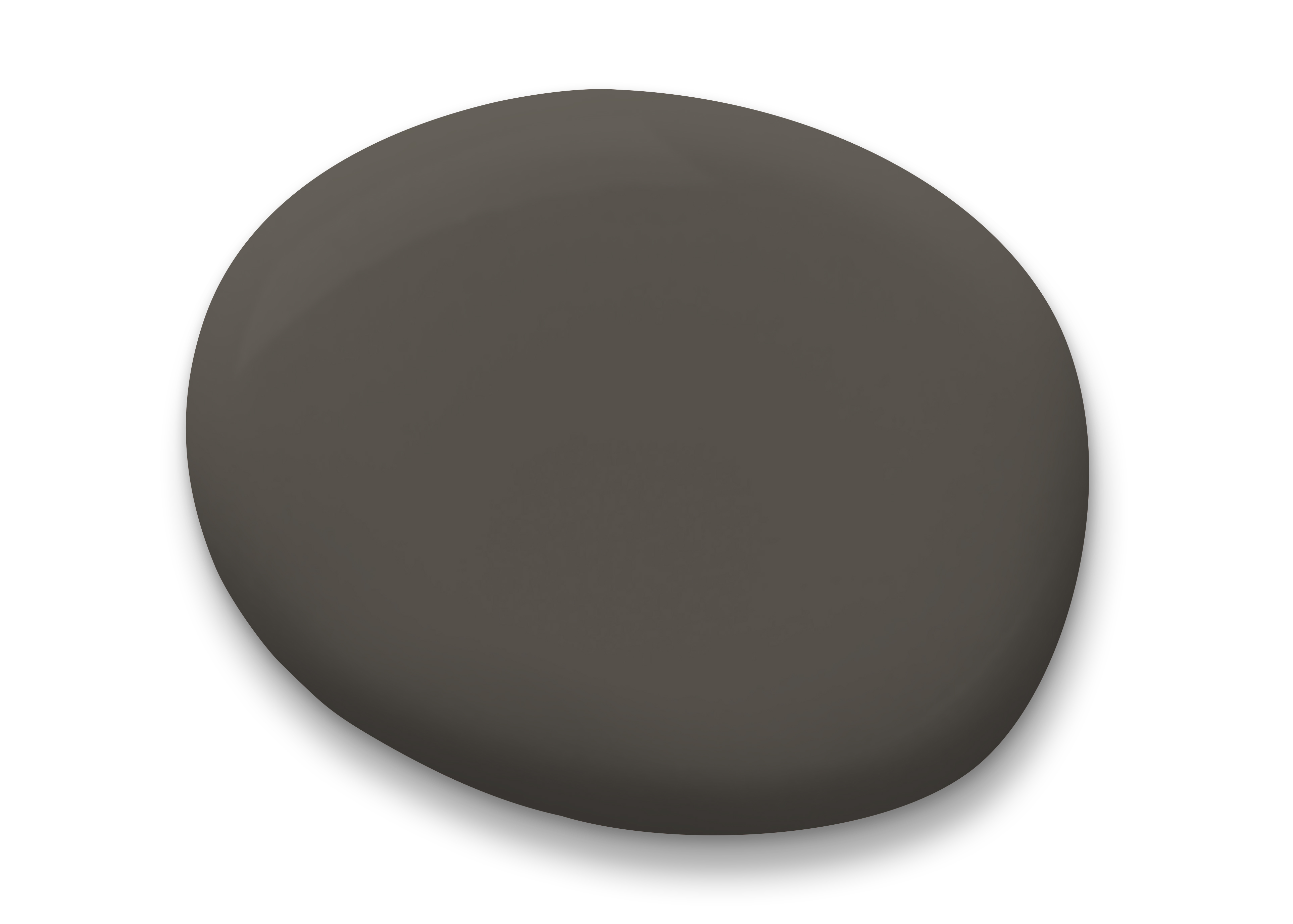
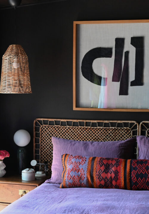
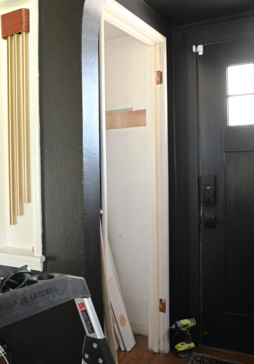
Now y’all know I had to throw one in that makes you go hmmm?! Yes, I’m putting Urbane Bronze in here with jewel tones because its an inky color that reminds me of graphite. Just like the mineral, this color changes on you and can look different in various situations. It’s the best kind of neutral in that it works with everyyyyyyything. It’s also the Sherwin-Williams 2021 Color of the Year so I’m still deeply and fully invested in it. Sooooo many of you have already painted a space in your home this color in recent months after I shared my sisters bedroom makeover and it makes my heart so so happy.
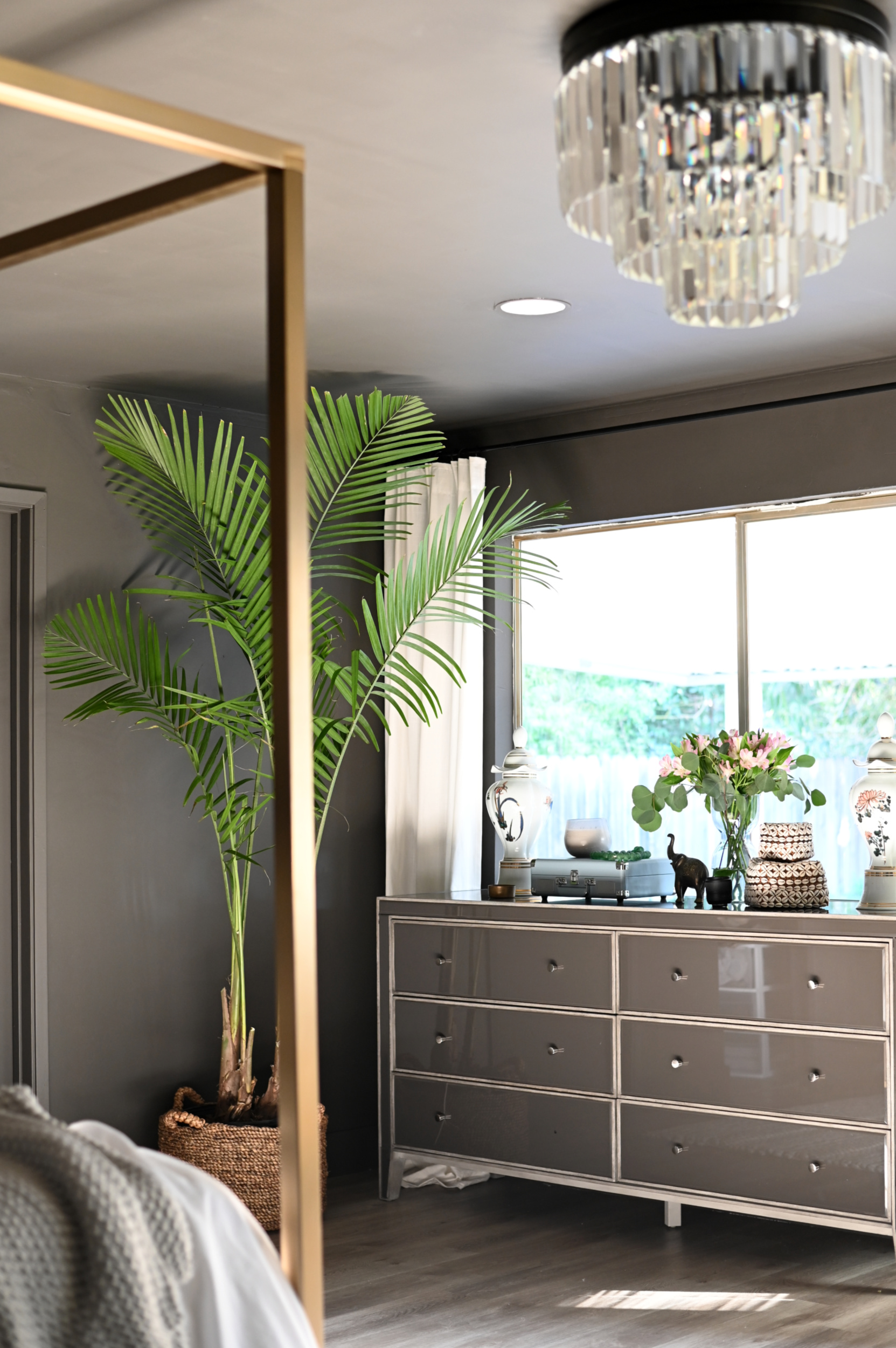
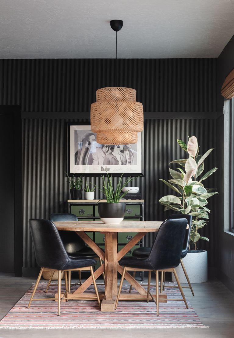
Alright friends! There you have it. My top five jewel tone picks for bringing in juicy, vibrant, crave-able color into your spaces this year. What are your thoughts? Would you use any of them in your home? Also of note, If you want to take a closer look at the color in person, paint chips can be ordered online for delivery for free at swsamples.com. Peel and stick samples are also available in select colors. Samples are removable and repositionable to easily move from room to room, or wall to
wall. No mess, no dry time, just peel and stick!
Can’t wait to show you all how Yarrow makes an appearance in ours. Until next time…..
Kristine says
Where did you purchase the brass four poster bed. Absolutely beautiful and have never seen anything like it.
Paul H says
These colors are exceptional with the exception of magenta. Would have to use that color in a well light room. All paint colors should be color coordinated with furnishings in the appropriate room. Always use Sherwin Williams paints for all my painting projects.
dee says
Need more muted colors! Most of these look atrocious with the existing furniture!
Rebecca says
I love the bold use of color! I found these inspirational! 🙂
Martha E Wells says
i am in a granny flat in the basement very nicely done, but i need to have a colour not dark as there is not a lot of light from outside. . what colour do you think
Yvonne says
I just used the Framboise to brighten up my laundry room, and it looks amazing! It’s a small, narrow space with no windows and lighting issues, but I painted the far end wall with this color and it was incredible the difference it made! I kept the rest of the space neutral, but this one accent wall brought warmth and energy and just the right amount of brightness to the space! Everyone that’s seen the before and after comments on how much better the room looks. My husband was skeptical but it won him over the first time he stepped into the freshly painted room! I love this color, just bright enough to give it life but still mature. Love this color!
Shauna says
I used Urban Bronze for the walls behind my basement bar. It’s absolutely gorgeous, rich, and classy.
Julie says
I painted my living room with the urbane bronze and absolutely love it! The room is huge with several windows and a cathedral ceiling. It most certainly changes color from the time it gets the morning sun through the evening. So happy with the color!
Rebecca says
I used Urbane Bronze on the exterior brick of our last home and it was fabulous. In my new home, I needed that color in my life still and painted my dining room with it. It works with almost every accent color, especially wood grains, blues and reds and even greens!!!
Carol says
The urbane bronze was fabulous on some exterior posts Made them seem so important and stately.
Diane cross says
I have a color similar to Oceanside in our living room and it’s a great neutral. I like the Urban Bronze for outdoor shutters – a winter project.
Linda Shenk says
I used Oceanside in my master bedroom with white trim and sheer white curtains. I love it!!!
Julie Coates says
I love all the colors except the bronze! That yarrow and the emerald are my faves.
Dana says
What is the color of the door trim in the first picture?
Allison says
Need to see some bold exterior colors
Janice says
Me too! Was wondering what Yarrow would look like on a simple ranch style with an aluminum metal roof with Urbane Bronze for the doors!
Carole Cypress says
Also a May baby, I too love emerald green (although I choose apple green in my craft room for lighting purposes). But that bronze…WOW!! I see that in my living room in the very near future. Love your blog and thanks for the inspiration!
Amida says
I love your blog! i am obsessed with the colours, the Pink room looks amazing! it looks mature aswell. You should check out at https://cadcabin.com/ for 3d home design plans and articles.
Marji says
The Sharock is so gorgeous and I am definitely intrigued by Urban Bronze. Thank you for sharing these beautiful colors.
Jessica says
I’m renovating my house at the moment and adding a little laundry room/nook. I love love love these jewel tones! I may need to switch gears and go with that beautiful green! I love your blog and how it makes me rethink how to approach adding color to a home.
Carol says
I’m usually a big fan of your colors, but sorry, I don’t like any of these except maybe the bronze.
janet butler says
Hi I wouldn’t go that far but most of these colors are throw backs from early 1900’s and have been renamed and used over and over with different applications! You always are a good quality paint and offer the painting world so much color so we can too be the next Picasso!
dee says
Need more muted colors! Most of these look atrocious with the existing furniture!
dee says
Remove my comment in this thread, please. Form nested it under existing comment. Not relevant!