Hi everyone!
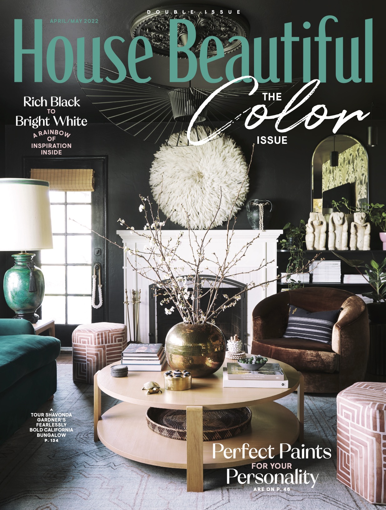
Sooooo by now most of you have heard and/or seen the news…IM IN HOUSE BEAUTIFUL. THE House Beautiful. And I’m not only in it…IM ON THE FREAKIN COVER

There really are no words to describe how incredibly honored and excited I am about it. I had NO IDEA my space would make the cover. It was never mentioned so when I got the call about of days before the issue it newsstands I was floored. What started out as their interest in featuring our kitchen renovaiton in the color issue pivoted into more of a multi-room feature, which pivoted into a bigger story, which ultimately pivoted into the cover story! Talk abou the ultimate pivot-a-bitch.
I was so excited about the kitchen feature because I worked so hard to create a highly personal space for our family and I am extremely proud of it, but I was a bit reserved and nervous about the rest of house. There are so many things that still aren’t complete. So many imperfections. But then I remembered my golden rule and my why in all of this: curating a home is a marathon, not a sprint. It’s ever-changing and constanly evolving. There will be corners that are empty and spaces that arent quite where you want them to be. This feature means so much to me because it’s a tangible manifestation of my passion as a desginer and of the work I do here on social media. It’s about the bigger story of home. About how we each get to define what that means. How we each get to dictate what our joy at home both looks and feels like. It’s about seeing deep striking black walls on the cover of a publication sitting alongside the other shelter mags on the shelf. It’s about how this little home and our journey into downsized living quite literally changed my life.

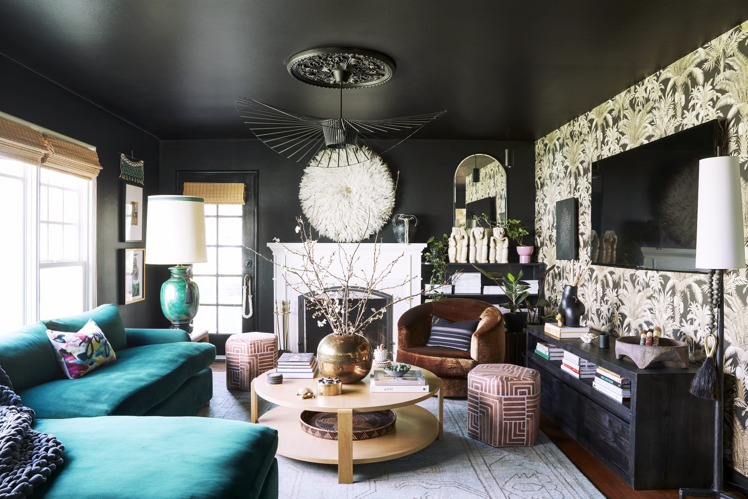
I have so many house things to catch you up on here on the blog, including many of the details here in the living room. Hello black ceiling, new sofa, wallpaper and dream pendant! So many things. But first, here’s a little peek at the kitchen

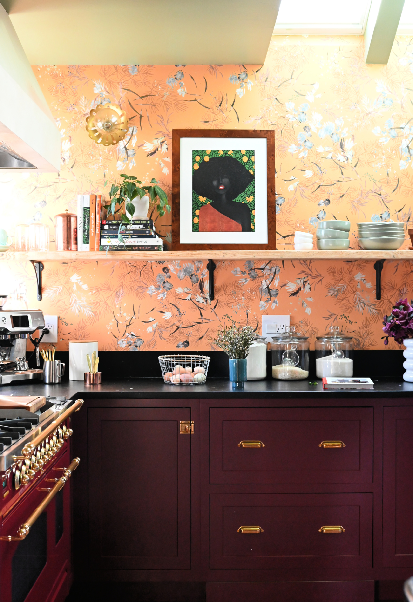
Obsessed is an understatement. Yall, I actually cook in here. What even is life! See more of this space in the current issue of House Beautiful. Im so incredibly grateful to the HB team for the honor.
Full kitchen renovation post coming soon friends. In the meantime, you can catch the entire reno process from demo to install through my kitchen reno IG vlog series. Until next time….

Deborah Schuler says
Hi Shavonda
What fabric is on your BobMitchell Giselle chair?
I love it
I love the cover shot!
Deb
Krishan Kant Koli says
This is a very interesting and innovative blog. It encased all types of trendy and user-friendly interior designs for all types of homes. The blog was about design concepts, and we have the resources to make them a reality. We deal with anything from home decor to furniture and more. I recommend that you go to Apkainterior.com for additional details.
Nicole says
Are you a professional interior designer or is this simply love manifested in your house design?
Apkainterior says
I’ve always found reading blogs to be a relaxing experience.
This blog was really informative, and I particularly enjoyed the fact that it highlighted the numerous Indian interior designers who have such diverse tastes.
I’d like to emphasise that we deal with interior décor and furnishings that complement these designers’ preferences while staying under budget.
For additional information, please visit our website Apkainterior.com.
Connie Carbonaro says
Enjoyed they cover house beautiful. Can you tell me please what is the white looking wreath over the fireplace mantel. I can’t quite figure out what it is. Intriguing
Shavonda Gardner says
Hi Connie! Its called a juju hat.
Jill says
This was my favorite issue of House Beautiful in a looonggg time. I just discovered you today, and am happy to be following along now. Lovely work!
Shavonda Gardner says
Hi Jill!
Thank you so much! So happy to have you. It really was suuuuuuuch a great issue.