This post is in partnership with Sherwin-Williams.
Hi Everyone!
Yes, I did just skip right over the fact that I HAVE AN OFFICE STUDIO NOW! Holy smokes I’m still in awe over that statement. I promise I’m going to cirlce back and tell you alllllll the things about how it came to be. I promise. But today we are skipping to the good part! The interior is finished (for now) and I’m so so thrilled to share it with you.
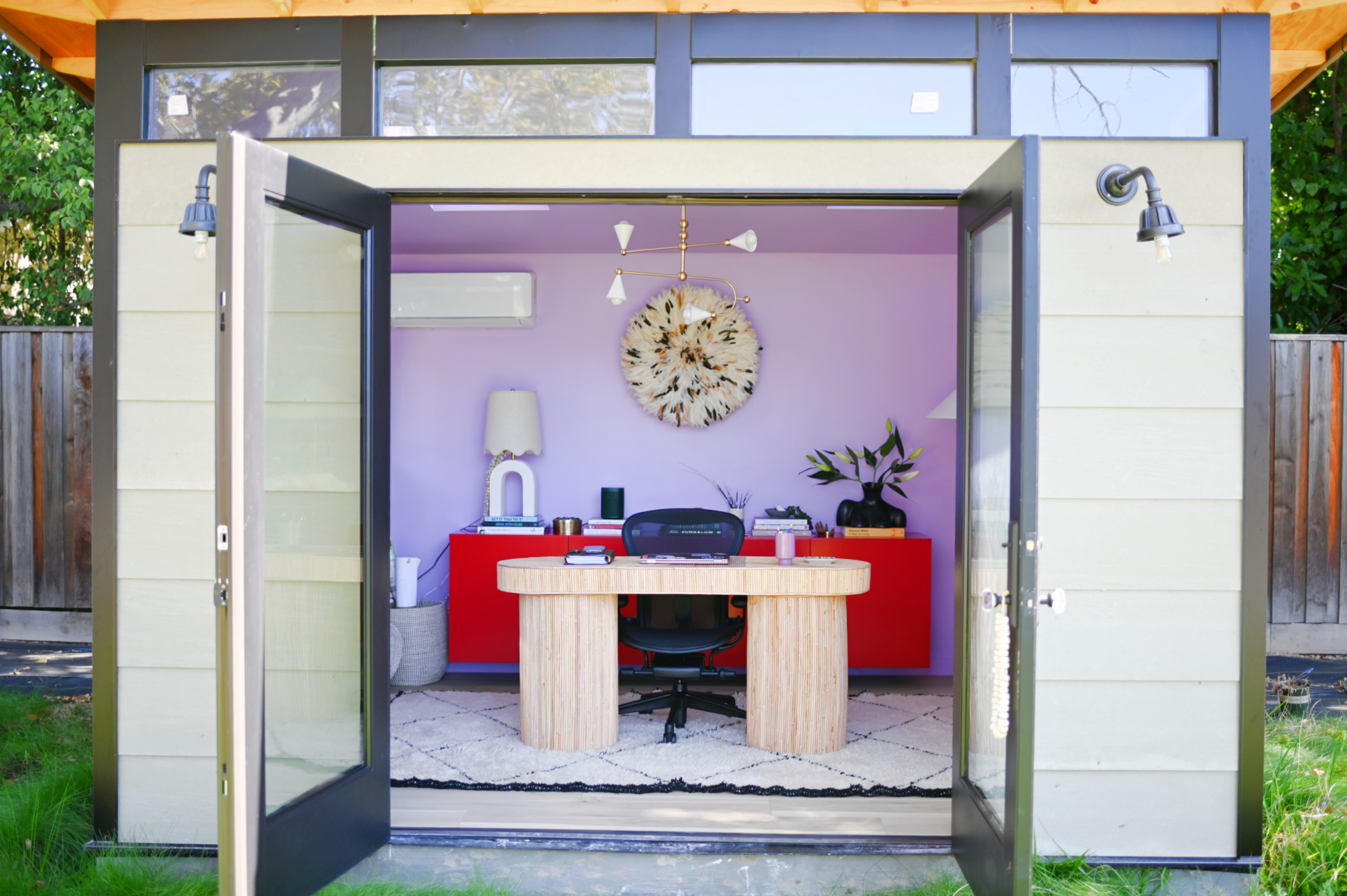
So let’s start with a look at the office shall we!
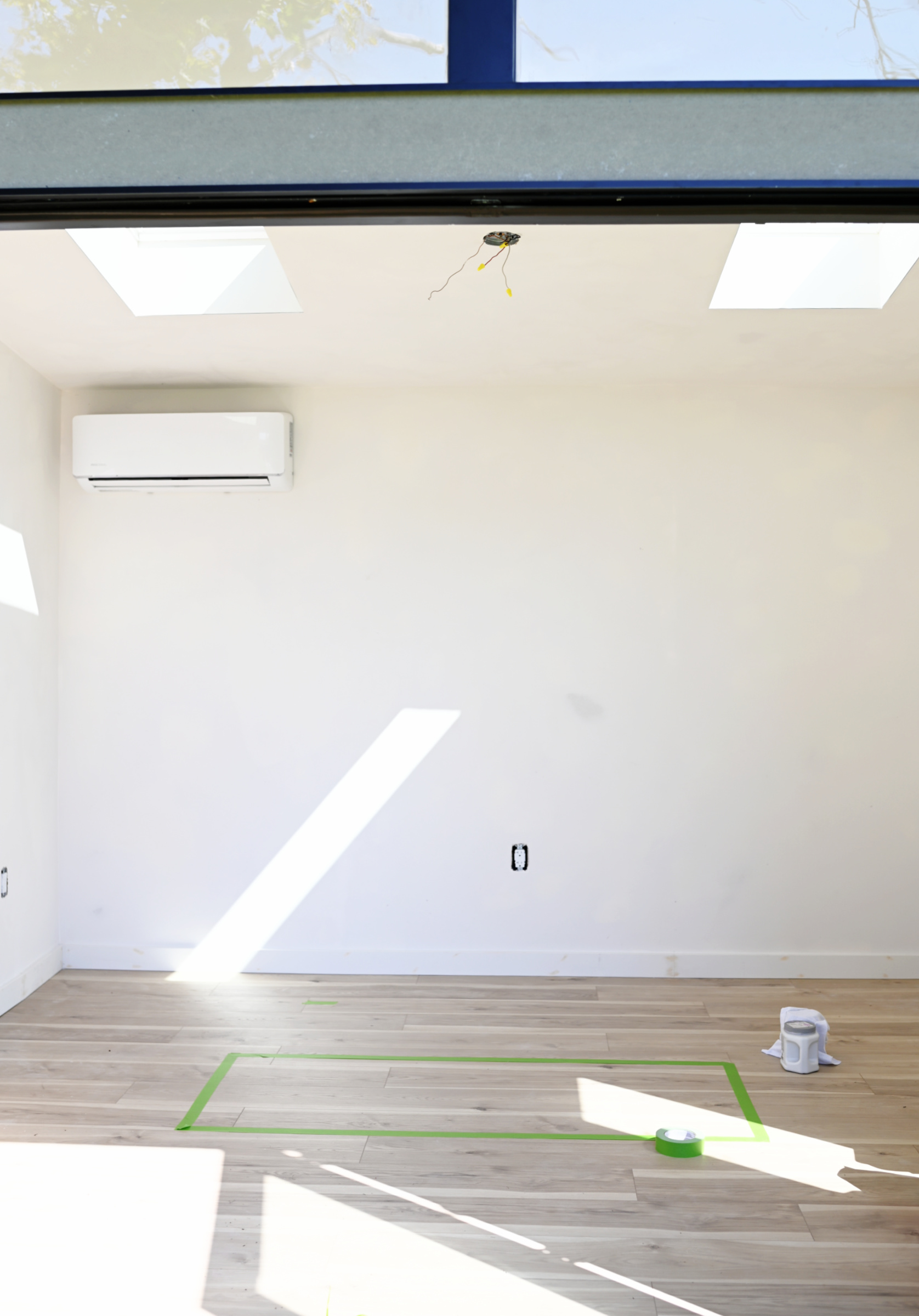
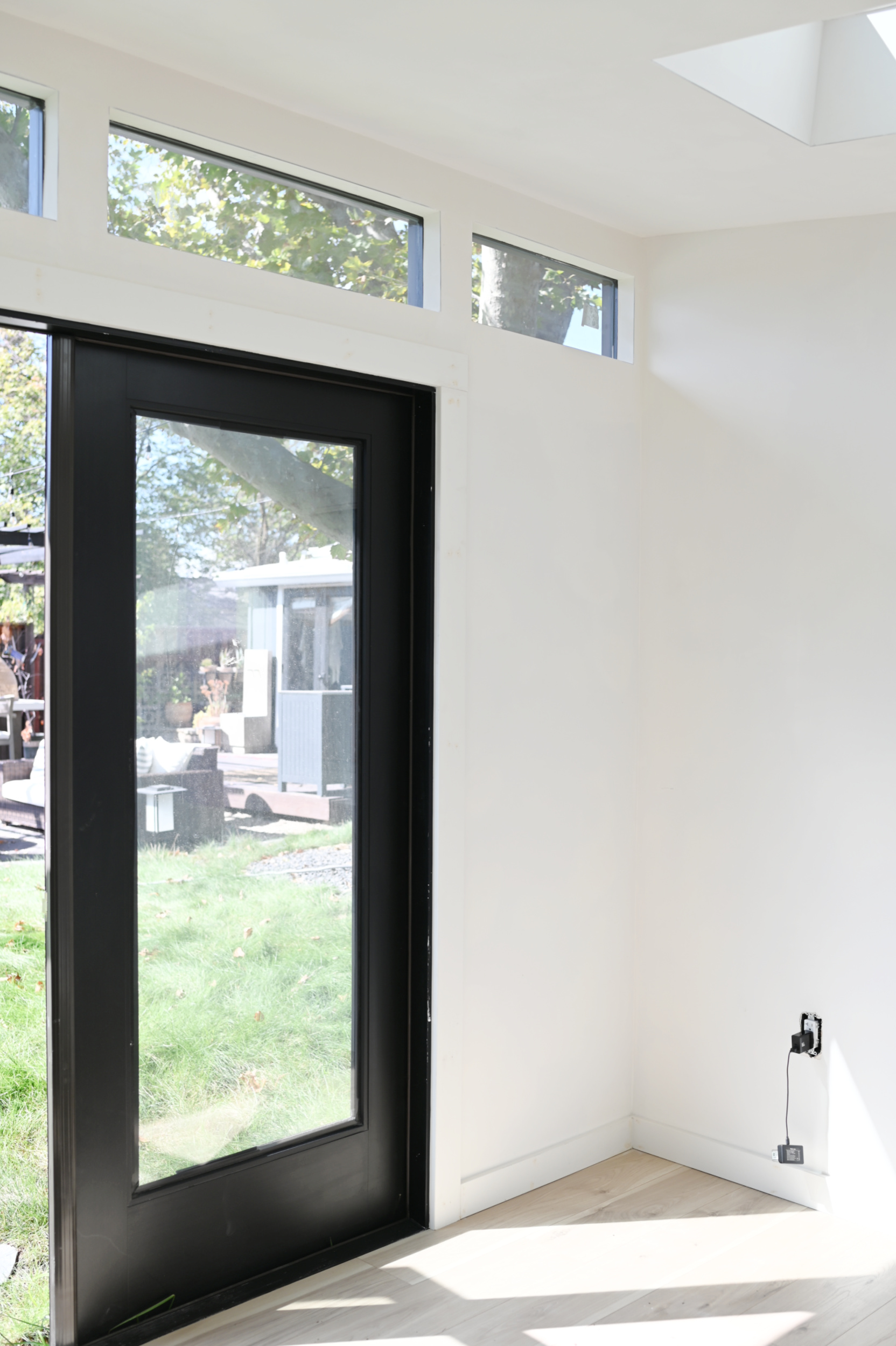
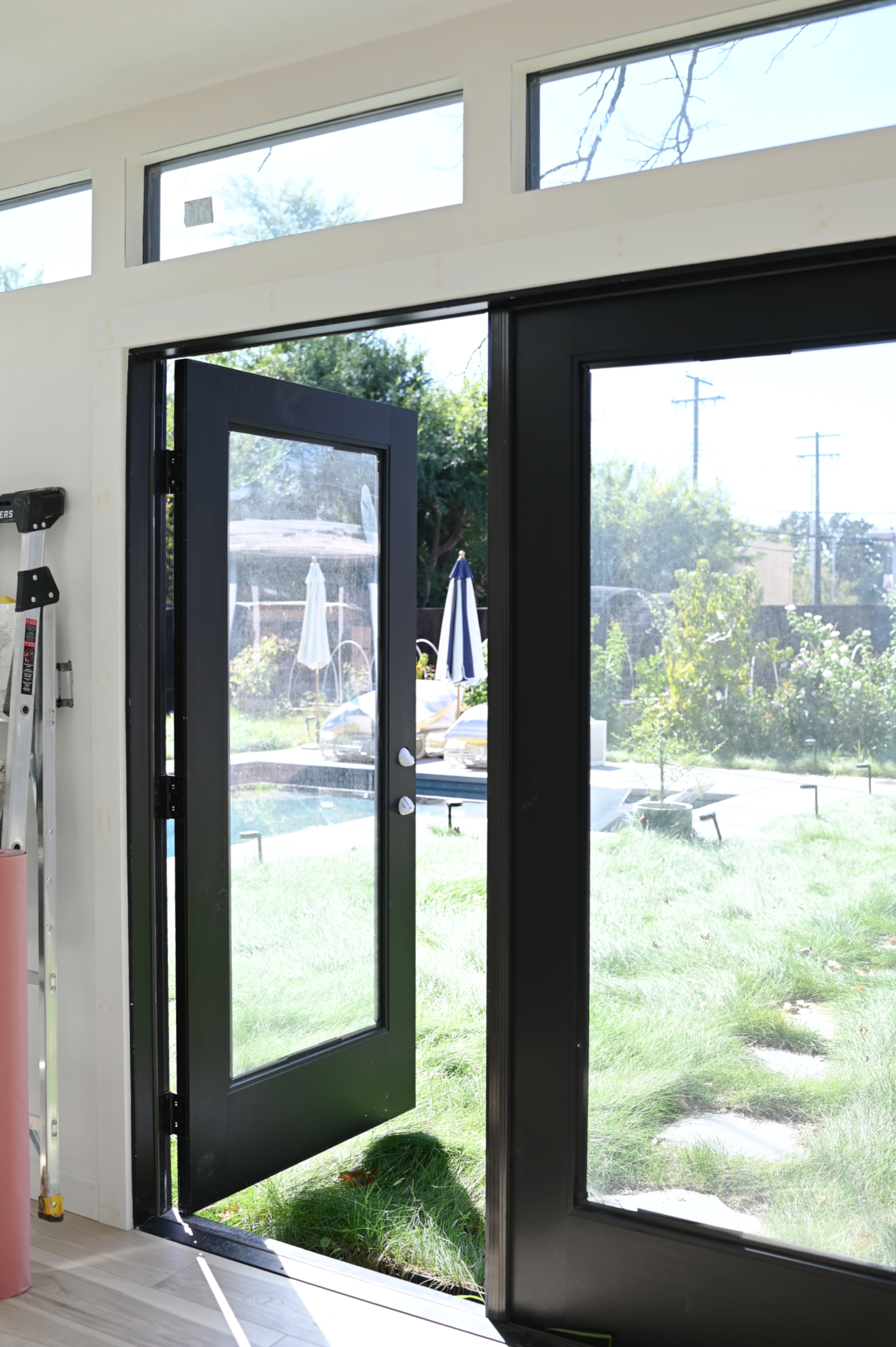
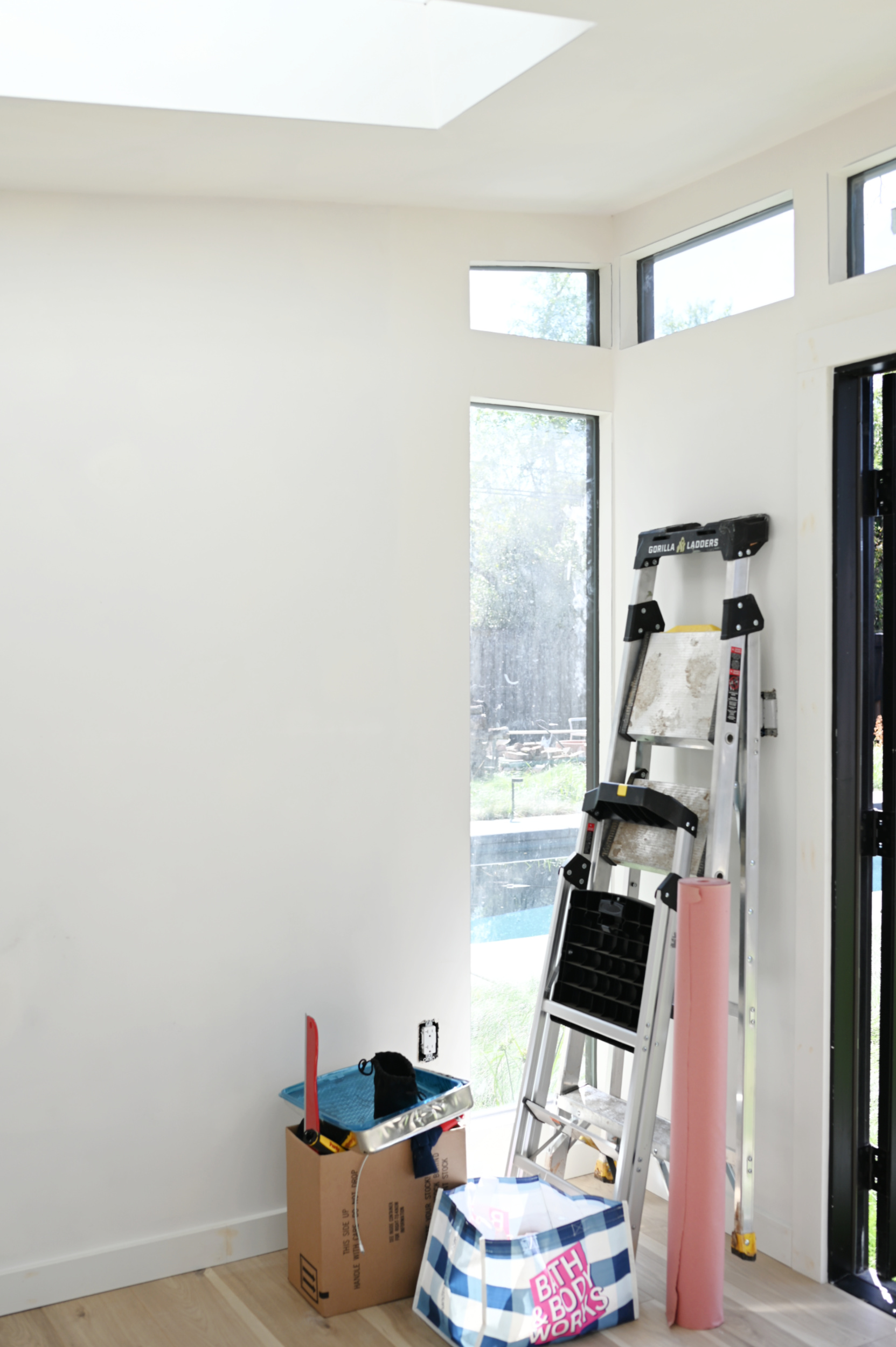
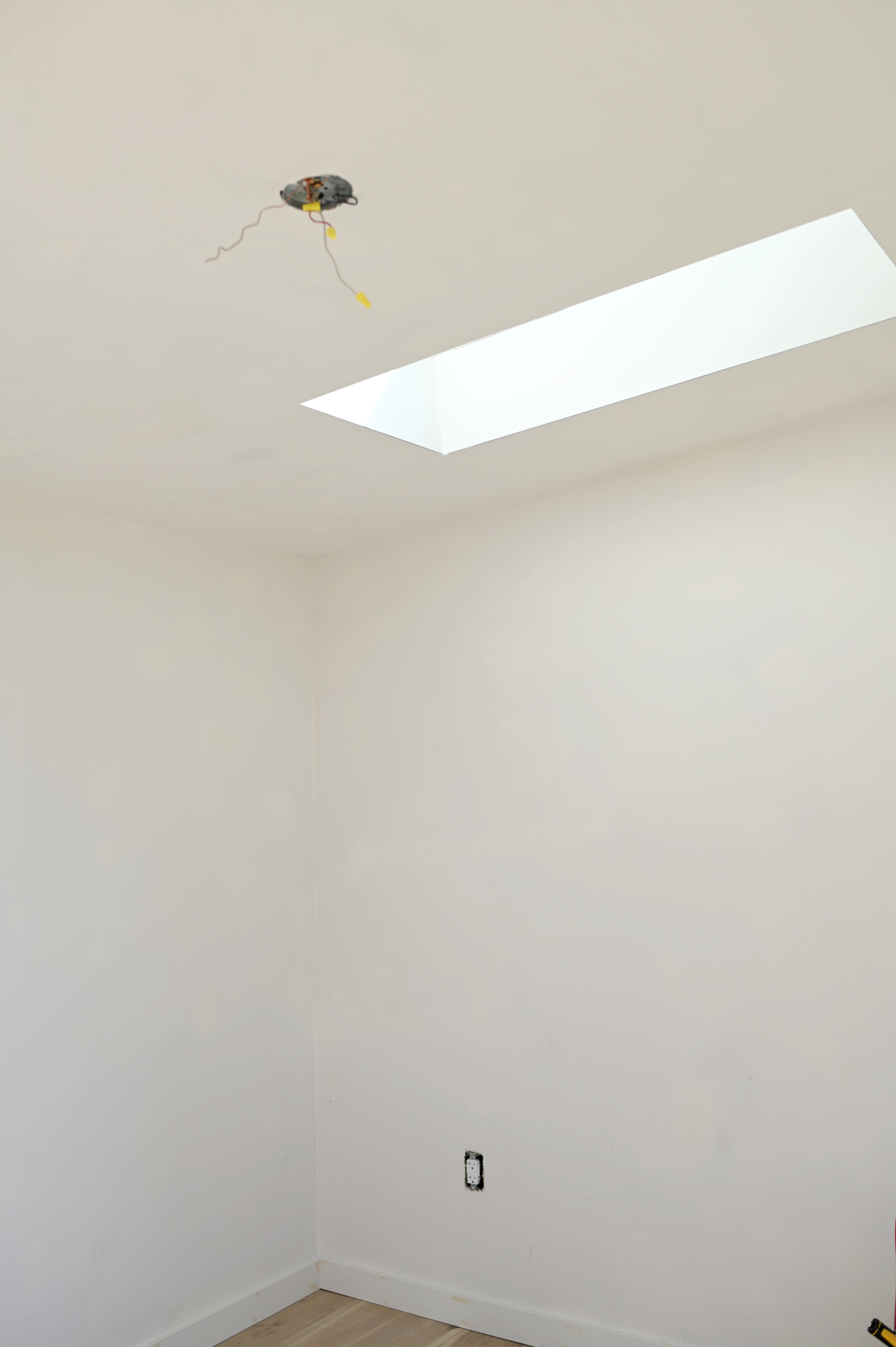
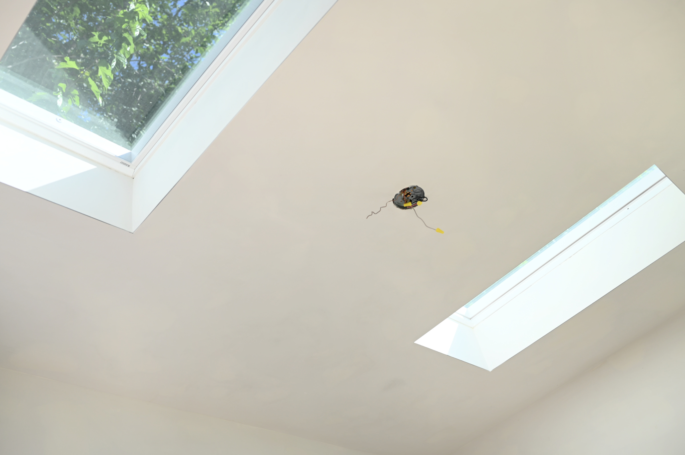
I LOVE IT SO SO MUCH! It’s just the right size (10 x 12) and there’s so much light. Also the commute from the house is kind of amazing, lol!
Before we ever put up a single wall or started any construction on the studio I KNEW I wanted to paint the interior in my favorite color combo: purple and red! I’ve been a looooooong time fan of a purple and red moment in both fashion and interiors. I’ve been pinning inspiration for years and it was really a no-brainer that I’d want it as the visual foundation of my very own creative space. Sidenote: you should definitely be on the lookout for lots of interesting color combos in design this year. I have a feeling it’s going to be a big trend. But I digress…
While I’ve always LOVED color and have NEVER been afraid to use it, it wasn’t until my color theory class in design school that I truly gained both confidence in using color and also an understanding about why I was inherently drawn to certain colors, while others have never really been my jam. Having an education in the differences between analogous, complementary, and split-complementary colors really unlocks a whole new world. For the average, non-designer, it can really help with facing the fear of using color in spaces.
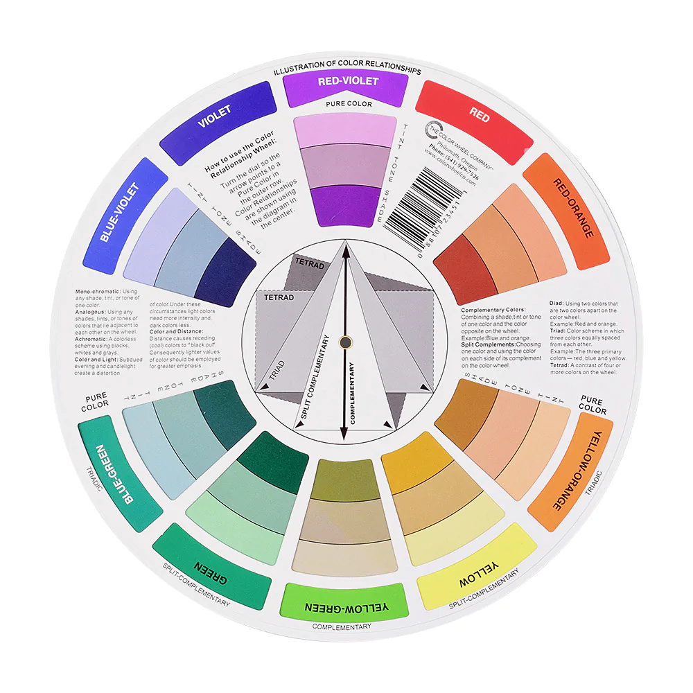
THE COLOR WHEEL IS YOUR FRIEND! It’s a super easy tool for referencing color relationships, and it’s so useful when trying to figure out not only what colors look great together, but also why they look great together. In my case, purple and red are right next to one another on the color wheel which makes them analogous colors. Analogous colors are pretty much guaranteed to look amazing together and generally create a very smooth visual transition from one color to the next. These aren’t high-contrast like complimentary colors (those opposite one another on the color wheel) so they are a fantastic way to dip your toes in the color waters.
Now, y’all know I’m the queen of a moody interior. It’s my absolute fave, and it’s always my first instinct to go deep, sultry and moody with color in a space. BUT, this time I decided to do something a little unexpected. *GASP* My immediate gravitation was toward a moody plum purple, but I wanted to push myself outside of my comfort zone and go for colors with a bit more vibrancy. Instead of deep purple I decided on something in the lavender/lilac family for the walls, and rather than a deep brick red as an accent I opted for a true vibrant red.
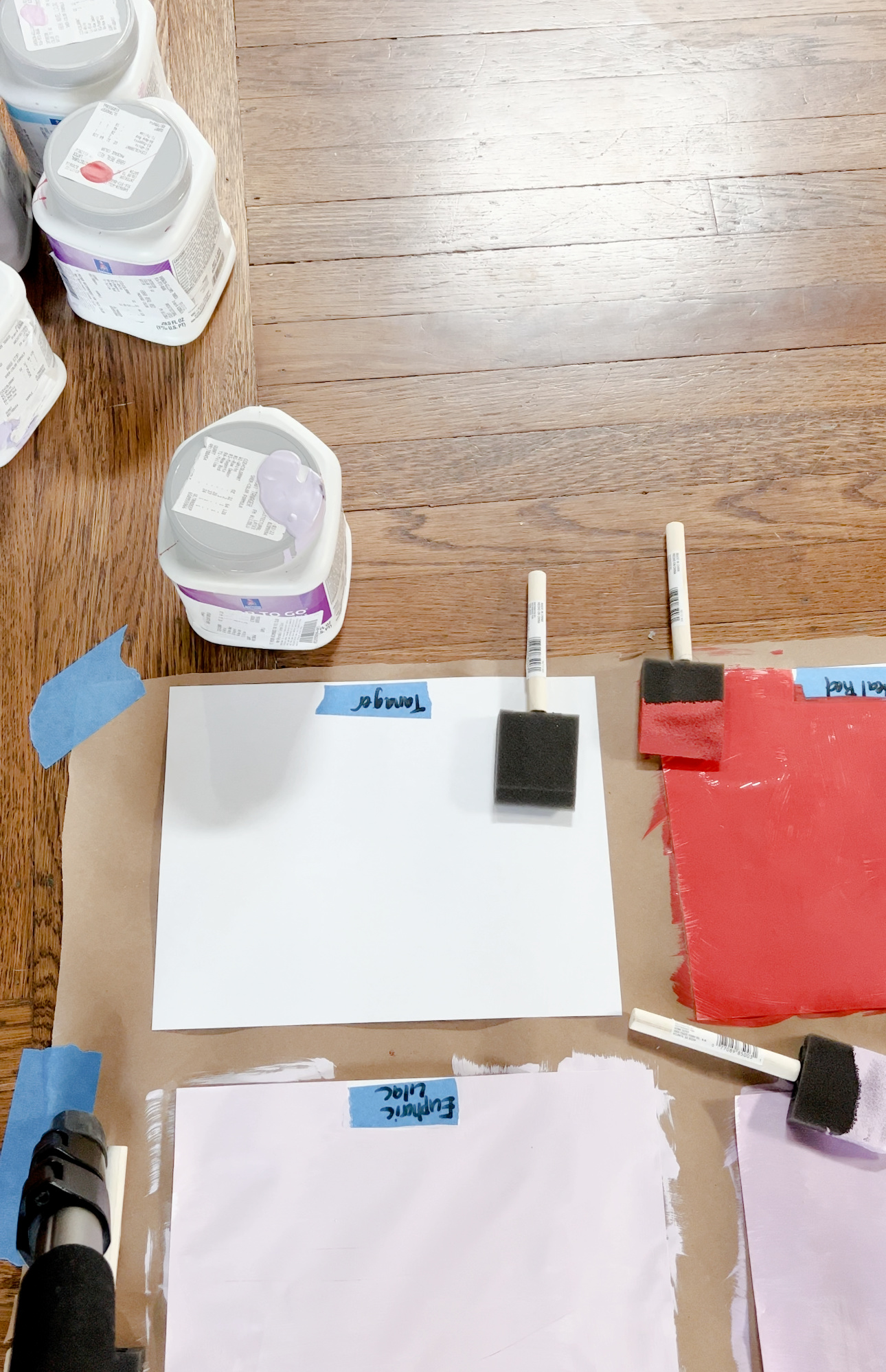
Once I decided on a color direction it was time to test out samples. Sherwin-Williams has so many great options in both the lilac and red color families so I had a good selection to choose from. I picked up several Color to Go® samples and got to work. Color to Go® paint samples are great for giving you an idea of how a color will look and feel in your space. Each sample comes in a convenient Twist-n-Pour container that holds enough paint for creating test swatches so you can choose your final color with confidence. I painted lots of sample swatches on paper and moved them around the space until I made the final color decision.
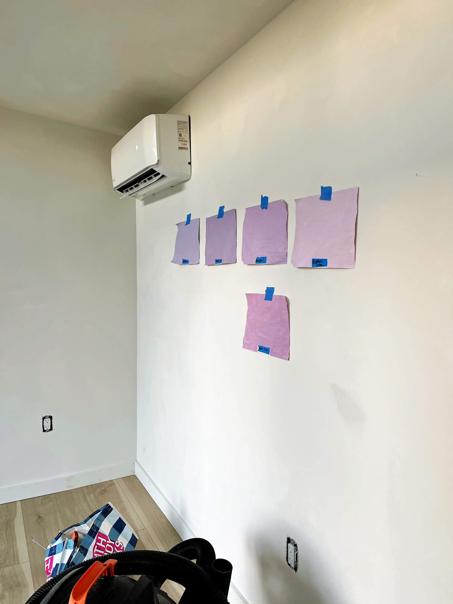
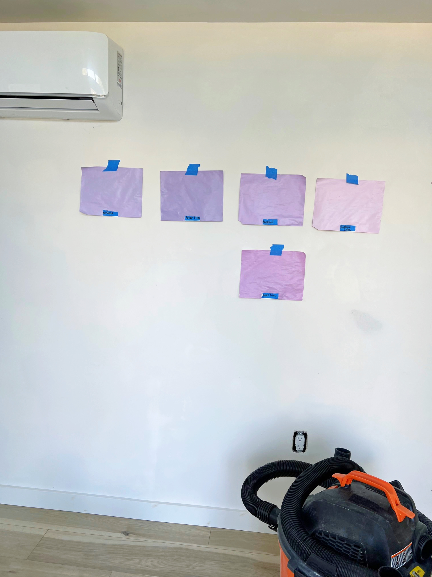
Ok so these aren’t the best pics since they were quickly snapped with my cell phone so just stick with me here. Once I chose my top few faves, I further narrowed it down to my top two: Novel Lilac SW 6836 and Magical SW 6829.
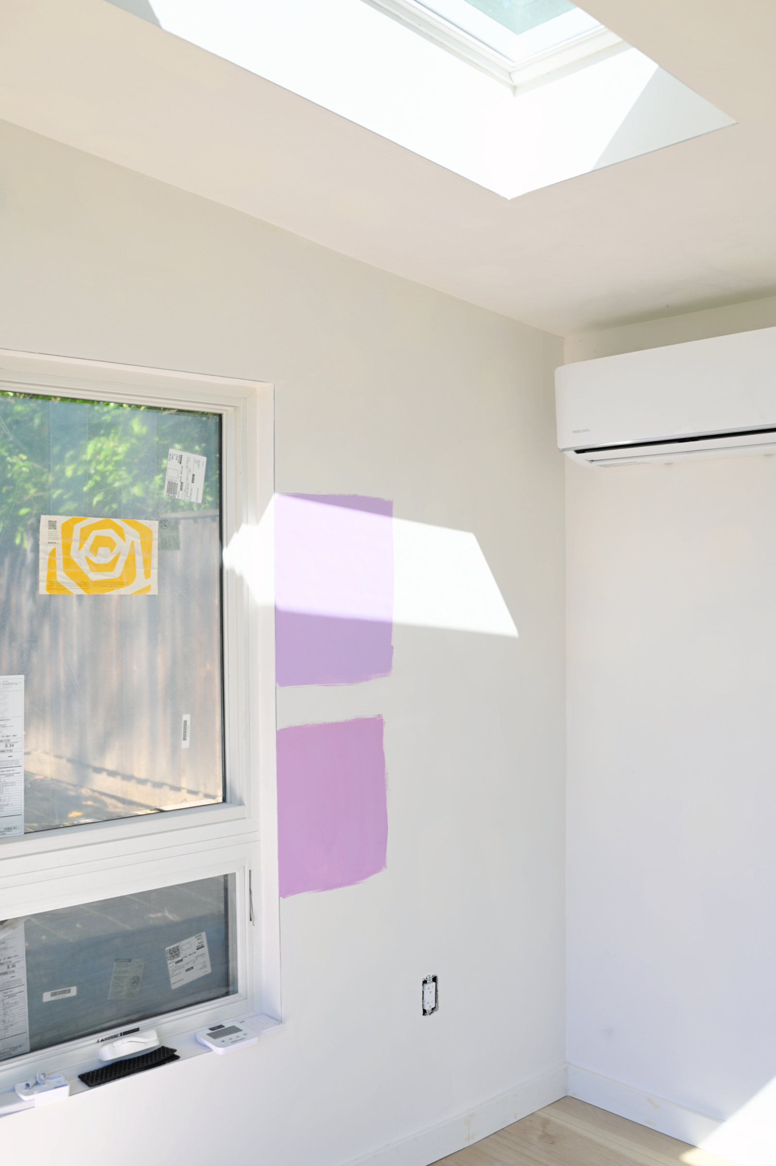
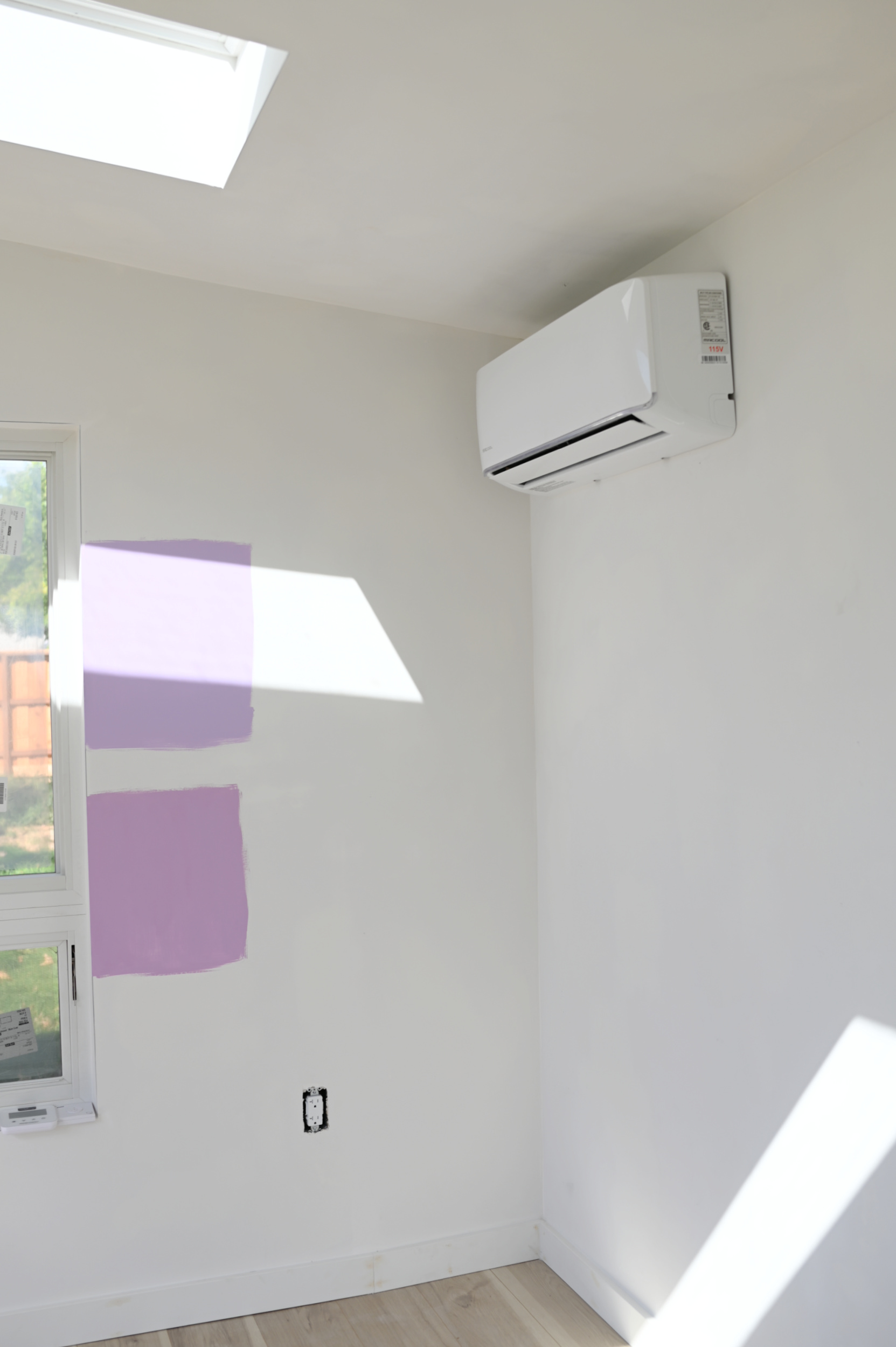
Ok so now you can see the colors in their truer state. The top is Magical and the bottom is Novel Lilac. I truly loved them both and it was really hard to choose between them. In the end I chose Magical because, well, the name is kind of amazing, right!? But mostly because I felt Novel Lilac had a bit more pink in it than I wanted.
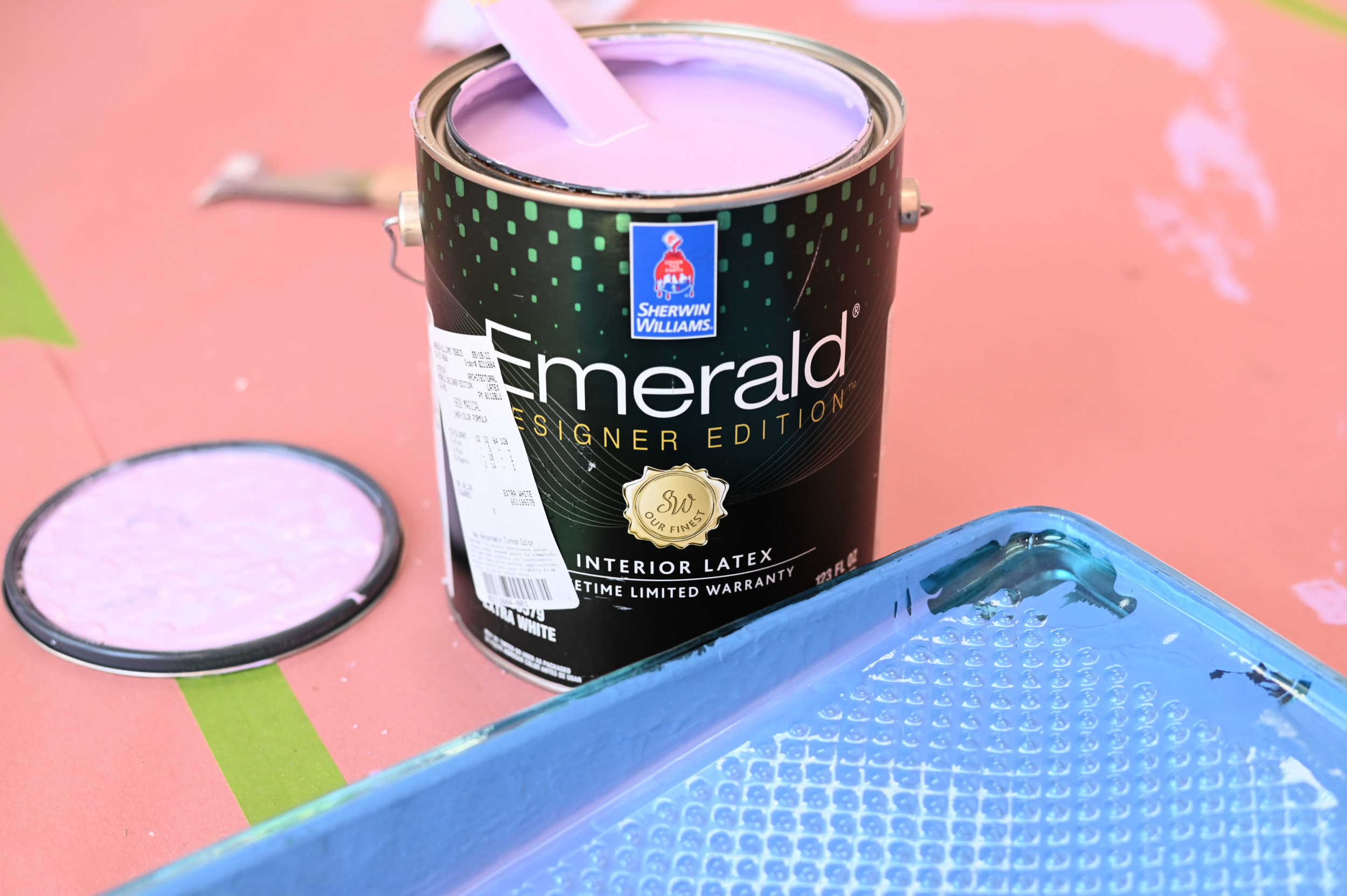
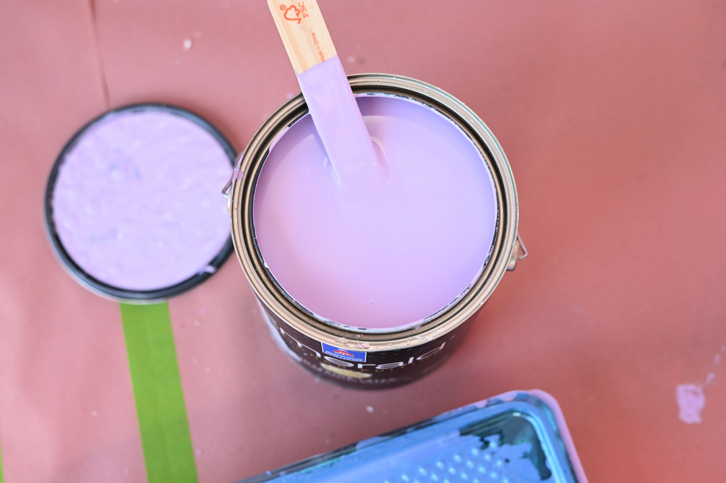
With my decision made it was time to paint. Seeing this color go up on the wall was so exciting!
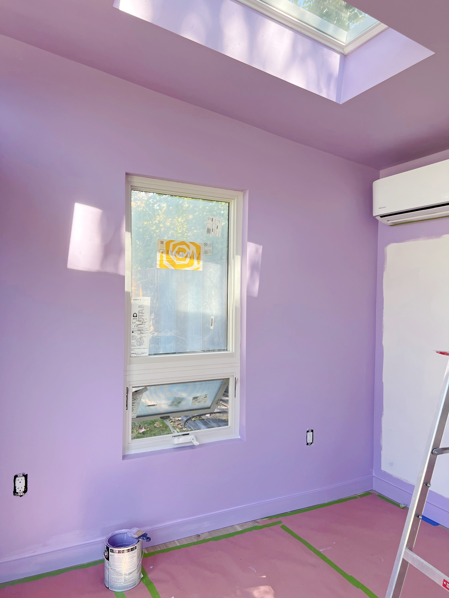
About 15 minutes into painting I just knew it was the right choice and I could already picture it with the red painted console I planned to install against it. Speaking of…..
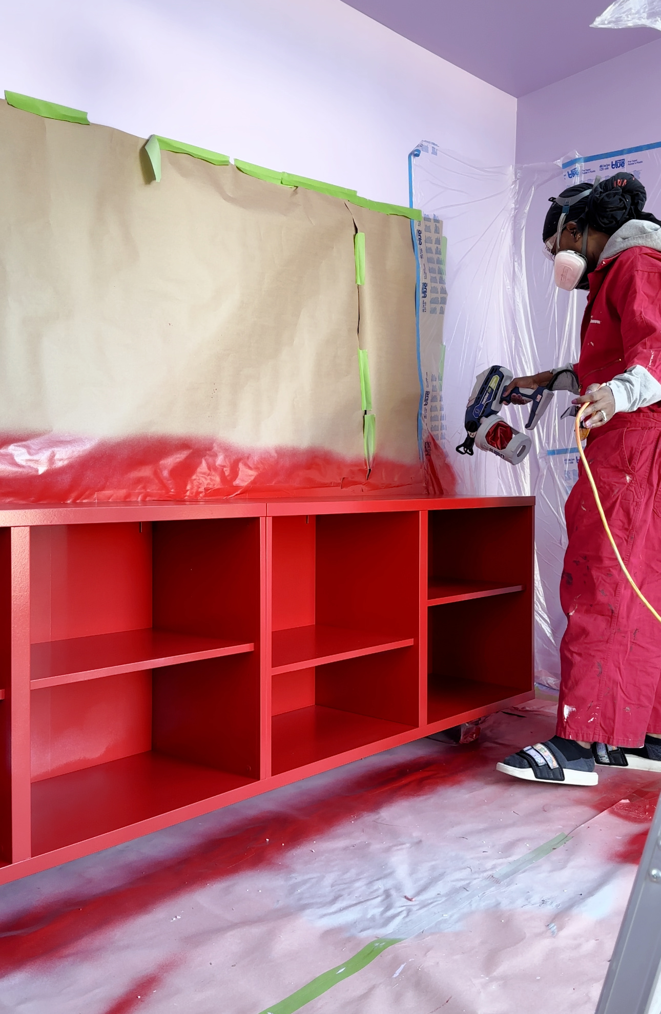
Ummmmm EXCUSE MEEEEE! Do you see this colorrrrrr! Ugh! It’s so so good. It’s Positive Red SW 6871, and it’s really and truly positively perfect against the purple.
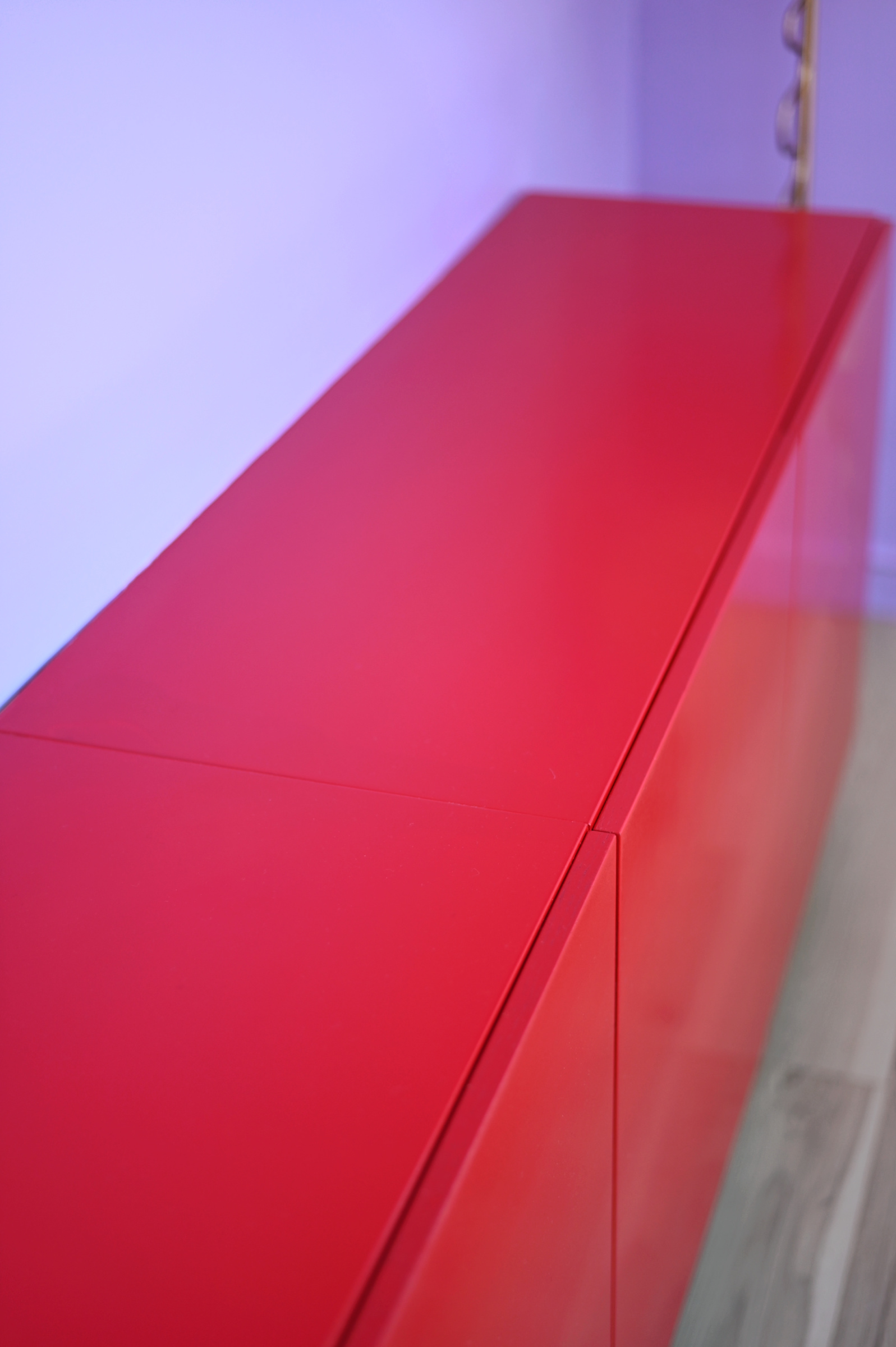
Once the room and console were painted it was time to start pulling the space together. I’ve been collecting and stockpiling pieces for my office in my garage for over a year, so I (and Naomi!) was really excited to pull it all out and start bringing this creative space to life.
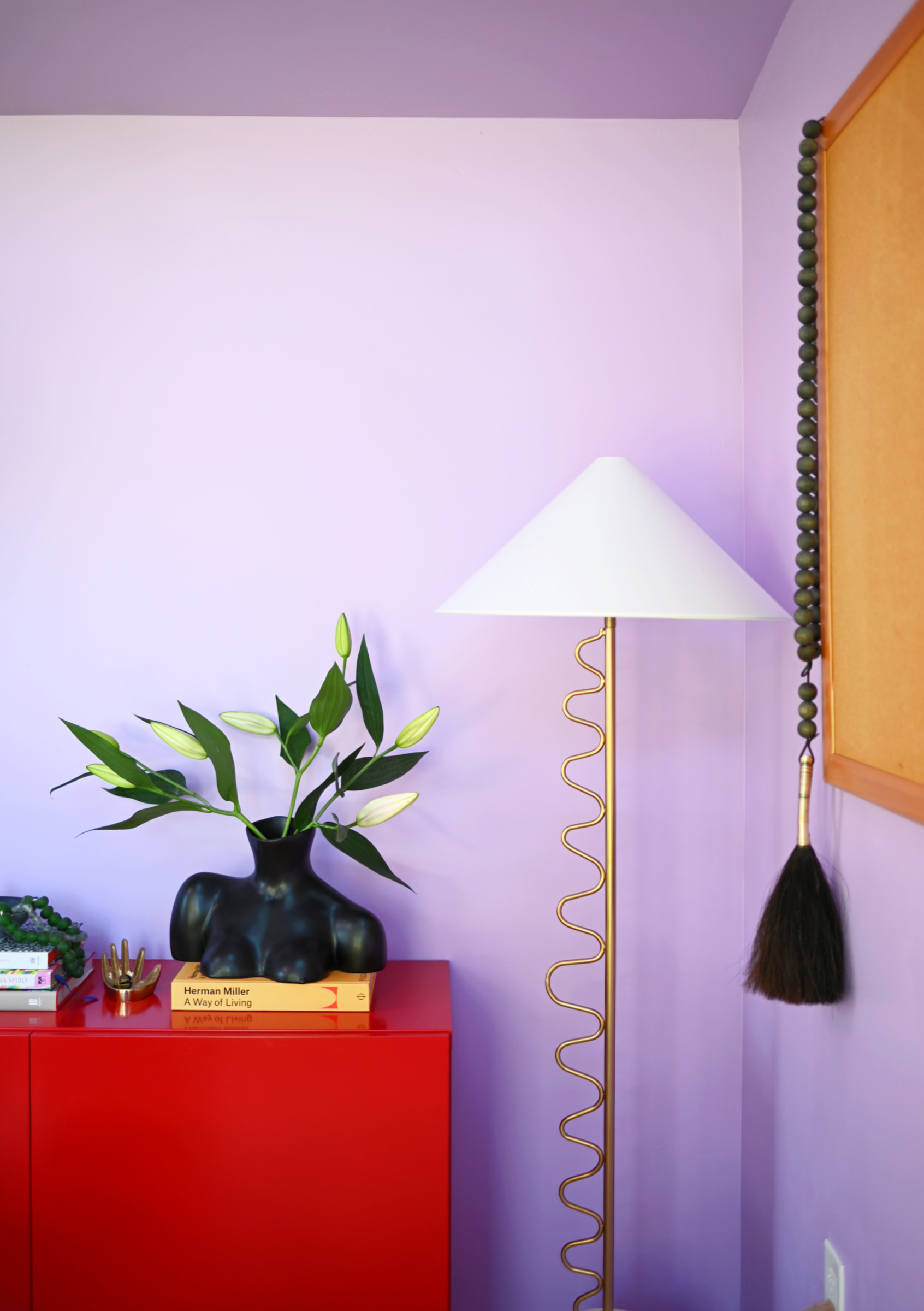
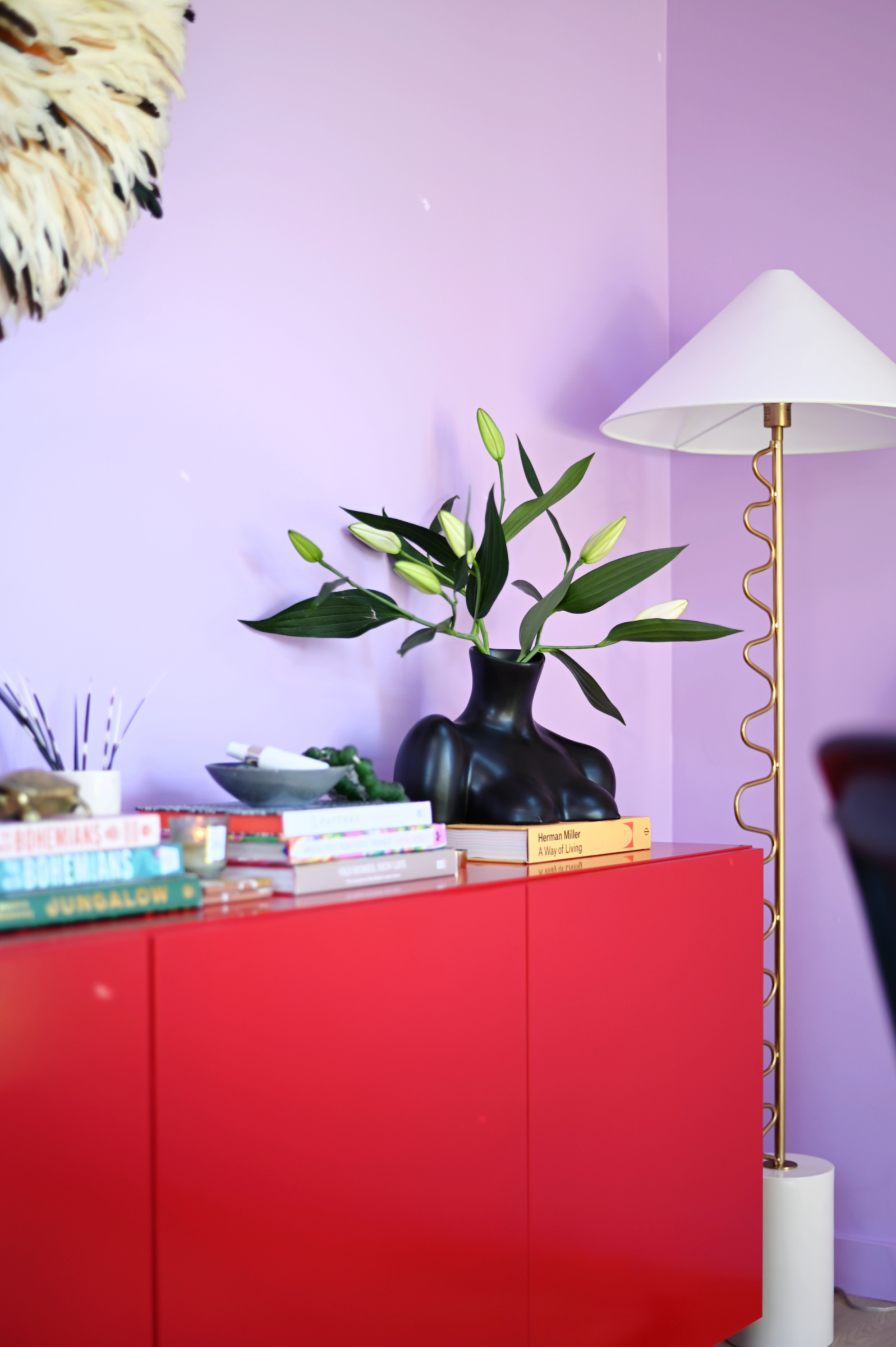
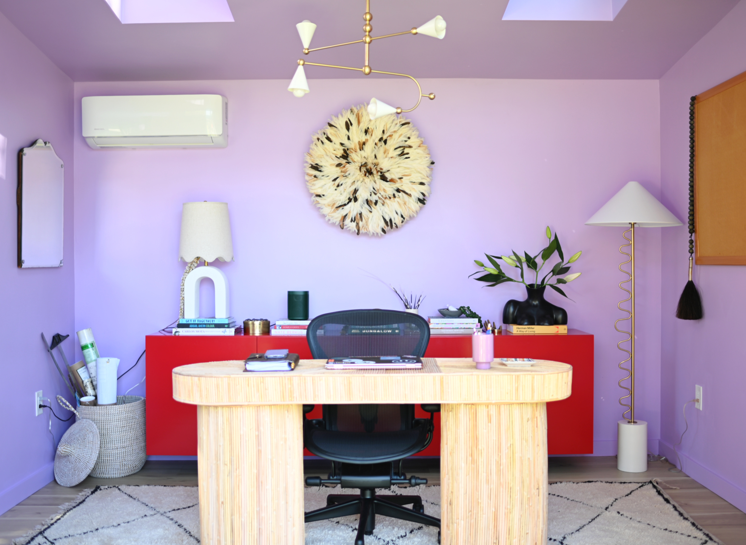
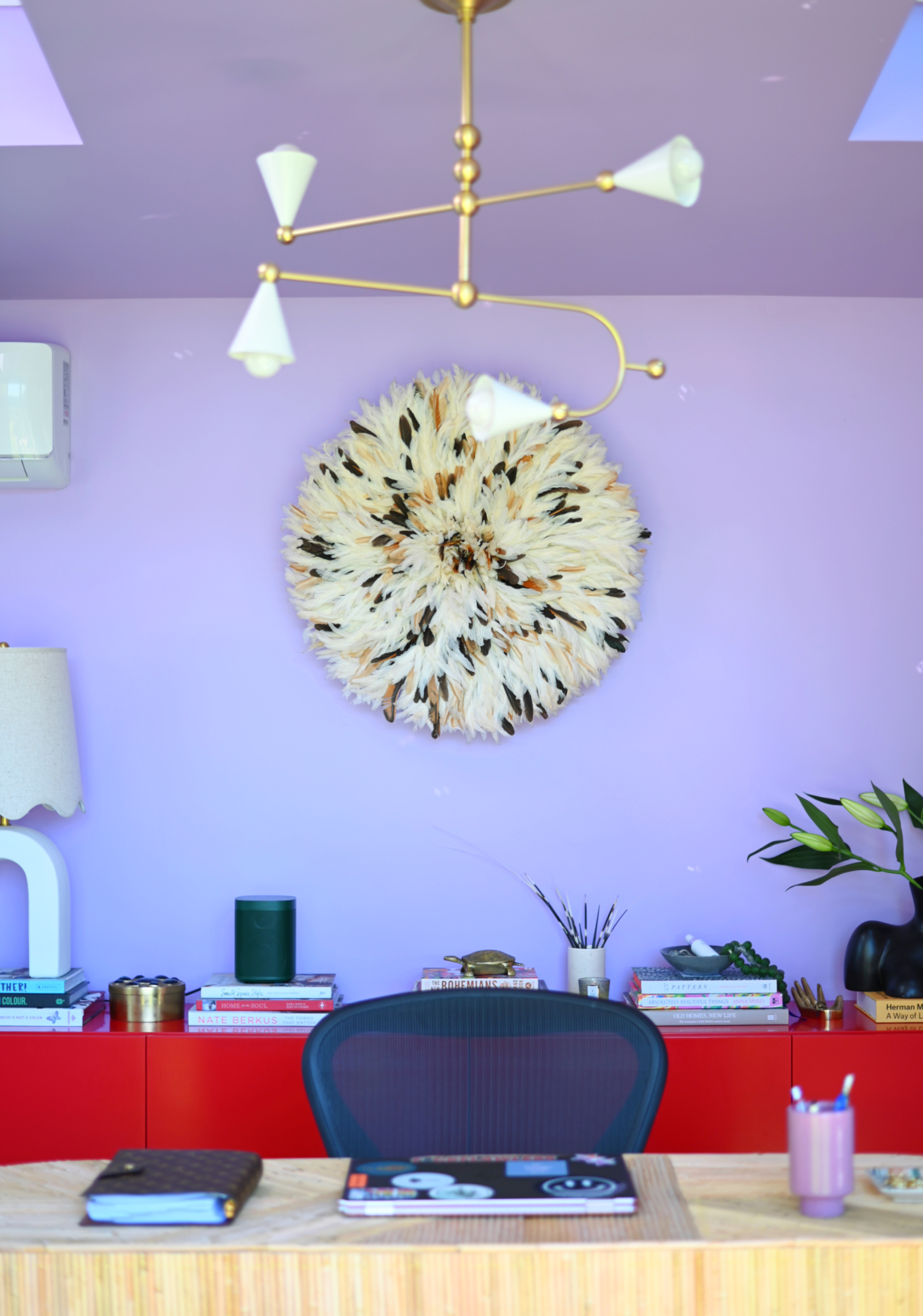
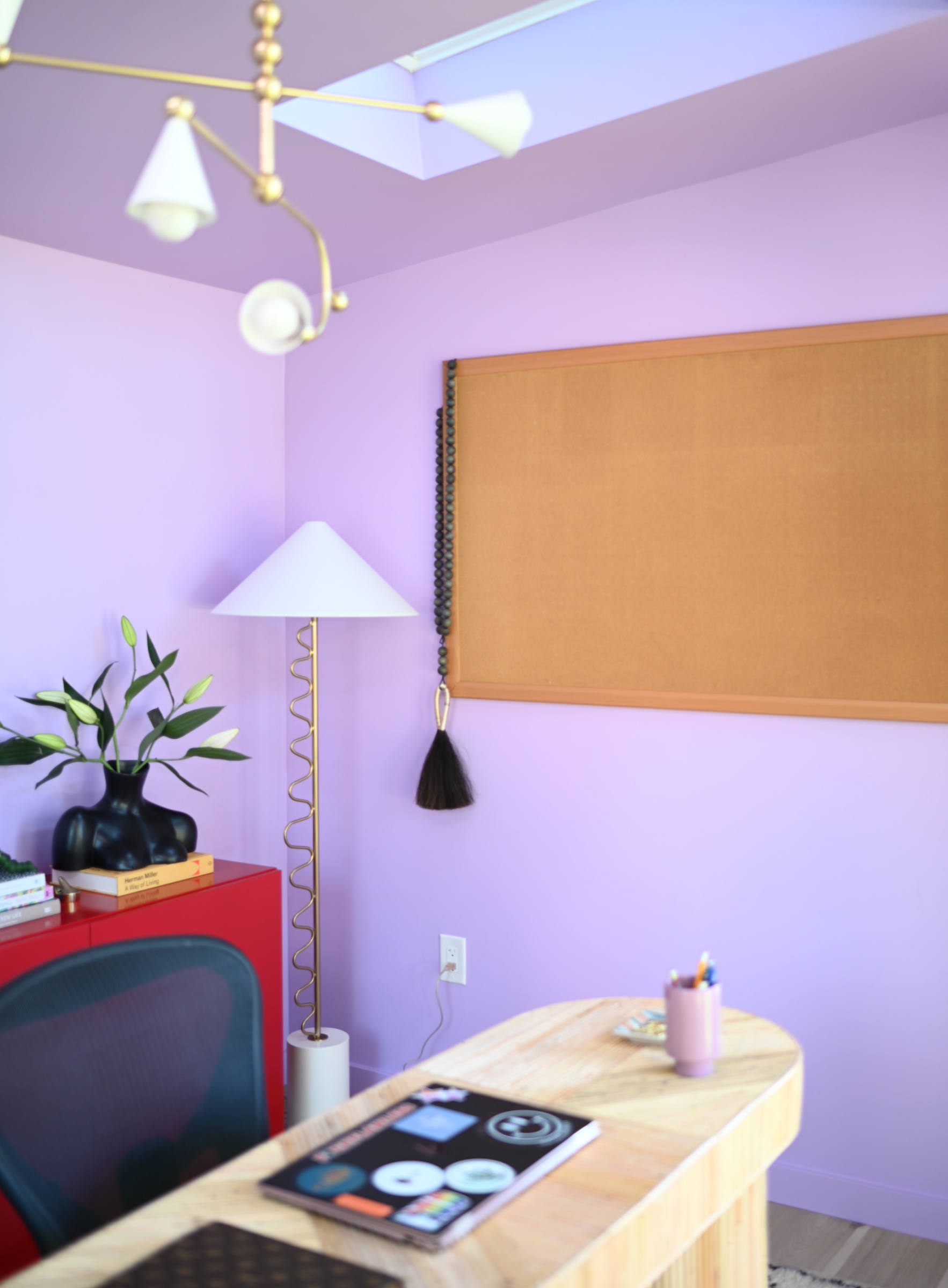
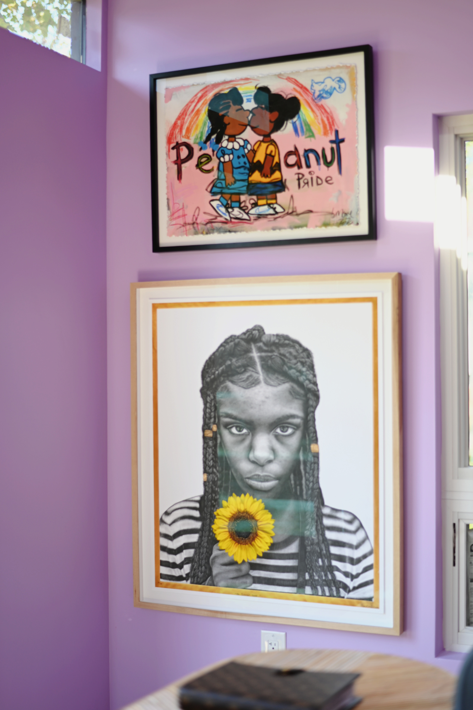
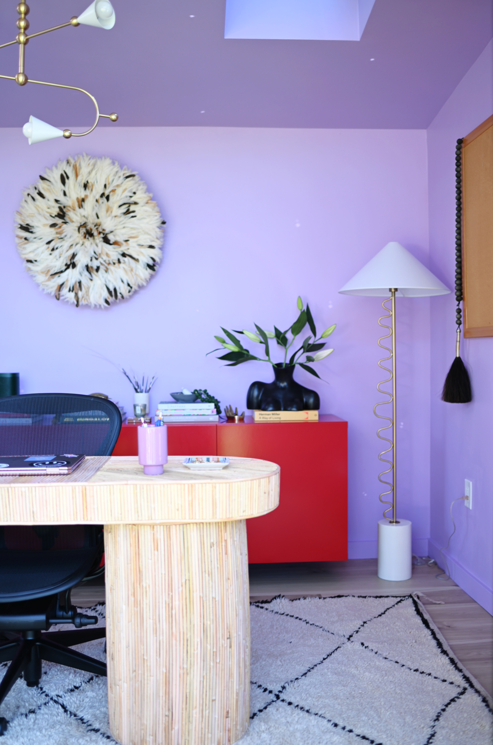
It’s such an interesting color in the way that it changes throughout the day as the light changes. It also seems to change day -to-day. If it’s a super bright day the color looks quite diffrent than it does on days that it’s more overcast. I snapped a pic of it on a really sunny day and you can really tell!
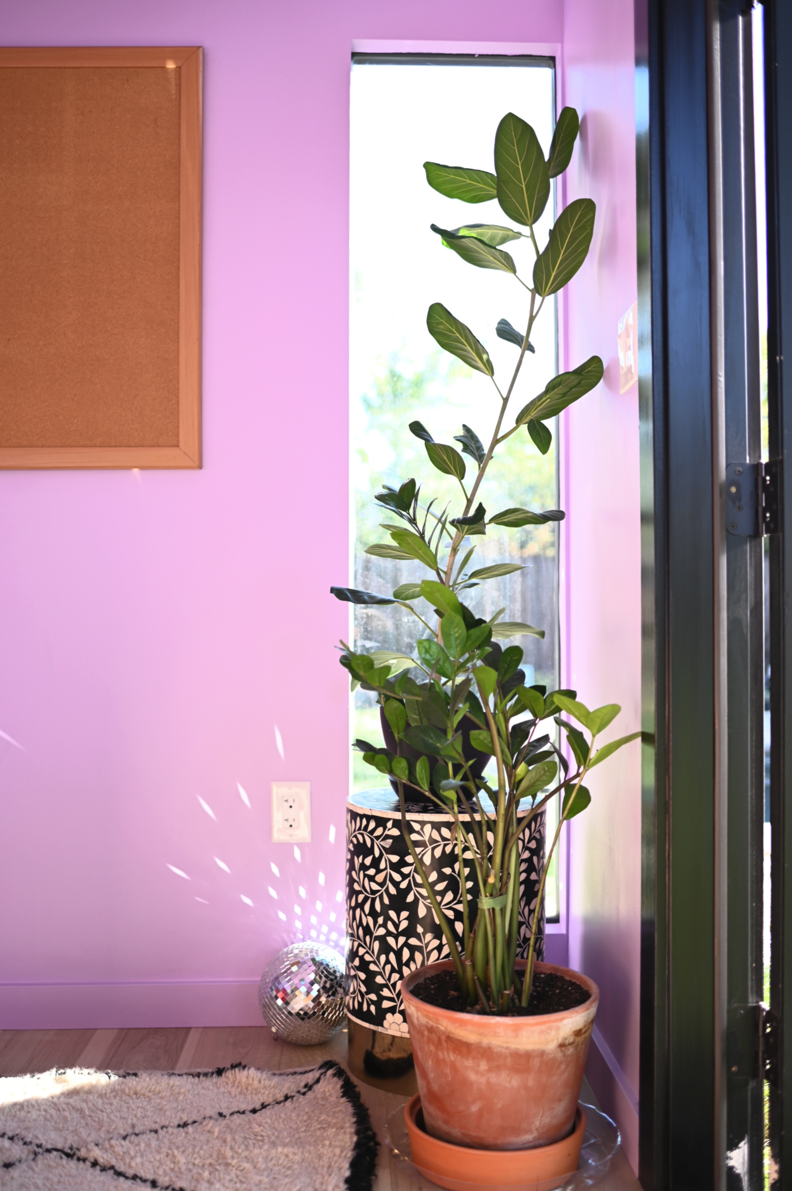
Of course, as with all my spaces this one will change and evolve over time. In fact, much has already changed as new pieces have arrived, but having my own space to work and create in feels incredible. I thrive in a space infused with layers of color so it’s really amazing walking in every day. It feels fresh, invigorating and super inspiring. It feels really magical!
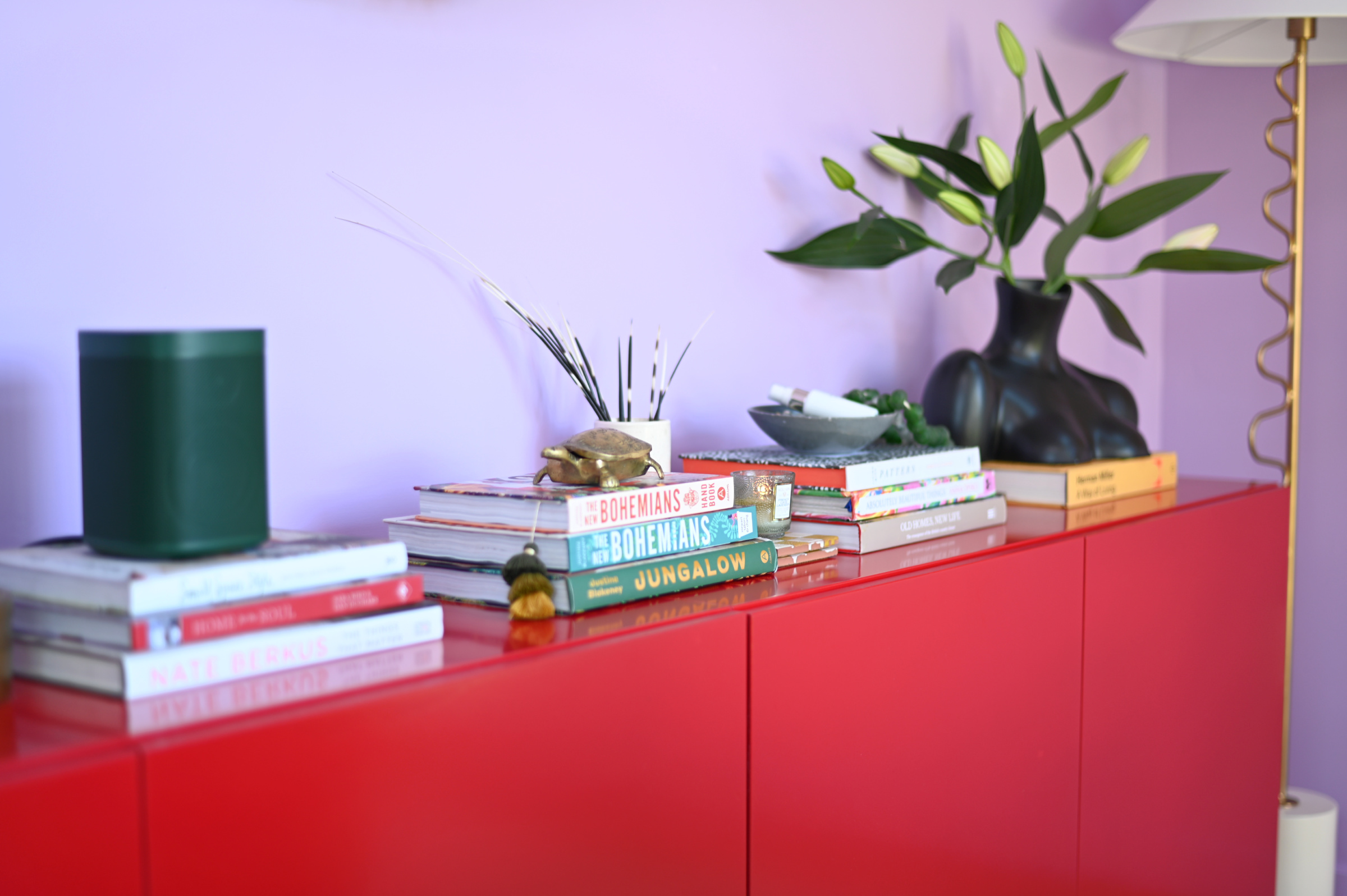
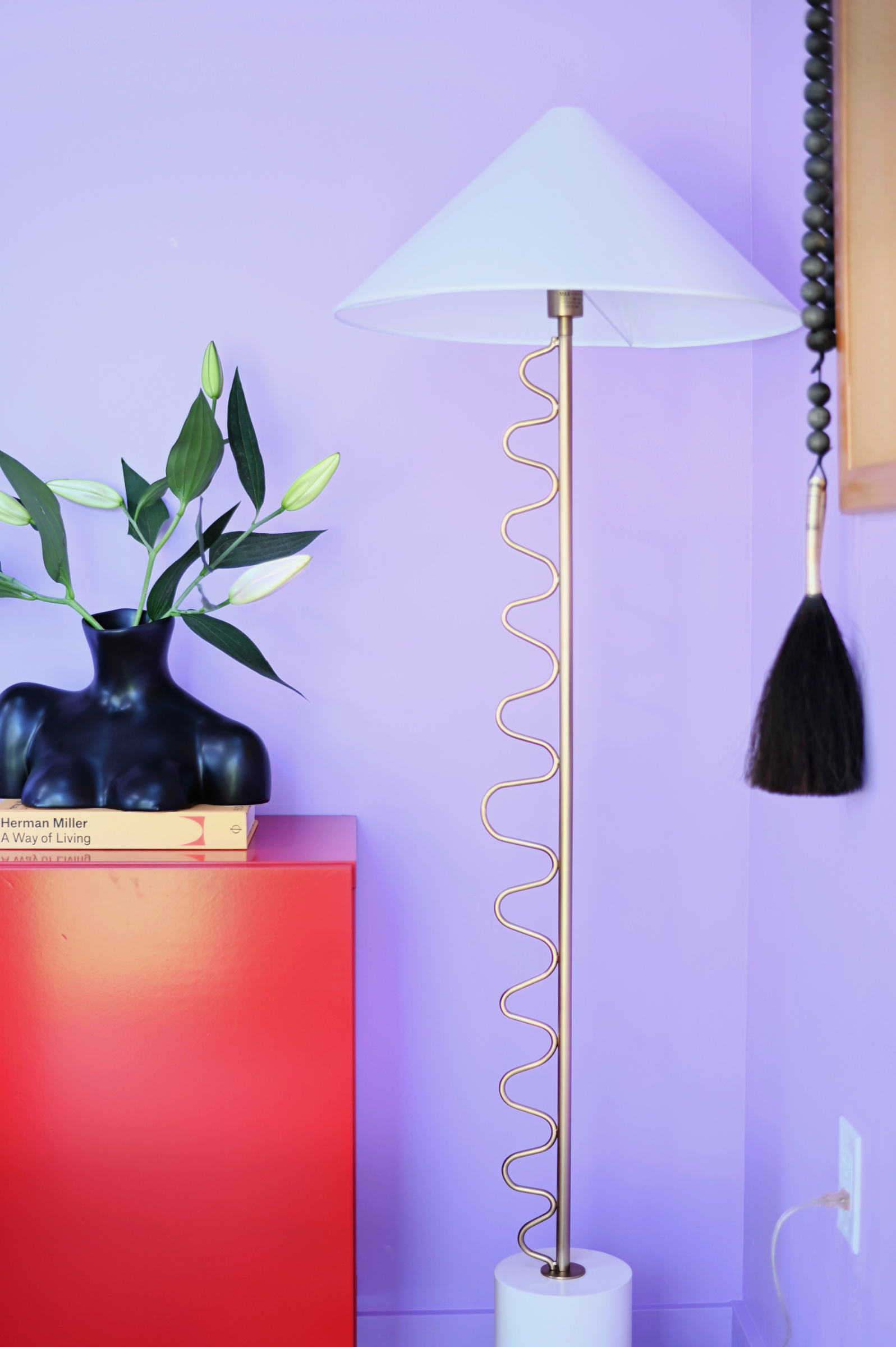
I’ll be sharing more of the office soon, including the exterior paint. For now, if you need me, you know where I’ll be!
Until next time……
George Moorhead says
Choosing the perfect color combo for an office studio is such an exciting process! Colors have the power to set the mood and boost creativity, making the space feel both inspiring and comfortable. Whether it’s a bold contrast or soft neutrals, the right combination can truly transform a room. Designing with confidence allows personal style to shine, just like selecting Bothell homes for sale gives buyers the chance to find their perfect space. A well-decorated office makes work more enjoyable and productive. Can’t wait to see the final look!
THERESA DEXTER says
Hello,
I love your office space. Do you have a section that speaks to where the office fabrication came from or who the maker is?
I am going to get my own office and am loving all the windows in yours and would love to know who fabricated the design or is it a kit?
Shavonda Gardner says
Hi! The office is a kit from Studio Shed. You build it on the site and they ship it to you in pieces.
Christine K says
O B S E S S E D. This color is high on my list for my soon-to-be purple front door. So good!!!
Liz Cadorette says
I have been so excited to see this build progress, knowing you would have incredible ideas for the interior to inspire creativity, & as always, you knocked it out of the park! Congrats on your gorgeous new space, these colors are such great energy!
amy says
this came out amazing! thank you for sharing your full process via blog, i appreciate the time and effort it takes into writing everything out.
karen says
I’m predisposed to like this because I’m already a big fan of lilac, but the whole composition is so beyond that. The space looks so inviting, and somehow both calm and energetic. It’s not hard to imagine some serious creative work being done here.
Laura says
I gasped when I saw the red console with the lilac walls. Magical, indeed. This reveal was worth the wait. And the disco ball moment is so fun!
Racheal says
This is one of my favorite color combos. You nailed those shades!
Julie says
Hello,
This absolutely gorgeous. Love that combination.
Did you use a lacquer on the red cabinet?
Shavonda Gardner says
Hello. No I didnt. I used SW Emerald interior paint in high gloss finish.
Cecilia Gonzalez says
Shut up! Friend, this looks so so incredible! Like no words! A
Anna says
This is SOOOO good!!!
Christy says
Holy moly this is so so good! Every detail right down to the disco ball tucked in the corner and throwing sparkle into the office. 😍
Andrea says
It’s so stunning! Your eye for color and detail is just so incredible
Tasha says
It’s beautiful.
Jonisha Holmes says
It looks beautiful 😍
Mandy Stewart says
It’s fabulous. I never cease to be impressed by your eye for detail. Gorgeous space!
Noell Billings says
Wow!! Loved how your office space turned out.
MD says
Wow! Stunning as per usual.
Carmeon Hamilton says
To see this space finally come to life is mind blowing!!!! Your vision was everything and it’s now even more magical in real life!!! Love it Bestie!
Angelique says
Red and lilac were my grandmother’s favorite colors! Red brocade sofas and lilac walls with black accents is forever etched in my memory. Your space is so good!
Mary Peterson says
A beautiful and visually interesting space!
Jessica says
Never ever in a million years would I have put those two colors together but wow! So stunning!!! I love it!
Elizabeth says
This is amazing!
Can you tell me more about the piece of artwork with young woman and the sunflower?
Kare Nann says
It is The Sweetest Thing by Gee Horton: https://www.geehorton.com/product-page/the-sweetest-thing