Hi Everyone!
Happy New Year friends! 2023 is off to a staaaaart, let me tell youuuuu. I’ve got so much to catch you all up on and so much to share, but for now let’s get into our first project of the year, shall we.
Welcome to our primary bedroom makeover, AKA #projectthebombcyclonemadeusdoit.
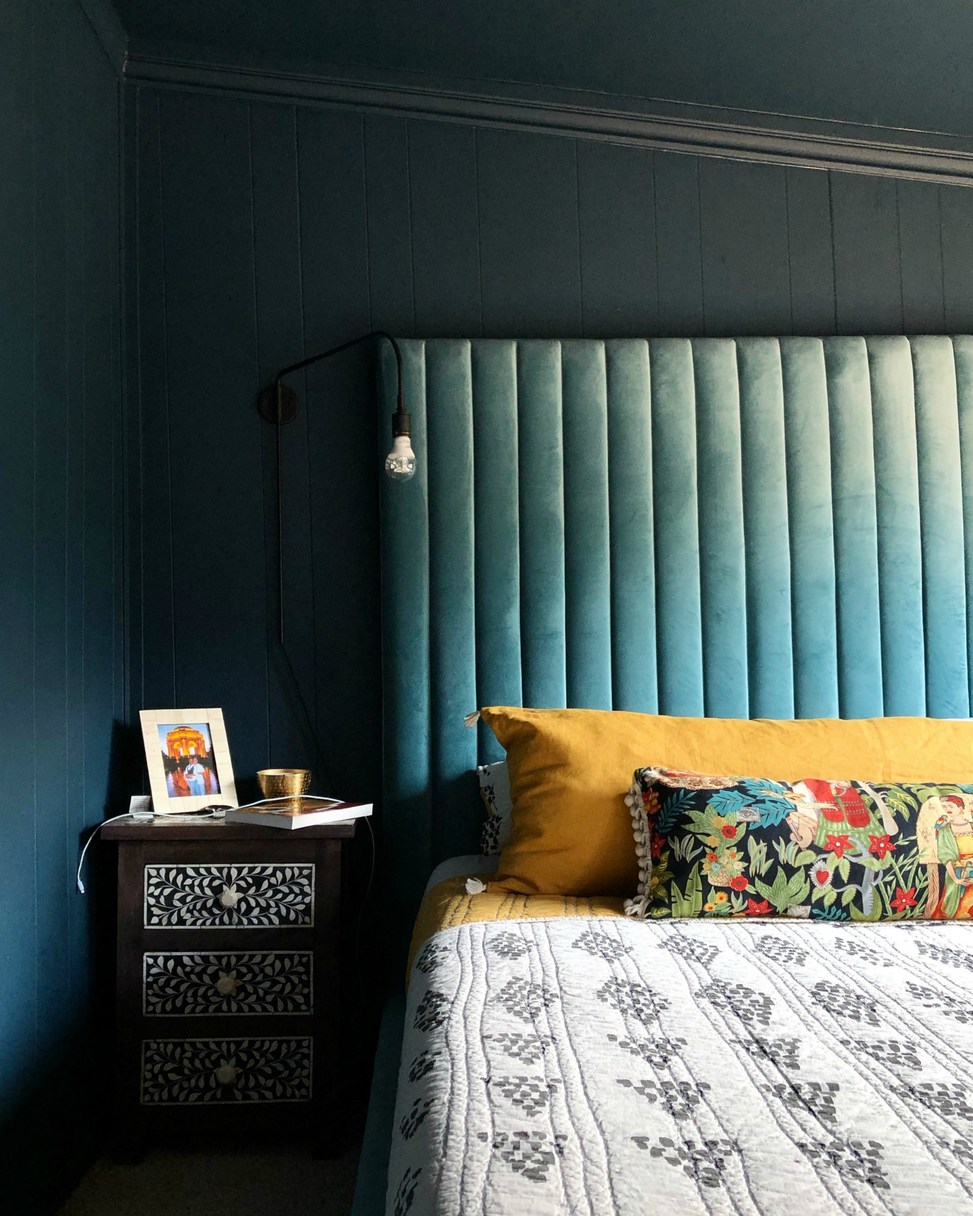
So here’s the thing…we had NO intention on touching this room AT ALL. Like, pretty much ever. Or at least not until we were ready to embark on the formal addition/extension of our actual primary bedroom (the room used by our daughter). This room was the wild card space that made it possible for us to image this house as our home. It was used as a den by the previous homeowners, and it was an outdoor patio prior to that! It’s a bonus space in our otherwise 2 bed, 1 ba house. We use it as our bedroom which meant Bry got the true primary bedroom in the house and Michael got the second bedroom. It’s been just what we’ve needed it to be for the last 8 years and we weren’t planning to dedicate any time or money toward renovating it for a while yet. That was until the recent bomb cyclone that hit CA caused some roof damage which resulted in water pouring down our walls during the rain. And now here we are.
THE CURRENT SPACE
It’s actually been a while since I’ve even mentioned the primary bedroom here on the blog. The last time was my 2019 Home Goals check-in where I shared an update mid-process of painting the space a moody blue.
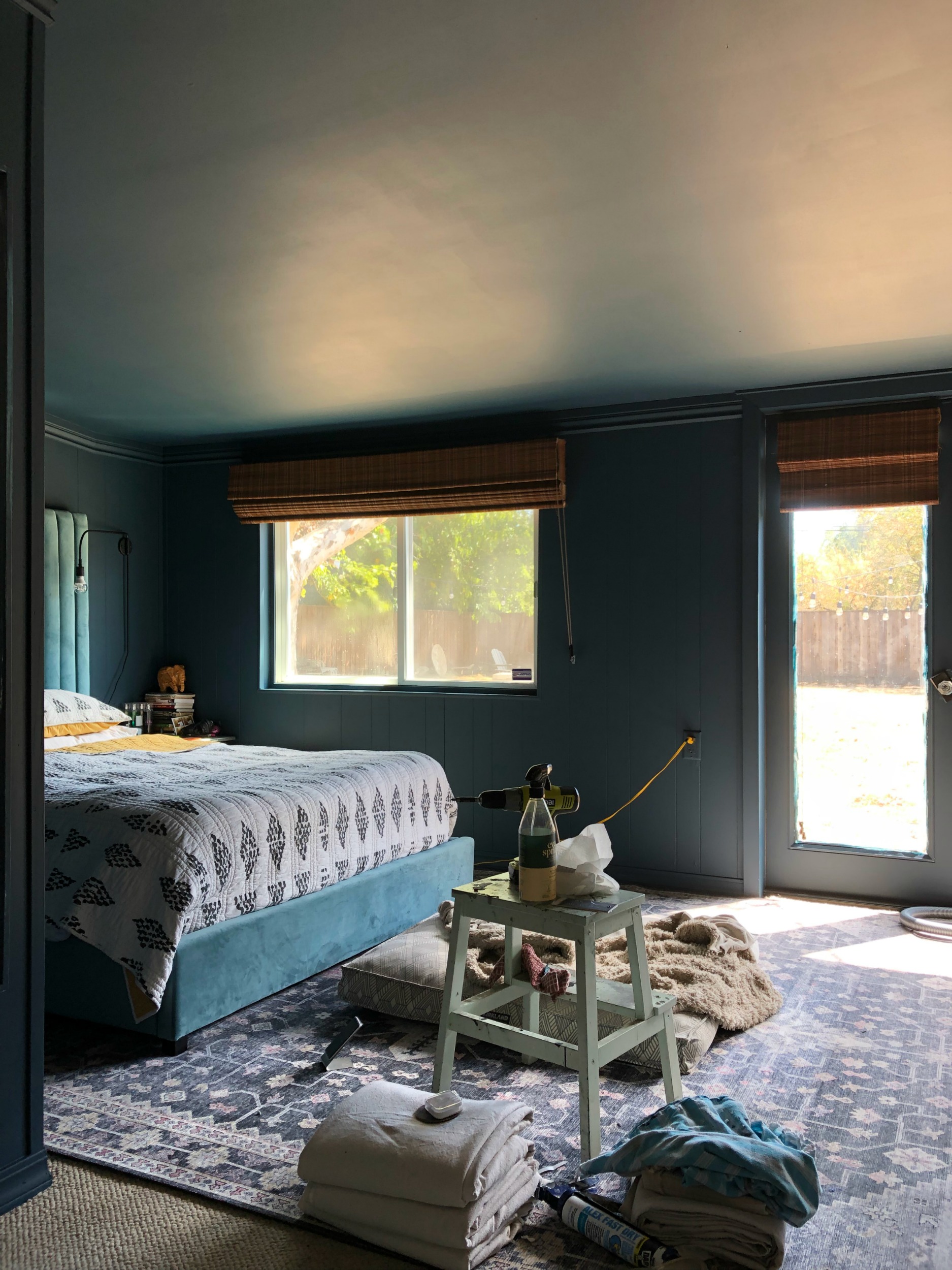
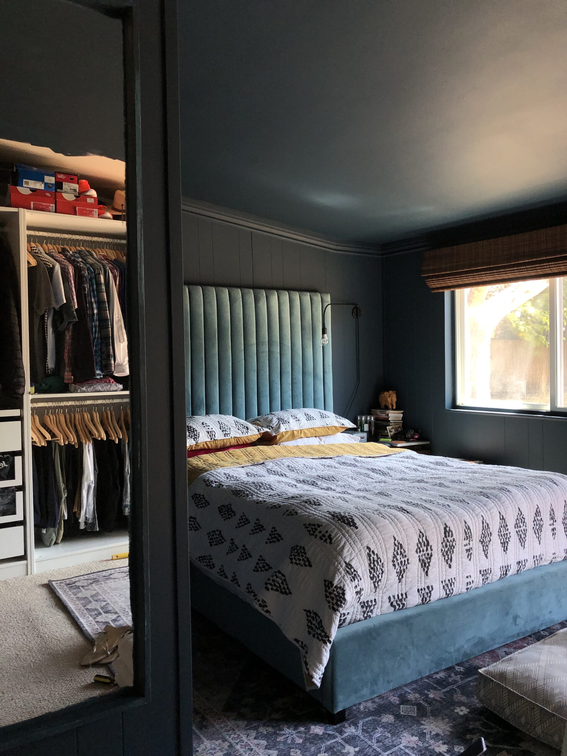
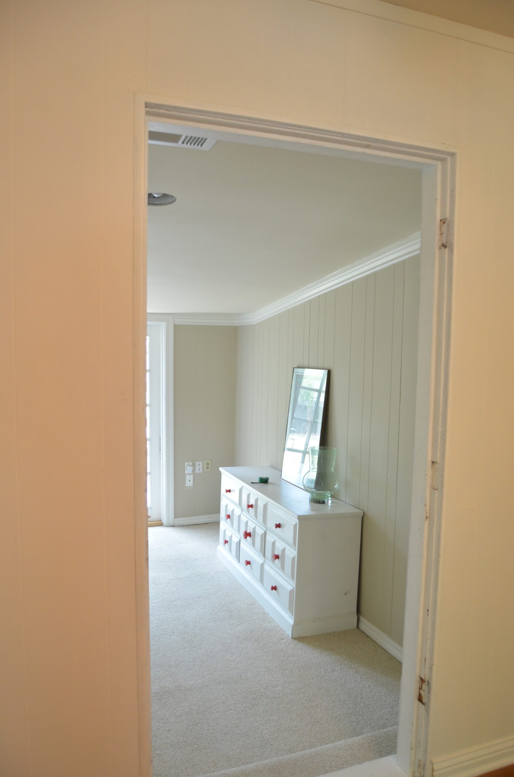
But let’s take it all the way back to the beginning with a peek at the room the day we closed on our house. You’ll need this for context as we get further into the details of the reno.
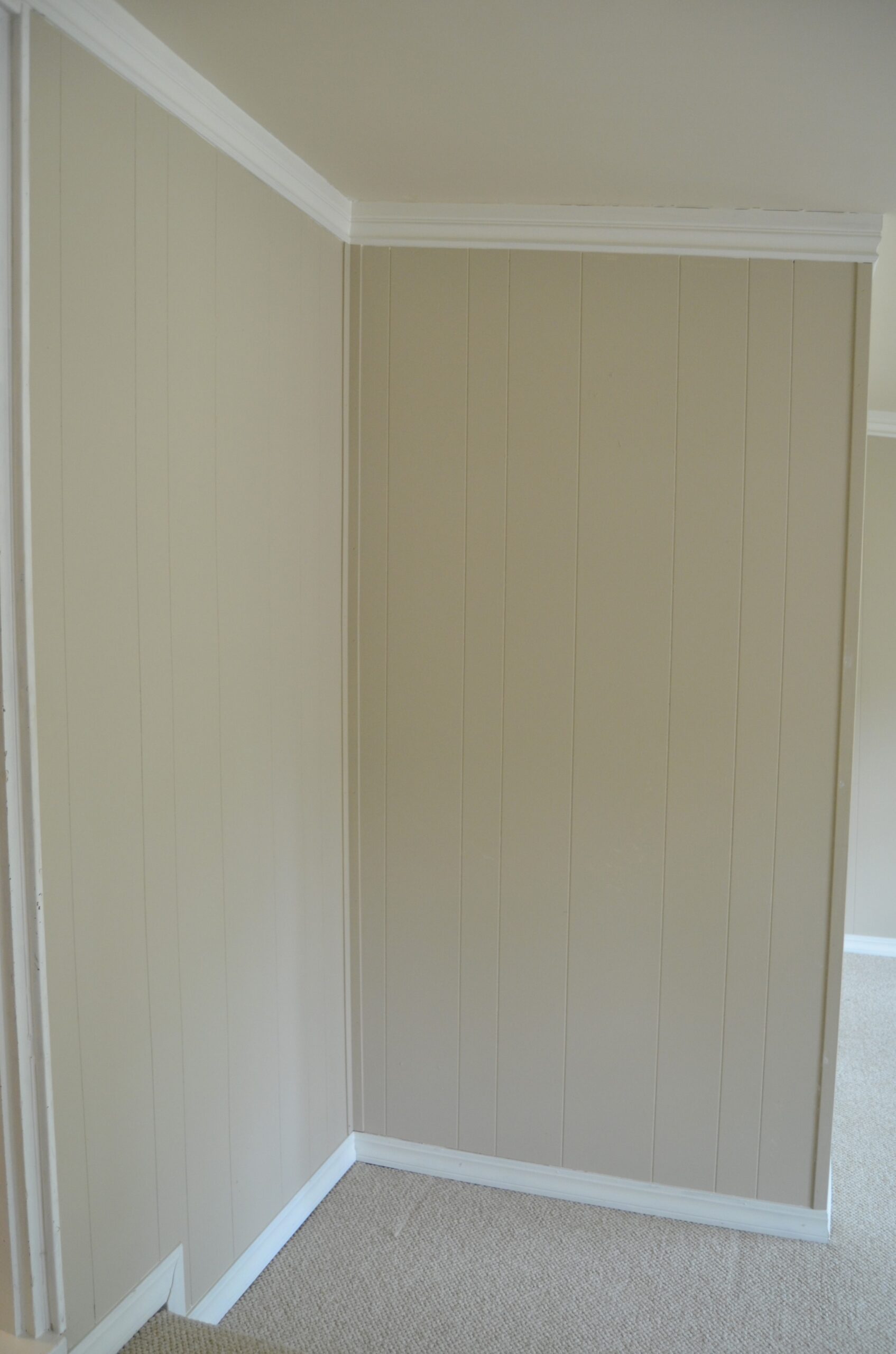
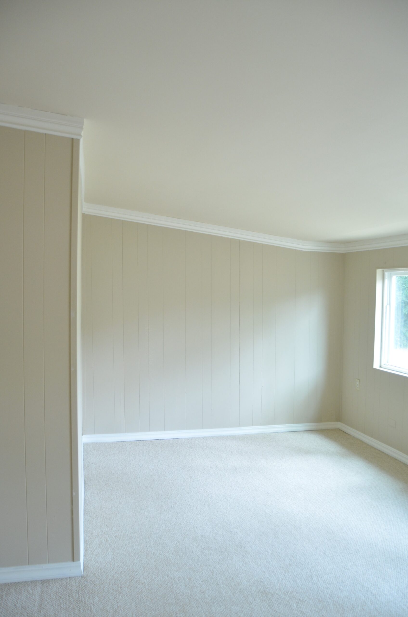
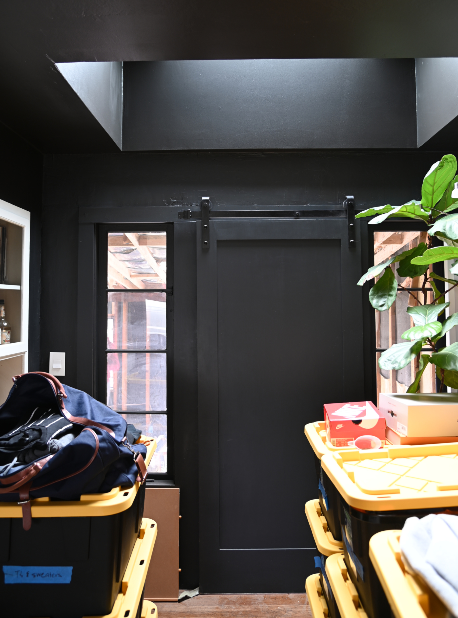
The room is located just off the original dining room so we added a barn door for privacy and PAX wardrobes along the back wall to create a closet.
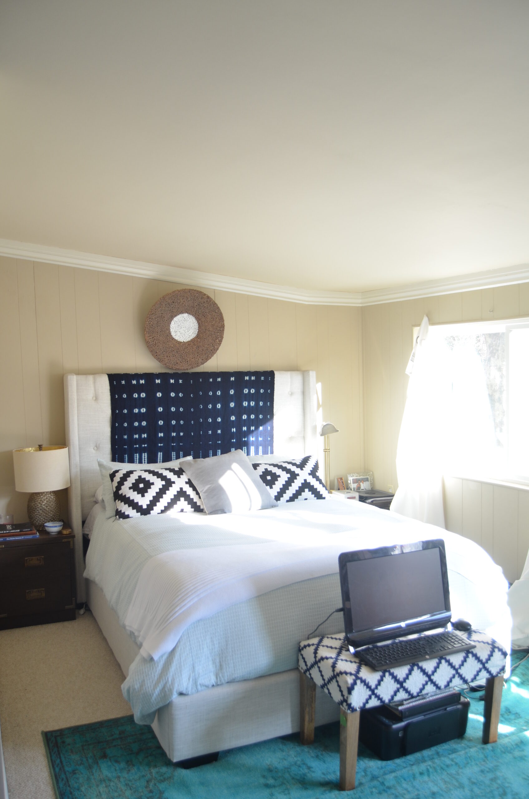
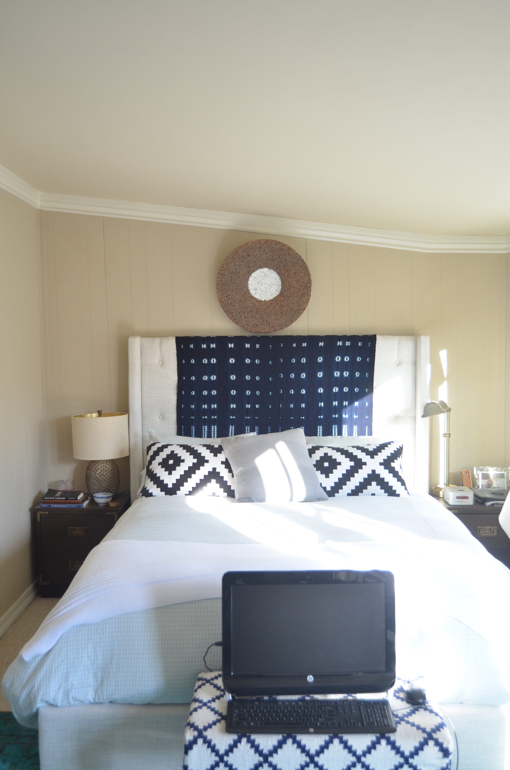
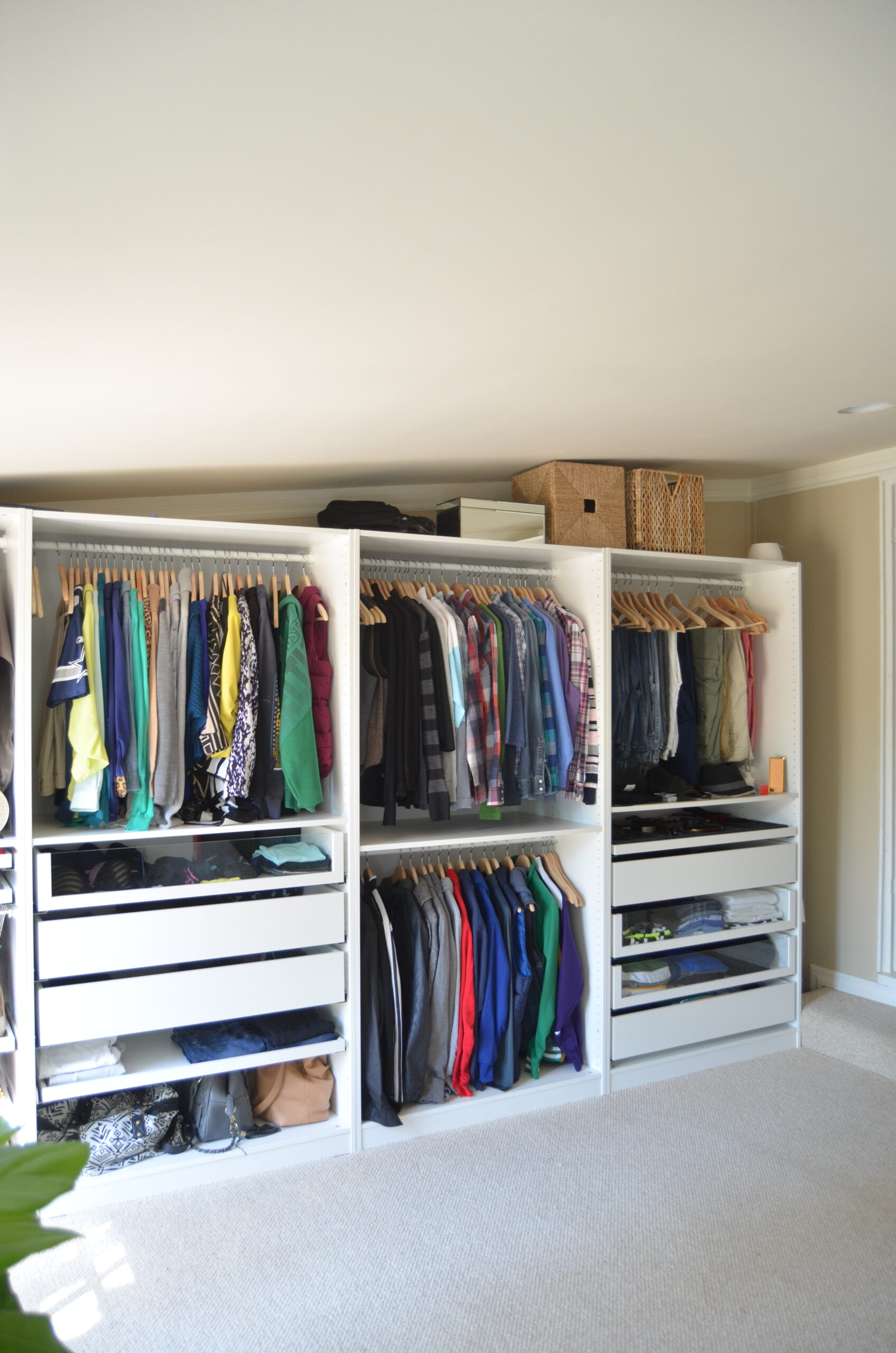
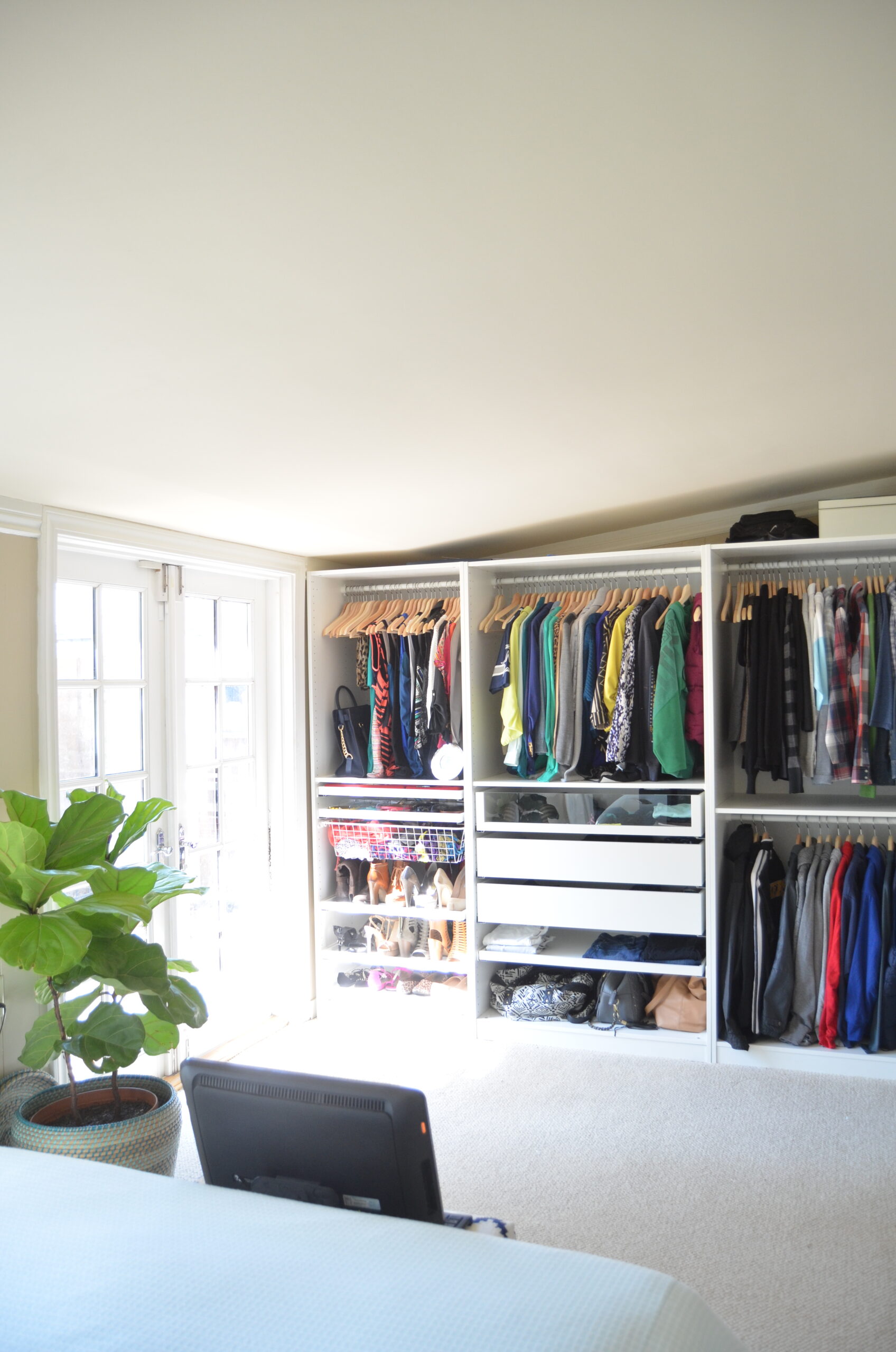
It’s super unconventional, but it really works! I also LOVE having the French doors with direct access to the backyard.
Though the room has worked well for us there are some things about it I really really DON’T like! We’ve kept a running list of all the things we’d love to change if/when the time came to tackle it. I certainly didn’t want storm damage to be the catalyst for a remodel, but since we already have to open up walls and pull back carpet to mitigate moisture and address damage, we decided we may as well take this time to tackle the changes we’d always talked about wanting to do.
The biggest reason we didn’t want to touch this room is because we knew we would be opening up a can of worms. Because the room was added on un-permitted some years after the house was built we had no idea what we’d encounter once we got started. The room was used as a den by the previous homeowners, but we discovered it was actually an outdoor patio prior to that. It had been enclosed some time in the 60s or 70s most likely. We figured we could run into everything from foundation issues, to electrical problems and who knows that else. It would take a lot more than just paint and updated decor to really make a difference in here.
THE NEW STRUCTURAL AND NON-STRUCTURAL CHANGES
In reality the proper way to address this space is to tear it down and completely rebuild the room from the ground up…correctly and permitted. This would at the very least get us a foundation, roofline and ceiling height on the same level as the rest of the house. But, we just don’t want to do it. I don’t think the cost alone is worth it, not to mention the time and displacement it would take to endure construction. Nope. Not interested. The room is what it is and I think there is a way for us to make some really impactful changes that will not only update the space to current building standards, but also will cost just a fraction of what a completely new build would. The room isn’t a lost cause, it just needs some reimagining. Plus, I really love the challenge of making the space work. Here’s the plan:
- The paneling and trim has to go- My number one complaint about this room is the paneling on the walls. I loathe it. It’s the same paneling we’ve been slowly getting rid of throughout the house when we tackle a new space. We will be replacing the paneling with drywall.
- Goodbye carpet -It’s the only room in the house with carpet and we hate it. We plan to replace with hardwood. We also considered cork or just rocking with the cement floors.
- Raise ceiling height as much a possible-I know there isn’t going to be a ton we can do about the ceiling because of the way the room was attached to the house, but I’m just hoping for at least a few extra inches.
- Remove the sidelites behind the paneling on either side of the entry door- I’ve been waiting to get rid of these since I first discovered them shortly after we moved in.
- Add more outlets and lighting-This room only had ONE functioning outlet and an oddly placed recessed light. We will be adding more outlets, running electrical for bedside pendants and adding in some overhead lighting.
- Adjust the width of the step-Currently the step into the room extends beyond the width of the door and takes up space that could be used for storage (more on that coming up!)
With the plan in place we got to work
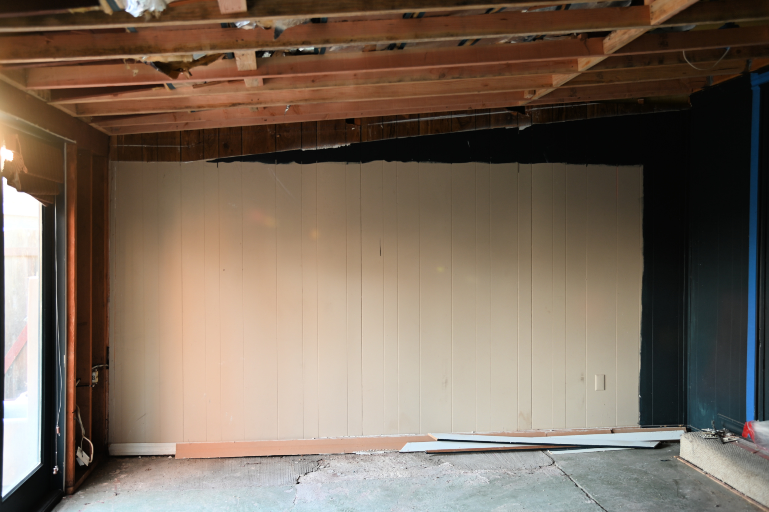
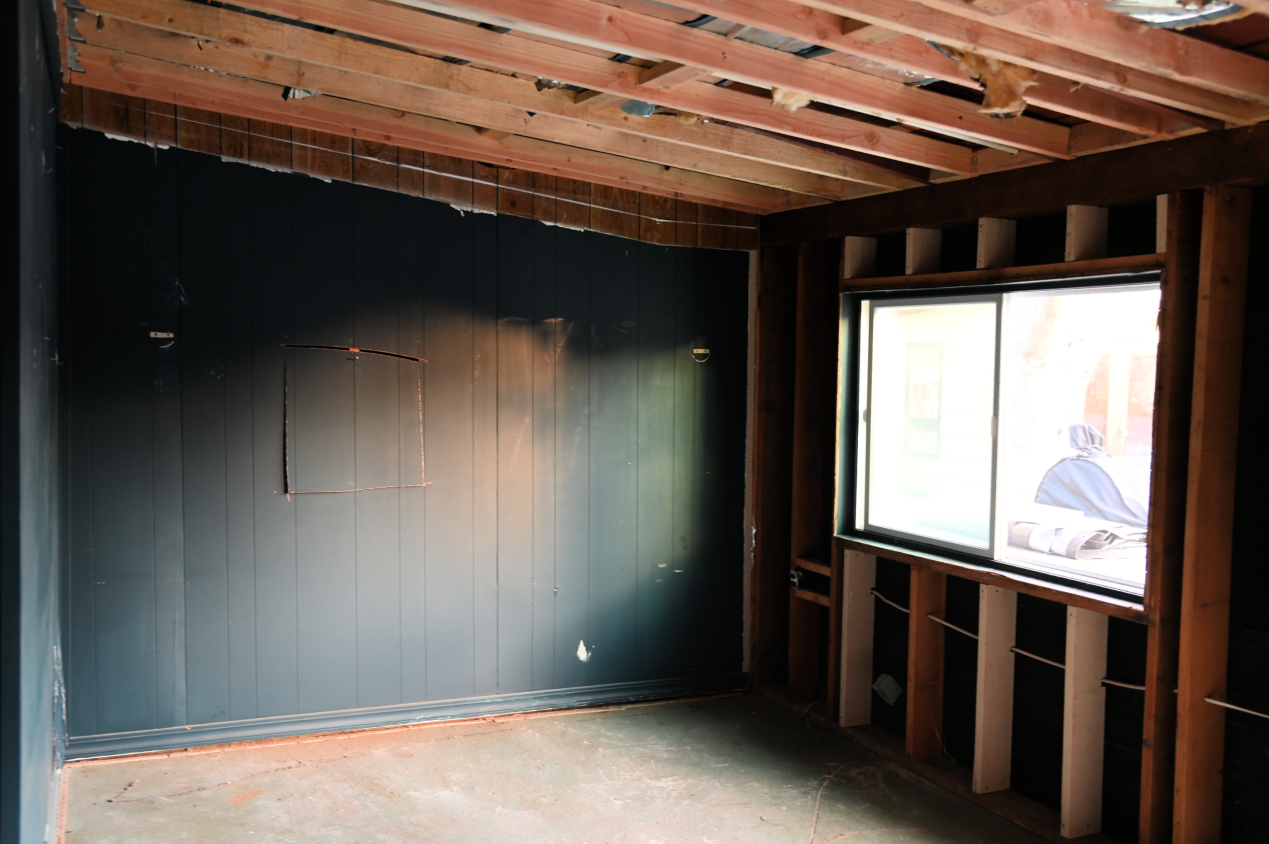
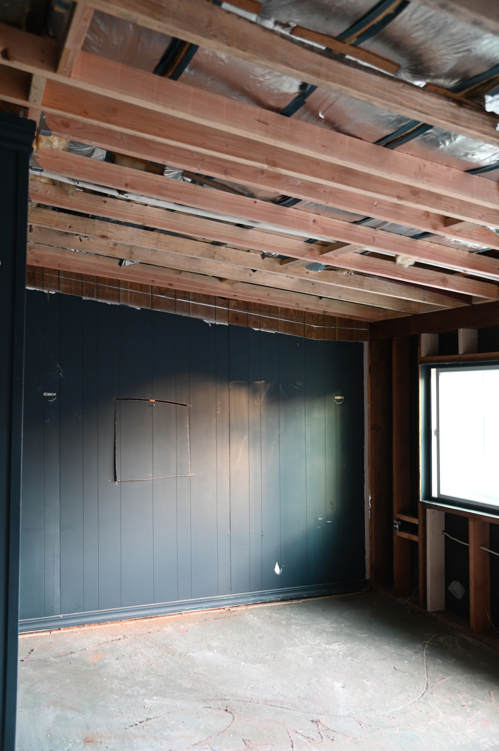
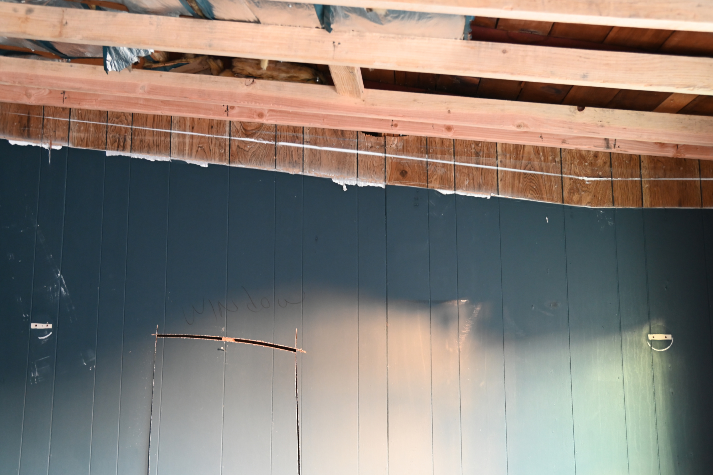
Once my contractor got a look at the ceiling he said he could re frame it so that we’d gain anywhere from about 2-5 inches of height by sistering the joists. I literally screamed and jumped for joy when he told us this! I know it doesn’t sound like a lot, but every single inch counts when you’re working with a low sloping ceiling. You can really see the difference in height by the paint line. That top white line is where the ceiling used to start. They were also able to get rid of the weird 90 degree angle of the ceiling at the lower end so now there’s just a clean slope down.
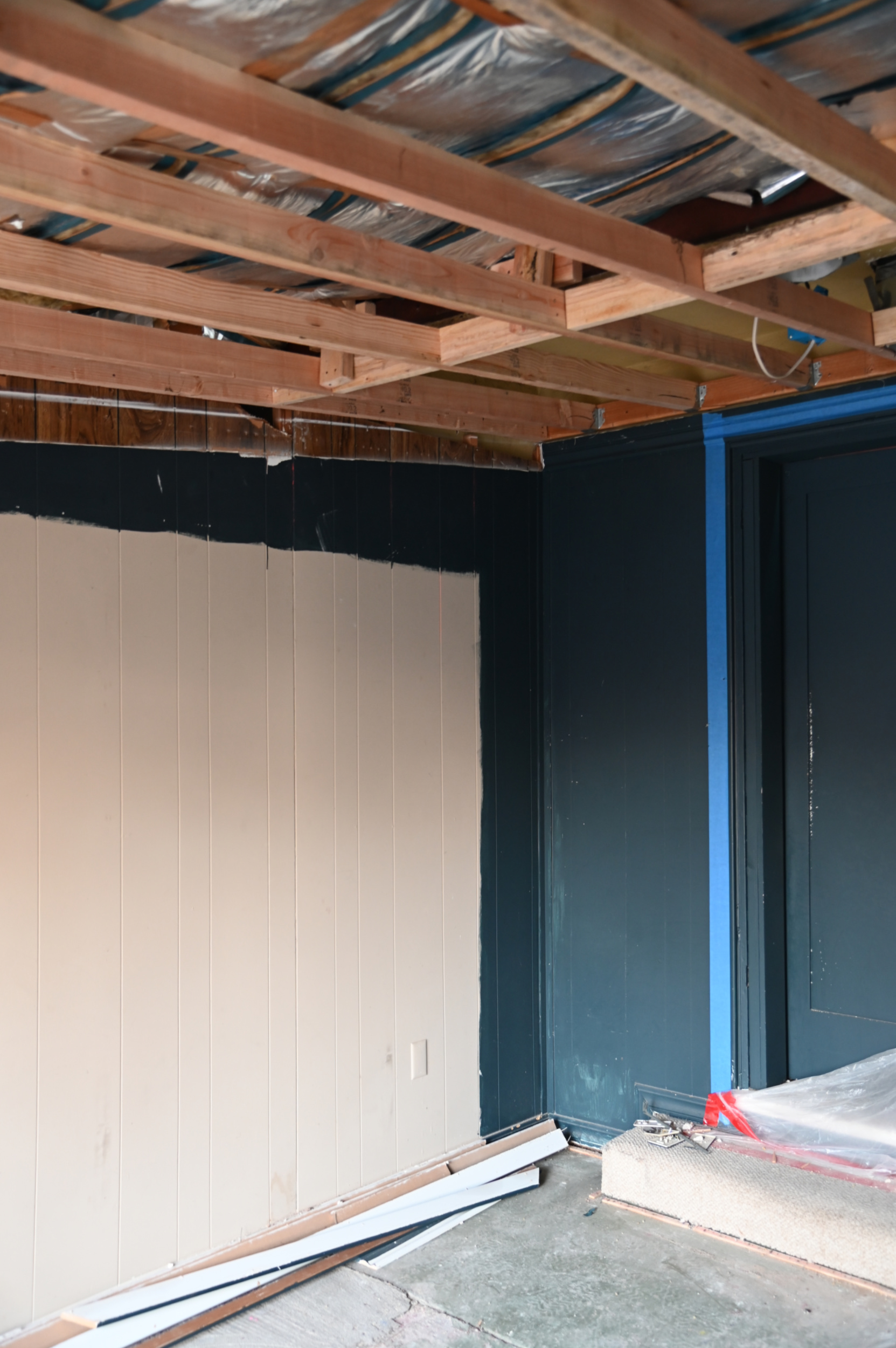
Next the paneling came down and the walls were rebuilt. We discovered the true bones of the space, more hidden windows (of course) and that the floor would need a lot more leveling than we thought. It was interesting to finally get to see the layout of the original structure.
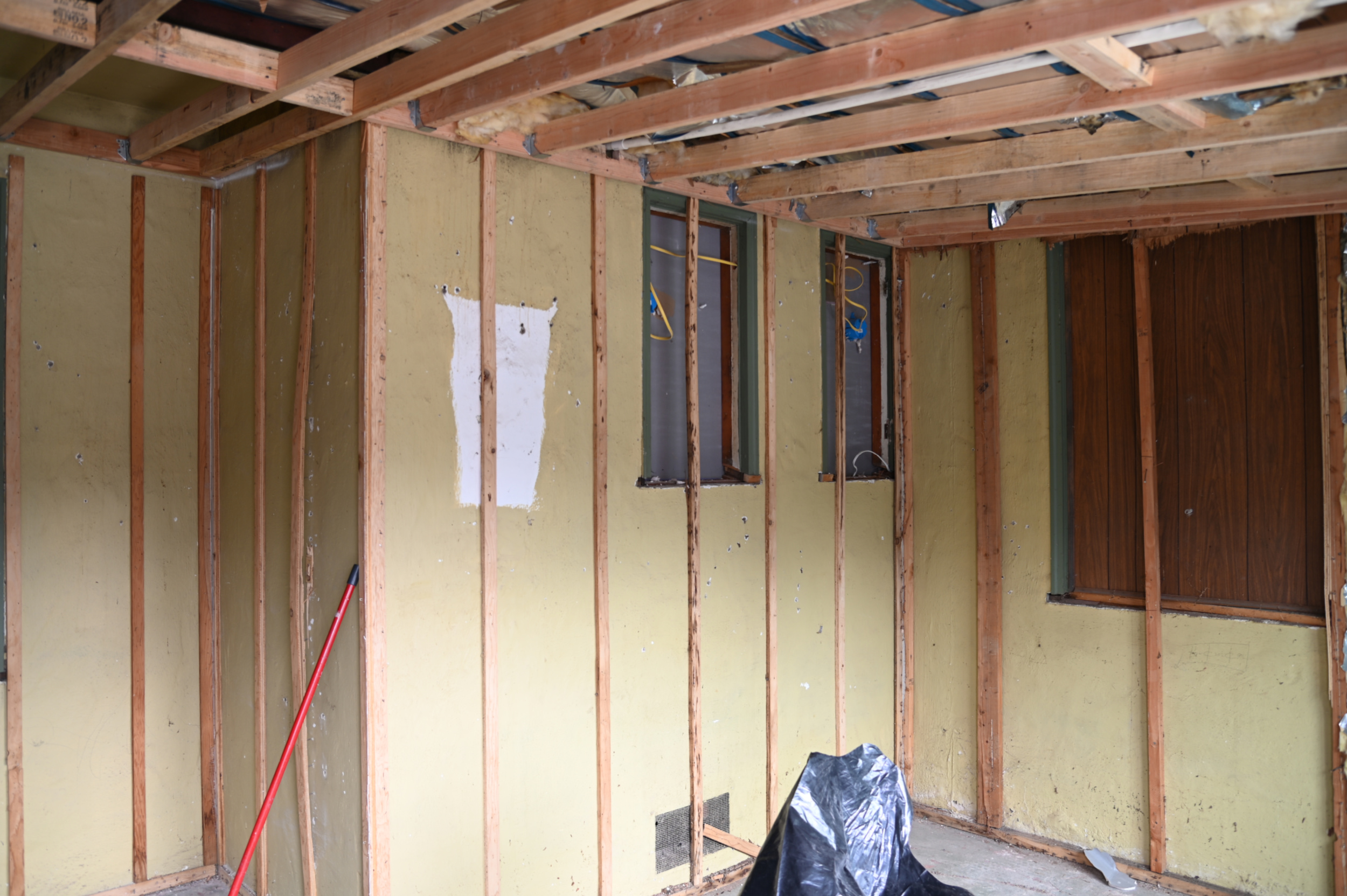
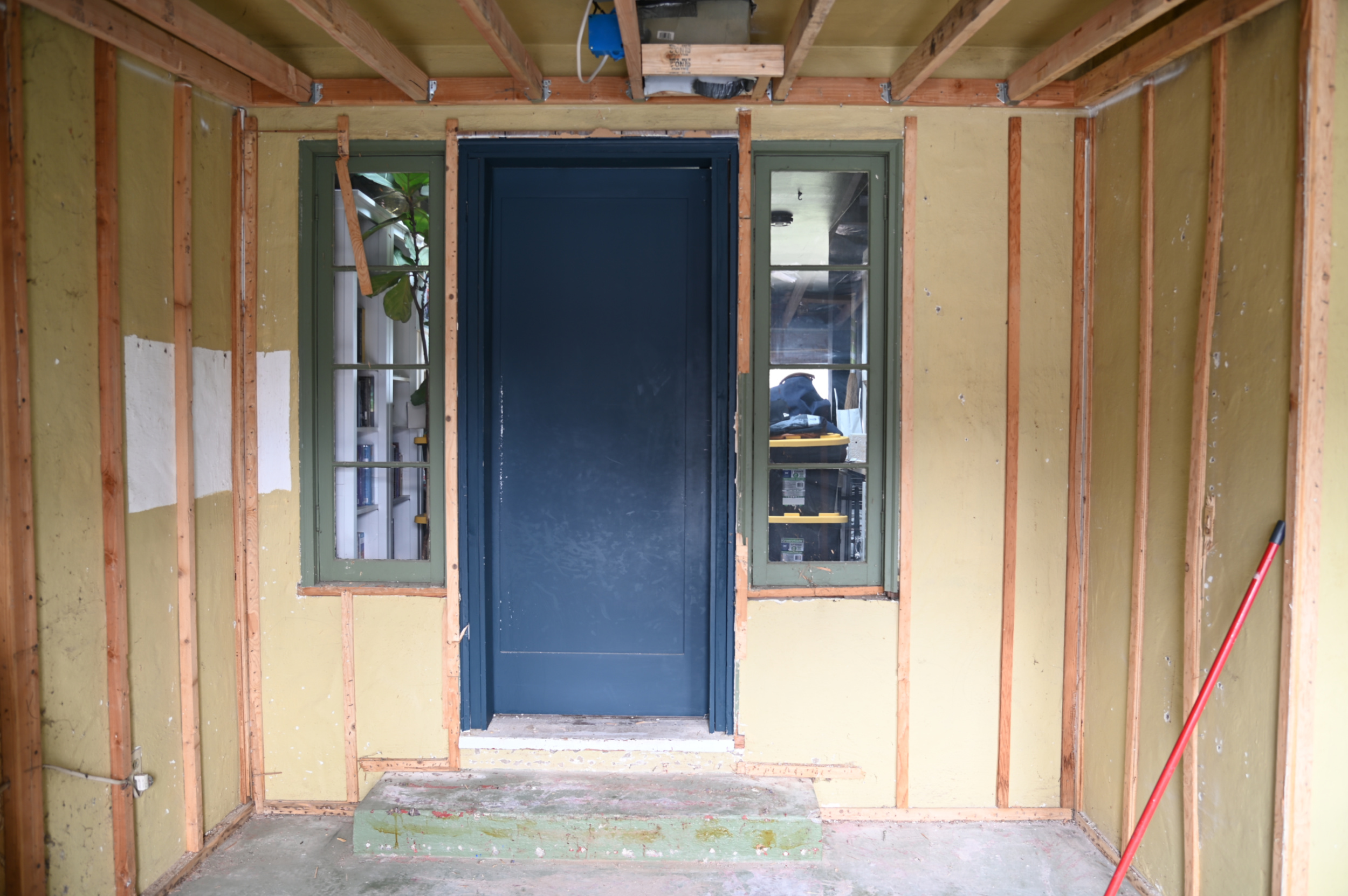
The paneling was literally just attached to the original exterior walls with thin strips of wood for it to nail into since the exterior is stucco. You can also see the sidelites that have been hiding behind the paneling in here. They were already exposed on the opposite side and I’ve shared my frustration about them many times before.
With all the demo done they got to work restructuring for the drywall, running the electrical and making the stair adjustment. Naomi really wanted to add overhead lights in the space since we only had one in here before. It was in an awkward place just inside the room right under the door and it never provided the best light. We supplemented with bedside wall sconces, but the light basically only dispersed on one side of the room. She really wanted to be able to flip the switch and turn on lights without having to walk all the way into the room to have light in the space. With the sidelites now gone that also means we could relocate the switch from the wall outside of the room to inside. You can see it there on the wall. It really was annoying to have to leave the room to turn the light on/off. I personally hate overhead lights in a bedroom and much prefer to layer in light with lamps, sconces, etc, but this was a compromise moment and I was happy to let her have them. You’ll see why in just a second. We also added outlets on almost all the walls.
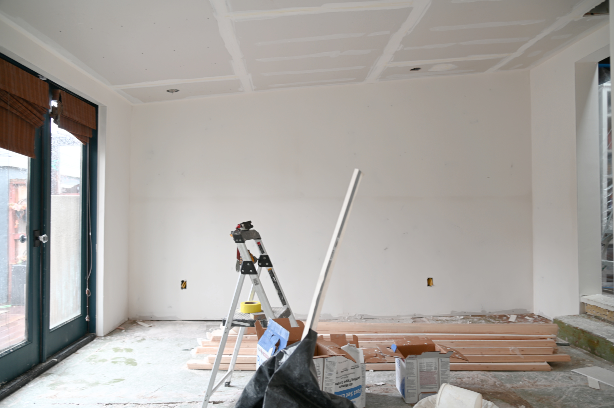
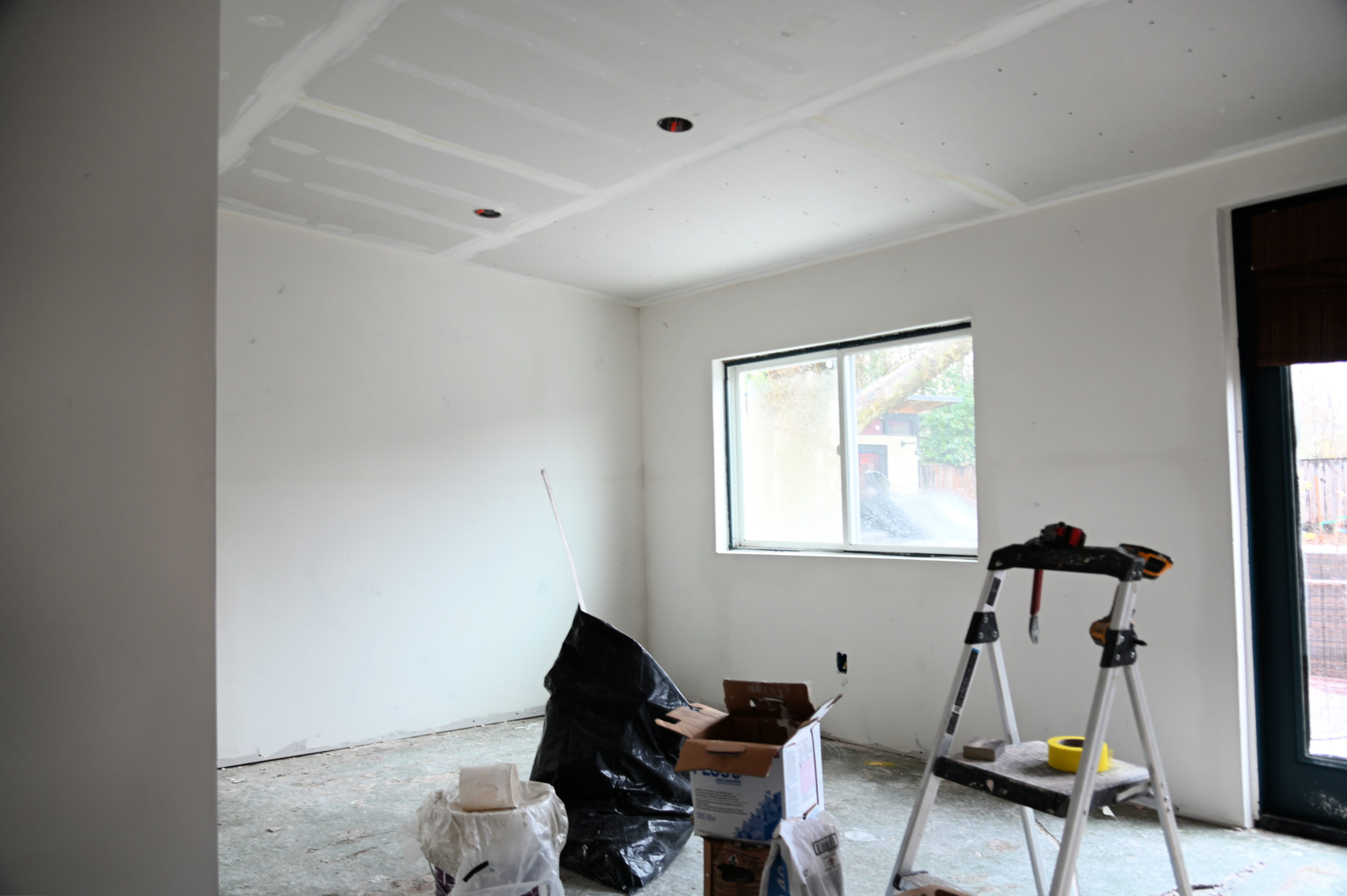
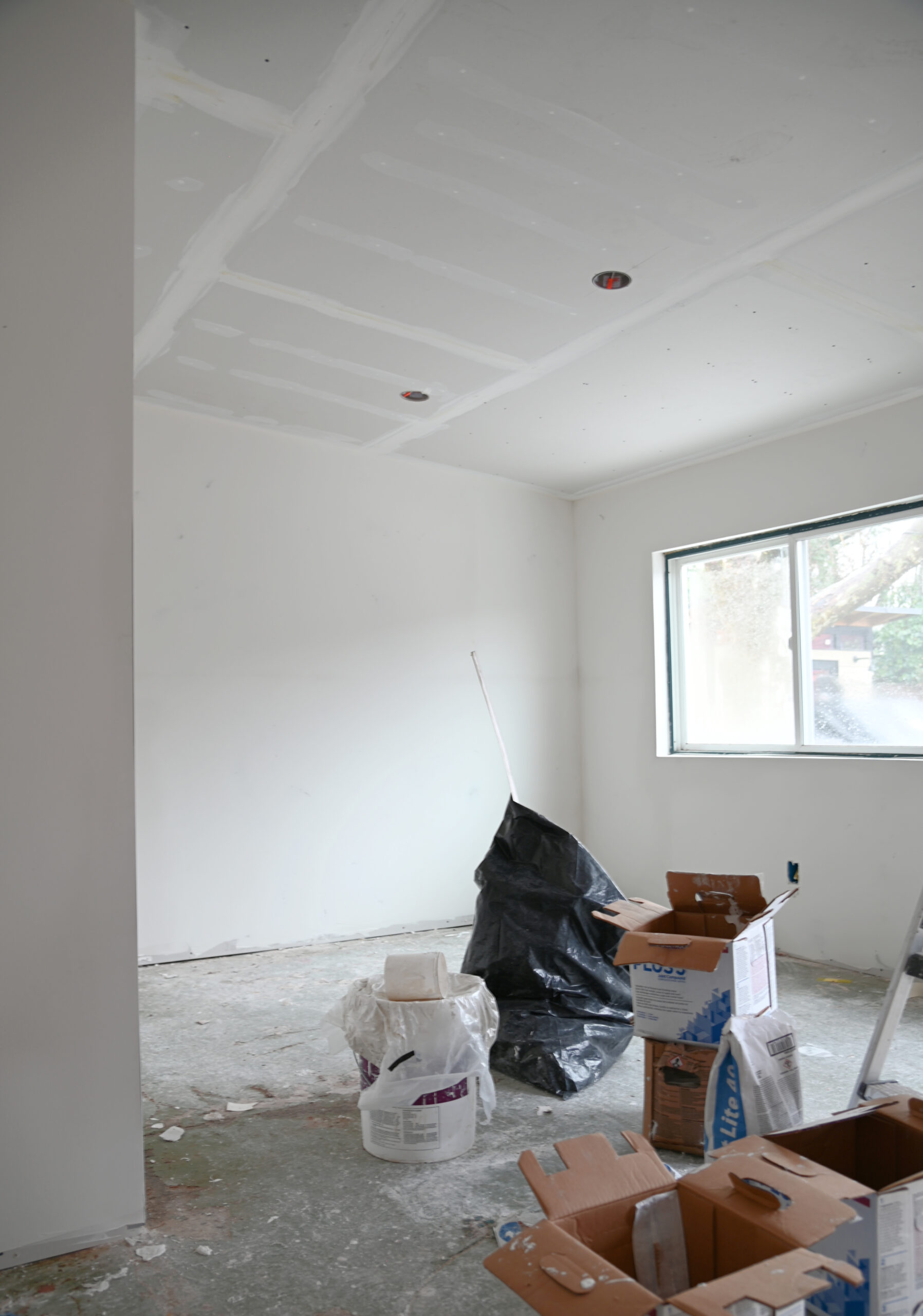
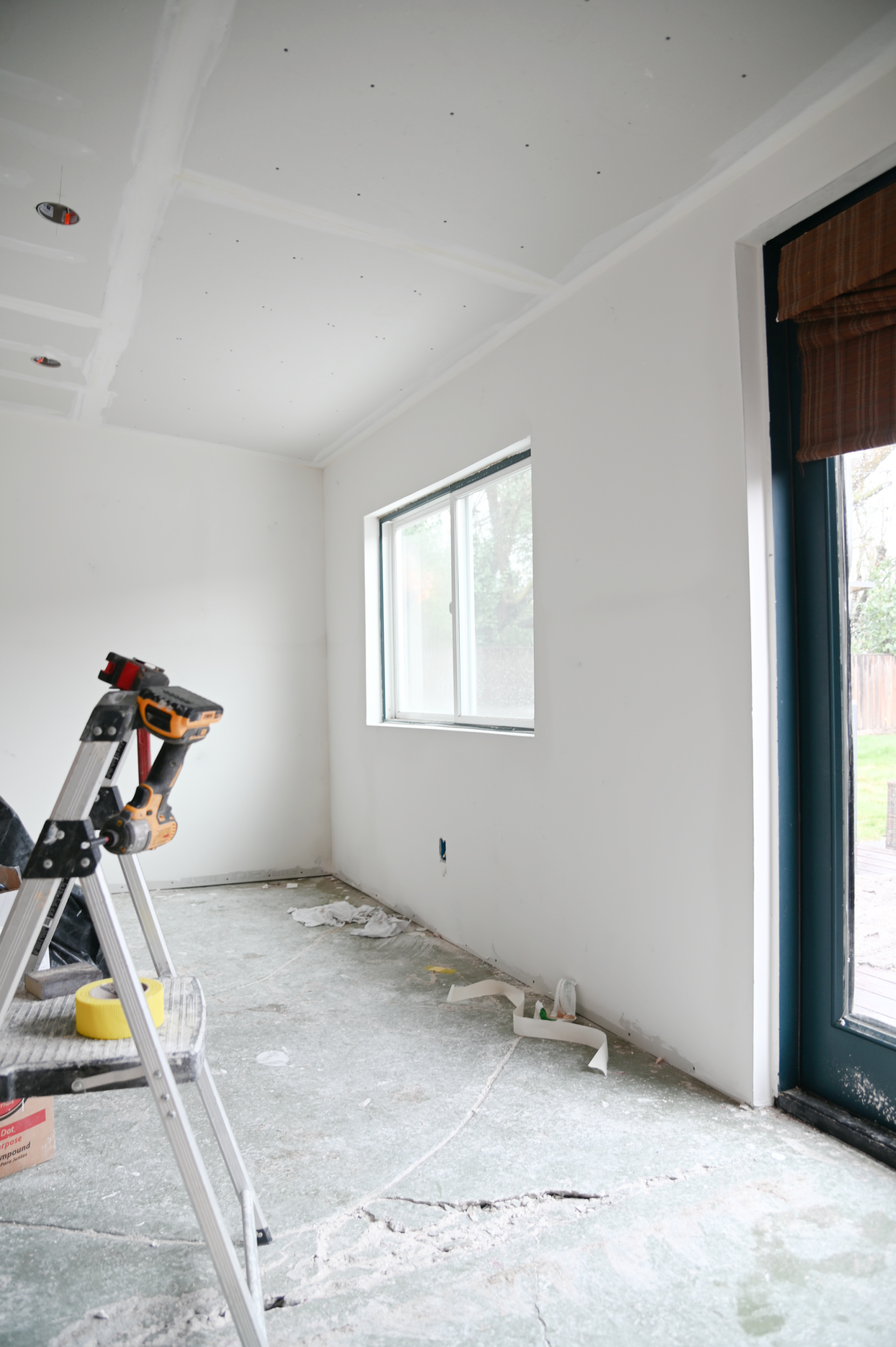
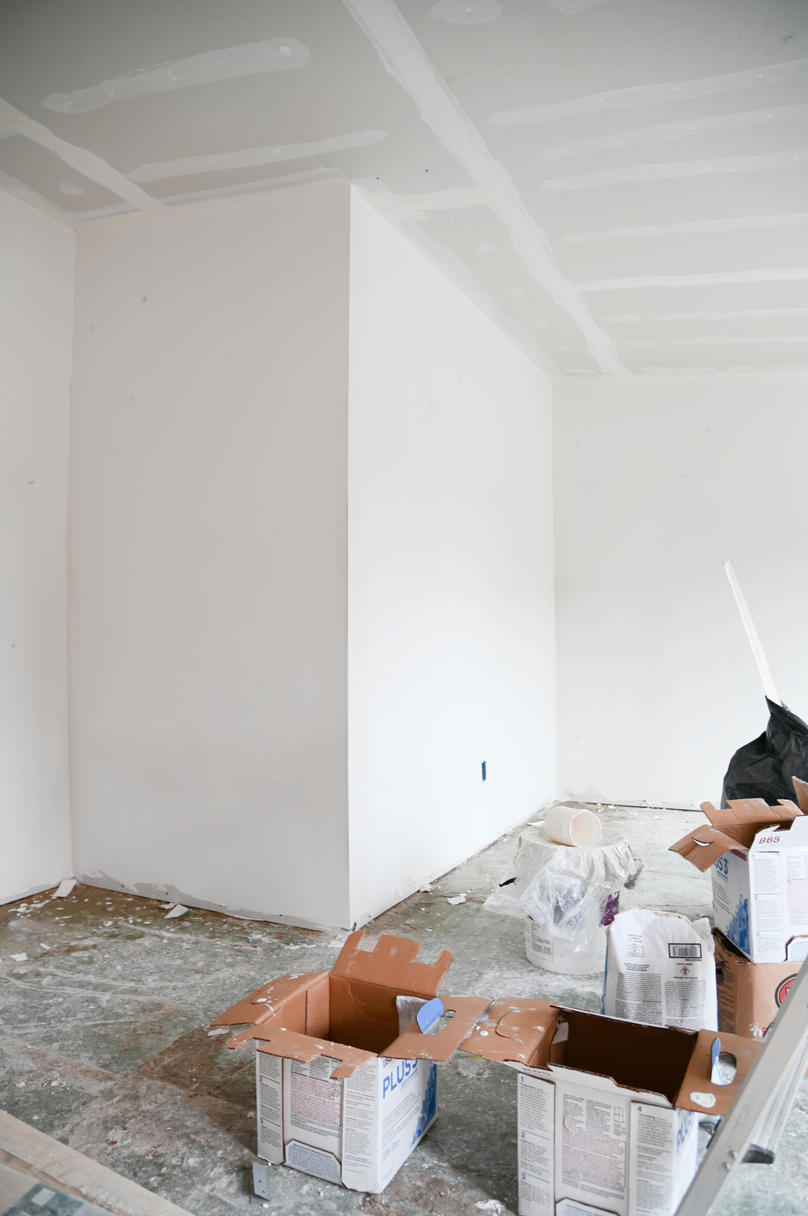
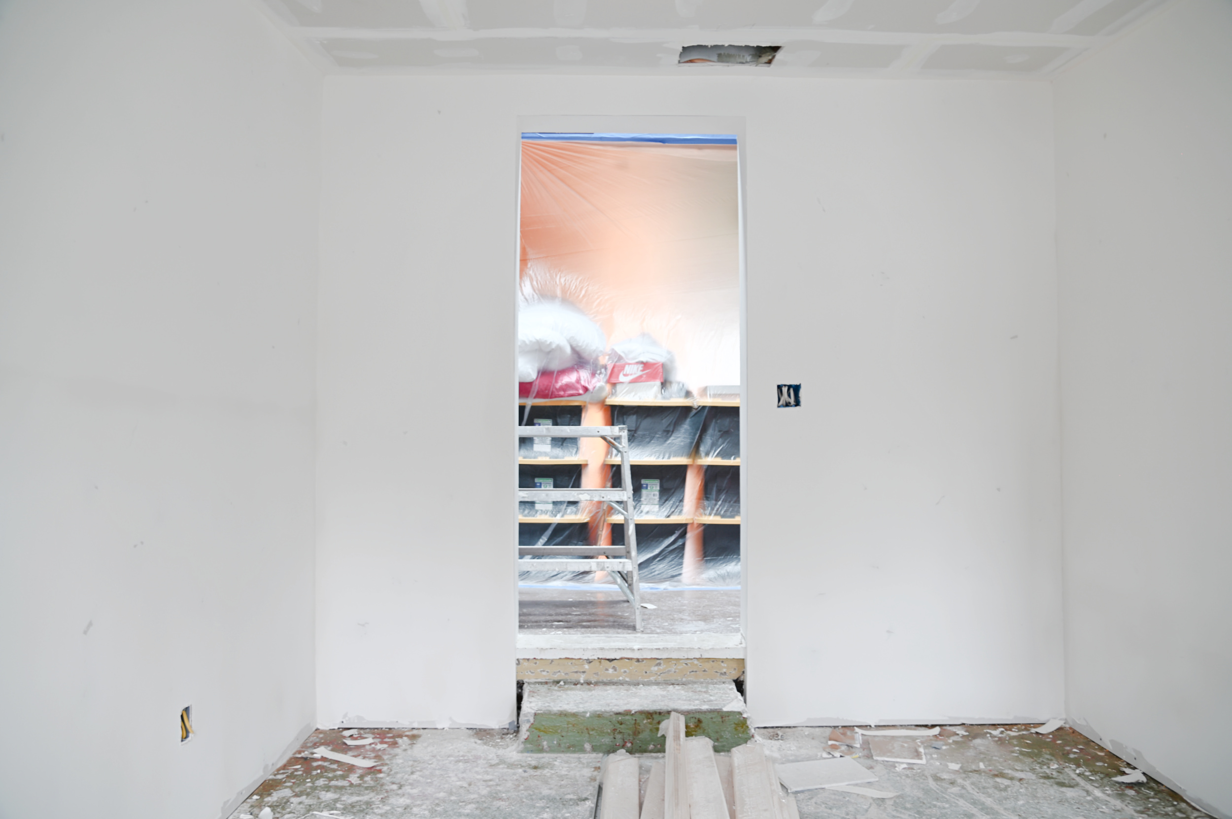
FRIENDS!! I swear this room feels a completely new space! Those few inches of added ceiling height make it seem like we have 10 ft ceilings now. The paneling dated the space so much and even if all we did was put in drywall it would have been a vast improvement.
I want to call out a couple of details here before we move forward: the adjustment of the width of the step and the placement of the overhead lights. I know you must be wondering what the heck is going on there so let’s get into it.
THE NEW LAYOUT
I’ve said it once and I’ll say it again, space planning is my absolute favorite part of the design process. For me it’s like solving a puzzle and when you get it right it’s truly impactful, particularly in the way a space functions day to day as well as long term. As we were taking things apart to prep for renovations, Naomi and I talked about what it would look like to possibly swap the layout of the room: placing our bed against the wall where the wardrobes were, and moving the wardrobes over to where the bed was. This would allow us to create a “dressing room” of sorts over in the recessed area of the room. I really really loved the idea of potentially getting more closet space and adding more storage in general. Especially for Naomi’s ever-growing sneaker collection. We were both really excited about how it could work and what this new layout could look like, but my only concern was if the bed placement would be a little too close to the entry door. I’m an old school sketch it on paper to-scale person, so I grabbed the dimensions and quickly drew up a floorplan as I envisioned it. Here’s what I’m thinking: (*the scale is 10″ = 1 square here for reference)
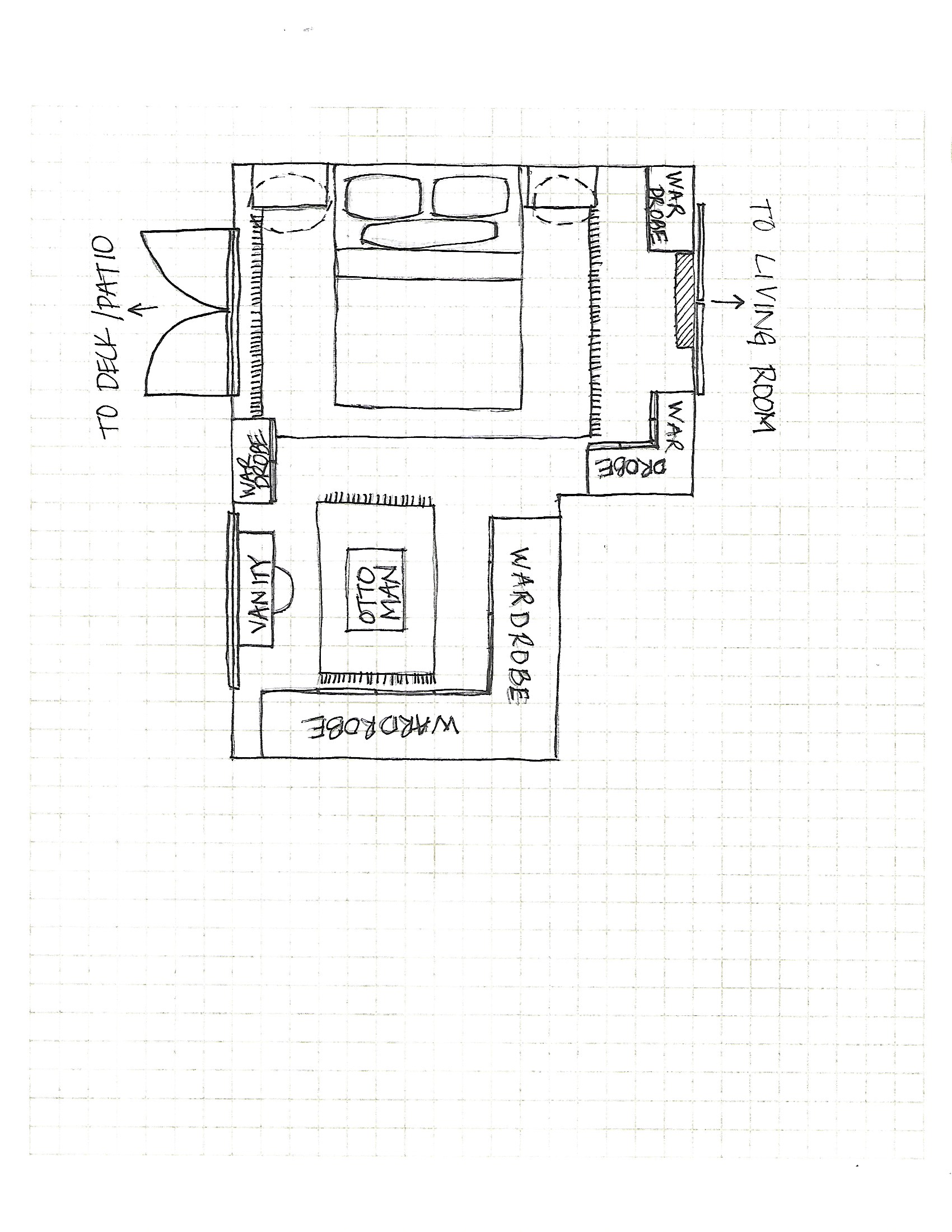
I’m actually kind of obsessed with it! This new layout offers a few benefits we didn’t have before:
- More closet storage. This allows us to add several more wardrobes to the space giving us dedicated storage for Naomi’s shoes, adding long hanging space for me (currently don’t have) and expanding shoe and handbag storage for me.
- More options for nightstands. The current layout only allowed for about 22″ on either side of the bed for nightstands, which was very limiting. Relocating the bed to other side opens up a lot more space for larger scale furniture.
- Stops the thoroughfare to the backyard! This is a HUGE one for us. The existing layout created a situation where our bedroom is used to access the backyard from the main living area. And even though we have access to the backyard via the laundry room, somehow our bedroom became the route everyone takes to get there. It’s something that has always bothered us a bit. Moving the bed over to the other side quite literally creates an access barrier.
- Allows me to bring in a vanity area. I already created a really small vanity area inside one of my wardrobes, but it will be nice to have a space where I can actually sit to do my makeup and self care in the bedroom. I currently do my makeup in the bathroom, which is fine, but as a one bathroom household it would be even better to dedicate space for this in another area of the house to keep the bathroom even more accessible and free.
- Overall feeling of a primary suite. The new layout would really help to make this room feel like a an intentional part of our home, rather than a room that we are just using to tide us over. It’s even possible this new layout could change our minds about embarking on the formal (and very expensive) primary suite addition we’ve been thinking about once Bry moves out and that room becomes available.
So now that we’ve nailed down the construction details and how we plan to reimagine the room, let’s talk about the overall design direction and inspiration for the new space…
THE INSPIRATION
Not gonna lie, friends. This space has me perplexed. Going in we decided to embrace its imperfections and the fact that it is, indeed, a quirky addition to the original footprint of the house. The ceilings are sloped, it’s on a lower level foundation, and technically it’s not even a bedroom. So rather than trying to make it “match” the rest of the house, we decided to embrace its individuality in terms of the design and aesthetic. I don’t abide by an “every room in the house must visually connect to the other” rule anyway. Each room in our house is its own moment, has its own color story and evokes an emotion specific to that space when you enter it. Carrying that same energy into the new bedroom is a no-brainer, BUT, what has me perplexed is that I like two very different design directions for the room.
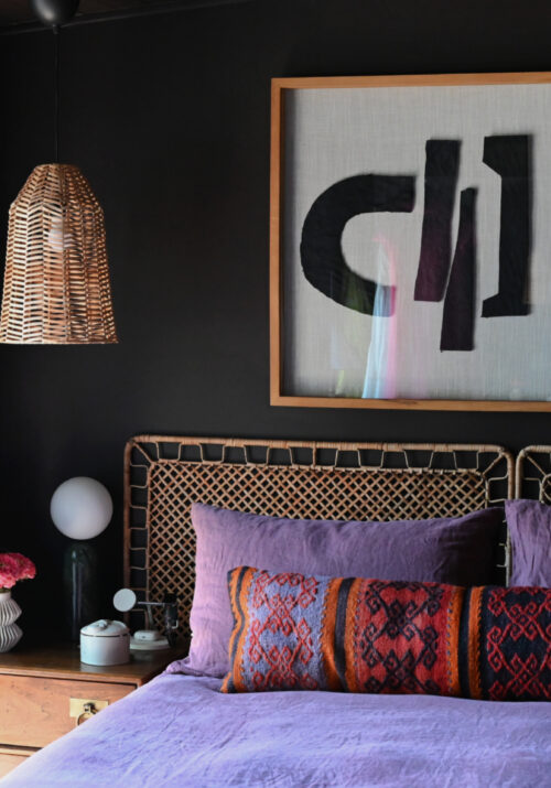
The first is a bit of a departure from my typical maximalist leanings. It’s a very muted, textural, wabi-sabi, Japanese-minimal, Balinese-esque vibe. I know that sounds like a complex mish-mash of A LOT, but stick with me. I’d still want it to be moody, because, well…Shavonda! BUT, it’s quite pared back and minimal. Not a lot of decoration or embellishment, rather there’s lots of texture through linens, rugs, rattan, natural fibers, rustic materials, etc. It’s also a look that’s very monochromatic and, dare-I-say: neutral. I mean who even is sheeeee!? Here’s are a few examples that I really love…
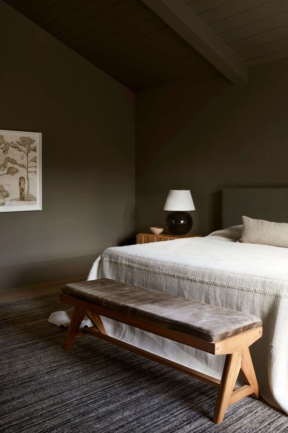
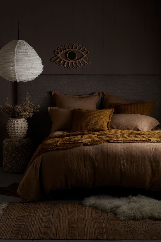
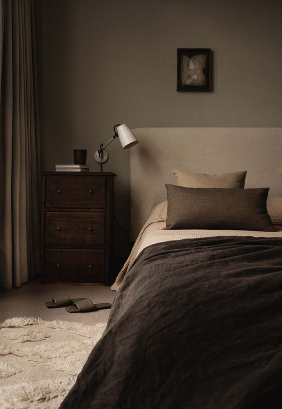
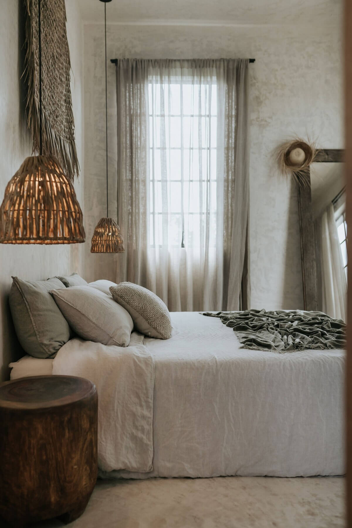
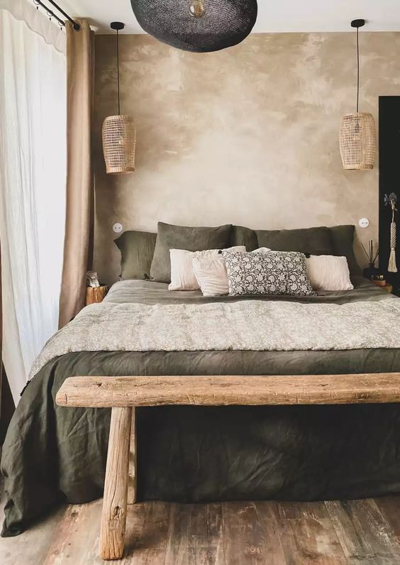
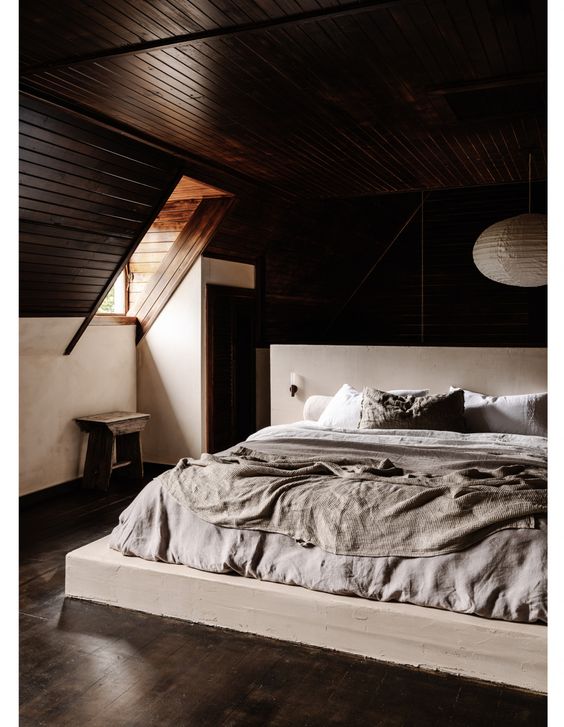
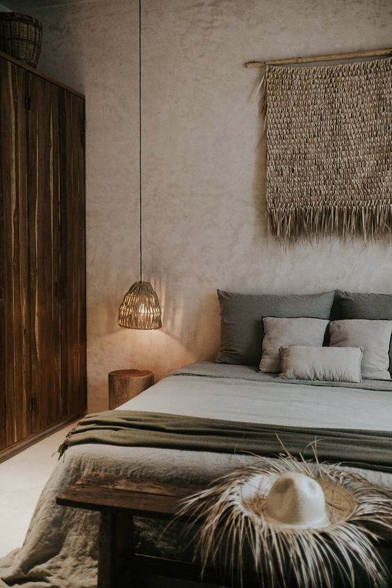
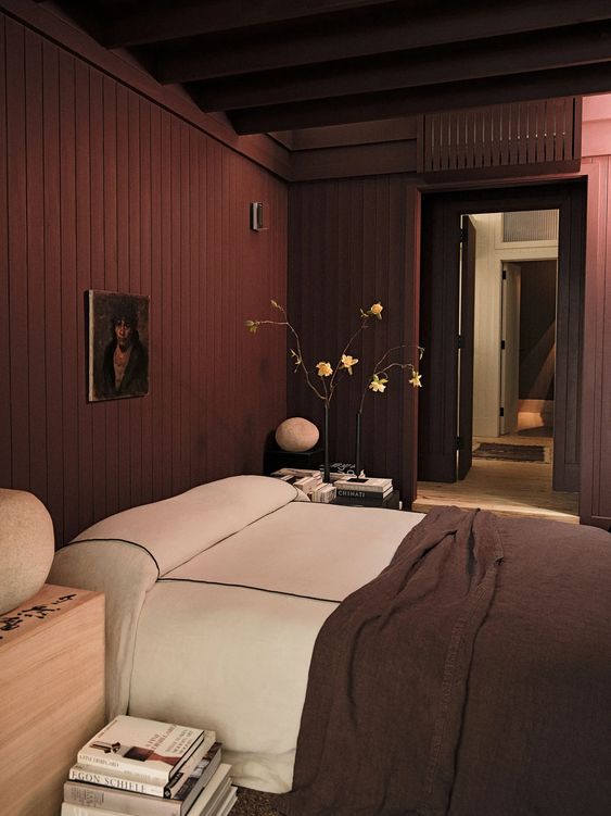
Colin’s room is also a great example of bed placement next to an entryway!
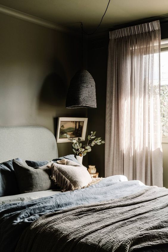
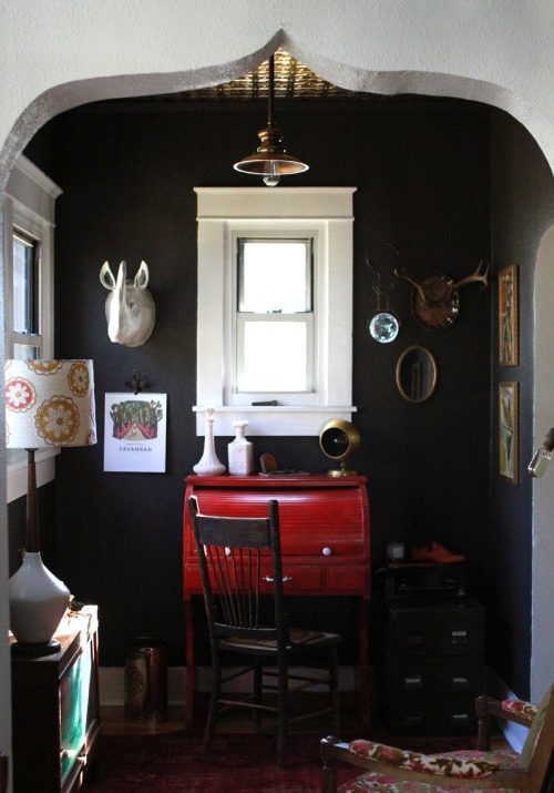
I feel like this is a vibe that could work really well in this space, especially with the sloped ceilings. It’s just a pretty big departure from what I’m innately drawn to, which brings me to the other direction I’m considering. Still moody, of course, but more visually layered and eclectic. Much more ME. A little something like this….
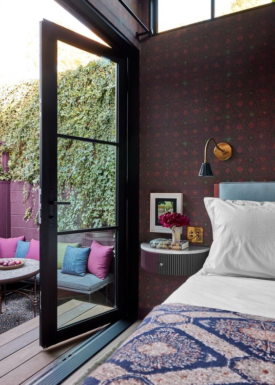
High key obsessed with Sarah Paulson’s tiny home and this bedroom in particular. Love the color story here and how smart is the floating nightstand in this super small space!
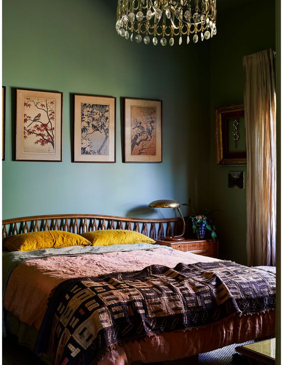
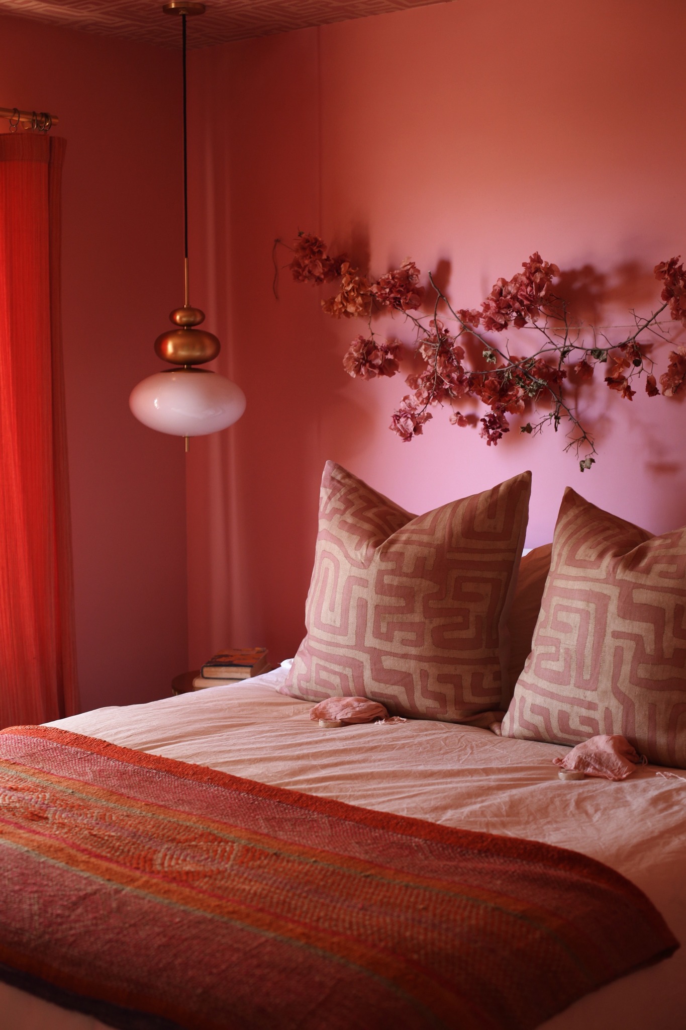
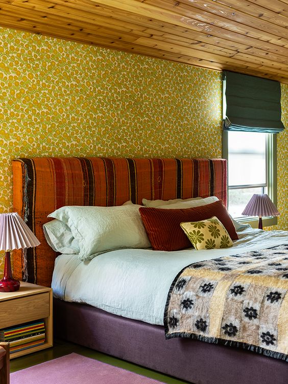
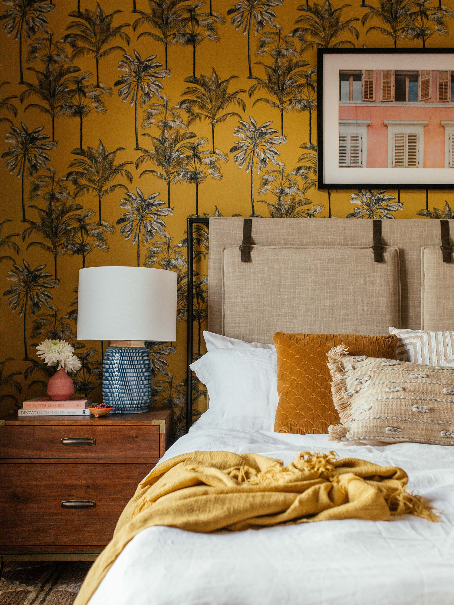
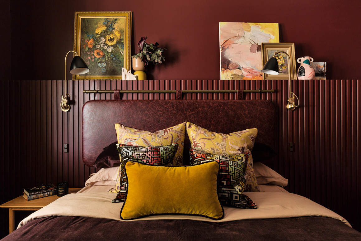
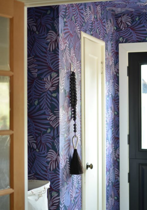
So yeah. There’s the dilemma. Also I feel like it would be a seriously missed opportunity if I didn’t bring some wallpaper into this space, right? Every room in our house has a wallpaper moment and this space deserves one too! I still have no idea what I’m going to do in here as far as design just yet. I think I may land on something that feels like a mix of the two. I do know one thing for sure though: I will be using chocolate brown. I’ve wanted to design a chocolate brown room for quite some time now and I really excited about that detail.
Alright friends that’s all for now. I know this was a really long one filled with a lot of info so thanks for sticking with me. I’m hoping to nail down the design over the weekend and next week will be sharing the design plan and mood board, I’ll also be sharing an in depth closet plan and more progress pics of work in here. Make sure you’re following me on IG because I’m sharing everything over there as well. I also have the entire renovation saved in a highlight.
Until next time friends…..
George Moorhead says
Explore the vibrant lifestyle and timeless appeal of the Pacific Northwest, where <a href="https://www.georgemoorhead.com/blog/2023/12/08/Investing-in-Bellevue-Real-Estate-Opportunities-You-Cant-Miss"Investing in Bellevue Real Estate provides access to a dynamic community, modern amenities, and a variety of properties to match your investment goals.
Krifor says
Thanks for the blog loaded with so much information. It’s really informative.
pre laminated mdf
Michelle says
Hello! Where is the reveal?!?! I can’t wait to see it and am truly curious how the cabinets and storage worked out for you.
Danish Design says
Ahhhh Waw I love this new layout and direction for furnitures so much. Your backyard is so magical and I’m dying to know what the view from the bed through the patio doors and other furniture out to the backyard will be good.
Danish Design Co. is constantly looking for new designer furniture brands to add to its expansive collection in order to provide clients with endless options. To name a few – Duxiana, Cane-line Outdoor Furniture, and MiaCara are the newest brands available at our Singapore furniture store. The most iconic bed hand crafted is specially produced by furniture brand Duxiana. Scientific research has shown that DUX beds give their customers deeper sleep. Cane-Line offers reasonably priced, functional, and aesthetically beautiful outdoor Scandinavian furniture, fit for any outdoor space that you in mind. Lastly, MiaCara offers a collection of gorgeous, durable pet furniture for your four-legged pals.
Lexi says
What a great idea – to swap the bed location. It would be great if we could see the dimensions of the rooms in your home… and especially this bedroom. It would help us to know what is possible!
Katie says
Ahhhh I love this new layout and direction so much. Your backyard is so magical and I’m dying to know what the view from the bed through the patio doors out to the backyard will be.
Leah says
Hi Shavonda! I love your aesthetic and can hardly wait to see how this space turns out!
Sarah says
Loved every detail! Inspiring as I’m thinking about my own home journey. Thanks, Shavonda!
Angelique says
Love it already, especially following your design thought process.